광고/포스터
공익·캠페인 포스터 (환경·건강·문화)
공익·환경·건강·문화 캠페인 포스터. 메시지·기관·CTA 입력하면 단정·따뜻 메시지 톤 공익 비주얼.
공익·캠페인 포스터 (환경·건강·문화) 검색 요약
공익·캠페인 포스터 (환경·건강·문화)은 광고/포스터 결과물을 만들 때 바로 복사해 활용할 수 있는 ChatGPT 이미지 프롬프트입니다. 주제, 배경, 스타일, 구도 조건을 함께 담아 빠르게 시안을 만들 수 있도록 구성했습니다.
관련 키워드: 공익·캠페인 포스터 (환경·건강·문화), 공익·캠페인 포스터 (환경·건강·문화) 프롬프트, 광고/포스터 프롬프트, 광고/포스터 AI 이미지 프롬프트, ChatGPT 이미지 프롬프트, AI 이미지 생성 프롬프트, AI 프롬프트, 이미지 프롬프트
공익·캠페인 포스터 (환경·건강·문화) 활용 포인트
원본 구조를 유지하면서 피사체, 배경, 색감, 구도를 바꿔 다양한 시안으로 확장할 수 있습니다.
- 핵심 소재는 유지하고 브랜드, 계절, 채널 목적에 맞는 색감과 배경을 바꿔보세요.
- 결과가 산만하면 배경 요소를 줄이고 피사체, 구도, 조명 조건을 구체화하세요.
- 복사한 뒤 ChatGPT에서 플랫폼, 화면 비율, 텍스트 포함 여부를 추가로 요청할 수 있습니다.
프롬프트 원문
[Input]
- language: Korean
- output_size: 1024x1536

[Purpose]
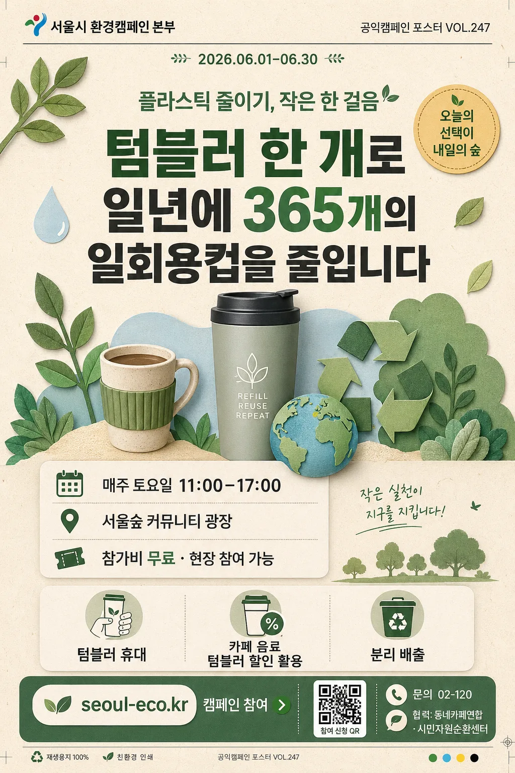
Korean public-interest campaign poster for environment/health/culture awareness, print-ready vertical layout and SNS-shareable editorial poster.
A credible civic communication piece with an action-focused message, enriched with real poster information such as campaign period, participation details, venue, sponsor area, contact line, QR-style participation block, and decorative campaign graphics.

[Composition]
- Main headline area: {핵심 메시지} placed in the upper-middle 30% of the poster, set as the largest text element with strong visual hierarchy.
- Supporting subject area: warm editorial illustration cluster around the headline using tumbler, reusable cup, plant, small earth motif, recycling arrows, and paper-cut leaf graphics.
- Top identity area: {기관/주최} aligned near the top, compact and official, with {포스터번호} and {캠페인 기간} shown as realistic poster metadata.
- Event information area: {행사일시}, {행사장소}, and {참여안내} presented in a clear civic-information block with small pictogram markers.
- Lower action area: {실천 방법} presented as 3 short, easy-to-scan lines with icon-like spacing.
- Footer CTA area: {CTA} anchored at the bottom with a clean call-to-action strip, QR-style square, contact line {문의}, and sponsor/cooperation text {후원/협력}.
- Background treatment: soft cream or beige paper-like surface with visible recycled-paper grain, tiny fiber speckles, muted green, sage, and soft blue accents.
- Framing direction: vertical poster with centered composition, print-safe crop guides implied by the layout, and a polished public-institution poster finish.

[3. CORE STRUCTURE]
1. Top header zone (top 10–15%): set {기관/주최} in a compact official style, add {포스터번호} on the opposite side, and place {캠페인 기간} beneath with a thin divider rule.
2. Campaign title zone (upper 16–28%): place {캠페인 주제} as the campaign title, large and bold, using a clean sans-serif hierarchy and comfortable line spacing.
3. Key message zone (center 30–50%): render {핵심 메시지} in the largest font size, visually emphasized with solid contrast, surrounded by editorial illustration accents that support the message.
4. Illustration and decorative graphics zone (center and side areas): add semi-flat motifs of a tumbler, leaf, reusable cup, small globe, recycling arrows, water droplet, and circular badge reading {슬로건태그}; use rounded shapes and gentle overlaps like a contemporary civic poster.
5. Event details zone (lower-middle 52–66%): show {행사일시}, {행사장소}, and {참여안내} in three stacked information rows, each with a simple calendar, map-pin, or ticket/participation icon.
6. Action list zone (lower-middle 66–78%): show {실천 방법} as concise bullet-style lines with small pictogram markers, evenly spaced and easy to read at a glance.
7. CTA and sponsor zone (bottom 80–94%): place {CTA} inside a footer band or button-like label, include a QR-code-like square labeled {QR라벨}, show {문의}, and add a sponsor/cooperation strip reading {후원/협력}.
8. Production detail zone (bottom edge): include small page/poster metadata such as {포스터번호}, recycled paper texture, tiny registration marks, and a fine divider line for a realistic printed poster impression.

[4. STYLE RULES]
- Typography: Pretendard or Noto Sans KR for the main text, Bold 700–800 for headlines, Medium 500–600 for supporting text, with headline size roughly 72–110px and body size 26–38px.
- Color palette: forest green #4F7A5B, sage #A7B89A, beige #F3EBDD, soft blue #C7DDE8, charcoal #2F3437, with occasional warm yellow #E8C96A for small badges.
- Border/shadow: use soft civic-poster depth such as a subtle shadow 0px 4px 12px at 12% opacity for the main message card or CTA band when needed.
- Graphic style: vector-like editorial illustration with rounded shapes, thin clean outlines, low-detail symbolic icons, tactile paper grain, small sticker labels, and neat divider rules.
- Information design: event details, participation notice, sponsor strip, QR block, and contact line should feel like authentic Korean public campaign poster content rather than placeholder text.

[5. VISUAL STYLE]
- Camera / lens: editorial poster design look, equivalent to a clean flat graphic composition rather than photography; if a source-photo feel is needed, emulate an 85mm f/1.4 shallow-depth portrait crop for any human-free design references.
- Lighting: soft diffused studio lighting feel, even illumination with no harsh highlights, as if lit by a large softbox from upper-left.
- Color grade: muted natural civic palette with warm cream, sage green, soft blue, and restrained charcoal contrast.
- Print finish: matte recycled paper texture, fine ink grain, crisp Korean typography, slight risograph-like warmth in the green and beige areas.

[6. MOOD]
Institutional campaign poster — a Seoul civic design office meets a Kinfolk editorial spread, with the clarity of a modern museum public-information graphic and the approachable warmth of a neighborhood environmental festival notice.

[7. CRITICAL]
- Korean text accuracy: 반드시 아래 문구가 정확히 표시되어야 함.
  - "플라스틱 줄이기, 작은 한 걸음"
  - "서울시 환경캠페인 본부"
  - "텀블러 한 개로 일년에 365개의 일회용컵을 줄입니다"
  - "텀블러 휴대 / 카페 음료 텀블러 할인 활용 / 분리 배출"
  - "seoul-eco.kr 캠페인 참여"
  - "2026.06.01–06.30"
  - "매주 토요일 11:00–17:00"
  - "서울숲 커뮤니티 광장"
  - "참가비 무료 · 현장 참여 가능"
  - "협력: 동네카페연합 · 시민자원순환센터"
  - "문의 02-120"
- Layout invariant: the main message must be the largest text and remain highly legible at poster distance.
- Illustrations and decorative graphics must stay secondary to the typography and must never cover required Korean text.
- Keep all text horizontal and properly spaced; avoid warped, broken, or decorative unreadable Korean characters.

[8. 🚫 PROHIBITED]
- Fake official seals / certifications
- Broken Korean characters
- Celebrity composites or recognizable celebrity likenesses
- English replacement of the required Korean campaign text