廣告/海報
한정식 고급 한식 메뉴판
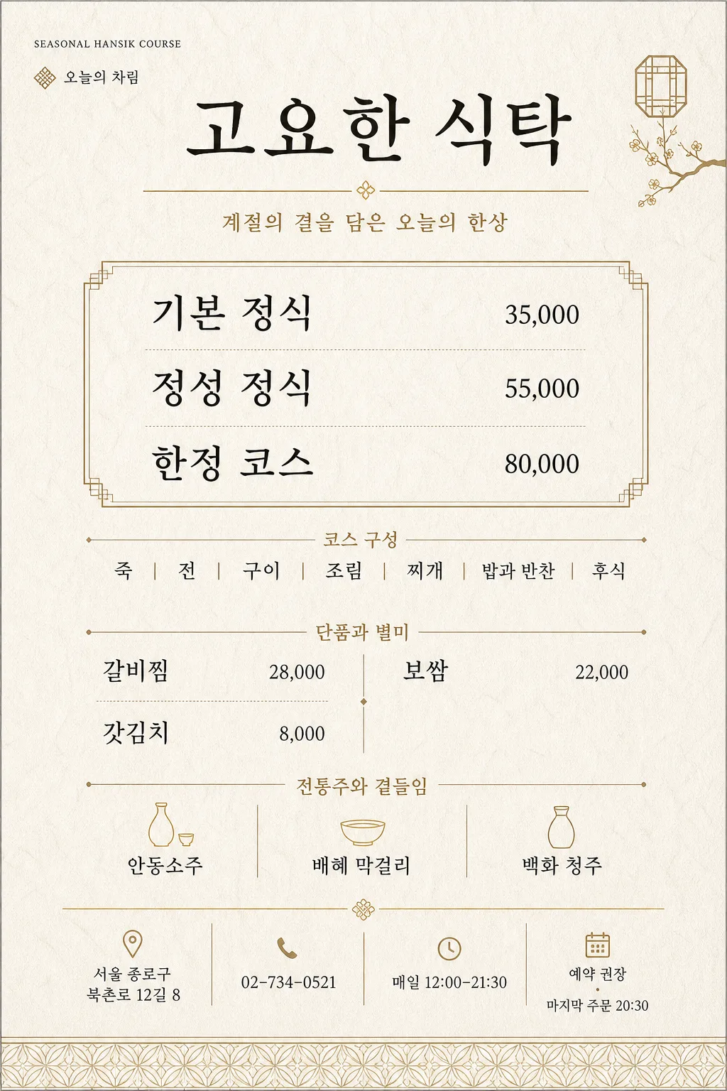
한정식·전통 한식·고급 한식 메뉴판. 먹·골드·세리프 톤. 코스 요리·반찬·요리 정보 단정 정렬.
한정식 고급 한식 메뉴판摘要
這是用來製作廣告/海報內容的 ChatGPT 圖像提示詞,已整理主題、背景、風格與構圖,方便快速調整。
相關關鍵字: 한정식 고급 한식 메뉴판, 한정식 고급 한식 메뉴판 프롬프트, 廣告/海報 프롬프트, 廣告/海報 AI 이미지 프롬프트, ChatGPT 이미지 프롬프트, AI 이미지 생성 프롬프트, AI 프롬프트, 이미지 프롬프트
한정식 고급 한식 메뉴판使用方式
保留原始結構並替換主體、背景、色彩或構圖,即可延伸出不同版本。
- 保留核心主體,並依品牌、季節或平台調整色彩與背景。
- 如果畫面太複雜,請減少背景元素並具體描述主體、構圖與光線。
- 複製後可要求 ChatGPT 配合平台、長寬比或文字需求調整。
提示詞原文
[Input]
- language: Korean
- output_size: 1024x1536

[Purpose]
High-end Korean restaurant menu board for a hansik omakase-style set meal, vertically composed for print-ready use and premium tabletop display.
A refined luxury Korean dining menu with structured pricing, tactile hanji texture, elegant calligraphy accents, realistic restaurant information, and polished fine-dining identity details.

[Composition]
- The page is a vertical 1024x1536 print menu with a balanced editorial grid; top title zone occupies about 16%, main menu body 68%, and footer information zone 16%.
- Background treatment: warm hanji paper texture in off-white with visible subtle fiber grain, softly uneven handmade-paper tone, and a premium matte print surface.
- Layout should feel airy, formal, and complete, with clear separation between course set, course composition, à la carte specials, alcohol section, and venue details.
- Add refined menu-board realism: thin dividers, small section labels, price alignment, a reservation note, address/contact line, and a small seasonal phrase.
- Use {매장명}, {코스메뉴}, {코스구성}, {단품별미}, {주류목록}, {계절문구}, {주소}, {연락처}, {영업시간}, {예약안내}, {컨셉톤}, {비율사이즈} placeholders.

[3. CORE STRUCTURE]
- Header zone (top 16%): set {매장명} as the main title, centered, with strong visual hierarchy and a restrained ink-and-gold treatment.
- Subtitle line: place a thin gold divider rule beneath the title, then add {계절문구} in small elegant Korean serif type, centered under the divider.
- Add a small upper-corner menu identity detail such as “SEASONAL HANSIK COURSE” and “오늘의 차림” in fine uppercase/small Korean label styling.
- Course menu block: arrange {코스메뉴} in a neat premium boxed section with each course line stacked; align prices consistently to the right in a small sans-serif style while item names remain prominent.
- Course composition block: place {코스구성} directly below the course box as a compact formal list, using refined separators, small dots, or slash spacing that feels precise and restaurant-menu appropriate.
- À la carte block: set {단품별미} in a 2-column grid with clear item-price pairing, tidy baseline alignment, and a small section heading such as “단품과 별미”.
- Alcohol block: place {주류목록} in a separate lower section with smaller type, aligned to the same grid, using a subtle divider and label such as “전통주와 곁들임”.
- Footer area: include {주소}, {연락처}, {영업시간}, and {예약안내} as real restaurant information; add a small horizontal divider and a discreet decorative traditional pattern accent in muted gold.
- Styling cue insertion: apply {컨셉톤} throughout the layout as the visual direction for type, spacing, material feel, dividers, and small ornamental details.

[4. STYLE RULES]
- Typography: use a refined Korean serif such as Noto Serif KR or Nanum Myeongjo for headers, paired with Pretendard or Noto Sans KR for prices, footer details, and small labels; title weight bold to semibold, body weight regular to medium, price size about 65-75% of item names.
- Color palette: deep ink black #111111, muted gold #B8944B, warm ivory #F6F1E7, soft stone beige #DDD4C5, subtle charcoal #2A2A2A, and a faint rice-paper gray #E8E0D2.
- Border/shadow: use thin rules in gold or charcoal, hairline section dividers, and very soft flat shadow only where paper layering is implied, like 2px y-offset, 6px blur, 10% opacity.
- Use restrained gold accents for separators, title embellishment, section labels, small geometric hanok-inspired ornaments, and the footer pattern; keep primary menu text ink-black for clear readability.
- Prices must look typeset, not handwritten; align currency-free Korean restaurant pricing consistently with commas.

[5. VISUAL STYLE]
- Camera / lens: flat editorial poster look, simulated as a top-down print design captured with a 50mm normal lens aesthetic, no perspective distortion, no 3D mockup framing.
- Lighting: diffuse museum-like overhead light with even tonal distribution, no glare, no strong reflections, no dramatic shadows.
- Color grade: warm ivory + ink black + subdued antique gold, with slightly desaturated paper tones and crisp contrast for legibility.

[6. MOOD]
Luxury Korean fine-dining menu — a restrained editorial aesthetic inspired by traditional hanok hospitality, contemporary Seoul tasting-menu restaurants, premium hotel stationery, handmade paper craft, and calm ceremonial dining.

[7. CRITICAL]
- Korean text accuracy: the following strings must appear exactly as written: “고요한 식탁”, “기본 정식 35,000 / 정성 정식 55,000 / 한정 코스 80,000”, “죽 / 전 / 구이 / 조림 / 찌개 / 밥과 반찬 / 후식”, “갈비찜 28,000 / 보쌈 22,000 / 갓김치 8,000”, “전통주 안동소주 / 배혜 막걸리 / 백화 청주”, “계절의 결을 담은 오늘의 한상”, “서울 종로구 북촌로 12길 8”, “02-734-0521”, “매일 12:00–21:30”, “예약 권장 · 마지막 주문 20:30”, “먹·골드·세리프 폰트 단정, 한지 텍스처, 정갈한 그리드”, “세로 1024x1536”.
- Korean text rendering must preserve spacing, punctuation, slashes, middle dots, en dash, commas, and all jamo correctly without broken characters.
- All menu sections should align cleanly to the grid; prices, address, contact, and operating hours must remain legible and consistent in size across sections.
- The final image must read as a complete premium Korean restaurant menu, not a blank stationery sheet.

[8. 🚫 PROHIBITED]
- Fake official seals / certifications
- Broken Korean characters or garbled menu text
- Celebrity composites / unauthorized likenesses