廣告/海報
포차·호프집 야간 메뉴판
닭발·곱창·뼈해장국·안주 등 한국 포차·호프집 메뉴판. 검정 베이스 + 따뜻한 전구 노랑 + 캘리그래피.
포차·호프집 야간 메뉴판摘要
這是用來製作廣告/海報內容的 ChatGPT 圖像提示詞,已整理主題、背景、風格與構圖,方便快速調整。
相關關鍵字: 포차·호프집 야간 메뉴판, 포차·호프집 야간 메뉴판 프롬프트, 廣告/海報 프롬프트, 廣告/海報 AI 이미지 프롬프트, ChatGPT 이미지 프롬프트, AI 이미지 생성 프롬프트, AI 프롬프트, 이미지 프롬프트
포차·호프집 야간 메뉴판使用方式
保留原始結構並替換主體、背景、色彩或構圖,即可延伸出不同版本。
- 保留核心主體,並依品牌、季節或平台調整色彩與背景。
- 如果畫面太複雜,請減少背景元素並具體描述主體、構圖與光線。
- 複製後可要求 ChatGPT 配合平台、長寬比或文字需求調整。
提示詞原文
[Input]
- language: Korean
- output_size: 1024x1536
- display_size_note: {비율/사이즈}

[Purpose]
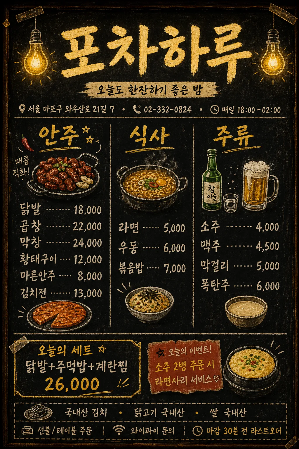
Korean pocha / hof house night menu board poster, vertical 1024x1536 layout for in-store wall display and window signage.
Create a realistic blackboard-style menu for {매장명}, using {컨셉 톤}: warm yellow bulb glow, hand-lettered Korean calligraphy, practical menu pricing, shop information, and small chalk food illustrations.

[Composition]
- Main title area at the top 14%: {매장명} placed large and centered, with a slightly hand-painted chalk or marker look and a warm tungsten halo.
- Directly below the title, add a small real-store information row: {주소}, {전화번호}, {영업시간}, separated by tiny dots or short chalk dividers.
- The center 58–62% is divided into three readable vertical menu sections for appetizers, meals, and alcohol, using handwritten category headers and price-aligned item rows.
- Background is matte black chalkboard or black paper texture with visible chalk dust, scuffed corners, tape marks, faint erased writing ghosts, and warm bulb reflections near the top edge.
- Small illustrated food icons sit around each category header and between item groups: 닭발, 곱창철판, 소주병, 맥주잔, 막걸리 사발, 라면 냄비, 김치전 조각.
- Bottom 18–22% contains a practical pocha footer: set menu strip, today event note, origin notice, Wi‑Fi / 주문 안내 micro text, and a chalk divider line.

[3. CORE STRUCTURE]
- Top header band: {매장명} in large Korean brush-calligraphy, warm yellow-white ink, slightly irregular stroke edges, centered, with tiny hand-drawn bulb icons on both sides.
- Subtitle under title: {대표문구} in smaller cream chalk lettering, slightly arched or written on a narrow brush-stroke ribbon.
- Shop info line: {주소} · {전화번호} · {영업시간}, written small but legible like an actual neighborhood pub board.
- Category block 1: “안주” section with {안주 메뉴}; each item and price should appear as a practical menu row with dot leaders, short dashes, or chalk divider marks.
- Category block 2: “식사” section with {식사 메뉴}; use slightly smaller rows but keep numbers and comma pricing clear.
- Category block 3: “주류” section with {주류 메뉴}; give drink options visual emphasis using small bottle, beer mug, and makgeolli bowl icons.
- Bottom set strip: “오늘의 세트” followed by {세트 메뉴}, styled as a yellow chalk label or taped-on black paper strip.
- Event / service note: {이벤트 문구} placed in a small amber badge or handwritten memo shape.
- Footer micro information: {원산지 안내}, plus small realistic labels such as “선불/테이블 주문”, “와이파이 문의”, and “마감 30분 전 라스트오더”.
- Overall layout should feel like an actual handwritten wall menu in a Korean night pocha, with lively asymmetry, practical dividers, realistic chalk smudges, and clear price hierarchy.

[4. STYLE RULES]
- Typography: hand-drawn Korean brush lettering or marker script for headers, Pretendard SemiBold or Noto Sans KR Bold for price alignment if any clean text is needed, size hierarchy 64–90px for title, 30–44px for categories, 22–30px for item lines, 14–18px for footer micro text.
- Color palette: matte black #101010, warm yellow #F5C542, amber glow #FFB84D, cream text highlight #F7E9B5, muted chalk gray #B8B8B8, small red-orange accent #E85D3F for event badges.
- Use chalk divider lines, dotted price leaders, small taped-paper labels, bulb doodles, hand-drawn arrows, and uneven chalk pressure to make the sign look used in a real pocha.
- Border/shadow: soft outer glow around title like tungsten bulb spill; chalk dust texture around edges; subtle worn paper or board grain; no glossy plastic finish.

[5. VISUAL STYLE]
- Camera / lens: front-facing straight-on poster composition, as if photographed with a 50mm lens at f/5.6 for flat, readable signage realism.
- Lighting: warm practical bulb lighting from upper-left and upper-right, creating a gentle amber halo and slight uneven brightness typical of a night pocha interior.
- Color grade: deep black base with warm tungsten yellow and amber highlights, slightly faded vintage chalkboard contrast.

[6. MOOD]
Authentic Korean night pocha wall menu — a cozy Seoul neighborhood hof pub at night, with handwritten chalk prices, warm bulbs, snack illustrations, practical shop details, and the feeling of a real menu board behind the counter.

[7. CRITICAL]
- Korean text accuracy: 반드시 다음 문구가 정확히 보여야 함: “포차하루”, “오늘도 한잔하기 좋은 밤”, “서울 마포구 와우산로 21길 7”, “02-332-0824”, “매일 18:00–02:00”, “안주”, “닭발 18,000 / 곱창 22,000 / 막창 24,000 / 황태구이 12,000 / 마른안주 8,000 / 김치전 13,000”, “식사”, “라면 5,000 / 우동 6,000 / 볶음밥 7,000”, “주류”, “소주 4,000 / 맥주 4,500 / 막걸리 5,000 / 폭탄주 6,000”.
- 추가 정보도 선명하게 보여야 함: “오늘의 세트”, “닭발+주먹밥+계란찜 26,000”, “소주 2병 주문 시 라면사리 서비스”, “국내산 김치 · 닭고기 국내산 · 쌀 국내산”.
- 한글 자모와 숫자, 쉼표, 슬래시, 원화 가격 표기를 정확하게 유지해야 함.
- Layout invariant: three category sections must remain clearly separated and readable; item names and prices must not collapse into a single paragraph.
- Food illustrations, bulbs, badges, tape marks, and chalk dust are supportive atmosphere elements; menu text remains the visual priority.

[8. 🚫 PROHIBITED]
- Fake official seals / certifications
- Broken Korean characters
- Illegible pricing
- Photorealistic food dominating the whole design