Ads/Posters
디저트 카페·팥빙수 메뉴판
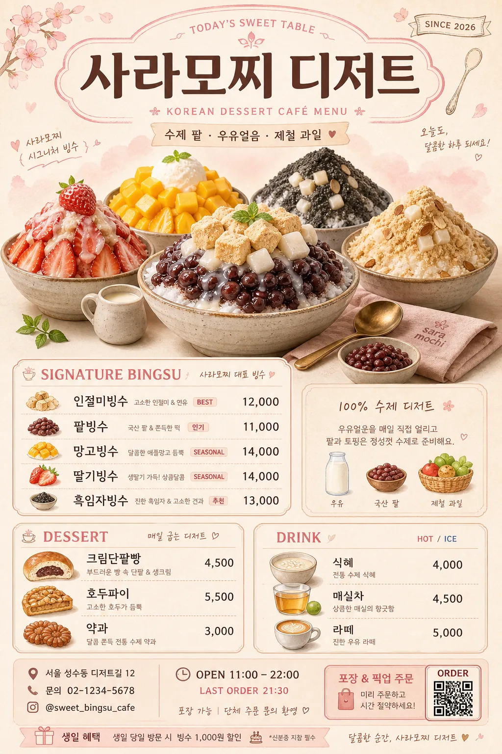
팥빙수·인절미·과일빙수·디저트 등 한국 디저트 카페 메뉴판. 핑크+크림 달콤 톤 + 디저트 일러스트.
디저트 카페·팥빙수 메뉴판 summary
Copy this ChatGPT image prompt to create Ads/Posters results. Its subject, background, style, and composition are organized for quick iteration.
Related keywords: 디저트 카페·팥빙수 메뉴판, 디저트 카페·팥빙수 메뉴판 프롬프트, Ads/Posters 프롬프트, Ads/Posters AI 이미지 프롬프트, ChatGPT 이미지 프롬프트, AI 이미지 생성 프롬프트, AI 프롬프트, 이미지 프롬프트
How to use 디저트 카페·팥빙수 메뉴판
Keep the prompt structure and swap the subject, background, palette, or composition to create new variations.
- Keep the main subject and adjust the palette and background for your brand, season, or channel.
- If the result feels busy, simplify the background and make the subject, composition, and lighting more specific.
- After copying, ask ChatGPT to adapt it for your platform, aspect ratio, or text requirements.
Original prompt
[Input]
- language: Korean
- output_size: 1024x1536

[Purpose]
Korean dessert café menu board for bingsu and sweets, vertical poster layout for in-store display.
Designed to present signature bingsu, desserts, drinks, prices, store details, and seasonal café character in a warm pastel Korean dessert shop style.

[Composition]
- Main title area at the top 14%: {매장명} centered as the café masthead, with a small subtitle line such as “KOREAN DESSERT CAFÉ MENU” and a tiny “SINCE 2026” or “TODAY’S SWEET TABLE” label.
- Central hero zone (middle 38%): large realistic signature bingsu photo/illustration cluster with bowls, shaved milk ice, red beans, rice cake cubes, mango, strawberry, black sesame powder, condensed milk drizzle, brass spoon, small ceramic side dishes, and a folded café napkin.
- Menu blocks below and around the hero zone: clearly aligned category sections for signature bingsu, desserts, and drinks, with readable item-price rows, small recommendation badges, and seasonal notes.
- Include practical café information near the bottom: “OPEN 11:00–22:00”, “LAST ORDER 21:30”, “서울 성수동 디저트길 12”, “문의 02-1234-5678”, plus a tiny QR/order pickup box and social handle line like “@sweet_bingsu_cafe”.
- Background treatment: cream paper base with soft pink and milk-white gradients, subtle dessert-watercolor texture, faint hand-drawn spoon/cup accents, small fruit illustrations, and printed-menu paper grain.
- Use {컨셉 톤} as the overall visual direction and maintain the vertical {비율/사이즈} poster feeling.

[3. CORE STRUCTURE]
- Header strip (top): place {매장명} in the largest text size, centered, with a soft rounded badge or hand-lettered accent behind it for café identity; add small Korean support text such as “수제 팥 · 우유얼음 · 제철 과일” beneath the title.
- Hero illustration/photo (upper-middle): show a premium handmade bingsu centerpiece in a shallow ceramic bowl, layered with realistic toppings, melting shaved ice edges, glossy fruit, chewy rice cake, red bean texture, condensed milk highlights, and small side props that feel natural to a café menu shoot.
- Signature bingsu section (mid-left or mid-right): list {시그니처 빙수} with {가격} in a tidy two-column menu layout, using bold category labels, aligned price text, and small tags like “BEST”, “SEASONAL”, “인기”, or “추천”.
- Dessert section (lower-left): present {디저트} as a separate block with small dessert doodles or watercolor icons beside each item line; include a divider label such as “DESSERT” and subtle notes like “매일 굽는 디저트”.
- Drink section (lower-right): present {음료} in a matching block, slightly smaller than the signature section, with tiny cup icons, hot/ice markers, and compact price alignment.
- Bottom information band: add store address, contact, opening hours, pickup/order note, and a tiny barcode/QR-style square labeled “ORDER”; keep all microtext visually integrated like a real printed café menu.
- Decorative accents: add thin dividers, rounded corner motifs, small spoon/cup doodles, hand-drawn fruit stamps, soft watercolor splashes, menu section frames, and light paper shadows to make it feel like an actual café poster.

[4. STYLE RULES]
- Typography: use Pretendard Bold or Noto Sans KR Bold for headings, Pretendard Medium for menu items, and a hand-drawn Korean accent font only for small decorative emphasis; title size should dominate the top area, while prices stay compact and readable.
- Color palette: cream #FFF6EE, blush pink #F7D9E2, milk white #FFFDF8, warm beige #EEDCC9, strawberry pink #F08FA7, cocoa brown #7A5A48.
- Border/shadow: soft drop shadow 4px y-offset, 12px blur, 15% opacity on hero graphics; thin rounded border lines in muted beige for menu sections; subtle printed ink texture and café-paper grain.
- Layout finish: realistic menu-board print design with balanced section rhythm, visible category hierarchy, tactile paper texture, and small café-brand details such as “TAKE OUT 가능”, “1인 1메뉴 부탁드립니다”, and “시즌 과일은 변경될 수 있어요”.

[5. VISUAL STYLE]
- Camera / lens: editorial food-poster look photographed on Canon EOS R5 with a 50mm lens aesthetic, f/2.8 depth-of-field feel for the hero dessert elements, crisp but slightly soft-edged like a café menu shoot.
- Lighting: bright diffused window light from upper-left at 45°, with a gentle fill from right; soft natural shadows under bowls, spoons, fruit, and menu cards for realistic depth.
- Color grade: warm cream + blush pink + milk white with gentle strawberry and honey accents, lightly desaturated for a refined dessert-café finish.
- Material realism: ceramic bowl glaze, glossy red beans, powdery black sesame, translucent shaved ice, soft rice cake texture, fresh fruit moisture, matte paper background, and subtle ink bleed on printed text.

[6. MOOD]
Premium Korean dessert café editorial — feels like a warm Seoul café menu board, mixing a polished bakery poster with handcrafted watercolor dessert details and realistic food photography.

[7. CRITICAL]
- Korean text accuracy: 반드시 아래 문구가 정확히 보여야 함.
  - {매장명}
  - {시그니처 빙수}
  - {가격}
  - {디저트}
  - {음료}
- Additional Korean menu/support text may appear and should be readable, such as “수제 팥빙수”, “오늘의 추천”, “매일 굽는 디저트”, “OPEN 11:00–22:00”, “서울 성수동 디저트길 12”, “문의 02-1234-5678”, “TAKE OUT 가능”.
- Menu hierarchy must clearly separate signature bingsu, desserts, and drinks.
- Korean syllables and spacing must be clean and readable; no jumbled characters.
- The hero bingsu imagery must visually support the menu and coexist naturally with the pricing and information blocks.

[8. 🚫 PROHIBITED]
- Fake official seals / certifications
- Broken Korean characters