광고/포스터
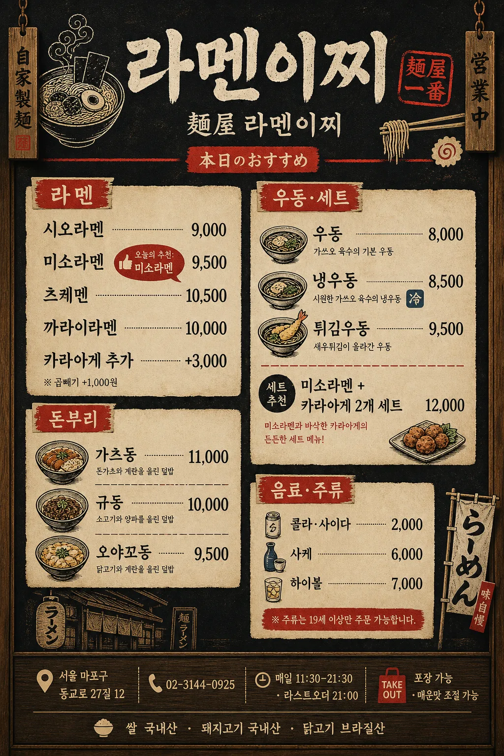
한국 라멘·일식점 메뉴판 (블랙+우드)
라멘·돈부리·우동·튀김 등 한국 일식점 메뉴판. 검정+우드 톤 + 일본 풍 캘리그래피·일러스트.
한국 라멘·일식점 메뉴판 (블랙+우드) 검색 요약
한국 라멘·일식점 메뉴판 (블랙+우드)은 광고/포스터 결과물을 만들 때 바로 복사해 활용할 수 있는 ChatGPT 이미지 프롬프트입니다. 주제, 배경, 스타일, 구도 조건을 함께 담아 빠르게 시안을 만들 수 있도록 구성했습니다.
관련 키워드: 한국 라멘·일식점 메뉴판 (블랙+우드), 한국 라멘·일식점 메뉴판 (블랙+우드) 프롬프트, 광고/포스터 프롬프트, 광고/포스터 AI 이미지 프롬프트, ChatGPT 이미지 프롬프트, AI 이미지 생성 프롬프트, AI 프롬프트, 이미지 프롬프트
한국 라멘·일식점 메뉴판 (블랙+우드) 활용 포인트
원본 구조를 유지하면서 피사체, 배경, 색감, 구도를 바꿔 다양한 시안으로 확장할 수 있습니다.
- 핵심 소재는 유지하고 브랜드, 계절, 채널 목적에 맞는 색감과 배경을 바꿔보세요.
- 결과가 산만하면 배경 요소를 줄이고 피사체, 구도, 조명 조건을 구체화하세요.
- 복사한 뒤 ChatGPT에서 플랫폼, 화면 비율, 텍스트 포함 여부를 추가로 요청할 수 있습니다.
프롬프트 원문
[Input]
- language: Korean
- output_size: 1024x1536

[Purpose]
Korean ramen and Japanese-style restaurant menu board, vertical wall poster for in-store display and takeout-counter reference.
Black-and-wood base with red accents, combining Korean menu clarity, Japanese-inspired signage details, item prices, shop information, and practical ordering notes in a vintage izakaya mood.

[Composition]
- Main header sits in the top 15% of the poster, centered, with {매장명} as the dominant title, {일본어부제} beneath it, and a red hanko-style decorative stamp graphic that is clearly non-official.
- Menu body fills the middle 70% in a structured 2-column restaurant menu layout: left column for ramen and donburi, right column for udon, set menu, drinks, and alcohol.
- Background uses dark charcoal black with visible warm wood-grain side panels, cream paper menu slips, small red divider tabs, brush texture, and slightly worn printed edges like an authentic Japanese eatery wall menu.
- Use {컨셉 톤} as the overall visual direction, with clear category hierarchy, readable price alignment, subtle dividers, and realistic counter-menu details.
- Footer area includes store address, contact, business hours, last order note, origin notice, and a small takeaway 안내 label.

[3. CORE STRUCTURE]
1. Header zone (top 15%): place {매장명} in bold brush-calligraphy style, with {일본어부제}, a small 「本日のおすすめ」 red label, and a thin red divider rule across the poster.
2. Category block 1 — 라멘 (upper-left): list {라멘 메뉴} with {가격} aligned in a neat price column; add a small 추천 badge reading {추천메뉴} next to the best item.
3. Category block 2 — 돈부리 (mid-left): place {돈부리 메뉴} as a separate cream paper section, using small bowl icons, dotted dividers, and neatly aligned won prices.
4. Category block 3 — 우동·세트 (mid-right): show {우동 메뉴} and {세트메뉴} with matching label style, red category tags, and compact explanatory subtext.
5. Category block 4 — 음료·주류 (lower-right): place {음료·주류} in smaller text, with a subtle red accent bar, bottle/cup icons, and a softer tone to distinguish beverages.
6. Decorative illustration zone: add ramen bowl line art, steam curls, chopsticks, naruto fish cake, chikuwa, nori strips, small nobori flag illustrations, and tiny wood-burned corner marks around the menu without blocking any essential text.
7. Footer strip: include a dark footer band with wood texture, small decorative separators, {주소}, {연락처}, {영업시간}, {안내문}, and {원산지표기} in fine but legible Korean text.

[4. STYLE RULES]
- Typography: title in a bold brush/calligraphy style resembling hand-painted Japanese signage; body in Pretendard or Noto Sans KR Medium 22–28px; prices in a condensed sans style for alignment; footer information in 16–18px clean Korean sans.
- Color palette: matte black #111111, dark wood brown #5A3A24, warm beige #E8DDC8, accent red #C73A2E, off-white #F6F1E7, aged ink gray #3B332B.
- Border/shadow: subtle paper-edge framing, soft drop shadow 4px y-offset, 12px blur, 15% opacity; thin red rules between sections; small cream paper labels layered over dark wood panels.
- Menu realism: include won symbols or comma-formatted prices consistently, small dots or leader lines between items and prices, and category labels that feel like a real Seoul ramen shop counter menu.

[5. VISUAL STYLE]
- Camera / lens: front-facing straight-on poster composition, 50mm equivalent lens look, flat-on commercial menu board framing.
- Lighting: soft even indoor lighting as if photographed inside a Japanese ramen shop, gentle top-front illumination with controlled natural paper sheen and warm shop ambience.
- Color grade: deep black + warm wood + muted cream with restrained red accents, slightly desaturated vintage restaurant print tone.

[6. MOOD]
Authentic Japanese ramen shop wall menu — a vintage izakaya signage feel with the practical clarity of a modern Seoul restaurant interior, including warm wood texture, hand-painted charm, readable Korean pricing, and lively small food illustrations.

[7. CRITICAL]
- Korean text accuracy: 반드시 정확히 들어가야 하는 문구: "라멘이찌", "麺屋 라멘이찌", "시오라멘 / 미소라멘 / 츠케멘 / 까라이라멘 / 카라아게 추가", "시오 9,000 / 미소 9,500 / 츠케멘 10,500 / 까라이 10,000 / 카라아게 +3,000", "가츠동 11,000 / 규동 10,000 / 오야꼬동 9,500", "우동 8,000 / 냉우동 8,500 / 튀김우동 9,500", "콜라·사이다 2,000 / 사케 6,000 / 하이볼 7,000", "미소라멘 + 카라아게 2개 세트 12,000", "검+우드+빨강 액센트, 일본 캘리그래피 한자 + 한글 mix, 빈티지 일식점".
- Footer text must be readable and include: "서울 마포구 동교로 27길 12", "02-3144-0925", "매일 11:30–21:30 · 라스트오더 21:00", "포장 가능 · 매운맛 조절 가능", "쌀 국내산 · 돼지고기 국내산 · 닭고기 브라질산".
- Korean jamo and spacing must be rendered correctly with no broken characters; all menu categories should remain clearly separated and readable at a glance.
- Use realistic menu-board details such as red dividers, price leader dots, small food icons, and shop information while preserving the black + wood + red ramen-shop concept.

[8. 🚫 PROHIBITED]
- Fake official seals / certifications
- Broken Korean characters
- Celebrity composites