廣告/海報
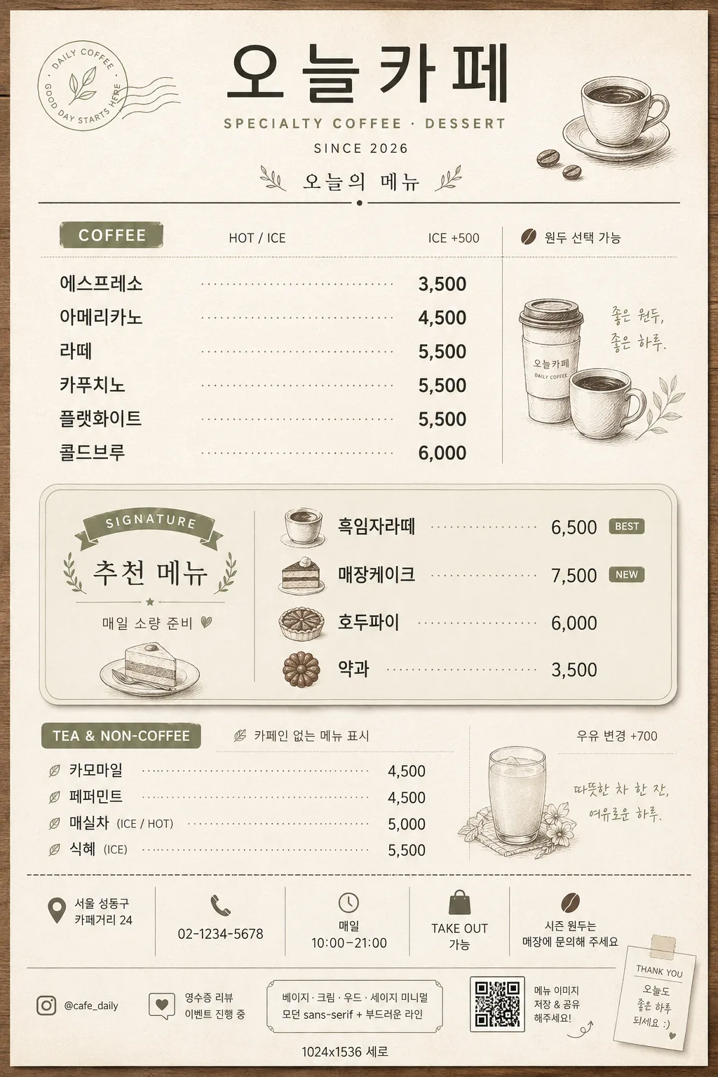
한국 카페 메뉴판 (모던 미니멀·인스타 친화)
스페셜티 커피·디저트·티 등 한국 모던 카페 메뉴판. 베이지·우드·모던 미니멀 톤 + 인스타 공유용.
한국 카페 메뉴판 (모던 미니멀·인스타 친화)摘要
這是用來製作廣告/海報內容的 ChatGPT 圖像提示詞,已整理主題、背景、風格與構圖,方便快速調整。
相關關鍵字: 한국 카페 메뉴판 (모던 미니멀·인스타 친화), 한국 카페 메뉴판 (모던 미니멀·인스타 친화) 프롬프트, 廣告/海報 프롬프트, 廣告/海報 AI 이미지 프롬프트, ChatGPT 이미지 프롬프트, AI 이미지 생성 프롬프트, AI 프롬프트, 이미지 프롬프트
한국 카페 메뉴판 (모던 미니멀·인스타 친화)使用方式
保留原始結構並替換主體、背景、色彩或構圖,即可延伸出不同版本。
- 保留核心主體,並依品牌、季節或平台調整色彩與背景。
- 如果畫面太複雜,請減少背景元素並具體描述主體、構圖與光線。
- 複製後可要求 ChatGPT 配合平台、長寬比或文字需求調整。
提示詞原文
[Input]
- language: Korean
- output_size: 1024x1536

[Purpose]
Korean modern cafe menu board for in-store use and Instagram sharing, portrait layout with a refined grid hierarchy, realistic cafe-branding details, and small illustrated accents.
Designed to feel like a trendy Seoul cafe menu in the Anthracite / Fritz / Mok aesthetic, with readable category organization, a highlighted signature section, and practical shop information that makes the design feel like an actual printed menu card.

[Composition]
- Vertical poster composition with the store name occupying the top 12–15% as a centered masthead, menu body filling the middle 70%, and a practical footer note area at the bottom 8–10%.
- Background surface: warm beige paper or matte plaster texture in cream, with subtle wood-toned framing elements, soft sage accent lines, realistic paper grain, and faint print-press texture.
- Use an elegant 2-column menu grid for category blocks and price alignment, with fine dividers, small section labels, and menu metadata that resembles a real Korean cafe counter menu.
- Use {매장명}, {커피 메뉴}, {가격}, {시그니처·디저트}, {티·논커피}, {컨셉 톤}, {비율/사이즈} throughout the layout as the custom content.
- Add realistic supporting information without introducing new placeholders: address line “서울 성동구 카페거리 24”, contact “02-1234-5678”, hours “매일 10:00–21:00”, takeout note “TAKE OUT 가능”, and small seasonal note “시즌 원두는 매장에 문의해 주세요”.

[3. CORE STRUCTURE]
1. Header area (top 12–15%): set {매장명} as the primary title in a clean modern sans-serif, centered, with slightly expanded letter spacing. Add small English/Korean sublabels such as “SPECIALTY COFFEE · DESSERT”, “SINCE 2026”, and “오늘의 메뉴” beneath it, plus a thin horizontal divider line below.
2. Main menu grid (middle 35–55%): place {커피 메뉴} as the coffee category content and {가격} as the matching price column, aligned line-by-line with precise spacing, dot leaders, and subtle separators. Include realistic small labels around the list such as “COFFEE”, “HOT / ICE”, “ICE +500”, and “원두 선택 가능”.
3. Signature block (middle 20–30%, visually emphasized): present {시그니처·디저트} inside a soft rounded rectangle or outlined panel with a light sage tint, a very soft shadow, and a tiny illustrated coffee cup or dessert icon beside the title. Add short Korean callouts like “SIGNATURE”, “추천 메뉴”, and “매일 소량 준비” to make the block feel like a real cafe highlight.
4. Tea / non-coffee block (lower middle 15–20%): place {티·논커피} in a secondary block with slightly smaller type and a lighter line weight, maintaining the same grid rhythm as the coffee section. Add small labels such as “TEA & NON-COFFEE”, “카페인 없는 메뉴 표시”, and “우유 변경 +700”.
5. Decorative accents: add small line-art illustrations of a coffee cup, leaf, traditional Korean sweet, roasted coffee bean, and receipt-like tick marks near corners or separators. Use monochrome charcoal, muted olive, or sage so the accents support the hierarchy and feel integrated with the cafe brand.
6. Footer / style note area (bottom 8–10%): integrate a compact note strip that visually reflects {컨셉 톤}, and include practical shop details: “서울 성동구 카페거리 24”, “02-1234-5678”, “매일 10:00–21:00”, “@cafe_daily”, “영수증 리뷰 이벤트 진행 중”, and “{비율/사이즈}”. Add a tiny QR-code placeholder box and small social/share icon marks for Instagram-friendly realism.

[4. STYLE RULES]
- Typography: use Pretendard or Noto Sans KR for the main Korean text, weight 500–700 for headers and 400–500 for body, with 18–28 px for category titles and 12–18 px for menu lines; allow a restrained English mix in the same sans-serif family.
- Color palette: beige #F3EBDD, cream #FAF7F0, warm wood #B68A5A, sage #A8B89A, charcoal #2E2E2E, muted olive #7E8B72.
- Border/shadow: use thin 1–2 px charcoal or sage rules, hairline dividers, small rounded panels, and a very soft shadow (0px x-offset, 4px y-offset, 12px blur, 10–15% opacity) only on the signature panel.
- Build the graphic language as a believable premium cafe menu: print-ready hierarchy, tactile paper grain, careful price alignment, realistic service notes, small editorial details, and cafe-counter signage energy.
- Include tasteful decorative dividers, small item markers, category tabs, and subtle paper/ink imperfections that make the menu feel physically printed rather than sterile.

[5. VISUAL STYLE]
- Camera / lens: flat-lay editorial design look, 50mm equivalent top-down composition feel, sharply legible poster typography rather than photographic depth.
- Lighting: soft diffused window light from upper-left, with a faint reflected fill from lower-right, producing gentle paper texture visibility and low-contrast edges.
- Color grade: warm cream + beige + sage with restrained charcoal text, inspired by contemporary Korean cafe branding and muted craft-paper printing.
- Rendering details: make the menu look like a high-quality printed board or thick paper card photographed for an Instagram post, with realistic ink density, slight paper fibers, and gentle edge shadows.

[6. MOOD]
Trend-forward Korean cafe branding — a restrained Kinfolk-meets-Aesop editorial menu card with Seoul specialty cafe sensibility, enriched with practical shop details, friendly handwritten-style micro notes, and a warm neighborhood cafe atmosphere.

[7. CRITICAL]
- Korean text accuracy: the following strings must appear correctly and exactly as provided:
  - {매장명}
  - {커피 메뉴}
  - {가격}
  - {시그니처·디저트}
  - {티·논커피}
  - {컨셉 톤}
  - {비율/사이즈}
- Additional Korean text should be correctly rendered and realistic, such as “오늘의 메뉴”, “추천 메뉴”, “서울 성동구 카페거리 24”, “매일 10:00–21:00”, “TAKE OUT 가능”, “ICE +500”, and “영수증 리뷰 이벤트 진행 중”.
- Preserve clear category alignment and readable line spacing.
- Signature section must remain visually emphasized above the other category blocks.
- Prices must align clearly with item names, using dot leaders or consistent right-aligned columns.

[8. 🚫 PROHIBITED]
- Fake official seals / certifications
- Broken Korean characters