広告・ポスター
POP 가격표 카드 (개별 메뉴)
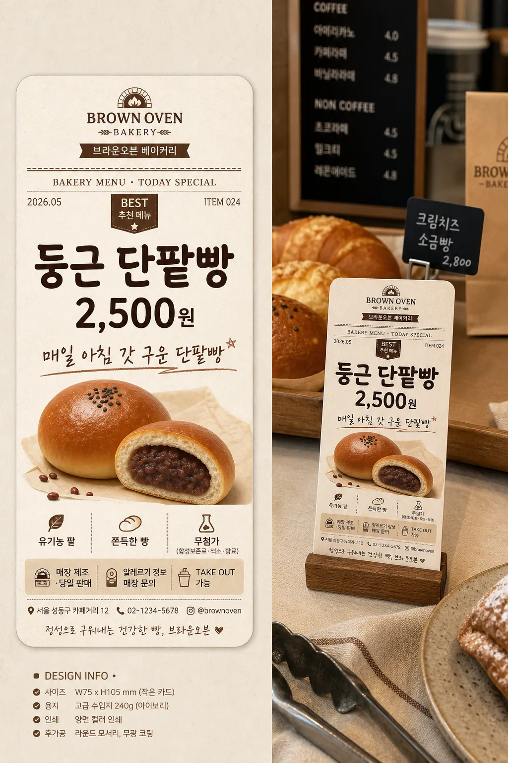
매장 진열대·메뉴 옆에 두는 POP 가격표 카드. 메뉴·가격·포인트 입력하면 인쇄 가능한 시안.
POP 가격표 카드 (개별 메뉴)の概要
広告・ポスター画像を作るためのChatGPT画像プロンプトです。主題、背景、スタイル、構図を整理し、すぐに試せるよう構成しています。
関連キーワード: POP 가격표 카드 (개별 메뉴), POP 가격표 카드 (개별 메뉴) 프롬프트, 広告・ポスター 프롬프트, 広告・ポスター AI 이미지 프롬프트, ChatGPT 이미지 프롬프트, AI 이미지 생성 프롬프트, AI 프롬프트, 이미지 프롬프트
POP 가격표 카드 (개별 메뉴)の活用方法
元の構造を保ちながら、被写体、背景、色、構図を変更して別案に展開できます。
- 主題を維持し、ブランドや季節、媒体に合わせて色と背景を変更してください。
- 結果が複雑な場合は背景要素を減らし、被写体、構図、照明を具体化してください。
- コピー後、ChatGPTに媒体、アスペクト比、文字の有無を追加で指定できます。
プロンプト原文
[Input]
- language: Korean
- output_size: 1024x1536

[Purpose]
Korean retail POP price-tag card for an individual menu item, showing both a polished print design draft and a realistic in-store bakery/café mockup on one portrait canvas.
Print-ready small promotional menu price card with rich retail details, clear pricing hierarchy, store identity, item notes, and a believable counter-placement scene suitable for bakery display, café shelf, or dessert showcase.

[Composition]
- Single portrait canvas split into two coordinated areas: left side for the finished POP card design draft, right side for the real-life placement scene beside a bakery display shelf, counter tray, or acrylic menu stand.
- Left design area occupies about 52% of the frame: front-facing card presentation with crisp printed edges, visible paper grain, rounded corners, subtle thickness, and a refined editorial layout.
- Right mockup area occupies about 48% of the frame: the same card placed physically on a light beige tabletop or in a small wooden/acrylic stand, shot at a slight 10–15° angle for realistic depth.
- Background surface should use warm cream paper texture, beige tabletop, cocoa-brown accents, real café counter materials, soft crumbs, bakery tray edge, linen napkin, small tongs, blurred pastries, and a distant menu board to create an authentic retail environment.
- Keep typography legible at small scale; use {메뉴명}, {가격}, {포인트 카피}, {추가 정보}, {컨셉 톤}, {레이아웃}, {비율/사이즈} exactly as configurable content.
- Add realistic price-card information around the main content: store name, category label, small item code, date label, address line, contact number, decorative divider rules, and small badge elements such as “TODAY”, “BEST”, or “추천”.

[3. CORE STRUCTURE]
- Left panel (design draft): build a polished POP price card with a small store header such as “BROWN OVEN BAKERY / 브라운오븐 베이커리” at the top, then {메뉴명} as the largest headline, {가격} directly beneath it in bold, and {포인트 카피} as the supporting line in a hand-written accent style.
- Left panel main card details: include a compact category line such as “BAKERY MENU · TODAY SPECIAL”, a small date label such as “2026.05”, a tiny item code such as “ITEM 024”, and a subtle badge reading “BEST” or “추천 메뉴”.
- Left panel sub-block: place {추가 정보} as a compact detail row or small footer line, separated with a thin decorative divider rule; add realistic micro-copy such as “매장 제조 · 당일 판매”, “알레르기 정보 매장 문의”, or “TAKE OUT 가능” in small Korean type.
- Left panel footer: include store contact and location details in tiny but readable text, for example “서울 성동구 카페거리 12 · 02-1234-5678 · @brownoven”.
- Left panel styling: create a warm BI-inspired palette using cream, beige, and brown, with balanced spacing, rounded card corners, small label-card proportions, light paper fibers, cocoa ink texture, and tasteful decorative dividers.
- Right panel (mockup): show the same card physically placed beside a bakery tray, cake dome, menu board, shelf tag rail, or tabletop stand according to {레이아웃}; include realistic paper thickness, slight perspective tilt, soft contact shadow, and tiny imperfections along the printed edge.
- Right panel environment: suggest a believable bakery or café counter area with warm pastries, a croissant or roll tray, kraft paper bag, ceramic plate, linen napkin, wooden shelf edge, small price tags in the distance, and softly blurred background objects while the main card stays visually dominant.
- Layout logic: keep the two panels visually linked through the same color palette, same typography system, consistent line weights, matching badge shapes, and repeated divider motifs, so the design draft and mockup feel like one coherent brand package.
- {레이아웃} should guide whether the card is shown as a tabletop card, shelf tag, or standing sign, while preserving the split-view composition.
- {비율/사이즈} should influence the apparent card proportions and print scale, while the overall canvas remains a 1024x1536 portrait composition.

[4. STYLE RULES]
- Typography: use Pretendard Bold for {메뉴명}, Pretendard SemiBold or Noto Sans KR Bold for {가격}, and a hand-drawn style or Nanum Pen Script for {포인트 카피}; size hierarchy should be strong and instantly readable.
- Supporting typography: use Pretendard Regular or Noto Sans KR Medium for store name, item code, date label, address line, contact number, and {추가 정보}; micro text should look like real printed retail stationery, not filler blocks.
- Color palette: cream #F6F0E6, beige #E8DDCF, warm brown #8A5A3C, dark cocoa #3E2A22, soft gray #B9B0A7; adapt this with {컨셉 톤} while preserving warm bakery retail identity.
- Border/shadow: use thin 1.5px brown outline, soft drop shadow 4px y-offset, 12px blur, 15% opacity, with subtle paper edge texture and fine printed ink variation.
- Graphic details: add small dividers, rounded label tabs, tiny corner marks, dotted price leader lines, tasteful badge stickers, and café stationery motifs such as wheat lines, small bean icons, or bakery stamp-style shapes without making them look like official certification seals.
- Card styling should feel print-ready, premium, commercially usable, and rich with believable menu-card information.

[5. VISUAL STYLE]
- Camera / lens: 50mm prime lens, f/4, editorial product-photo framing for the mockup side; clean orthographic-like front view for the design side.
- Lighting: soft window light from upper-left at about 45°, with gentle fill from the right, producing warm café-counter realism, soft shadows under the stand, and natural paper highlights.
- Color grade: warm cream + beige + cocoa with slightly muted saturation, similar to a polished bakery editorial still life.
- Material realism: matte coated paper, faint fiber texture, slight corner rounding, printed ink density variation, tabletop grain, pastry surface texture, and shallow depth-of-field blur in the right-side environment.

[6. MOOD]
Premium Korean bakery stationery aesthetic — Kinfolk-style editorial meets a warm café brand system, with realistic retail POP details, appetizing counter atmosphere, and a handcrafted yet professional printed-card feel.

[7. CRITICAL]
- Korean text accuracy: 반드시 아래 문구가 정확한 한글로 보여야 함: {메뉴명}, {가격}, {포인트 카피}, {추가 정보}
- Additional Korean text rendered in image should be clean and realistic, such as “브라운오븐 베이커리”, “추천 메뉴”, “매장 제조 · 당일 판매”, “TAKE OUT 가능”, “서울 성동구 카페거리 12”, “02-1234-5678”, “2026.05”, “오늘의 메뉴”.
- Layout invariant: both left design draft and right mockup must be visible in the same canvas.
- Typography hierarchy invariant: {메뉴명} largest, {가격} second largest, {포인트 카피} smaller accent, {추가 정보} smallest detail.
- Printability invariant: all Korean characters must be clean, properly spaced, and free of broken jamo.
- Realism invariant: the right-side card must match the left-side design exactly in menu name, price, point copy, colors, badge style, and footer details.

[8. 🚫 PROHIBITED]
- Fake official seals / certifications
- Broken Korean characters