사진 변환/필터
네이버 플레이스 등록용 매장 사진 세트
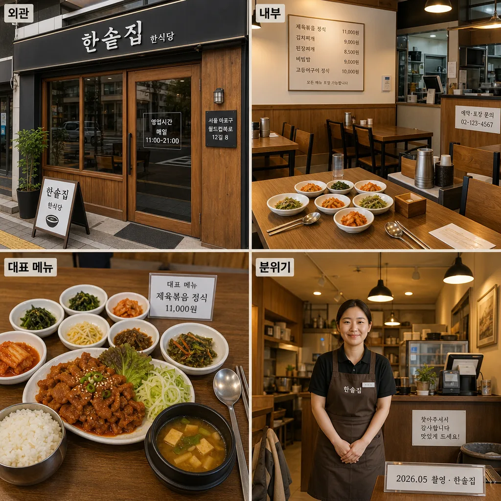
네이버 플레이스·구글 비즈니스용 매장 사진 시안. 외관·내부·메뉴·매장 분위기 4컷 세트.
네이버 플레이스 등록용 매장 사진 세트 검색 요약
네이버 플레이스 등록용 매장 사진 세트은 사진 변환/필터 결과물을 만들 때 바로 복사해 활용할 수 있는 ChatGPT 이미지 프롬프트입니다. 주제, 배경, 스타일, 구도 조건을 함께 담아 빠르게 시안을 만들 수 있도록 구성했습니다.
관련 키워드: 네이버 플레이스 등록용 매장 사진 세트, 네이버 플레이스 등록용 매장 사진 세트 프롬프트, 사진 변환/필터 프롬프트, 사진 변환/필터 AI 이미지 프롬프트, ChatGPT 이미지 프롬프트, AI 이미지 생성 프롬프트, AI 프롬프트, 이미지 프롬프트
네이버 플레이스 등록용 매장 사진 세트 활용 포인트
원본 구조를 유지하면서 피사체, 배경, 색감, 구도를 바꿔 다양한 시안으로 확장할 수 있습니다.
- 핵심 소재는 유지하고 브랜드, 계절, 채널 목적에 맞는 색감과 배경을 바꿔보세요.
- 결과가 산만하면 배경 요소를 줄이고 피사체, 구도, 조명 조건을 구체화하세요.
- 복사한 뒤 ChatGPT에서 플랫폼, 화면 비율, 텍스트 포함 여부를 추가로 요청할 수 있습니다.
프롬프트 원문
[Input]
- language: Korean
- output_size: 1024x1024

[Purpose]
네이버 플레이스·구글 비즈니스 등록용 {매장명} {업종} 매장 사진 4컷 세트. {비율/사이즈} 2x2 균등 그리드 한 캔버스 구성으로, 외관·내부·대표 메뉴·분위기를 실제 방문 전에 확인할 수 있게 보여주는 즉시 등록용 실사 톤 이미지.

[Composition]
- Canvas layout: 2x2 equal grid, each panel with identical margins and gutters, straight vertical/horizontal dividers, balanced business-listing presentation.
- Subject hierarchy: panel 1 highlights {외관 컨셉} with the store exterior as the main subject; panel 2 shows {내부 구성} with seating, tabletop detail, and wall menu context; panel 3 presents {대표 메뉴 구성} as a close-up food hero; panel 4 captures {분위기} with staff and customer-facing warmth.
- Store identity: apply {매장명} and {업종} naturally through real storefront signage, door vinyl lettering, apron name tag, counter notice, menu board, receipt stand, or table tent where plausible.
- Real listing details: include small but readable Korean business information in-scene, such as {주소}, {연락처}, {영업시간}, {대표메뉴명}, {대표가격}, and {촬영일자}; these should feel printed on real shop materials rather than floating graphics.
- Labeling: each panel has a small Korean label placed at the top-left of the panel, readable and consistent: 외관, 내부, 대표 메뉴, 분위기.
- Background treatment: consistent real-world materials across all panels, with warm wood, charcoal trim, ivory walls, glass reflections, stainless utensils, menu paper, ceramic dishes, side-dish containers, floor texture, and practical restaurant lighting.

[Core Structure]
- Panel 1 — 외관: photograph the exterior of {매장명} as a neat Korean restaurant storefront matching {외관 컨셉}; include a realistic signboard reading “{매장명}”, smaller category text “{업종}”, a door sticker reading “영업시간 {영업시간}”, a small address plaque “{주소}”, window reflections, entrance mat, potted plant, and a sidewalk edge in natural daylight.
- Panel 2 — 내부: show a compact dining interior with {내부 구성}; include two to three tables, aligned chairs, water bottle, chopsticks and spoon case, tissue box, side dishes already placed on one table, a wall menu board with Korean items and prices such as “{대표메뉴명} {대표가격}”, “김치찌개 9,000원”, “된장찌개 8,500원”, plus a small counter notice reading “예약·포장 문의 {연락처}”.
- Panel 3 — 대표 메뉴: place {대표 메뉴 구성} as the main close-up subject on a wooden table in sharp focus; show steam, glossy sauce texture, rice bowl, soup, kimchi, greens, pickled vegetables, metal spoon/chopsticks, a small printed table tent reading “대표 메뉴 {대표메뉴명} / {대표가격}”, and natural food reflections on ceramic plates.
- Panel 4 — 분위기: depict {분위기} through a staff member greeting politely near the entrance or service counter; include a customer coat or bag on a chair, warm ceiling lights, order counter, simple payment terminal, pickup shelf, and an in-scene caption card reading “{촬영일자} 촬영 · {매장명}”.
- Unification: all four panels must share the same time of day, white balance, photographic finish, and store materials so the set feels like one real location shoot for the same business.

[Style Rules]
- Typography: use Pretendard SemiBold for the panel labels, 20–24px on a 1024px canvas, black or near-black text with slight letter spacing for clarity.
- In-scene text: storefront sign, business hours, menu board, price tags, and contact stickers should use realistic Korean print styles, sized according to their distance from the camera.
- Color palette: warm wood brown, charcoal black, soft ivory, muted beige, stainless steel gray, ceramic white, kimchi red, leafy green, and natural daylight highlights; keep saturation moderate and consistent across all four panels.
- Divider/shadow: thin 1px divider lines in #E5E0D8 between panels; subtle soft shadow only if needed, 4px y-offset, 10px blur, 12% opacity.

[Visual Style]
- Camera / lens: realistic commercial interior/exterior photography, full-frame DSLR or mirrorless look, 24mm for exterior and interior panels, 50mm for menu close-up, 35mm for the greeting scene; aperture around f/4 to f/5.6.
- Lighting: consistent natural daylight look with soft window light from upper-left at about 45°, gentle fill from the front, practical warm interior fixtures, believable glass reflections, no harsh flash, no dramatic rim light; keep shadows soft and believable.
- Color grade: neutral warm grade with slightly lifted shadows, ivory highlights, wood-brown mids, restrained black accents, natural food color, and realistic skin tones; avoid oversaturated reds or artificial contrast.

[Mood]
Real Korean neighborhood restaurant editorial — reliable Naver Place featured-store photography with practical warmth, visible business information, appetizing menu detail, and a welcoming everyday dining atmosphere.

[Critical]
- Korean text accuracy: the panel labels must appear exactly as follows: 외관, 내부, 대표 메뉴, 분위기.
- Korean text accuracy: visible store text must match “{매장명}”, “{업종}”, “영업시간 {영업시간}”, “{주소}”, “예약·포장 문의 {연락처}”, “{대표메뉴명} {대표가격}”, and “{촬영일자} 촬영”.
- Layout invariant: all 4 panels must have equal size and consistent spacing, with no missing panel and no mismatched scene type.
- Image realism: the food, tables, storefront, printed signs, staff, and lighting must look like a real photographed Korean restaurant, not an illustration or 3D render.

[8. 🚫 PROHIBITED]
- Fake official seals / certifications / verification badges
- Broken Korean characters or garbled menu text
- Celebrity composites or recognizable celebrity likenesses unless explicitly requested