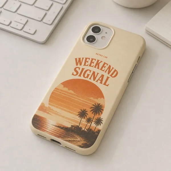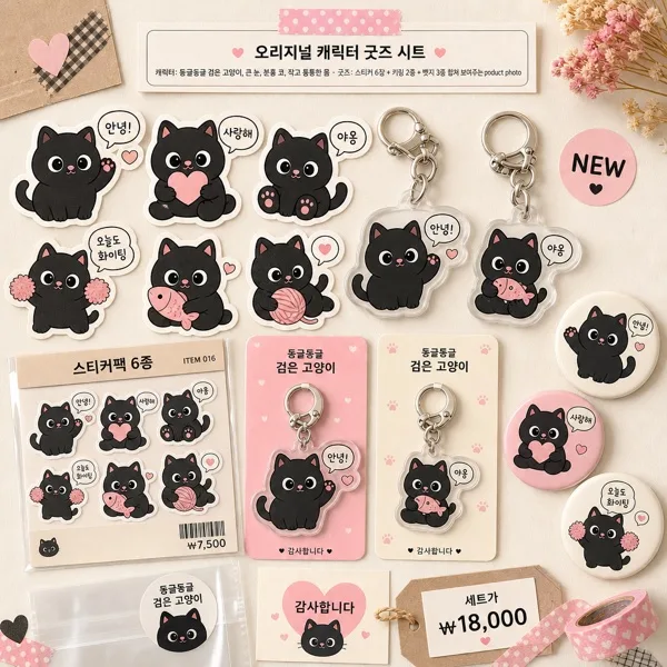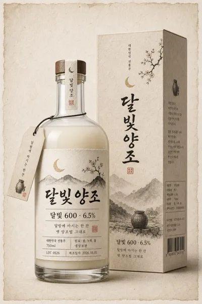
굿즈/목업
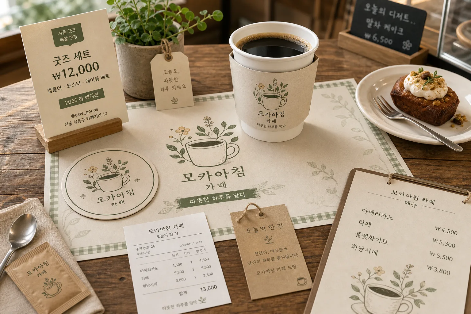
테이블 매트·컵홀더·코스터 굿즈 목업
매장 테이블에 두는 매트·컵홀더·코스터 mockup. 매장 BI 적용한 테이블 굿즈 시안.
테이블 매트·컵홀더·코스터 굿즈 목업 검색 요약
테이블 매트·컵홀더·코스터 굿즈 목업은 굿즈/목업 결과물을 만들 때 바로 복사해 활용할 수 있는 ChatGPT 이미지 프롬프트입니다. 주제, 배경, 스타일, 구도 조건을 함께 담아 빠르게 시안을 만들 수 있도록 구성했습니다.
관련 키워드: 테이블 매트·컵홀더·코스터 굿즈 목업, 테이블 매트·컵홀더·코스터 굿즈 목업 프롬프트, 굿즈/목업 프롬프트, 굿즈/목업 AI 이미지 프롬프트, ChatGPT 이미지 프롬프트, AI 이미지 생성 프롬프트, AI 프롬프트, 이미지 프롬프트
테이블 매트·컵홀더·코스터 굿즈 목업 활용 포인트
원본 구조를 유지하면서 피사체, 배경, 색감, 구도를 바꿔 다양한 시안으로 확장할 수 있습니다.
- 핵심 소재는 유지하고 브랜드, 계절, 채널 목적에 맞는 색감과 배경을 바꿔보세요.
- 결과가 산만하면 배경 요소를 줄이고 피사체, 구도, 조명 조건을 구체화하세요.
- 복사한 뒤 ChatGPT에서 플랫폼, 화면 비율, 텍스트 포함 여부를 추가로 요청할 수 있습니다.
프롬프트 원문
[Input]
- language: Korean
- output_size: 1536x1024

[Purpose]
Korean café merchandise mockup catalog image, multi-item tabletop presentation for promotional use.
Showcase a branded table mat, cup holder sleeve, and paper coaster together in one realistic retail-style composition, styled like an actual café counter scene prepared for a seasonal goods launch.

[Composition]
- Single wide canvas with the tabletop occupying about 78% of the frame, slightly angled top-down view for a catalog look.
- Main hero zone: the table mat spreads across the lower half, with the cup holder sleeve placed on a warm coffee cup near center-right, and the paper coaster visible near the front-left or partly under the drink.
- Background treatment: {배경} with a real wooden table surface, visible grain, tiny natural scratches, warm neutral indoor ambience, and softly blurred café surroundings such as a counter edge, menu board tones, or window reflection.
- Add realistic retail context around the goods: a small folded launch card, a thin receipt strip, a menu/pricelist corner, a kraft paper tag, and {추가 소품} arranged naturally around the branded set.
- Use {매장명/BI}, {굿즈 종류}, {디자인 모티프}, {배경}, {추가 소품}, {비율/사이즈} as the customizable content anchors, but keep the overall mockup layout consistent with a premium café merchandise showcase.

[3. CORE STRUCTURE]
- Hero product arrangement: place the table mat first as the base layer, aligned with the table perspective, showing its full printed surface, trim line, paper thickness, and {비율/사이즈} proportions.
- Cup area: position a ceramic coffee cup and cup holder sleeve slightly above the mat center; the sleeve wraps naturally around the cup, with visible paper seam, slight fiber texture, and a soft contact shadow on the mat.
- Coaster detail: show one coaster near the cup or under a small dessert plate so the coaster design remains readable; include a visible rim, thickness, tiny paper texture, and printed motif matching the mat and sleeve.
- Branding application: apply the same {디자인 모티프} across all items so the table mat, sleeve, and coaster feel like one coordinated set from {매장명/BI}; include small Korean copy such as “오늘의 한 잔”, “시즌 굿즈”, “매장 한정”, and “따뜻한 하루를 담다” where appropriate.
- Retail information elements: add a small tabletop goods card that reads “굿즈 세트 ₩12,000”, “컵홀더 · 코스터 · 테이블 매트”, “2026 봄 에디션”, and a tiny contact line like “@cafe_goods” or “서울 성동구 카페거리 12”.
- Menu/pricelist detail: include a partially visible café menu slip with 3–4 Korean items and prices, for example “아메리카노 ₩4,500”, “라떼 ₩5,300”, “플랫화이트 ₩5,500”, “휘낭시에 ₩3,800”, printed small but legible.
- Supporting props: add {추가 소품} in a believable café tabletop way, such as a teaspoon, linen napkin, sugar packet, small dessert fork, flower stem, coffee beans, or pastry crumb details, all physically resting on the table.
- Scene realism: ensure the objects rest physically on the table with accurate perspective, paper thickness, slight curl on edges if needed, tiny imperfections in ink and fiber, believable contact shadows, and realistic overlap between items.
- Presentation tone: make it feel like a social-media café merchandise showcase and catalog mockup photographed during an actual shop launch, with the brand system easy to recognize through repeated typography, motif, and color.

[4. STYLE RULES]
- Typography: Pretendard and Noto Sans KR, medium to semibold for the small Korean signature, 18–26px equivalent on the mat, crisp print edges, with smaller 8–12px equivalent text for menu slip, receipt, and goods card details.
- Color palette: use the {매장명/BI} palette as the main anchor, with beige, warm cream, soft green, muted brown, paper white, roasted coffee tones, and subtle accent colors derived from {디자인 모티프}.
- Border/shadow: soft drop shadow with 4px vertical offset, 14px blur, 18% opacity; no harsh cutout edges; paper surfaces should look matte, tactile, and slightly textured.
- Print finish: flat printed ink on paper goods, low gloss, visible paper grain, natural ink absorption, accurate registration, and realistic edges on the sleeve, coaster, tag, receipt, and table mat.
- Surface detail: include warm wood grain, cup ceramic glaze, coffee surface reflection, dessert texture if present, tiny paper fibers, and gentle wear on table corners to make the scene feel photographed rather than generated.

[5. VISUAL STYLE]
- Camera / lens: 35mm full-frame lens at f/4.5, top-down-ish angled product photography, realistic catalog framing.
- Lighting: natural window light from upper-left at about 45°, gentle fill from lower-right, soft shadows with no hard specular glare.
- Color grade: warm beige + sage green + coffee brown, lightly desaturated editorial finish, clean indoor daylight balance.

[6. MOOD]
Premium café merchandise editorial — feels like a modern Kinfolk-style tabletop product spread mixed with a real Korean café shop reveal, warm, tactile, curated, and ready for an Instagram goods announcement.

[7. CRITICAL]
- Korean text accuracy: the rendered image must correctly show the small Korean signature and any brand text from {매장명/BI} without broken characters.
- Render Korean text strings clearly: “오늘의 한 잔”, “시즌 굿즈”, “매장 한정”, “굿즈 세트 ₩12,000”, “컵홀더 · 코스터 · 테이블 매트”, and the menu prices must not be garbled.
- All three goods must be clearly identifiable as separate items: table mat, cup holder sleeve, and paper coaster.
- The same design system from {디자인 모티프} must appear consistently across every item in the set.
- Any included coffee cup, dessert, receipt, menu slip, tag, plant, or {추가 소품} must look physically plausible on the tabletop with correct shadows, scale, and perspective.

[8. 🚫 PROHIBITED]
- Fake official seals / certifications
- Broken Korean characters