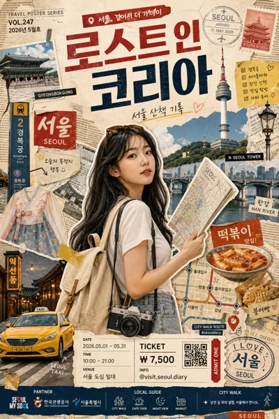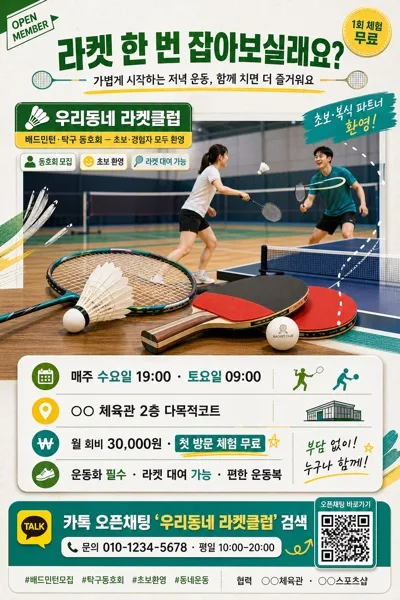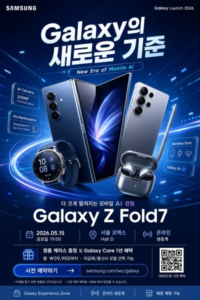
廣告/海報
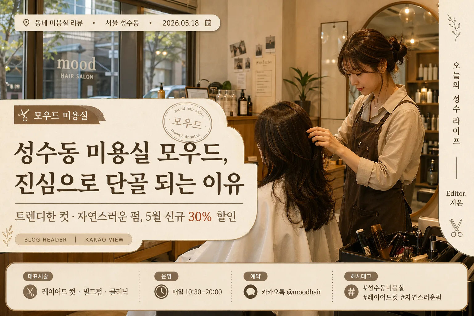
블로그·카카오뷰 매장 헤더 비주얼
네이버 블로그·카카오뷰·티스토리 매장 메인 콘텐츠 헤더 비주얼. 글 제목·매장 정보 자연스럽게 결합.
블로그·카카오뷰 매장 헤더 비주얼摘要
這是用來製作廣告/海報內容的 ChatGPT 圖像提示詞,已整理主題、背景、風格與構圖,方便快速調整。
相關關鍵字: 블로그·카카오뷰 매장 헤더 비주얼, 블로그·카카오뷰 매장 헤더 비주얼 프롬프트, 廣告/海報 프롬프트, 廣告/海報 AI 이미지 프롬프트, ChatGPT 이미지 프롬프트, AI 이미지 생성 프롬프트, AI 프롬프트, 이미지 프롬프트
블로그·카카오뷰 매장 헤더 비주얼使用方式
保留原始結構並替換主體、背景、色彩或構圖,即可延伸出不同版本。
- 保留核心主體,並依品牌、季節或平台調整色彩與背景。
- 如果畫面太複雜,請減少背景元素並具體描述主體、構圖與光線。
- 複製後可要求 ChatGPT 配合平台、長寬比或文字需求調整。
提示詞原文
[Input]
- language: Korean
- output_size: 1536x1024

[Purpose]
Korean blog and KakaoView store header visual for a salon content post, designed as a wide editorial hero image with realistic local-business information layered over a warm photographic cover.
Built for Naver Blog, KakaoView, and Tistory cover use, with a polished promotional layout that feels like an actually published neighborhood salon article header.

[Composition]
- Hero image fills the full 1536x1024 canvas as a wide blog header: use {키 비주얼} as the main photographic layer, showing real salon context such as storefront glass, reception counter, mirror station, hair tools, product shelves, stylist hands, or a client styling moment.
- Place {매장명} as the brand anchor, with {블로그 글 제목} as the largest headline and {부제/한 줄 설명} as the supporting line; add blog-like metadata so it reads as a real Korean content cover rather than a bare ad image.
- Include a small top label strip with {카테고리}, {지역명}, and {작성일}; use it like a blog category/date marker.
- Add a lower information band or corner card containing {대표시술}, {운영시간}, {예약문의}, and {해시태그}, with small divider dots or thin rules for a realistic store-header layout.
- Add a subtle blog identity area with {블로그명} and “Editor. {에디터명}” as a spine-credit-like editorial signature along one side or near the bottom edge.
- Apply {컨셉 톤} through warm tinting, typography plates, cream paper-like overlays, faint grain, salon-inspired decorative line art, small scissors/comb icons, and layered translucent shapes that support readability.

[3. CORE STRUCTURE]
1. Background layer — Render {키 비주얼} as the base image with natural salon detail preserved: warm wood, beige walls, mirror reflections, towels, styling chair texture, product bottles, soft daylight, and a lived-in premium local-shop atmosphere.
2. Top metadata strip — Place “{카테고리} · {지역명} · {작성일}” in small Korean text near the upper-left or upper-right, using a cream capsule or narrow ribbon over the photo.
3. Main headline zone — Set {블로그 글 제목} in a large Korean headline across the most readable central-left or central-right area, with strong contrast against the photo using a translucent cocoa or cream text plate if needed.
4. Supporting line zone — Place {부제/한 줄 설명} directly under the headline in a smaller size, aligned to the headline; let it feel like a blog post deck line rather than a banner slogan.
5. Brand signature zone — Add {매장명} as a small label, stamp-style badge, or editorial logo text near the headline cluster; include “BLOG HEADER” or “KAKAO VIEW” as a tiny interface-like tag if composition allows.
6. Practical info zone — Add a compact bottom band with “대표시술 {대표시술}”, “운영 {운영시간}”, “예약 {예약문의}”, plus {해시태그}; separate items with thin vertical dividers, small dots, or beige rounded tags.
7. Editorial credit zone — Place “{블로그명} / Editor. {에디터명}” as a small vertical or horizontal side credit, imitating a magazine-cover spine credit adapted for a blog header.
8. Size adaptation — Keep the headline and main store information comfortably readable at 1536x1024 and still recognizable when cropped by blog or KakaoView preview thumbnails.

[4. STYLE RULES]
- Typography: Pretendard SemiBold for the headline, Pretendard Medium or Noto Sans KR for the subtitle, and Pretendard Regular for metadata, tags, and editorial credit; headline around 64–84px feel, subtitle around 28–36px feel, metadata around 18–24px feel.
- Color palette: warm beige #E8D8C6, cocoa brown #6A4E3B, soft cream #F6F0E8, muted taupe #B59B86, deep charcoal #2E2622, with occasional muted terracotta or dusty rose accents for salon warmth.
- Layout details: use semi-transparent text plates at about 55–70% opacity, rounded corners, fine divider lines, small tag capsules, subtle paper grain, and delicate salon-themed decorative graphics such as a comb outline, hair wave line, or tiny scissors icon.
- Border/shadow: use soft text shadow only where needed, 4px y-offset, 12px blur, 18% opacity; plates and tags may cast a very light editorial card shadow so the header feels layered and tactile.

[5. VISUAL STYLE]
- Camera / lens: realistic commercial photography look, 50mm f/1.8 or 85mm f/2 framing, depending on whether {키 비주얼} is an exterior shot or a stylist work shot.
- Lighting: soft daylight or diffused indoor window light from the upper-left at roughly 45°, with gentle fill on the shadow side and controlled reflections on mirrors, glass doors, and product bottles.
- Color grade: warm cream + beige + light brown, with restrained saturation and natural skin-tone / wood-tone rendering for a polished Korean local-business blog aesthetic.
- Image texture: realistic store photography with visible material details such as wood grain, fabric chair texture, mirror highlights, hair-tool metal, signage vinyl, and softly blurred background depth.

[6. MOOD]
Korean local salon editorial header — warm, trustworthy, and publish-ready, combining neighborhood store realism with the refined feeling of a lifestyle magazine feature and a modern Naver Blog/KakaoView cover.

[7. CRITICAL]
- Korean text accuracy: 반드시 아래 문구가 정확히 보여야 함:
  - {매장명}
  - {블로그 글 제목}
  - {부제/한 줄 설명}
  - {카테고리} · {지역명} · {작성일}
  - 대표시술 {대표시술} / 운영 {운영시간} / 예약 {예약문의}
  - {해시태그}
  - {블로그명} / Editor. {에디터명}
- Header hierarchy must be clear: one dominant headline, one subordinate description, one small brand label, and secondary metadata/info elements.
- Text must remain fully legible over the photo with no broken spacing or overlapped Korean characters.
- The visual should read like a genuine Korean blog/KakaoView store header for a salon review or promotion article, with realistic store details and useful local-business information.

[8. 🚫 PROHIBITED]
- Fake official seals / certifications
- Broken Korean characters
- Celebrity composites or misleading endorsement photos