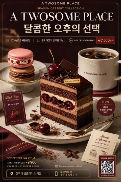
広告・ポスター
액세서리 4컷 멀티앵글 시트
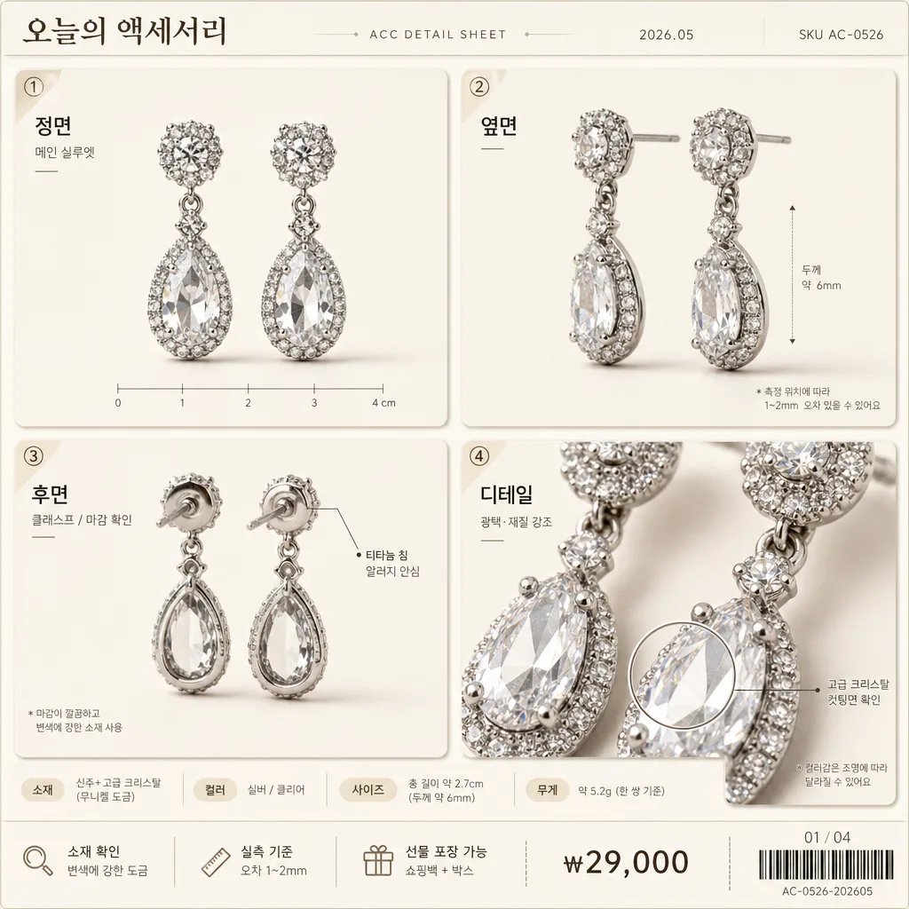
악세서리 정물 사진 1장을 reference 박으면 4가지 다각도 (정면·옆면·뒷면·디테일) 클로즈업 시트로 변환.
액세서리 4컷 멀티앵글 시트の概要
広告・ポスター画像を作るためのChatGPT画像プロンプトです。主題、背景、スタイル、構図を整理し、すぐに試せるよう構成しています。
関連キーワード: 액세서리 4컷 멀티앵글 시트, 액세서리 4컷 멀티앵글 시트 프롬프트, 広告・ポスター 프롬프트, 広告・ポスター AI 이미지 프롬프트, ChatGPT 이미지 프롬프트, AI 이미지 생성 프롬프트, AI 프롬프트, 이미지 프롬프트
액세서리 4컷 멀티앵글 시트の活用方法
元の構造を保ちながら、被写体、背景、色、構図を変更して別案に展開できます。
- 主題を維持し、ブランドや季節、媒体に合わせて色と背景を変更してください。
- 結果が複雑な場合は背景要素を減らし、被写体、構図、照明を具体化してください。
- コピー後、ChatGPTに媒体、アスペクト比、文字の有無を追加で指定できます。
プロンプト原文
[Input]
- reference_image: {참고 이미지}
- language: Korean
- output_size: 1024x1024

[Purpose]
Korean accessory multi-angle detail sheet, 4-panel grid, e-commerce catalog and Smart Store detail-page use.
Show one accessory in four synchronized views with clear product clarity, material fidelity, and a realistic premium catalog presentation, enriched with Korean product annotations, shop-style metadata, and detail-page information blocks.

[Composition]
- Single product presented across a balanced 2x2 grid, with each product photo cell occupying roughly 24% of the canvas and equal gutters between panels.
- Add a slim top catalog header above the grid: store-style title “오늘의 액세서리”, small line “ACC DETAIL SHEET”, date label “2026.05”, and inventory text “SKU AC-0526”.
- Background is {배경/톤}: cream monochrome or very light beige gradient surface with subtle paper grain, warm tabletop realism, soft contact shadow under each product view, and lightly tinted panel cards.
- Keep all four panels visually coherent in tone, lighting, and backdrop so the set reads as one product sheet, while adding realistic micro-details such as small angle tags, tiny scale ticks, a material note, and an e-commerce info strip.
- Place a narrow footer strip below the grid with concise Korean catalog copy: “소재 확인”, “실측 기준”, “선물 포장 가능”, price text “₩29,000”, and page indicator “01 / 04”. Include a small barcode-like inventory area at one corner for catalog realism.
- Use {제품 종류}, {앵글 4종}, {배경/톤}, {조명}, {레이아웃}, {제품 보존}, {비율/사이즈} as production constraints.

[3. CORE STRUCTURE]
1. Top-left panel: render {제품 종류} in {앵글 4종} first view, aligned neatly within the cell, with product edge crisp and material detail visible. Add label “정면” plus a tiny caption “메인 실루엣”.
2. Top-right panel: show the second angle of {제품 종류} with the same scale and lighting, preserving exact shape, color, and surface reflection. Add label “옆면” plus a small arrow marker indicating thickness or profile.
3. Bottom-left panel: show the third angle of {제품 종류}, maintaining identical background tone and a consistent shadow direction across the sheet. Add label “후면” with a tiny hardware note such as “클래스프 / 마감 확인”.
4. Bottom-right panel: show the close-up detail view of {제품 종류}, emphasizing crystal sparkle, metal grain, fabric texture, clasp, engraving, gemstone, bead, or hardware finish as applicable without changing the product’s true form. Add label “디테일” and a small magnifier-style callout ring around the key texture area.
5. Add small Korean labels inside each cell near a corner, using the angle names from {앵글 4종} while also clearly showing the fixed labels “정면”, “옆면”, “후면”, “디테일”. Labels should feel like real catalog annotations and must not cover important product details.
6. Add fine divider lines, rounded panel cards, small numeric markers ① ② ③ ④, and realistic Smart Store-style microcopy such as “컬러감은 조명에 따라 달라질 수 있어요” in tiny but legible type.

[4. STYLE RULES]
- Typography: Pretendard or Noto Sans KR, regular to medium weight, 18–24px for angle labels, 28–36px for the top title, 10–14px for SKU, date, price, captions, and footer notes; refined Korean editorial catalog style.
- Color palette: cream #F6F0E6, light beige #E9DDCF, warm gray #B8AEA3, soft charcoal #2B2B2B; preserve the product’s original colors exactly.
- Border/shadow: thin warm-gray panel dividers, soft rounded catalog cards, subtle drop shadow 4px y-offset, 12px blur, 15% opacity under each item, plus faint paper texture and natural contact shadows.
- Graphic accents: small beige sticker tags, delicate measurement ticks, tiny barcode block, and restrained dot/line decorations that support the product sheet without overpowering the accessory.

[5. VISUAL STYLE]
- Camera / lens: studio product photography look, 85mm macro lens at f/8 for clean edge definition and controlled reflection.
- Lighting: {조명}; studio key light from upper-left at 45° with a soft fill from front-right; gentle specular highlight to reveal crystal shine, polished metal, enamel, pearl, leather, or fabric texture without harsh hotspots.
- Color grade: neutral warm catalog grade, light cream and soft beige with restrained contrast, accurate whites, natural shadow falloff, and realistic printed-detail-page finish.
- Render quality: high-resolution macro product clarity, crisp Korean typography, believable reflections, consistent scale across all four angles, and natural material response based on {제품 보존} and {비율/사이즈}.

[6. MOOD]
Premium Korean e-commerce catalog sheet — like a Smart Store detail page blended with a boutique accessory brand lookbook: warm, tactile, realistic, polished, information-rich, and ready for a product sales page.

[7. CRITICAL]
- Korean text accuracy: 반드시 정확히 표시할 문자열: 정면, 옆면, 후면, 디테일, 오늘의 액세서리, 소재 확인, 실측 기준, 선물 포장 가능, ₩29,000, 01 / 04.
- All 4 panels must show the same product identity, with no change in shape, material, color, or size between views.
- The accessory must remain anatomically and physically plausible as a real product; edges, clasps, stones, chains, hinges, engravings, stitching, plating, and crystal details must be clean and consistent.
- Preserve {제품 종류}, {앵글 4종}, {배경/톤}, {조명}, {레이아웃}, {제품 보존}, {비율/사이즈} exactly as the guiding constraints for subject, angles, layout, scale, and material fidelity.

[8. 🚫 PROHIBITED]
- Fake official seals / certifications
- Broken Korean characters
- Celebrity composites / unauthorized likeness