SNS/카드뉴스
액세서리 인스타그램 9컷 그리드
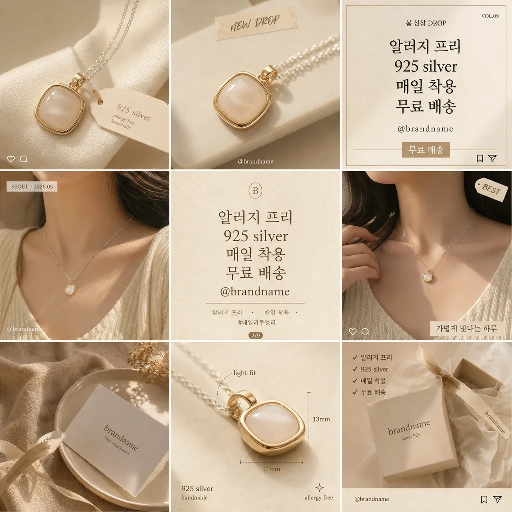
악세서리 정물 사진을 reference 박으면 매장 인스타 피드 9컷 그리드 (제품·모델·텍스트·배경 mix) 콜라주로 변환.
액세서리 인스타그램 9컷 그리드 검색 요약
액세서리 인스타그램 9컷 그리드은 SNS/카드뉴스 결과물을 만들 때 바로 복사해 활용할 수 있는 ChatGPT 이미지 프롬프트입니다. 주제, 배경, 스타일, 구도 조건을 함께 담아 빠르게 시안을 만들 수 있도록 구성했습니다.
관련 키워드: 액세서리 인스타그램 9컷 그리드, 액세서리 인스타그램 9컷 그리드 프롬프트, SNS/카드뉴스 프롬프트, SNS/카드뉴스 AI 이미지 프롬프트, ChatGPT 이미지 프롬프트, AI 이미지 생성 프롬프트, AI 프롬프트, 이미지 프롬프트
액세서리 인스타그램 9컷 그리드 활용 포인트
원본 구조를 유지하면서 피사체, 배경, 색감, 구도를 바꿔 다양한 시안으로 확장할 수 있습니다.
- 핵심 소재는 유지하고 브랜드, 계절, 채널 목적에 맞는 색감과 배경을 바꿔보세요.
- 결과가 산만하면 배경 요소를 줄이고 피사체, 구도, 조명 조건을 구체화하세요.
- 복사한 뒤 ChatGPT에서 플랫폼, 화면 비율, 텍스트 포함 여부를 추가로 요청할 수 있습니다.
프롬프트 원문
[Input]
- reference_image: {참고 이미지}
- language: Korean
- output_size: 1024x1024

[Purpose]
Instagram 9-panel grid collage for an accessories brand feed, designed as a realistic profile-first-screen editorial mockup.
Luxury handmade accessory feed layout with product macro close-ups, model-on wearing shots, Korean copy cards, small social UI details, branded captions, price/drop information, and warm mood styling in one cohesive boutique brand system.

[Composition]
- Canvas: square 1:1 Instagram grid mockup, divided into a polished 3x3 matrix with thin even gutters and equal cell sizes, like a brand profile feed preview captured at high resolution.
- Main subject distribution: {9컷 구성} arranged so product close-ups dominate the top-left and center areas, model wearing shots appear in balanced mid-row cells, copy cards occupy strong contrast cells, and the mood background anchors one corner cell.
- Product preservation: {제품 보존} exactly, with the accessory shape, material, clasp, chain, stone, finish, and proportions kept faithful to the reference image.
- Background treatment: each panel uses a consistent cream-beige-gold BI tone, with visible matte paper grain, soft studio surfaces, linen texture, ceramic tray surfaces, warm shadow gradients, and boutique packaging details that support the accessory.
- Framing direction: all panels must feel like one branded Instagram set, aligned to the same visual language, with consistent gutter rhythm, balanced visual weight, and realistic feed-post cropping across the grid.
- Add small social-commerce details where natural: tiny @brandname handle, micro save/share icons, subtle like/comment icon marks, short hashtag lines, launch date labels, product tag stickers, and small caption strips integrated inside selected panels.
- Use {레이아웃}, {비율/사이즈}, {컬러 팔레트}, and {시그니처 카피 예시} as the customizable structure anchors.

[3. CORE STRUCTURE]
1. Top-left panel: a tight accessory close-up on a warm cream surface, showing texture, metal shine, clasp/edge detail, soft shadows, a tiny paper product tag reading "925 silver", and editorial macro sharpness.
2. Top-middle panel: another product close-up from a slightly different angle, keeping the same lighting, palette, and shadow softness for continuity; include a small handwritten-style label strip such as "NEW DROP" and a faint @brandname mark.
3. Top-right panel: a typography-heavy Instagram promo card with {시그니처 카피 예시} as the main Korean line, plus short supporting copy "봄 신상 DROP", "무료 배송", "VOL.09", and tiny save/share micro icons along the lower edge.
4. Middle-left panel: model wearing shot featuring the accessory styled naturally on the body, cropped as a polished social-commerce image with skin, fabric texture, hair shadow, and the product readable at first glance; add a small date/location label "SEOUL · 2026.05".
5. Middle-center panel: signature brand text card using {시그니처 카피 예시}, arranged as a bold elegant editorial slogan panel with supporting lines "알러지 프리", "매일 착용", "#데일리주얼리", and a tiny carousel indicator "2/9".
6. Middle-right panel: second wearing shot with slightly different pose or crop, still keeping the same accessory clearly visible and faithfully preserved; include a tiny product tag sticker "BEST" and subtle caption text "가볍게 빛나는 하루".
7. Bottom-left panel: mood background panel with a styled tabletop, linen fabric, ceramic dish, folded brand card, ribbon shadow, warm sunlight gradient, and packaging texture that matches the accessory aesthetic while keeping the reference accessory as the hero context.
8. Bottom-middle panel: a secondary product detail cell highlighting the accessory finish, attachment point, clasp, stone setting, or silhouette with macro-level clarity; add small measurement-style annotations such as "light fit" and "925 silver" without changing the product design.
9. Bottom-right panel: final mood or brand-end card that closes the grid like a profile-feed teaser, with @brandname, "저장하고 다시 보기", "무료 배송", a short hashtag row "#데일리주얼리 #핸드메이드 #선물추천", and tiny Instagram-like bookmark/share icons.

[4. STYLE RULES]
- Typography: Pretendard SemiBold for Korean copy cards, Noto Sans KR Medium for small supporting text, and optional Nanum Myeongjo for premium accent words; headline size equivalent to 36–54 px on the square canvas, with clear tracking, clean line breaks, and realistic Korean social-commerce hierarchy.
- Color palette: {컬러 팔레트} with cream #F7F1E8, beige #E6D7C7, warm gold #C8A86A, soft taupe #B79D88, and dark brown text #3A2C24.
- Border/shadow: thin white gutters between panels, soft drop shadow 4px y-offset, 12px blur, 15% opacity on product cutouts, tags, stickers, and cards; refined boutique edges with natural contact shadows.
- Print-like finish: subtle matte paper texture, low-contrast highlights, crisp image edges, realistic micro grain, and tactile surfaces for a premium feed-grid mockup look.
- Social UI realism: use tiny line icons for heart, comment, share, and bookmark only as decorative Instagram-style micro details; keep them understated and aligned with the beige-gold brand system.

[5. VISUAL STYLE]
- Camera / lens: full-frame product-editorial look, 85mm f/1.8 for model shots and 100mm macro f/2.8 for accessory detail panels, with top-down flat lay cells rendered as if shot on a 50mm lens from overhead.
- Lighting: soft studio softbox at 45° from upper-left, gentle fill from lower-right, and a faint rim highlight on metallic edges; mood cells use overcast diffused daylight for even shadows, plus occasional soft window-shadow texture for realism.
- Color grade: warm cream + beige + muted gold grade with restrained contrast, slightly lifted blacks, natural skin tones, polished metal highlights, and a clean boutique-commerce finish.

[6. MOOD]
Premium boutique accessories brand grid — a refined Aesop / COS / Le Labo visual language translated into a realistic Instagram feed mockup with Korean social-commerce details, tactile packaging, soft editorial styling, and handmade jewelry warmth.

[7. CRITICAL]
- Korean text accuracy: 반드시 정확히 렌더링할 문자열: "알러지 프리", "925 silver", "매일 착용", "무료 배송", "@brandname", "봄 신상 DROP", "저장하고 다시 보기", "#데일리주얼리".
- Layout invariants: exactly 9 panels in a 3x3 grid, each cell visually distinct but unified by the same BI color tone, gutter rhythm, paper texture, lighting language, and Instagram feed context.
- Product fidelity: all accessory instances must match the reference image shape, material, and design details; do not alter clasp shape, chain geometry, stone placement, engraving, size relationship, or silhouette.
- Text rendering: English and Korean copy must be sharp, correctly spelled, readable at 1024x1024, and cleanly placed within the designated copy-card, tag, caption, or micro-UI areas.

[8. 🚫 PROHIBITED]
- Fake official seals / certifications
- Broken Korean characters