사진 변환/필터
액세서리 배경 변경 컷
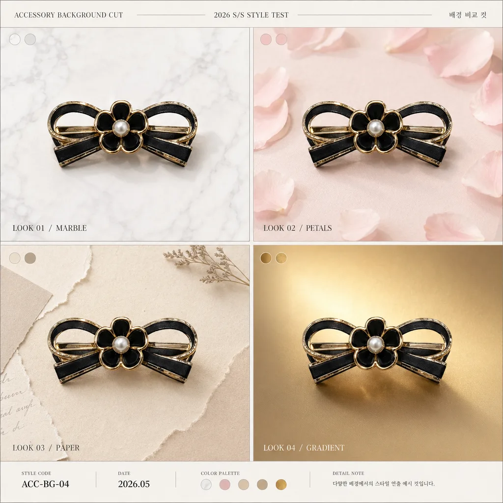
악세서리 정물 사진을 reference 박으면 다양한 컨셉 배경 (대리석·꽃·페이퍼·그라데이션) 으로 변환한 4컷 시트.
액세서리 배경 변경 컷 검색 요약
액세서리 배경 변경 컷은 사진 변환/필터 결과물을 만들 때 바로 복사해 활용할 수 있는 ChatGPT 이미지 프롬프트입니다. 주제, 배경, 스타일, 구도 조건을 함께 담아 빠르게 시안을 만들 수 있도록 구성했습니다.
관련 키워드: 액세서리 배경 변경 컷, 액세서리 배경 변경 컷 프롬프트, 사진 변환/필터 프롬프트, 사진 변환/필터 AI 이미지 프롬프트, ChatGPT 이미지 프롬프트, AI 이미지 생성 프롬프트, AI 프롬프트, 이미지 프롬프트
액세서리 배경 변경 컷 활용 포인트
원본 구조를 유지하면서 피사체, 배경, 색감, 구도를 바꿔 다양한 시안으로 확장할 수 있습니다.
- 핵심 소재는 유지하고 브랜드, 계절, 채널 목적에 맞는 색감과 배경을 바꿔보세요.
- 결과가 산만하면 배경 요소를 줄이고 피사체, 구도, 조명 조건을 구체화하세요.
- 복사한 뒤 ChatGPT에서 플랫폼, 화면 비율, 텍스트 포함 여부를 추가로 요청할 수 있습니다.
프롬프트 원문
[Input]
- reference_image: {참고 이미지}
- language: Korean
- output_size: 1024x1024

[Purpose]
Create a 2x2 accessory background variation sheet for catalog and social-media sharing, showing the same product placed on four different styled backgrounds.
The image should feel like a premium product styling board: realistic surface textures, refined lighting, clear comparison value, and enough editorial detail to work as an e-commerce thumbnail, product detail page asset, and SNS post.

[Composition]
- Main canvas is a square 1024x1024 sheet divided into a polished 2x2 grid, using {레이아웃} as the composition guide with equal cell sizes, narrow gutters, and crisp panel separation.
- Each cell contains the same accessory product from {참고 이미지}, preserved with identical shape, material, color, silhouette, and visible details, while only the background styling changes.
- Product placement should follow {제품 위치}: centered hero placement or aligned at the 1/3 point, kept visually consistent across all four cells.
- Apply {비율/사이즈} so the product reads at a consistent catalog scale in every panel, with matching crop logic and comparable visual weight.
- Use small editorial labels inside each cell, placed near the lower edge or upper corner so they remain legible and do not cover important product details.
- Apply {배경 4종} as four distinct backdrop styles, each clearly separated by grid boundaries and rendered with realistic material cues such as stone grain, paper fiber, satin sheen, brushed metal, linen weave, soft gradient, or warm tabletop texture depending on the selected backgrounds.
- Add a refined catalog-board header or footer strip in a small type treatment: “ACCESSORY BACKGROUND CUT”, “2026 S/S STYLE TEST”, and a tiny Korean subtitle such as “배경 비교 컷”.
- Include subtle visual merchandising details that belong to the backgrounds, such as faint surface shadows, texture seams, tiny corner tags, paper deckle edges, metallic reflection, or soft fabric folds, without competing with the accessory.

[3. CORE STRUCTURE]
1. Global layout — Build a premium 2x2 comparison grid on a square canvas, with thin separators, consistent padding, and a small editorial title area that makes the sheet feel like a finished brand catalog asset.
2. Top-left cell — Place the same accessory on the first background in {배경 4종}, scaled consistently and positioned according to {제품 위치}; add a compact label such as “LOOK 01 / MARBLE” or Korean-friendly styling text like “룩 01”. Render the background with believable surface detail, soft contact shadow, and gentle tonal variation.
3. Top-right cell — Reuse the exact same product cutout and size, switch only the background to the second option in {배경 4종}, and keep the label aligned consistently with the first cell. Add realistic lighting response on the surface, such as subtle paper grain, fabric texture, warm reflection, or soft shadow falloff.
4. Bottom-left cell — Repeat the accessory unchanged over the third background, preserving color accuracy and product material texture. Let the background show a different mood through tactile details such as satin folds, terrazzo flecks, brushed metal, wood grain, or muted color blocking as appropriate to {배경 4종}.
5. Bottom-right cell — Show the accessory on the fourth background, maintaining the same framing, scale, and crop logic as the other three panels. Use matching label size and placement, plus a refined surface treatment such as warm gradient glow, ceramic texture, linen weave, or soft spotlight depending on the selected style.
6. Catalog detail pass — Add small comparison-board details: tiny product styling code “ACC-BG-04”, date text “2026.05”, small color swatch dots matching each panel, and fine divider rules in a premium editorial layout.
7. Consistency pass — Across all four cells, ensure {제품 보존} is strictly followed: no deformation, no redesign, no product color shift, no change in product silhouette, and no alteration to original engraved or printed details.

[4. STYLE RULES]
- Typography: use Pretendard or Noto Sans KR for Korean text such as “배경 비교 컷”, and a clean sans-serif English label style like Inter or Helvetica Neue, regular to medium weight, 18–28 px equivalent for panel labels and 10–14 px equivalent for micro catalog details.
- Color palette: derive the backgrounds from {배경 4종}, keeping the palette polished and commercial; support with neutral whites, soft blush, warm beige, muted metallic gold, charcoal accents, stone gray, and gentle cream tones.
- Border/shadow: use thin divider lines in cool gray #D9D9D9; add a realistic soft contact shadow under the product, 4px y-offset, 12px blur, 15% opacity, consistent in every cell, with slight natural variation based on the surface reflectivity.
- Text labels should be small, refined, and legible, set in black or charcoal on light backgrounds, or white on darker backgrounds for contrast.
- Surface styling should feel tactile and photographed: visible but tasteful material grain, realistic reflected highlights, subtle depth, and carefully controlled shadow edges.
- Keep the product as the visual hero while allowing each background to feel like a real styled product-photo setup rather than a flat color block.

[5. VISUAL STYLE]
- Camera / lens: product-photo look, 85mm macro lens at f/8 for crisp object detail and controlled perspective, as if shot for a premium studio catalog.
- Lighting: use {조명} as the primary lighting direction and mood; combine even studio softbox lighting with gentle top-left key light and subtle fill from the right, keeping highlights controlled and shadows soft but readable in each cell.
- Color grade: clean neutral commercial grade with slightly warm whites, soft blush accents, natural beige midtones, polished stone grays, and restrained gold shimmer for any gradient or metallic panel.
- Rendering quality: realistic product cutout integration, accurate contact shadows, consistent scale, clean panel boundaries, and natural background texture detail at high resolution.

[6. MOOD]
Premium e-commerce catalog comparison sheet with a calm editorial finish — like a refined accessory styling test page for a boutique brand, combining Aesop / Le Labo style restraint with richer real-world product photography textures.

[7. CRITICAL]
- Korean text accuracy: the product itself must remain exactly as in {참고 이미지} with no broken characters or altered details.
- Render Korean text clearly where used: “배경 비교 컷”, “룩 01”, “룩 02”, “룩 03”, “룩 04”, and optional micro text such as “2026.05 촬영 샘플”.
- All 4 cells must show the same accessory, same scale logic, same framing rules, and the same product preservation standard from {제품 보존}.
- Backgrounds must change clearly across the four panels according to {배경 4종}, with richer texture, lighting, and material realism while the product remains unchanged.
- English labels and Korean micro labels must be small, clean, consistent, and placed so they do not obscure the accessory.

[8. 🚫 PROHIBITED]
- Fake official seals / certifications
- Broken Korean characters
- Celebrity composites / unauthorized likeness