廣告/海報
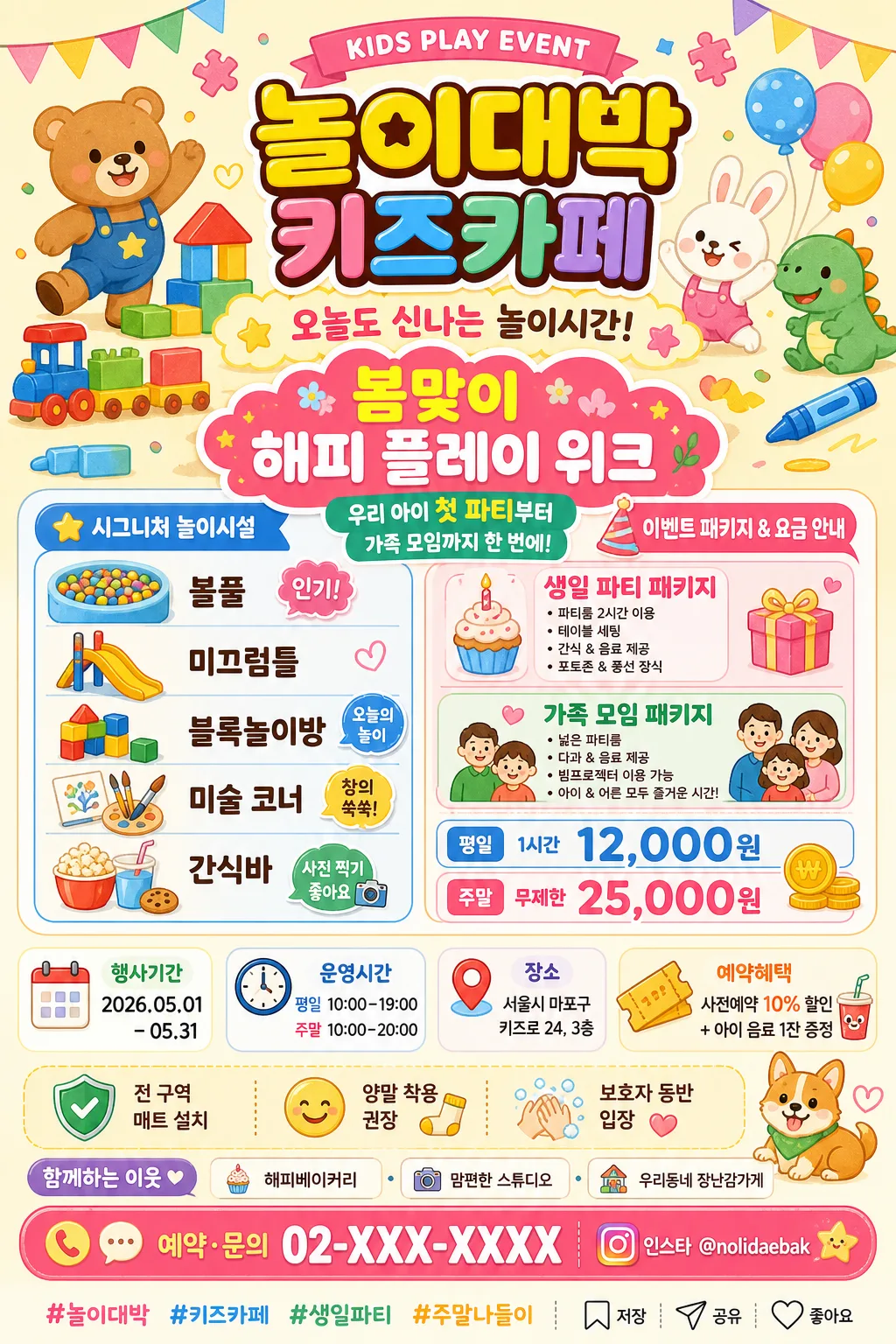
키즈카페 매장 비주얼·이벤트 포스터
키즈카페 매장 외관·내부·이벤트·생일 파티 패키지 비주얼. 컬러풀 친근 톤 + 어린이 일러스트.
키즈카페 매장 비주얼·이벤트 포스터摘要
這是用來製作廣告/海報內容的 ChatGPT 圖像提示詞,已整理主題、背景、風格與構圖,方便快速調整。
相關關鍵字: 키즈카페 매장 비주얼·이벤트 포스터, 키즈카페 매장 비주얼·이벤트 포스터 프롬프트, 廣告/海報 프롬프트, 廣告/海報 AI 이미지 프롬프트, ChatGPT 이미지 프롬프트, AI 이미지 생성 프롬프트, AI 프롬프트, 이미지 프롬프트
키즈카페 매장 비주얼·이벤트 포스터使用方式
保留原始結構並替換主體、背景、色彩或構圖,即可延伸出不同版本。
- 保留核心主體,並依品牌、季節或平台調整色彩與背景。
- 如果畫面太複雜,請減少背景元素並具體描述主體、構圖與光線。
- 複製後可要求 ChatGPT 配合平台、長寬比或文字需求調整。
提示詞原文
[Input]
- language: Korean
- output_size: 1024x1536

[Purpose]
Korean kids cafe store visual and event poster for print and social media.
A friendly, colorful vertical promo poster that highlights {매장명}, signature play facilities, seasonal event packages, pricing, date/time/venue information, reservation benefits, and a clear contact CTA.

[Composition]
- Main headline, {매장명}, and {이벤트명} occupy the top 24% of the poster, with playful children/animal illustrations, balloons, paper garlands, puzzle pieces, and toy blocks framing the title area.
- Center area uses a lively 2-column rounded-card layout: facilities on the left, event packages and pricing on the right, with icon stickers, small speech bubbles, and colorful dividers that feel like a real kids cafe flyer.
- Add a mid-lower information strip for {행사기간}, {운영시간}, {장소}, and {티켓혜택}, using calendar, clock, pin, and ticket icons.
- Bottom 14–16% forms a strong CTA band with {CTA}, {SNS해시태그}, and small save/share-style social icons arranged for social media reposting.
- Include a small sponsor/partner area near the footer labeled “함께하는 이웃” with {협찬문구}, styled as friendly local partner badges rather than official seals.
- Background is a bright cream base with pastel color blocks, soft confetti dots, star icons, crayons, toy-train shapes, sticker labels, and rounded decorative graphics, creating a full family-event poster atmosphere.
- Use {컨셉 톤} as the dominant visual direction while keeping the hierarchy readable and clearly divided into headline, benefits, details, and CTA.

[3. CORE STRUCTURE]
1. Top header area: Place {매장명} at the top center with a ribbon label “KIDS PLAY EVENT” and a large playful Korean headline such as “오늘도 신나는 놀이시간!” beneath it. Surround the title with cute bear, rabbit, dinosaur, balloon, crayon, and building-block illustrations.
2. Event hero badge: Add {이벤트명} in a bright starburst or cloud-shaped badge, with a small subcopy line “우리 아이 첫 파티부터 가족 모임까지 한 번에!” in rounded Korean lettering.
3. Middle content area, left card: Show {시그니처 시설} as a neat icon list with labels for ball pit, slide, block room, art corner, and snack bar. Add small childlike sticker captions such as “인기!”, “오늘의 놀이”, “사진 찍기 좋아요”.
4. Middle content area, right card: Present {이벤트 패키지} and {이용시간/요금} in stacked colorful boxes. Package names should be emphasized with cupcake/party-hat icons, and pricing should use a bolder weight with won-symbol readability.
5. Event details strip: Add four compact info chips: “행사기간 {행사기간}”, “운영시간 {운영시간}”, “장소 {장소}”, and “예약혜택 {티켓혜택}”. Use calendar, clock, map-pin, and ticket illustrations.
6. Reassurance band: Add {안내문구} with shield, smile, hand-wash, and socks icons, styled as friendly store guidance rather than warning text.
7. Sponsor/partner area: Include a small line “함께하는 이웃 · {협찬문구}” with tiny rounded partner badges and decorative dots, clearly secondary to the CTA.
8. Footer CTA area: Place {CTA} centered inside a high-contrast rounded banner with phone, chat, and Instagram-style icons. Add {SNS해시태그} below or beside it as a social-sharing line.

[4. STYLE RULES]
- Typography: Use Pretendard ExtraBold for the main headline, Pretendard Bold for section labels, and Noto Sans KR Medium for details; add a rounded hand-drawn Korean accent font for sticker captions and small decorative phrases.
- Color palette: Bright yellow #FFD84D, bubble pink #FF7DB3, sky blue #6EC8FF, mint #7FE3C2, soft coral #FF8A6B, white #FFFFFF, warm cream #FFF9EF, charcoal #333333, and small lavender accents #BFA7FF.
- Border/shadow: Rounded cards with 18–24px corner radius, soft drop shadow 0px 8px 20px rgba(0,0,0,0.10), subtle white stroke on colorful panels, sticker-like dashed dividers, scalloped ribbons, and soft paper-cut style labels.
- Information hierarchy: The store name and event headline must read first, then package/pricing, then date/time/venue, then CTA. Use bold color blocks and icon labels to guide the eye.
- Decorative graphics: Use toy blocks, confetti, stars, crayons, party hats, tiny animal faces, and balloon strings as thematic poster elements that support the kids cafe concept.

[5. VISUAL STYLE]
- Camera / lens: Clean graphic poster layout with a front-facing design approach, like a polished Adobe Illustrator / Figma promotional mockup rather than a photographed scene.
- Lighting: Bright even studio-style illumination with no visible harsh shadows, as if under diffused softbox light for a clean family-friendly retail poster.
- Color grade: High-saturation pastel grade with warm cream balance, candy-like accents, and crisp contrast for legibility.

[6. MOOD]
한국 키즈카페 마케팅 포스터 — 일본 캐릭터 카페 전단지의 친근함과 Pinterest-style family event flyer의 정돈감을 섞은 느낌. 실제 동네 키즈카페 입구, 엘리베이터 게시판, 인스타그램 피드에 붙어 있어도 자연스러운 활기찬 행사 안내물 분위기.

[7. CRITICAL]
- Korean text accuracy: 반드시 정확히 들어가야 하는 문구: “{매장명}”, “{이벤트명}”, “{시그니처 시설}”, “{이벤트 패키지}”, “{이용시간/요금}”, “{행사기간}”, “{운영시간}”, “{장소}”, “{티켓혜택}”, “{CTA}”, “{SNS해시태그}”.
- Poster detail requirements: 행사 안내 문구로 “오늘도 신나는 놀이시간!”, “함께하는 이웃”, “예약혜택”, “KIDS PLAY EVENT”가 자연스럽게 보여야 한다.
- Layout invariants: Top area must contain the store name and a large headline; middle area must contain facility, event, and pricing boxes; event date/time/venue and ticket benefit must be visible; CTA must be clearly visible at the bottom.
- Safety tone: The poster should feel cheerful, trustworthy, warm, and suitable for children and parents.

[8. 🚫 PROHIBITED]
- Fake official seals / certifications
- Broken Korean characters
- Misleading celebrity composites or fake celebrity endorsements
- Unreadable contact, price, date, or venue information