Ads/Posters
IT 서비스 앱 랜딩 비주얼
스타트업 앱·서비스 랜딩 페이지 hero 비주얼. 스크린샷·기능·CTA 박힌 모던 그래픽.
IT 서비스 앱 랜딩 비주얼 summary
Copy this ChatGPT image prompt to create Ads/Posters results. Its subject, background, style, and composition are organized for quick iteration.
Related keywords: IT 서비스 앱 랜딩 비주얼, IT 서비스 앱 랜딩 비주얼 프롬프트, Ads/Posters 프롬프트, Ads/Posters AI 이미지 프롬프트, ChatGPT 이미지 프롬프트, AI 이미지 생성 프롬프트, AI 프롬프트, 이미지 프롬프트
How to use IT 서비스 앱 랜딩 비주얼
Keep the prompt structure and swap the subject, background, palette, or composition to create new variations.
- Keep the main subject and adjust the palette and background for your brand, season, or channel.
- If the result feels busy, simplify the background and make the subject, composition, and lighting more specific.
- After copying, ask ChatGPT to adapt it for your platform, aspect ratio, or text requirements.
Original prompt
[Input]
- language: Korean
- output_size: 1536x1024

[Purpose]
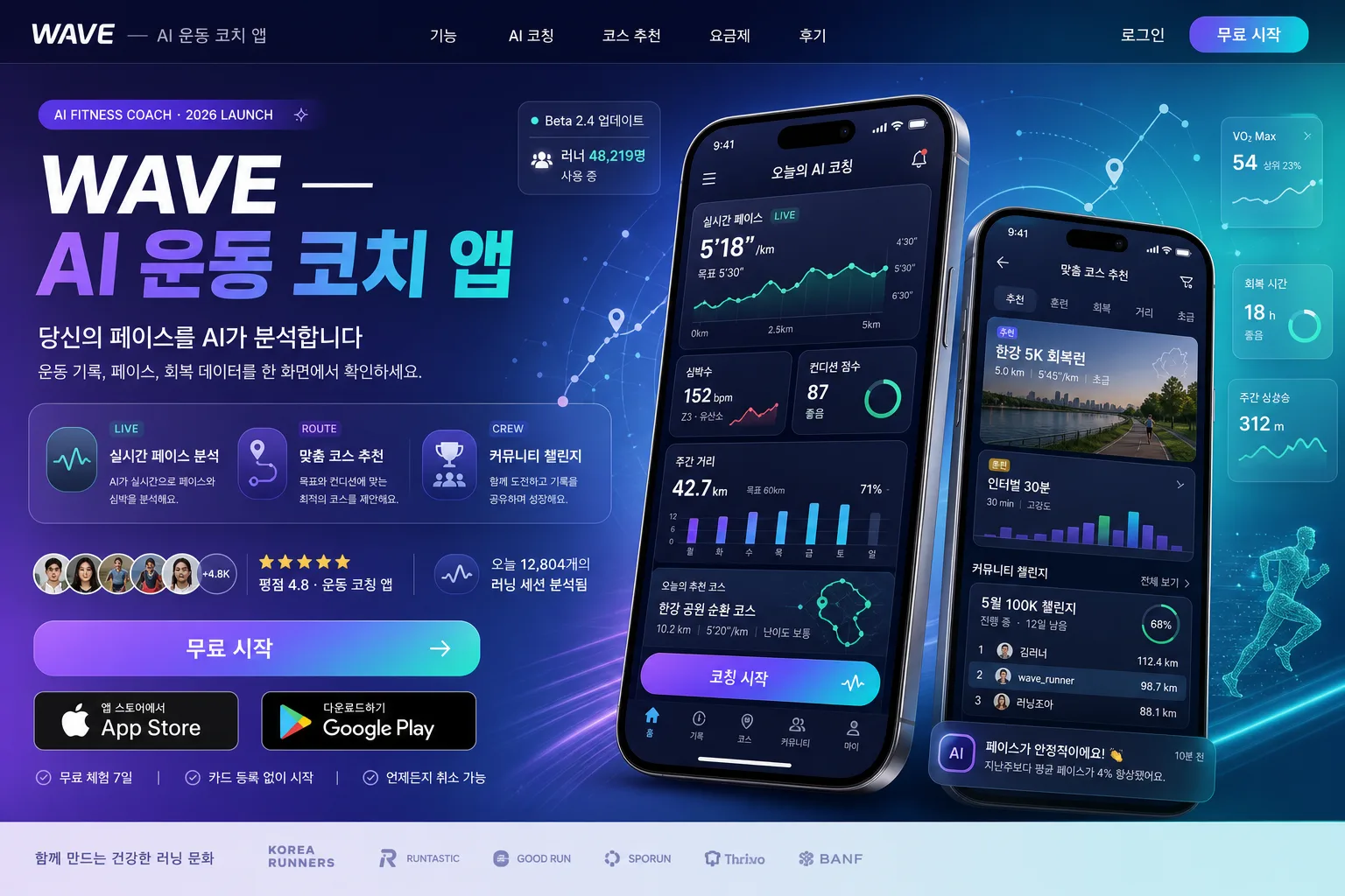
IT startup app landing page hero visual, wide website header composition for a modern AI fitness coaching service. Create a realistic, content-rich product marketing key visual that looks like an actual launch landing page for a Korean mobile app, optimized for conversion, credibility, and immediate understanding of the service.

[Composition]
- Left side hero block occupies about 52% of the frame: large headline at top, {태그라인} below, then feature list, trust/social-proof row, and CTA stack.
- Right side product block occupies about 40% of the frame: 2 vertically staggered mobile mockups showing app UI, slightly overlapping with realistic depth, glass reflection, device bevels, and app content visible.
- Add a realistic website header at the very top: small {서비스명} wordmark on the left, navigation labels in Korean such as “기능”, “AI 코칭”, “코스 추천”, “요금제”, “후기”, and a small login/start button on the right.
- Background is a polished startup gradient field with layered translucent UI panels, soft geometric shapes, subtle grid texture, faint route-map lines, AI data particles, and performance-themed motion arcs around the mockups.
- Include small credibility details: “Beta 2.4 업데이트”, “러너 48,219명 사용 중”, star rating micro text, and tiny partner/app-store style badges without claiming official certification.
- Use {서비스명}, {태그라인}, {핵심 기능 3}, {앱 스크린샷 자리}, {CTA}, {컨셉 톤}, {비율/사이즈} as the customizable content anchors.

[3. CORE STRUCTURE]
- Website nav zone (top, 8%): render a slim header bar with {서비스명}, Korean navigation menu items, and a compact rounded “무료 시작” or “앱 다운로드” button.
- Title zone (top-left, 18%): set {서비스명} as the main headline in large bold sans-serif, aligned left, with a clean modern hierarchy and strong visual weight. Add a small pill label above it: “AI FITNESS COACH · 2026 LAUNCH”.
- Tagline zone (under title, 8%): place {태그라인} in smaller regular-weight text with generous line spacing, readable at a glance, supported by one short Korean subcopy line such as “운동 기록, 페이스, 회복 데이터를 한 화면에서 확인하세요.”
- Feature zone (middle-left, 18%): present {핵심 기능 3} as three concise feature cards or bullet rows, each with a tiny icon: pace graph, route pin, trophy/community. Add small supporting labels like “LIVE”, “ROUTE”, “CREW”.
- CTA zone (bottom-left, 12%): place {CTA} as a clear button-style area with one primary CTA emphasis and one secondary option. Include realistic app download badges/text: “App Store”, “Google Play”, “무료 체험 7일”, and a tiny note “카드 등록 없이 시작”.
- Social proof strip (near CTA): add compact avatar circles, star rating, and Korean microcopy such as “오늘 12,804개의 러닝 세션 분석됨” and “평점 4.8 · 운동 코칭 앱”.
- Product zone (right side, 52% height): render {앱 스크린샷 자리} as realistic smartphone mockups with clean UI frames, subtle perspective tilt, soft shadow separation, glass highlights, and legible Korean UI details.
- Main phone UI: show a fitness dashboard with “오늘의 AI 코칭”, live pace card, heart-rate zone graph, weekly distance chart, route map preview, and a prominent button “코칭 시작”.
- Secondary phone UI: show “맞춤 코스 추천”, “한강 5K 회복런”, “인터벌 30분”, community challenge ranking, progress rings, and notification card “페이스가 안정적이에요”.
- Accent zone: add abstract line art, gradient orb, motion-trail accents, tiny floating analytics cards, route dots, and translucent data chips around the mockups to suggest AI, speed, and performance.

[4. STYLE RULES]
- Typography: Pretendard or Noto Sans KR for Korean, Inter for English; headline 56–72px bold, body 20–28px regular/medium, CTA 18–22px semibold, navigation 15–17px medium, micro UI labels 10–14px.
- Color palette: use a modern startup gradient with violet #7C5CFF, teal #23D5D5, deep navy #0B1020, white #FFFFFF, and soft gray #E9EEF5.
- Border/shadow: mobile mockups with soft drop shadow 0px 18px 40px rgba(0,0,0,0.18); CTA buttons with subtle 12px radius and gentle inner highlight; floating cards with translucent glassmorphism, fine 1px light strokes, and soft ambient glow.
- UI realism: app screens should include real interface density: status bars, tab bars, icons, graph axes, progress indicators, cards, route maps, small Korean labels, and notification banners.
- Landing page realism: include browser-like canvas proportions for {비율/사이즈}, crisp alignment, product screenshots, nav, CTAs, testimonial snippet, and small footer-like credit text such as “Made for everyday runners · Seoul”.

[5. VISUAL STYLE]
- Camera / lens: high-end brand key visual look, equivalent to a 50mm standard lens on a full-frame camera, straight-on web hero composition with crisp product rendering.
- Lighting: studio softbox key from upper-left at 45°, faint cool fill from right, controlled glow around gradient accents, realistic reflections along phone glass and button surfaces.
- Color grade: polished violet-teal startup gradient with cool white UI surfaces and slightly darkened navy contrast for depth.
- Rendering quality: premium SaaS launch page, sharp vector typography, photoreal device edges, layered depth, soft shadows, realistic glow, polished Korean tech startup advertising finish.

[6. MOOD]
Korean tech startup landing hero — Stripe / Linear product marketing aesthetic with a polished premium SaaS feel, energetic fitness data storytelling, trustworthy AI coaching, and a real app-launch campaign atmosphere.

[7. CRITICAL]
- Korean text accuracy: must render these strings exactly as written: “WAVE — AI 운동 코치 앱”, “당신의 페이스를 AI가 분석합니다”, “실시간 페이스 분석 / 맞춤 코스 추천 / 커뮤니티 챌린지”, “앱 스토어 / Play 스토어 / 무료 시작”.
- Also include realistic supporting Korean UI text where appropriate: “오늘의 AI 코칭”, “코칭 시작”, “맞춤 코스 추천”, “한강 5K 회복런”, “주간 거리”, “페이스 안정”, “커뮤니티 챌린지”.
- Layout invariant: left text column and right smartphone mockups must remain clearly separated, with the hero composition balanced and conversion-focused.
- App UI in the mockups should look like a real fitness coaching app interface, clean and legible, with no distorted Korean characters.

[8. 🚫 PROHIBITED]
- Fake official seals / certifications
- Broken Korean characters