Infographics/Guides
레시피 카드 (재료·단계 + 완성 사진)
요리 레시피를 한 장에. 재료 리스트 + 조리 단계 + 완성 사진. 블로그·인스타·요리책용.
레시피 카드 (재료·단계 + 완성 사진) summary
Copy this ChatGPT image prompt to create Infographics/Guides results. Its subject, background, style, and composition are organized for quick iteration.
Related keywords: 레시피 카드 (재료·단계 + 완성 사진), 레시피 카드 (재료·단계 + 완성 사진) 프롬프트, Infographics/Guides 프롬프트, Infographics/Guides AI 이미지 프롬프트, ChatGPT 이미지 프롬프트, AI 이미지 생성 프롬프트, AI 프롬프트, 이미지 프롬프트
How to use 레시피 카드 (재료·단계 + 완성 사진)
Keep the prompt structure and swap the subject, background, palette, or composition to create new variations.
- Keep the main subject and adjust the palette and background for your brand, season, or channel.
- If the result feels busy, simplify the background and make the subject, composition, and lighting more specific.
- After copying, ask ChatGPT to adapt it for your platform, aspect ratio, or text requirements.
Original prompt
[Input]
- language: Korean
- output_size: 1024x1536
- canvas: {비율/사이즈}
- concept tone: {컨셉 톤}

[Purpose]
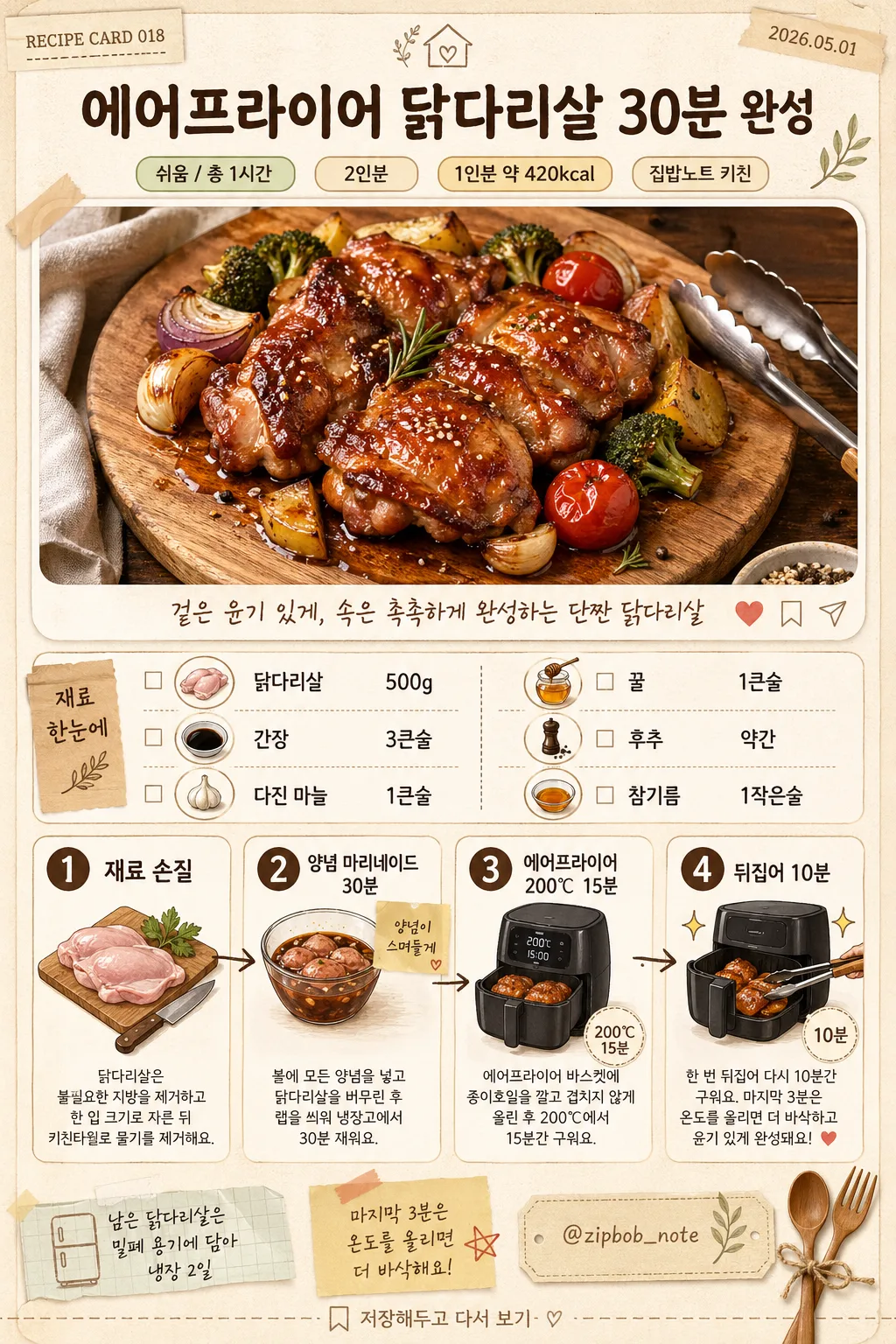
Korean recipe card editorial layout, vertical social-media infographic with a large finished dish photo, ingredient list, practical quantities, and step-by-step cooking panels.
Designed like a polished Korean home-cooking blog recipe card that can be saved, shared, printed, or posted as an Instagram/Pinterest-style cooking guide, with the overall mood guided by {컨셉 톤}.

[Composition]
- Top header zone (about 18%): centered {요리명} as the main title, with a small subtitle line for {난이도/시간}, {인분}, and {날짜} in compact rounded labels; add a tiny series mark "{레시피번호}" near the upper corner.
- Hero image zone (about 32%): large plated finished-dish photo for {완성 사진 컨셉}, framed in a rounded cream photo card with realistic food styling details such as garnish, sauce gloss, scattered sesame seeds, tongs, linen napkin edge, and warm tabletop context.
- Middle content zone (about 24%): ingredient list for {재료} and {재료상세}, arranged in two structured columns with small circular ingredient icons, quantity markers, pantry labels, and a tiny shopping-checklist treatment.
- Bottom zone (about 26%): 4-step cooking process for {조리 단계}, each step paired with a small illustrated icon, short note, temperature/time badge, and hand-drawn arrow cue.
- Background: warm beige paper texture with visible fiber grain, subtle wood-grain accents, cream blocks, soft brown separators, small washi-tape corners, handwritten memo marks, spoon/fork/leaf stickers, and realistic recipe-card decoration matching {컨셉 톤}.

[3. CORE STRUCTURE]
- Header area: place {요리명} in a large headline at the top center, with smaller badges below showing {난이도/시간}, {인분}, {칼로리}, and {작성자}; include "{레시피번호}" and "{날짜}" as small editorial metadata.
- Hero photo area: show the completed dish based on {완성 사진 컨셉} as a bright appetizing food photo, with glossy highlights, caramelized chicken skin, visible garnish, roasted vegetables, sauce pooling naturally, and a wooden cutting-board or rustic plate context.
- Caption strip: add a short one-line caption under the hero image using {요약문구}, aligned center, with a small heart/save/share micro-icon row on the right.
- Ingredient block: present {재료} as the quick ingredient summary, then show {재료상세} as practical quantities in two columns; use checkboxes, tiny ingredient pictograms, and thin brown dividers for scanability.
- Step 1 panel: render the first part of {조리 단계} with a prep illustration, a step number badge "1", and a concise explanation beneath it.
- Step 2 panel: render the second part of {조리 단계} with a marination bowl icon, badge "2", and a small sticky-note label showing "양념이 스며들게".
- Step 3 panel: render the third part of {조리 단계} with an air-fryer illustration, badge "3", and a clear temperature/time visual for 200℃ and 15분.
- Step 4 panel: render the fourth part of {조리 단계} with a turning/finishing icon, badge "4", and a final plating note with a garnish sparkle accent.
- Footer labels: place {보관팁}, {요리팁}, and {채널핸들} near the bottom edge as small recipe-note tags, plus page-style footer text "저장해두고 다시 보기".

[4. STYLE RULES]
- Typography: Pretendard Bold for {요리명} at large headline size, Pretendard Medium for badges and labels, Noto Sans KR for dense list text, and a hand-drawn Korean font accent for small callouts such as {요리팁} and {요약문구}.
- Color palette: warm beige #F4EBDD, milk cream #FFF8EF, wood brown #8C6245, dark cocoa #4A3428, honey gold #C89B5C, muted olive #8A9B6E, roasted paprika #B85C38; keep the palette and accent treatment aligned with {컨셉 톤}.
- Border/shadow: soft drop shadow 4px y-offset, 14px blur, 14% opacity; rounded cards with 18px radius; thin brown divider lines at 1px; photo card may have a subtle paper-edge shadow.
- Decorative style: friendly food-blog stickers, tiny sparkles, olive leaves, sesame dots, measuring spoon icons, washi-tape corners, handwritten arrows, and small save/share micro icons, while keeping recipe information readable.
- Editorial realism: include believable Korean microcopy such as "재료", "만드는 법", "TIP", "장보기 체크", "완성", "저장", "공유", and "오늘의 집밥 노트".

[5. VISUAL STYLE]
- Camera / lens: realistic food photography look, 50mm f/2.8 top-front angle for the hero dish, with crisp focus on glaze and texture; flat-lay style for ingredient and step icons.
- Lighting: soft diffused window light from upper-left at about 45°, gentle fill from lower-right, subtle specular highlights on the finished chicken surface.
- Color grade: warm beige and caramel grading with slightly boosted amber tones, natural greens for garnish, and low-contrast editorial clarity, tuned to the requested {컨셉 톤}.
- Material detail: tactile matte paper grain, slightly translucent cream blocks, real wooden tabletop texture, glossy sauce highlights, and small crumbs or sesame seeds that make the card feel photographed and designed rather than sterile.

[6. MOOD]
Korean home-cooking blog editorial — similar to a polished recipe post on 만개의 레시피, with a friendly warm tabletop aesthetic, practical saved-recipe card energy, handwritten kitchen notes, clear step-by-step guidance, and the overall emotional tone of {컨셉 톤}.

[7. CRITICAL]
- Korean text accuracy: 반드시 아래 문구가 정확히 보여야 함.
  - "{요리명}"
  - "{재료}"
  - "{조리 단계}"
  - "{완성 사진 컨셉}"
  - "{난이도/시간}"
  - "{컨셉 톤}"
  - "{비율/사이즈}"
  - "{인분}"
  - "{칼로리}"
  - "{작성자}"
  - "{채널핸들}"
  - "{날짜}"
  - "{레시피번호}"
  - "{재료상세}"
  - "{요약문구}"
  - "{요리팁}"
  - "{보관팁}"
- Layout invariant: the composition must clearly read as top title + large completed-dish photo + middle ingredient list + bottom 4-step instruction section.
- All step numbers must appear as 1, 2, 3, 4 in order and be visually consistent.
- Include realistic recipe-card micro text: "재료", "만드는 법", "TIP", "장보기 체크", "저장", "공유", "오늘의 집밥 노트".

[8. 🚫 PROHIBITED]
- Fake official seals / certifications
- Broken Korean characters
- Missing or scrambled ingredient quantities and step order