広告・ポスター
네일아트 디자인 카탈로그 (시즌·테마별)
네일아트 디자인 9~12종 카탈로그. 시즌·테마별 네일 + 모델 손 컷. 네일샵·인스타·시술 메뉴.
네일아트 디자인 카탈로그 (시즌·테마별)の概要
広告・ポスター画像を作るためのChatGPT画像プロンプトです。主題、背景、スタイル、構図を整理し、すぐに試せるよう構成しています。
関連キーワード: 네일아트 디자인 카탈로그 (시즌·테마별), 네일아트 디자인 카탈로그 (시즌·테마별) 프롬프트, 広告・ポスター 프롬프트, 広告・ポスター AI 이미지 프롬프트, ChatGPT 이미지 프롬프트, AI 이미지 생성 프롬프트, AI 프롬프트, 이미지 프롬프트
네일아트 디자인 카탈로그 (시즌·테마별)の活用方法
元の構造を保ちながら、被写体、背景、色、構図を変更して別案に展開できます。
- 主題を維持し、ブランドや季節、媒体に合わせて色と背景を変更してください。
- 結果が複雑な場合は背景要素を減らし、被写体、構図、照明を具体化してください。
- コピー後、ChatGPTに媒体、アスペクト比、文字の有無を追加で指定できます。
プロンプト原文
[Input]
- language: Korean
- output_size: 1024x1536

[Purpose]
Korean nail art design catalog poster for a trendy salon, seasonal theme menu, vertical editorial layout.
Designed for Instagram feed, KakaoTalk booking share, and in-store display as a realistic salon price catalog with seasonal design recommendations.

[Composition]
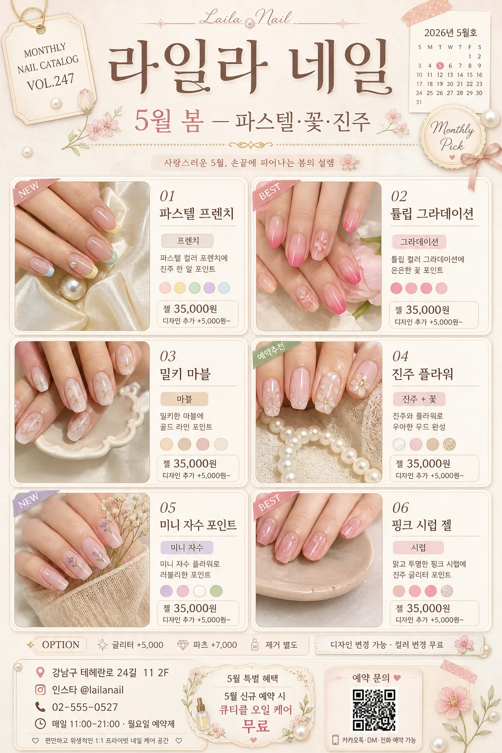
- Top header zone (top 18%): place {네일샵명} as the main salon name, a catalog tag such as {카탈로그번호}, and a large seasonal headline for {시즌/테마}. Add a small date line {카탈로그날짜} and a delicate “Monthly Pick” badge.
- Main content zone (middle 64%): 6-card design grid showing manicure close-ups paired with elegant hand crops. Each card includes a numbered design name, a short material note, {디자인 종류}, and {가격대} in a salon-menu format.
- Side and divider details: add thin pearl-gold dividers, tiny flower and pearl decorative graphics, small category tags such as “NEW”, “BEST”, “예약추천”, and subtle swatch chips matching the nail colors.
- Bottom info bar (bottom 18%): show {매장 정보}, {영업시간}, {예약혜택}, address/contact style details, Instagram handle, and a small QR-style booking box with the text “예약 문의”.
- Background surface: soft warm beige paper texture with subtle pink undertone, delicate pearl sheen accents, faint floral micro-patterns, and salon-menu sticker details around the catalog page.
- Spacing and framing: equal gutters between cards, rounded card frames, layered paper slips, small price ribbons, and a balanced vertical retail-poster hierarchy.

[3. CORE STRUCTURE]
- Header area: place {네일샵명} in a large decorative title treatment at the top, with {시즌/테마} as a smaller subheadline underneath. Include {카탈로그번호}, {카탈로그날짜}, and a thin soft divider so it reads like an actual monthly nail design catalog.
- Grid area: arrange 6 nail design cards in a 2-column x 3-row grid. Use realistic card titles such as “01 파스텔 프렌치”, “02 튤립 그라데이션”, “03 밀키 마블”, “04 진주 플라워”, “05 미니 자수 포인트”, “06 핑크 시럽 젤”. Each card should contain a hand crop, the nail art design, one short label from {디자인 종류}, and a compact price line from {가격대}.
- Card treatment: each card uses a soft off-white or blush background, thin beige border, rounded corners, slight shadow, tiny color swatches, small Korean captions, and a small badge showing “BEST” or “NEW” for a premium salon catalog page.
- Nail visuals: show Korean 20s female hands with natural skin texture from {모델 컨셉}, fingers relaxed and elegant, nails polished to match the seasonal palette. Use varied poses such as holding a pearl, resting on silk ribbon, touching a dried flower, or overlapping fingers on a ceramic tray.
- Menu/pricelist details: include a small “OPTION” strip with text like “글리터 +5,000 / 파츠 +7,000 / 제거 별도”, plus a note line “디자인 변경 가능 · 컬러 변경 무료”.
- Bottom information area: set {매장 정보}, {영업시간}, and {예약혜택} in clean text with tiny icon-like separators, a mini map-pin label, phone/DM prompt, and a QR-style square so the poster looks ready for real salon booking.

[4. STYLE RULES]
- Typography: use Pretendard or Noto Sans KR for body text, with a handwritten accent font for small labels; title can use a semi-bold display style, 52–68px equivalent, body 20–28px equivalent, prices slightly smaller but still legible.
- Color palette: use beige #F4EBDD, blush pink #F5D6DC, pearl white #FAF8F4, soft mauve #D8B7C7, warm gray #8E857D, pale gold #D7C2A3, and small botanical green accents #A8B8A0.
- Border/shadow: thin 1px border in #E7D7D0, soft drop shadow 0 8px 24px rgba(0,0,0,0.08), gentle inner highlight for a polished catalog-card feel.
- Decorative system: use pearl dots, micro floral line art, washi-tape corners, soft sticker labels, tiny calendar and location icons, and color-chip samples that support the nail menu theme.

[5. VISUAL STYLE]
- Camera / lens: high-resolution studio beauty shot, 85mm f/1.8 for the hand crops, with a slightly top-down product-catalog framing; each card feels like a refined nail menu photo.
- Lighting: softbox key light from upper-left at 45°, subtle fill from right, controlled shine on pearl decorations and gel surfaces, clean reflective highlights on glossy nail polish.
- Color grade: warm cream + pastel pink + pearl ivory with a faint rosy highlight, lightly desaturated to match a fashionable Korean nail salon aesthetic.
- Material realism: visible gel thickness, fine glitter particles, tiny pearl parts, dried flower decals, smooth cuticle oil sheen, real paper grain, silk ribbon texture, and ceramic tray reflections.

[6. MOOD]
Premium Korean beauty salon editorial — polished Instagram nail-menu aesthetic with a Niipi / Mideu Nail style influence, romantic spring boutique mood, realistic booking catalog energy.

[7. CRITICAL]
- Korean text accuracy: 반드시 아래 문구가 정확히 보여야 함: {네일샵명}, {시즌/테마}, {카탈로그번호}, {카탈로그날짜}, {디자인 종류}, {가격대}, {매장 정보}, {영업시간}, {예약혜택}.
- Render readable Korean salon copy inside the poster, including: “월간 추천 디자인”, “컬러 변경 무료”, “예약 문의”, “BEST”, “NEW”, “디자인 변경 가능”.
- Layout invariant: 6-card grid must be consistent in size and spacing, and each card must clearly show one nail design plus its label, short caption, and price.
- Hands: anatomically correct Korean female hands, natural proportions, exactly 5 fingers per hand.

[8. 🚫 PROHIBITED]
- Fake official seals / certifications
- Broken Korean characters or garbled Hangul
- Celebrity composites or unlicensed celebrity likenesses