광고/포스터
와인 바 SNS 메인 비주얼
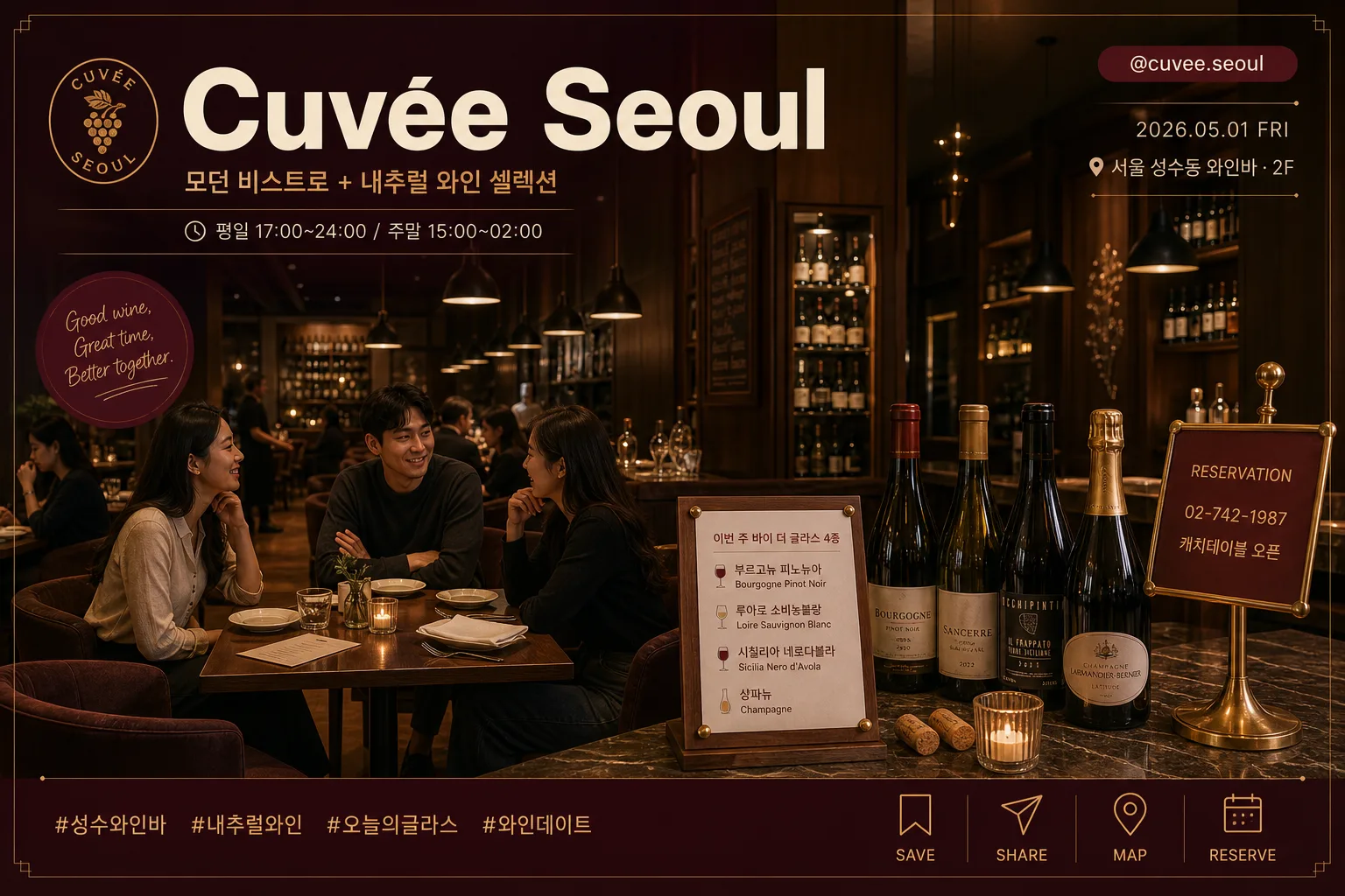
와인 바 매장 분위기를 살린 SNS·홈페이지 메인 비주얼. 우드+딤 라이트+와인 글라스 무드. 매장명·시그니처·시간 정보 박힌 매거진 톤.
와인 바 SNS 메인 비주얼 검색 요약
와인 바 SNS 메인 비주얼은 광고/포스터 결과물을 만들 때 바로 복사해 활용할 수 있는 ChatGPT 이미지 프롬프트입니다. 주제, 배경, 스타일, 구도 조건을 함께 담아 빠르게 시안을 만들 수 있도록 구성했습니다.
관련 키워드: 와인 바 SNS 메인 비주얼, 와인 바 SNS 메인 비주얼 프롬프트, 광고/포스터 프롬프트, 광고/포스터 AI 이미지 프롬프트, ChatGPT 이미지 프롬프트, AI 이미지 생성 프롬프트, AI 프롬프트, 이미지 프롬프트
와인 바 SNS 메인 비주얼 활용 포인트
원본 구조를 유지하면서 피사체, 배경, 색감, 구도를 바꿔 다양한 시안으로 확장할 수 있습니다.
- 핵심 소재는 유지하고 브랜드, 계절, 채널 목적에 맞는 색감과 배경을 바꿔보세요.
- 결과가 산만하면 배경 요소를 줄이고 피사체, 구도, 조명 조건을 구체화하세요.
- 복사한 뒤 ChatGPT에서 플랫폼, 화면 비율, 텍스트 포함 여부를 추가로 요청할 수 있습니다.
프롬프트 원문
[Input]
- language: Korean
- output_size: 1536x1024

[Purpose]
Wine bar SNS main visual in a magazine-editorial style, horizontal hero image for social media cover, Instagram feed announcement, and reservation promotion use.
Premium dining-space atmosphere with natural wine selection, designed to highlight venue identity, signature pours, opening hours, location, and social handle at a glance.

[Composition]
- Wide horizontal composition with the dining room occupying about 70% of the frame, while editorial typography is layered naturally across the upper-left brand area and lower-right reservation area.
- The interior should feel upscale but approachable: warm wood paneling, dim pendant lights, visible wine-cellar shelving, linen napkins, small plates, menu cards, a brass reservation stand, corks, coasters, and upholstered armchairs arranged for real conversation.
- Place {모델·인물} in the mid-foreground, slightly off-center, so the scene feels candid and editorial rather than staged.
- Use {매장명}, {컨셉}, {시그니처}, {시간 정보}, {위치라벨}, {예약정보}, {인스타핸들}, {해시태그}, and {메인 컬러} as visible brand anchors in the layout.
- Include tasteful SNS-card details: a small save/share icon row, a date label, a location tag, subtle hashtag strip, and a soft sticker-like caption badge integrated into the magazine spread.

[3. CORE STRUCTURE]
1) Background architecture: build a refined Seoul wine-bar interior with dark wood wall panels, a subtle wine-cellar backdrop, brushed metal details, a marble or walnut counter, pendant lights receding into depth, and softly glowing bottle shelves.
2) Primary dining zone (center-left 45%): arrange two or three small tables with armchairs, linen napkins, small ceramic plates, a candle, printed tasting notes, and a few opened bottles to make the venue feel actively prepared for service.
3) Counter/product zone (lower-center 25%): display {시그니처} on a small tabletop menu card and nearby shelving with bottle labels upright and readable, premium but not commercial-brochure exaggerated.
4) Human presence layer: place {모델·인물} as relaxed adult guests talking naturally, leaning slightly toward one another with calm evening gestures, while the staff area and table settings add a lived-in hospitality feeling.
5) Title and brand text zone: render {매장명} as the main headline, with {컨셉} as a smaller subtitle, {시간 정보} as a concise schedule line, and {예약정보} as a reservation CTA in the lower-right information block.
6) SNS information layer: add {인스타핸들} near the top-right, {게시일자} and {위치라벨} as a small editorial label, {해시태그} along the bottom edge, and a micro icon row showing save · share · map pin · reservation symbols.
7) Color emphasis: apply {메인 컬러} across accents, bottle styling, typography separators, candle reflections, and small UI-like labels, keeping the overall palette grounded in deep burgundy, warm wood, and restrained gold.

[4. STYLE RULES]
- Typography: use Pretendard Bold for {매장명} headline, Pretendard SemiBold for {컨셉}, and Noto Sans KR Medium for {시그니처}, {시간 정보}, {예약정보}, {위치라벨}, {게시일자}, and {해시태그}; headline size should dominate, with subtitle and schedule set smaller and tightly tracked.
- Color palette: {메인 컬러} plus deep burgundy #4A1F2A, walnut brown #5A3E2B, candle amber #C89B5C, muted olive #6B6A45, and ivory text #F4EBDD for contrast.
- Graphic treatment: use thin gold separators, small rounded caption badges, refined editorial drop shadows, 4px y-offset, 14px blur, 18% opacity on text blocks, bottles, and UI labels.
- Render social micro-elements as premium hospitality design: small bookmark icon, share arrow, map pin, reservation dot, and a discreet caption sticker reading {마이크로카피}.

[5. VISUAL STYLE]
- Camera / lens: 35mm full-frame editorial interior shot, shot on a Sony A7R IV with a 35mm f/1.4 lens at f/2.8 for moderate depth of field and crisp environmental detail.
- Lighting: warm practical pendant lights from above, soft fill from camera-left, candle glow on tabletops, subtle reflections on glassware, and a faint back rim from the cellar side to separate people and bottles from the darker wood background.
- Color grade: deep burgundy, amber tungsten, walnut brown, and muted gold with slightly lifted shadows for a polished magazine spread finish.

[6. MOOD]
Sophisticated evening hospitality editorial — somewhere between Kinfolk dining feature and Aesop interior storytelling, with the calm polish of a high-end Seoul natural wine bar and the practical readability of an Instagram main visual.

[7. CRITICAL]
- Korean text accuracy: 반드시 아래 문구가 정확히 보여야 함:
  - {매장명}
  - {컨셉}
  - {시그니처}
  - {시간 정보}
  - {예약정보}
  - {위치라벨}
  - {게시일자}
  - {인스타핸들}
  - {해시태그}
  - {마이크로카피}
- Bottle labels and tabletop menu text should remain upright, clean, and readable; no mirrored or garbled lettering.
- {모델·인물} must appear as adult guests only, ages 20+, with natural conversation poses and calm wine-bar etiquette.

[8. 🚫 PROHIBITED]
- Fake official seals / certifications
- Broken Korean characters
- Celebrity composites or recognizable public-figure likenesses
- Minor-coded faces or school-like styling