광고/포스터
위스키 바·라운지 분위기 (다크 우드)
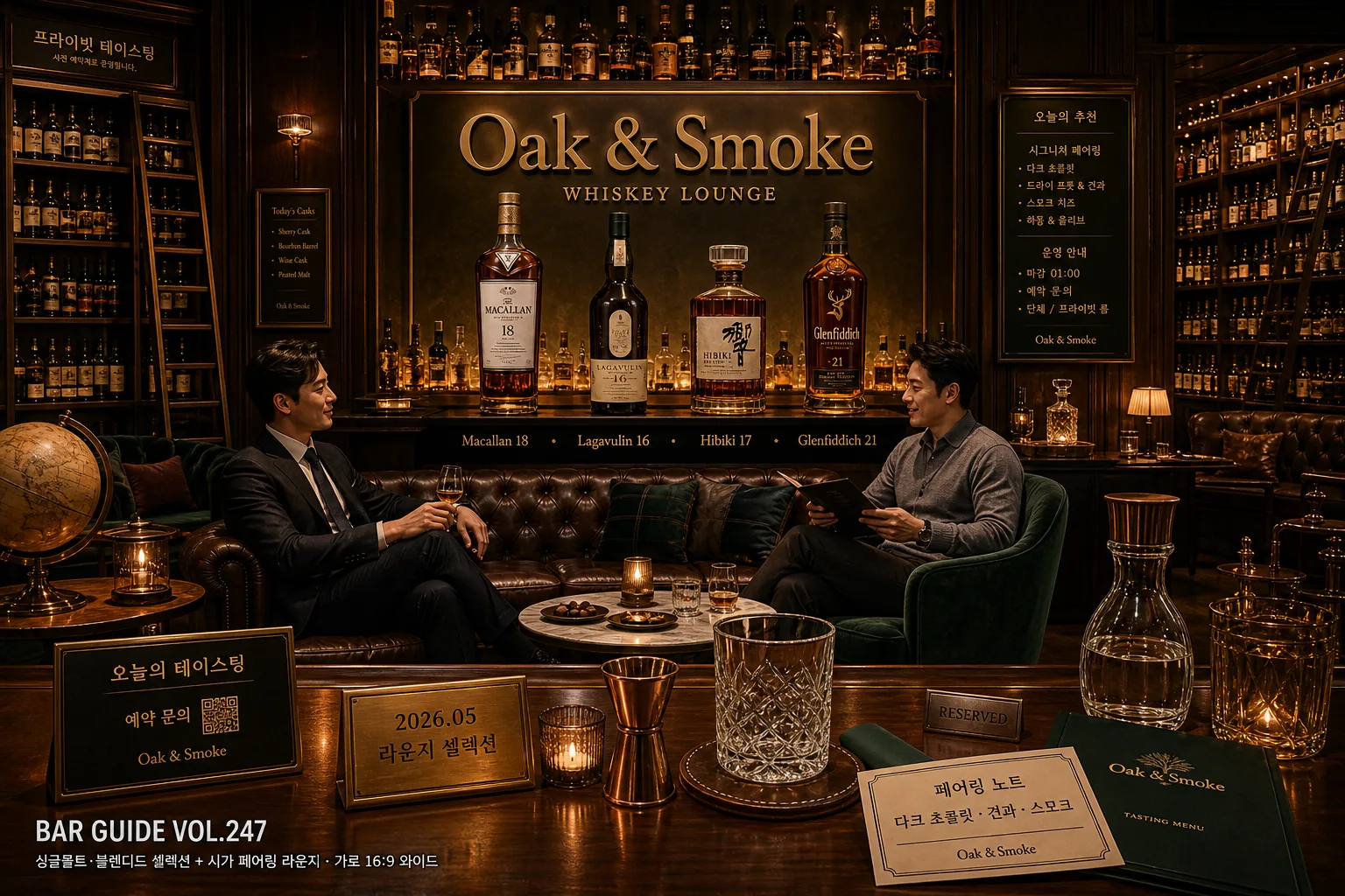
위스키 바·라운지 매장 분위기. 다크 우드 + 가죽 체스터필드 + 위스키 셀러 + 캔들. 시그니처 셀렉션 + 매장명 박힌 매거진 톤.
위스키 바·라운지 분위기 (다크 우드) 검색 요약
위스키 바·라운지 분위기 (다크 우드)은 광고/포스터 결과물을 만들 때 바로 복사해 활용할 수 있는 ChatGPT 이미지 프롬프트입니다. 주제, 배경, 스타일, 구도 조건을 함께 담아 빠르게 시안을 만들 수 있도록 구성했습니다.
관련 키워드: 위스키 바·라운지 분위기 (다크 우드), 위스키 바·라운지 분위기 (다크 우드) 프롬프트, 광고/포스터 프롬프트, 광고/포스터 AI 이미지 프롬프트, ChatGPT 이미지 프롬프트, AI 이미지 생성 프롬프트, AI 프롬프트, 이미지 프롬프트
위스키 바·라운지 분위기 (다크 우드) 활용 포인트
원본 구조를 유지하면서 피사체, 배경, 색감, 구도를 바꿔 다양한 시안으로 확장할 수 있습니다.
- 핵심 소재는 유지하고 브랜드, 계절, 채널 목적에 맞는 색감과 배경을 바꿔보세요.
- 결과가 산만하면 배경 요소를 줄이고 피사체, 구도, 조명 조건을 구체화하세요.
- 복사한 뒤 ChatGPT에서 플랫폼, 화면 비율, 텍스트 포함 여부를 추가로 요청할 수 있습니다.
프롬프트 원문
[Input]
- language: Korean
- output_size: 1536x1024

[Purpose]
Korean whiskey bar and lounge atmosphere editorial, wide interior scene for magazine-style promotion.
Dark wood premium lounge environment with bottle display, conversational guests, tasting culture, and realistic hospitality details for a refined promotional spread.

[Composition]
- Wide 16:9 composition with {매장명} as the visual anchor across the middle 60% of the frame, integrated as a brushed brass wall sign or softly backlit lettering above the central bar.
- Left and right seating zones frame the center counter; the bottle display stays sharply readable on the back counter shelf, with premium glassware, menu cards, pairing plates, and warm table lamps adding depth.
- Background treatment: dark wood paneling, deep green upholstery, copper accents, amber practical lights, leather Chesterfield sofa, ceiling-height bookshelf-style whiskey cellar, vintage globe, candles, framed tasting notes, decanter silhouettes, and {배경 디테일} woven naturally into the room.
- Add editorial poster details within the scene: a small tabletop reservation card reading “오늘의 테이스팅”, a slim brass placard with “2026.05 라운지 셀렉션”, and a subtle lower-corner magazine-style label reading “BAR GUIDE VOL.247”.
- Include 2 adult guests in their 30s wearing a mix of suit and smart casual, seated and talking naturally; one may rest a hand near a nosing glass on the table while the other reviews a tasting menu.

[3. CORE STRUCTURE]
- Foreground (bottom 18%): polished wood counter edge with realistic reflections, a copper jigger, leather coaster, folded napkin, cut crystal tumbler, small candle, water carafe, and a printed tasting menu card reading “페어링 노트 / 다크 초콜릿 · 견과 · 스모크”.
- Midground (center 50%): {매장명} lounge seating with leather Chesterfield sofa, muted deep green textiles, brass table bases, marble-topped side tables, two adults in natural conversation poses, and a small pairing plate with dark chocolate and roasted nuts.
- Product line (upper-mid 20%): {시그니처 셀렉션} bottles arranged on the counter and back shelf, labels fully visible and crisp, varied in height and glass tone like a real curated whiskey lineup with believable reflections and refractions.
- Background (top 30%): bookshelf-like whiskey cellar structure reaching toward the ceiling, vintage globe, catalog tags, warm ambient lamps, framed menu board, bottle ladder rail, and architectural wood grain visible across shelves and wall panels.
- Atmosphere layer: warm amber backlight from behind bottles, subtle haze only enough to catch highlights, cinematic shadow structure emphasizing wood grain, leather texture, brass edges, candlelight, and glass contours.
- Branding clarity: {매장명} and {시그니처 셀렉션} must read exactly and cleanly, with no distortions or partial occlusion; supporting Korean copy may include “프라이빗 테이스팅”, “예약 문의”, “시그니처 페어링”, and “마감 01:00”.

[4. STYLE RULES]
- Typography: Pretendard and Noto Sans KR, bold for main brand emphasis, medium for supporting copy, size hierarchy suitable for a landscape editorial poster; crisp sans-serif with high legibility.
- Color palette: {컬러 톤} anchored by deep walnut brown #3B2A22, forest green #1F3A2E, copper #B46A3C, amber #C98B3B, and warm cream highlights #E8DDCB.
- Border/shadow: soft realistic shadow under bottles and furniture, 4px y-offset, 14px blur, 18% opacity; highlights should feel like polished wood and glass rather than glossy plastic.
- Add layered hospitality graphics as real objects: cream menu paper, brass table number, tiny reservation tag, bottle neck labels, and a discreet lower-third editorial caption reading “{컨셉} · {비율}”.

[5. VISUAL STYLE]
- Camera / lens: full-frame interior editorial look, 24mm tilt-shift lens at f/5.6 for straight architectural lines and balanced depth across the lounge.
- Lighting: warm practical lamps mixed with amber backlight behind the bottle shelf, plus soft diffused fill from front-left at 45° to preserve label readability and face detail.
- Color grade: dark mahogany + deep green + copper amber, with controlled contrast and slightly muted blacks, like a premium hospitality spread in Wallpaper* or Kinfolk.
- Material realism: visible walnut grain, worn leather creases, cut-crystal facets, brushed brass patina, candle wax texture, linen napkins, paper menu fibers, and subtle fingerprints on glass where appropriate.

[6. MOOD]
Premium whiskey lounge editorial — Aesop-like restraint mixed with a luxe hotel bar atmosphere, cinematic but composed, warm enough to feel like a real evening service with quiet conversation and curated tasting rituals.

[7. CRITICAL]
- Korean text accuracy: {매장명}, {컨셉}, {시그니처 셀렉션}, {컬러 톤}, {배경 디테일}, {비율} must appear exactly if text is rendered.
- Render supporting Korean text cleanly if used: “오늘의 테이스팅”, “프라이빗 테이스팅”, “시그니처 페어링”, “예약 문의”, “페어링 노트”, “다크 초콜릿 · 견과 · 스모크”, “2026.05 라운지 셀렉션”.
- Bottle labels must stay readable and unwarped; no bottle duplication errors.
- Guests must look like adults in their 30s with relaxed, refined behavior; no youth-like features or drunken behavior.
- Interior geometry should remain realistic with straight shelves, clean counter lines, believable spatial depth, and consistent reflections across wood, brass, leather, and glass.

[8. 🚫 PROHIBITED]
- Fake official seals / certifications
- Broken Korean characters