광고/포스터
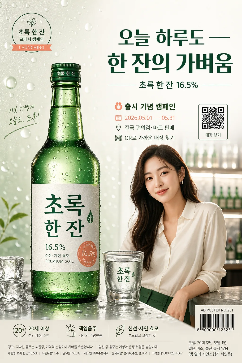
소주 광고 포스터
소주 신제품·시즌 광고 포스터. 모델 톤 다운 + 라벨 강조 + 한 줄 카피. 한국 광고 톤 (자연스러움·과음 묘사 X).
소주 광고 포스터 검색 요약
소주 광고 포스터은 광고/포스터 결과물을 만들 때 바로 복사해 활용할 수 있는 ChatGPT 이미지 프롬프트입니다. 주제, 배경, 스타일, 구도 조건을 함께 담아 빠르게 시안을 만들 수 있도록 구성했습니다.
관련 키워드: 소주 광고 포스터, 소주 광고 포스터 프롬프트, 광고/포스터 프롬프트, 광고/포스터 AI 이미지 프롬프트, ChatGPT 이미지 프롬프트, AI 이미지 생성 프롬프트, AI 프롬프트, 이미지 프롬프트
소주 광고 포스터 활용 포인트
원본 구조를 유지하면서 피사체, 배경, 색감, 구도를 바꿔 다양한 시안으로 확장할 수 있습니다.
- 핵심 소재는 유지하고 브랜드, 계절, 채널 목적에 맞는 색감과 배경을 바꿔보세요.
- 결과가 산만하면 배경 요소를 줄이고 피사체, 구도, 조명 조건을 구체화하세요.
- 복사한 뒤 ChatGPT에서 플랫폼, 화면 비율, 텍스트 포함 여부를 추가로 요청할 수 있습니다.
프롬프트 원문
[Input]
- language: Korean
- output_size: 1024x1536

[Purpose]
Korean soju advertisement poster, realistic premium editorial vertical layout for brand campaign, retail lightbox, and magazine advertising use.
Premium product-poster style emphasizing the chilled bottle, Korean typography, refined lifestyle atmosphere, and responsible adult branding.

[Composition]
- Main subject: {브랜드명} soju bottle placed slightly left of center, occupying about 38% of frame height, with crisp label visibility, realistic green glass refraction, condensation, cap detail, and a clean recognizable silhouette.
- Supporting human element: {모델 톤} positioned near the bottle as a polished adult lifestyle cue, leaning or seated naturally beside the tabletop, with calm eye line and relaxed campaign-poster presence.
- Background treatment: matte off-white studio-to-bar hybrid backdrop with a faint green gradient wash, soft water-drop texture, translucent condensation bokeh, and subtle reflections from a premium tabletop setting based on {시각 컨셉}.
- Realistic poster contents: include a small campaign badge, date period, venue/sales channel line, QR-style information block, tiny barcode area, responsible drinking notice, and compact production/credit text.
- Text hierarchy: large headline at upper-right or upper-center, product details beneath, campaign/event details in a smaller mid-lower block, and brand information in small footer text.
- Composition feel: refined Korean beverage advertising with layered foreground, product photography depth, readable information zones, and tactile condensation details.

[3. CORE STRUCTURE]
- Hero area left 38%: {브랜드명} bottle with dew droplets, lit to show glass reflections, condensation trails, cap highlights, embossed label paper texture, and the deep green bottle palette; bottle stands on a glossy stone or acrylic bar surface with a soft realistic reflection.
- Product environment: add a chilled soju glass beside the bottle, a few melting ice cubes, tiny water beads on the table, and restrained green/coral graphic bubbles that echo freshness without competing with the bottle.
- Model zone lower-mid right: {모델 톤} in a natural adult pose, softly integrated with the campaign scene, wearing clean contemporary styling in off-white, green, or muted coral accents; the model supports the brand mood while the bottle remains the visual hero.
- Copy block upper-right 35%: {카피 한 줄} set as the dominant headline in large Korean type, with {제품명·도수} directly below in smaller, tighter tracking.
- Campaign detail block mid-right: include short Korean poster details such as '출시 기념 캠페인', '2026.05.01 — 05.31', '전국 편의점·마트 판매', and 'QR로 가까운 매장 찾기', arranged like a real printed liquor advertisement.
- Footer information area: {브랜드 정보} arranged as a compact compliance-style line with responsible drinking notice, tiny barcode/QR area, poster number 'AD POSTER NO.231', and small credit text such as '모델: {모델 톤}'.
- Visual accent: a restrained coral highlight appears as a ribbon label, small circular sticker, or underline accent, balanced against the deep green bottle palette and clean white background.

[4. STYLE RULES]
- Typography: Pretendard Bold for the headline, Pretendard SemiBold for product details, Noto Sans KR Regular for brand information; headline size should feel like 72–96px equivalent, with tight leading and modern Korean ad styling.
- Color palette: use deep green, white, and muted coral from {컬러 톤}; support with off-white #F6F4EF, bottle green #1F4B3A, dark text #1A1A1A, accent coral #E88B7A.
- Border/shadow: soft studio drop shadow under the bottle, about 4px vertical offset, 12px blur, 15% opacity; use delicate printed-poster lines, small divider rules, and label-style accents where useful.
- Layout finish: magazine-cover clarity with a realistic printed advertisement hierarchy, premium Korean liquor campaign polish, crisp product edges, tactile paper/glass textures, and believable commercial poster micro-details.
- Information styling: QR and barcode elements should look like printed poster utility marks without implying a real scannable code; supporting text should be small but visually coherent.

[5. VISUAL STYLE]
- Camera / lens: commercial product photography look, 85mm lens at f/4 for bottle clarity, with a slightly longer portrait compression for the model and controlled depth separation.
- Lighting: soft backlight from upper-left with gentle rim light on bottle edges, balanced by a faint front fill; use diffused studio lighting with a clean reflective highlight on the glass and bright sparkle points on condensation.
- Color grade: deep green, clean white, and subtle coral accent with a premium Korean liquor-ad palette; slightly cool shadows and neutral highlights.
- Surface realism: visible condensation droplets, chilled glass fogging, faint tabletop reflection, label paper grain, and soft specular highlights on ice and bottle shoulders.

[6. MOOD]
Premium Korean liquor campaign — contemporary magazine editorial like a high-end beverage spread from Vogue Korea / Dazed Korea, blended with a realistic retail poster and refined Seoul nightlife freshness.

[7. CRITICAL]
- Korean text accuracy: must render exactly these strings:
  - {브랜드명}
  - {제품명·도수}
  - {카피 한 줄}
  - {브랜드 정보}
- Supporting Korean poster text should be crisp and readable where used:
  - 출시 기념 캠페인
  - 2026.05.01 — 05.31
  - 전국 편의점·마트 판매
  - QR로 가까운 매장 찾기
  - 성인 인증 후 구매 가능합니다
  - 지나친 음주는 건강에 해롭습니다
  - 모델: {모델 톤}
- The bottle label Korean typography must be crisp, legible, and not distorted.
- Adult-only advertising tone: model must read as clearly 20s or older; no intoxicated, suggestive, or excessive partying cues.
- Keep the bottle as the primary hero object; the model remains secondary.

[8. 🚫 PROHIBITED]
- Fake official seals / certifications
- Broken Korean characters
- Celebrity composites or unauthorized likeness