광고/포스터
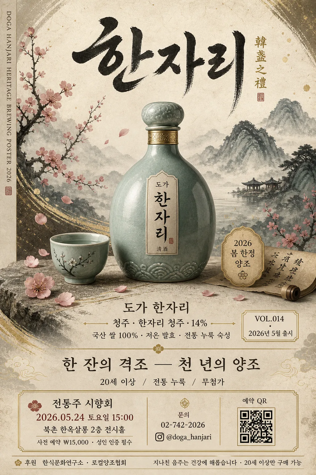
전통주 광고 포스터 (청주·약주·과실주)
청주·약주·과실주 등 전통주 프리미엄 광고. 도자기 + 매화·산수화 모티프 + 한자 캘리그라피. 럭셔리 톤.
전통주 광고 포스터 (청주·약주·과실주) 검색 요약
전통주 광고 포스터 (청주·약주·과실주)은 광고/포스터 결과물을 만들 때 바로 복사해 활용할 수 있는 ChatGPT 이미지 프롬프트입니다. 주제, 배경, 스타일, 구도 조건을 함께 담아 빠르게 시안을 만들 수 있도록 구성했습니다.
관련 키워드: 전통주 광고 포스터 (청주·약주·과실주), 전통주 광고 포스터 (청주·약주·과실주) 프롬프트, 광고/포스터 프롬프트, 광고/포스터 AI 이미지 프롬프트, ChatGPT 이미지 프롬프트, AI 이미지 생성 프롬프트, AI 프롬프트, 이미지 프롬프트
전통주 광고 포스터 (청주·약주·과실주) 활용 포인트
원본 구조를 유지하면서 피사체, 배경, 색감, 구도를 바꿔 다양한 시안으로 확장할 수 있습니다.
- 핵심 소재는 유지하고 브랜드, 계절, 채널 목적에 맞는 색감과 배경을 바꿔보세요.
- 결과가 산만하면 배경 요소를 줄이고 피사체, 구도, 조명 조건을 구체화하세요.
- 복사한 뒤 ChatGPT에서 플랫폼, 화면 비율, 텍스트 포함 여부를 추가로 요청할 수 있습니다.
프롬프트 원문
[Input]
- language: Korean
- output_size: 1024x1536

[Purpose]
Korean traditional liquor advertisement poster for premium cheongju, yakju, or fruit wine.
Designed as a luxury vertical print poster that combines traditional ink painting, ceramic still-life product photography, and realistic commercial poster information such as release date, tasting event notice, store contact, and responsible drinking copy.

[Composition]
- Vertical poster layout with a clear top-to-bottom hierarchy: upper calligraphy title, atmospheric Korean painting scene, central product hero, lower brand story and event information.
- Main ceramic liquor bottle and small traditional cup(s) placed slightly below center, occupying about 45% of the frame height, with refined still-life staging, natural tabletop texture, plum blossom petals, folded hanji paper, and a subtle gold accent line.
- Background uses {시각 컨셉} with layered Korean painting texture, visible hanji fibers, soft ink wash mountains, plum branches, and atmospheric depth.
- Arrange the calligraphy, bottle, cup, brand label, and information blocks like a finished premium liquor campaign poster intended for gallery display, magazine placement, and in-store promotion.

[3. CORE STRUCTURE]
1) Top header area (about 18%): place large brush-calligraphy inspired Korean/Chinese characters reading {상단 캘리그라피} in dark ink, lightly textured like sumi-e on hanji paper, aligned toward the upper center with a small gold vertical subtitle {한자 부제} beside it.
2) Mid-upper atmosphere: build a painted landscape with plum blossoms, distant mountains, ink wash fog, and celadon-tinted air using {컬러 톤}; include a few falling petals and brush-textured decorative strokes that support the premium heritage tone.
3) Center hero area (about 45%): render a ceramic liquor bottle and a small traditional cup in a refined studio still-life style, centered and slightly forward, with realistic ceramic glaze highlights, engraved bottle label, condensation-free premium surface, and a subtle shadow anchor on a textured hanji or stone tabletop.
4) Product labeling zone: integrate {브랜드명}, {제품 종류·이름·도수}, and {원료 설명} as elegant premium ad text near the lower third; include a small product badge reading {제품 배지} and a release label reading {출시 정보}.
5) Copy zone (bottom): display {카피 한 줄} prominently, followed by {브랜드 정보} in smaller supporting copy; add poster-style details: {행사 정보}, {장소 정보}, {티켓 정보}, and {문의 정보} in a neat information grid with thin gold dividers.
6) Sponsor / notice area: include a small sponsor row reading {후원 표기}, a responsible drinking notice {책임 고지}, a simple QR-code placeholder labeled {QR 안내}, and a tiny vertical spine credit along the left edge reading {스파인 크레딧}.
7) Finish: preserve the ink-texture mood while making the ad crisp, polished, text-rich, and suitable for a premium editorial liquor campaign and realistic printed poster.

[4. STYLE RULES]
- Typography: use a mix of hand-brushed Korean calligraphy for the headline and Pretendard or Noto Sans KR for supporting copy; headline weight appears like bold brush strokes, body text medium 500–600, with controlled letter spacing and strong print readability.
- Color palette: {컬러 톤} rendered as deep ink black, antique gold, celadon blue-green, and plum blossom pink; off-white hanji paper background (#F3EBDD) with muted accent tones.
- Poster details: use fine gold divider lines, small vertical captions, date/location microcopy, a sponsor strip, and a QR placeholder that feels printed rather than digital; typography should remain elegant and legible.
- Border/shadow: very soft drop shadow under the bottle and cup, about 4px y-offset, 12px blur, 15% opacity; paper-edge vignette and hand-painted ornamental flourishes may be used to create a premium printed frame.

[5. VISUAL STYLE]
- Camera / lens: premium studio still-life look, shot as if on a Hasselblad X2D 100C with an 80mm lens at f/5.6, clean product separation and fine ceramic detail.
- Lighting: soft diffused key light from upper-left at 45°, delicate rim light from upper-right, controlled reflections on the bottle glaze, no harsh specular hotspots.
- Color grade: warm hanji cream + ink black + celadon + muted blossom pink, with a restrained gold accent and slightly desaturated editorial finish.

[6. MOOD]
Premium Korean heritage liquor campaign — feels like a museum-quality traditional craft advertisement blended with a luxury cultural magazine poster, quiet, dignified, poetic, and commercially polished.

[7. CRITICAL]
- Korean text accuracy: 반드시 정확히 렌더되어야 하는 문구: "{브랜드명}", "{제품 종류·이름·도수}", "{카피 한 줄}", "{브랜드 정보}", "{상단 캘리그라피}", "{행사 정보}", "{장소 정보}", "{티켓 정보}", "{책임 고지}"
- The final poster must visibly include realistic printed-ad elements: product name, alcohol type and ABV, release/date information, tasting event details, venue, ticket or reservation information, sponsor row, QR 안내, and contact information.
- The bottle, cup, and decorative elements must stay elegant and non-explicit; avoid intoxication cues, party scenes, youth-oriented styling, or exaggerated health/performance messaging.
- All typography must be clean, legible, correctly oriented, and natural for Korean premium advertising.

[8. 🚫 PROHIBITED]
- Fake official seals / certifications
- Broken Korean characters
- Minors, youth, or school-related imagery
- Celebrity composites or unauthorized celebrity likeness