광고/포스터
수제맥주 광고 포스터 (IPA·스타우트 등)
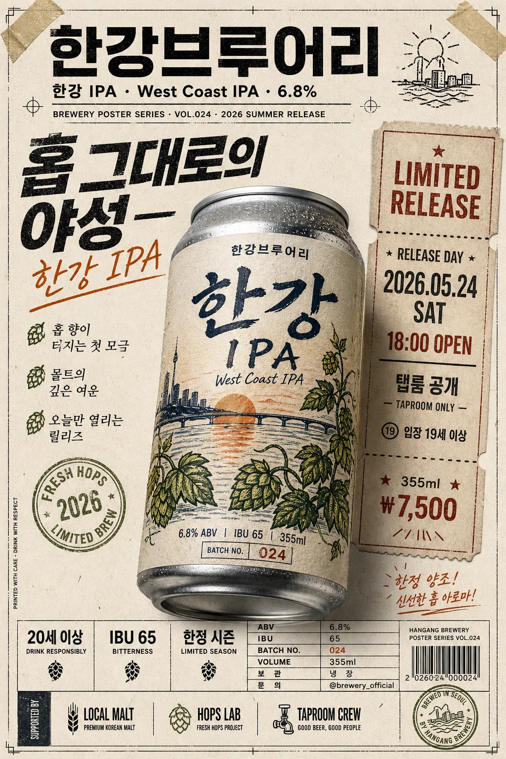
수제맥주 브루어리 신상 광고. 핸드드로잉 일러스트 라벨 + 인디 펑크 톤. 캔·병 mockup + 시그니처 카피.
수제맥주 광고 포스터 (IPA·스타우트 등) 검색 요약
수제맥주 광고 포스터 (IPA·스타우트 등)은 광고/포스터 결과물을 만들 때 바로 복사해 활용할 수 있는 ChatGPT 이미지 프롬프트입니다. 주제, 배경, 스타일, 구도 조건을 함께 담아 빠르게 시안을 만들 수 있도록 구성했습니다.
관련 키워드: 수제맥주 광고 포스터 (IPA·스타우트 등), 수제맥주 광고 포스터 (IPA·스타우트 등) 프롬프트, 광고/포스터 프롬프트, 광고/포스터 AI 이미지 프롬프트, ChatGPT 이미지 프롬프트, AI 이미지 생성 프롬프트, AI 프롬프트, 이미지 프롬프트
수제맥주 광고 포스터 (IPA·스타우트 등) 활용 포인트
원본 구조를 유지하면서 피사체, 배경, 색감, 구도를 바꿔 다양한 시안으로 확장할 수 있습니다.
- 핵심 소재는 유지하고 브랜드, 계절, 채널 목적에 맞는 색감과 배경을 바꿔보세요.
- 결과가 산만하면 배경 요소를 줄이고 피사체, 구도, 조명 조건을 구체화하세요.
- 복사한 뒤 ChatGPT에서 플랫폼, 화면 비율, 텍스트 포함 여부를 추가로 요청할 수 있습니다.
프롬프트 원문
[Input]
- language: Korean
- output_size: 1024x1536

[Purpose]
Korean craft beer advertising poster, indie brewery zine style, hand-drawn label-forward vertical poster for adult beer branding.
Poster should feel like a limited-release can or bottle campaign with modern typography, rough illustration textures, real product-ad information, release-event details, and tactile print materials.

[Composition]
- Primary subject: {제품 종류} close-up placed in the lower-middle 52% of the frame, angled slightly 10–15 degrees for dimensionality, with the label clearly readable and realistic metal/glass reflections.
- Brand hierarchy: {브루어리} appears as the brewery identifier in the top header zone, while {제품명·스타일·도수} sits as the main product title in a strong central typographic block.
- Background treatment: paper-like off-white base with recycled zine grain, faint halftone noise, screen-print texture, taped poster corners, small registration marks, and subtle ink smudges that feel naturally printed.
- Illustration placement: {라벨 일러스트} integrated directly on the label surface as hand-drawn artwork, with visible ink line variation, slightly imperfect edge registration, and label paper fibers.
- Copy placement: {카피 한 줄} positioned as the main slogan near the upper-middle or beside the product, supported by short Korean release blurbs such as “한정 양조”, “탭룸 선공개”, “신선한 홉 아로마”.
- Information block: {브랜드 정보} set in a compact footer area with small but legible text, aligned like an indie beer release sheet with spec rows, price, batch note, and contact line.
- Poster details: include event information in Korean — “RELEASE DAY”, “2026.05.24 SAT 18:00”, “탭룸 공개”, “입장 19세 이상”, “355ml / ₩7,500”, plus a small ticket-style strip and sponsor/support area.

[3. CORE STRUCTURE]
1. Header zone (top 15%): place {브루어리} in a bold modern sans-serif masthead style, then support it with a smaller secondary line for {제품명·스타일·도수}; add a tiny issue-style line such as “BREWERY POSTER SERIES · VOL.024 · 2026 SUMMER RELEASE”.
2. Main hero zone (mid 45%): render {제품 종류} as a realistic packaged product close-up, slightly enlarged, with crisp silhouette edges, label readability, condensation micro-beads or gentle paper-label texture depending on the package type, and a believable cast shadow on the printed poster surface.
3. Label zone: draw {라벨 일러스트} directly on the label with rough hand-drawn strokes, visible brush jitter, ink trapping, small batch-number details, and printed-poster texture so it feels like a small-batch brewery release.
4. Slogan zone: set {카피 한 줄} in a high-contrast typographic treatment, mixing condensed sans for the product mood with a subtle handwritten accent if needed; add 2–3 short supporting blurbs in Korean: “홉 향이 터지는 첫 모금”, “몰트의 깊은 여운”, “오늘만 열리는 릴리즈”.
5. Event and ticket zone: add a vertical side ticket strip or stamped panel reading “LIMITED RELEASE”, “2026.05.24 SAT”, “18:00 OPEN”, “TAPROOM ONLY”, “₩7,500”, with perforation dots, small arrows, starbursts, and hand-drawn divider lines.
6. Info footer (bottom 15%): place {브랜드 정보} as a compact beer-spec block, aligned in a neat grid with small separators, including “ABV”, “IBU”, “BATCH NO. 024”, “355ml”, “보관: 냉장”, “문의: @brewery_official”, and a tiny barcode-style area that reads as packaging/poster detail rather than an official certification.
7. Sponsor / support area: include a small row at the bottom or side labeled “SUPPORTED BY LOCAL MALT · HOPS LAB · TAPROOM CREW” with tiny logo-like wordmarks, simple icons of hops/barley, and decorative dividers.
8. Final polish: keep the overall composition poster-like and collector-zine-like, with balanced asymmetry, layered print artifacts, tactile material detail, strong product emphasis, and clear separation between illustration, typography, event information, and product packshot.

[4. STYLE RULES]
- Typography: Pretendard Bold / Noto Sans KR SemiBold for headers, Noto Sans KR Regular for details, and optional hand-drawn accent lettering for the slogan; title size should feel large enough for a 1024x1536 poster, with clear hierarchy.
- Color palette: {컬러 톤} should dominate, supported by off-white paper #F4F0E6, ink black #171717, muted neutral shadow tones, and small accent blocks for the ticket strip, batch label, and hops/barley icons.
- Border/shadow: thin printed-border feel with soft offset shadow 4px y-offset, 10–12px blur, 14% opacity, like a screen-printed poster layered on paper; add slight paper curl or taped-corner depth.
- Print texture: add halftone dots, slightly uneven ink edges, risograph-style color misregistration, small scuffs, paper fibers, and tiny speckles; avoid polished corporate-ad perfection while preserving premium craft quality.
- Decorative graphic elements: include hand-drawn hops, barley stems, small arrows, starbursts, measurement ticks, batch-number stamps, and a perforated ticket motif around the product without covering the key label text.

[5. VISUAL STYLE]
- Camera / lens: product-poster realism with a 50mm prime look, f/4 framing, slightly elevated front-facing composition, as if shot for a craft-beer campaign reference board.
- Lighting: soft studio key light from upper-left at about 45°, gentle fill from front-right, controlled specular highlights so the label remains readable and the can/bottle edge stays crisp.
- Color grade: deep orange + dark green + cream white with muted print blacks, slightly desaturated midtones, warm paper highlights, and rich ink density in the headline and label art.
- Material realism: realistic aluminum can rim or bottle glass thickness, label seam, tiny condensation beads if appropriate, subtle dents or manufacturing imperfections, and a grounded contact shadow on the paper-poster background.

[6. MOOD]
Indie craft-beer zine poster — a mix of Vice magazine editorial energy and refined Korean taproom design, with the tactile feel of a small-batch brewery release, a real event poster, and a collectible limited-can campaign.

[7. CRITICAL]
- Korean text accuracy: 반드시 아래 문구가 이미지에 정확히 보여야 함: "{브루어리}", "{제품명·스타일·도수}", "{카피 한 줄}", "{브랜드 정보}"
- Additional Korean poster text should be readable and theme-fit: “한정 양조”, “탭룸 선공개”, “2026.05.24 SAT 18:00”, “입장 19세 이상”, “355ml / ₩7,500”, “보관: 냉장”, “문의: @brewery_official”.
- Label illustration must remain hand-drawn and rough, not vector-flat corporate art.
- Adult-only alcohol branding tone: no people drinking, no intoxication cues, no youthful or school-related imagery; the product can be promoted as a release poster or taproom announcement.
- If English text appears in the design, it must be clean and spelled correctly; no broken Hangul or garbled mixed text.

[8. 🚫 PROHIBITED]
- Fake official seals / certifications
- Broken Korean characters
- Celebrity composites or unauthorized likeness