廣告/海報
와인 광고 포스터 (레드·화이트·스파클링)
와인 신제품·시즌 광고. 럭셔리 매거진 톤. 보틀 + 글라스 + 우드 + 로고. 매끈한 미니멀 레이아웃.
와인 광고 포스터 (레드·화이트·스파클링)摘要
這是用來製作廣告/海報內容的 ChatGPT 圖像提示詞,已整理主題、背景、風格與構圖,方便快速調整。
相關關鍵字: 와인 광고 포스터 (레드·화이트·스파클링), 와인 광고 포스터 (레드·화이트·스파클링) 프롬프트, 廣告/海報 프롬프트, 廣告/海報 AI 이미지 프롬프트, ChatGPT 이미지 프롬프트, AI 이미지 생성 프롬프트, AI 프롬프트, 이미지 프롬프트
와인 광고 포스터 (레드·화이트·스파클링)使用方式
保留原始結構並替換主體、背景、色彩或構圖,即可延伸出不同版本。
- 保留核心主體,並依品牌、季節或平台調整色彩與背景。
- 如果畫面太複雜,請減少背景元素並具體描述主體、構圖與光線。
- 複製後可要求 ChatGPT 配合平台、長寬比或文字需求調整。
提示詞原文
[Input]
- language: Korean
- output_size: 1024x1536

[Purpose]
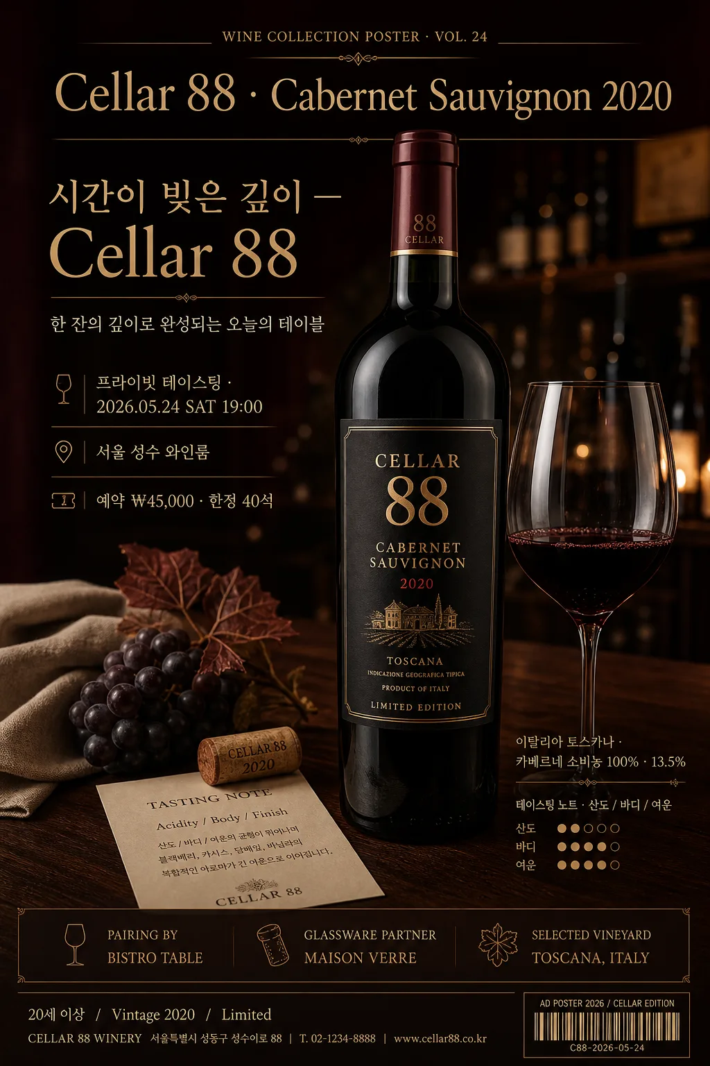
Luxury wine advertisement poster in a magazine-editorial style, designed for a premium bottle-centered brand campaign. Emphasize a refined adult-only wine aesthetic with clear label legibility, realistic still-life richness, and elegant commercial polish suitable for a full-page printed poster.

[Composition]
- Vertical poster composition with the bottle as the primary hero occupying about 58% of the frame height, slightly off-center for a premium editorial balance.
- Place {브랜드명·빈티지} prominently near the upper third, with the bottle and glass arranged on a dark wood table plane below.
- Build a realistic luxury wine still life around the hero bottle: polished dark walnut surface, folded linen napkin, cork, small tasting card, subtle grape vine or dried botanical accent, and soft reflections on the glassware.
- Background should feel like an intimate premium wine bar or cellar corner, using deep brown and burgundy gradients, blurred shelving silhouettes, candle-like warm highlights, and matte paper poster depth.
- Keep {와인 종류} visually consistent with the bottle presentation and glass pour styling: red wine with deep ruby body, white wine with pale gold clarity, sparkling wine with fine bubbles and champagne flute cues.
- Use {시각 컨셉} as the core scene structure and {컬러 톤} as the dominant visual palette.
- Include refined poster information blocks: a small tasting event line, date/time/venue, reservation or ticket note, sponsor area, and decorative gold divider rules that support the luxury campaign without overpowering the bottle.
- {브랜드 정보} appears as a precise footer line with address/contact-style polish.
- The layout should feel premium and content-rich, with the label and bottle silhouette immediately readable at first glance.

[3. CORE STRUCTURE]
1. Top header zone (12%): set {브랜드명·빈티지} in a refined editorial masthead style, centered or slightly left-aligned, with generous tracking and clean spacing. Add a tiny poster series label such as “WINE COLLECTION POSTER · VOL. 24” above or beside it.
2. Hero zone (middle 58%): render a single elegant wine bottle on the dark wood table, with a partially poured glass beside it; the bottle label must be the visual focal point and fully legible. Add realistic table details such as cork texture, condensation or glass reflection, a folded ivory tasting note card, and soft ambient bokeh in the background.
3. Secondary detail zone: place {원산지·품종·도수} as a clean small-text line near the bottle base or lower right, aligned with the luxury ad hierarchy. Add a second micro-detail line in Korean: “테이스팅 노트 · 산도 / 바디 / 여운”.
4. Main copy zone: position {카피 한 줄} as the main emotional line, with elegant spacing and a strong editorial hierarchy. Support it with short Korean subcopy such as “한 잔의 깊이로 완성되는 오늘의 테이블”.
5. Event detail zone: include realistic poster details in Korean: “프라이빗 테이스팅 · 2026.05.24 SAT 19:00”, “서울 성수 와인룸”, “예약 ₩45,000 · 한정 40석”. Use small caps, refined dividers, and antique gold accents.
6. Sponsor / partner zone: add a small sponsor area with text such as “PAIRING BY BISTRO TABLE · GLASSWARE PARTNER MAISON VERRE” and tiny line icons for glass, cork, and vineyard leaf.
7. Footer zone (bottom 8%): place {브랜드 정보} in small, precise type, maintaining an adult-only, certified-free commercial look. Include a tiny barcode-style rectangle or catalog code area labeled “AD POSTER 2026 / CELLAR EDITION” for printed realism, not as a certification mark.

[4. STYLE RULES]
- Typography: use Pretendard SemiBold or Noto Sans KR Medium for Korean text, paired with a refined serif like Cormorant Garamond or Playfair Display for the brand-style headline; headline size large, supporting text small and crisp.
- Color palette: deep burgundy #4A1020, dark brown #2A1A14, antique gold #C8A45D, warm black #111111, soft ivory #F3EBDD.
- Border/shadow: subtle soft drop shadow under the bottle, 4px y-offset, 14px blur, 18% opacity; no harsh outline, no glossy sticker effects.
- Add tasteful editorial decoration: thin antique-gold divider lines, small wine-spec glyphs, delicate corner registration marks, and a restrained barcode/catalog block that makes the poster feel commercially printed.
- Surface realism: show wood grain, glass caustics, cork pores, linen weave, paper texture, and gentle specular highlights on the bottle shoulder.
- Keep label typography sharp, aligned, and premium; the design should feel like a high-end wine magazine ad on matte paper.

[5. VISUAL STYLE]
- Camera / lens: full-frame product photography, 85mm f/1.4 lens, medium close-up on bottle and glass, shallow depth of field with the label in sharp focus.
- Lighting: soft directional light from upper-left at about 45°, with a gentle rim light from right to shape the bottle curves; controlled reflections only, no blown highlights.
- Color grade: rich burgundy and dark walnut shadows with restrained gold accents, slightly warm editorial toning, high contrast but elegant.
- Rendering quality: realistic commercial product photography merged with premium poster typography; accurate glass refraction, believable wine color density, natural bottle curvature, and matte print finish.

[6. MOOD]
Premium wine magazine advertisement — think Condé Nast-style luxury still life with the polished restraint of a high-end vineyard editorial, enriched with the atmosphere of a private evening tasting at an elegant cellar table.

[7. CRITICAL]
- Korean text accuracy: 반드시 아래 문구가 이미지에 정확히 보여야 함: {브랜드명·빈티지}, {원산지·품종·도수}, {카피 한 줄}, {브랜드 정보}
- 추가 포스터 문구는 선명한 한국어로 표시: “프라이빗 테이스팅 · 2026.05.24 SAT 19:00”, “서울 성수 와인룸”, “예약 ₩45,000 · 한정 40석”, “테이스팅 노트 · 산도 / 바디 / 여운”.
- Label legibility: bottle label text must be sharp, clean, and fully readable in both Korean and English where applicable.
- Adult-only commercial tone: keep the scene sophisticated and responsible, with no intoxication cues and no youthful styling.
- The bottle, glass, cork, table plane, reflections, and label must remain anatomically and perspectively plausible with realistic proportions.

[8. 🚫 PROHIBITED]
- Fake official seals / certifications
- Broken Korean characters