Ads/Posters
하이볼·논알콜 광고 포스터 (트렌드)
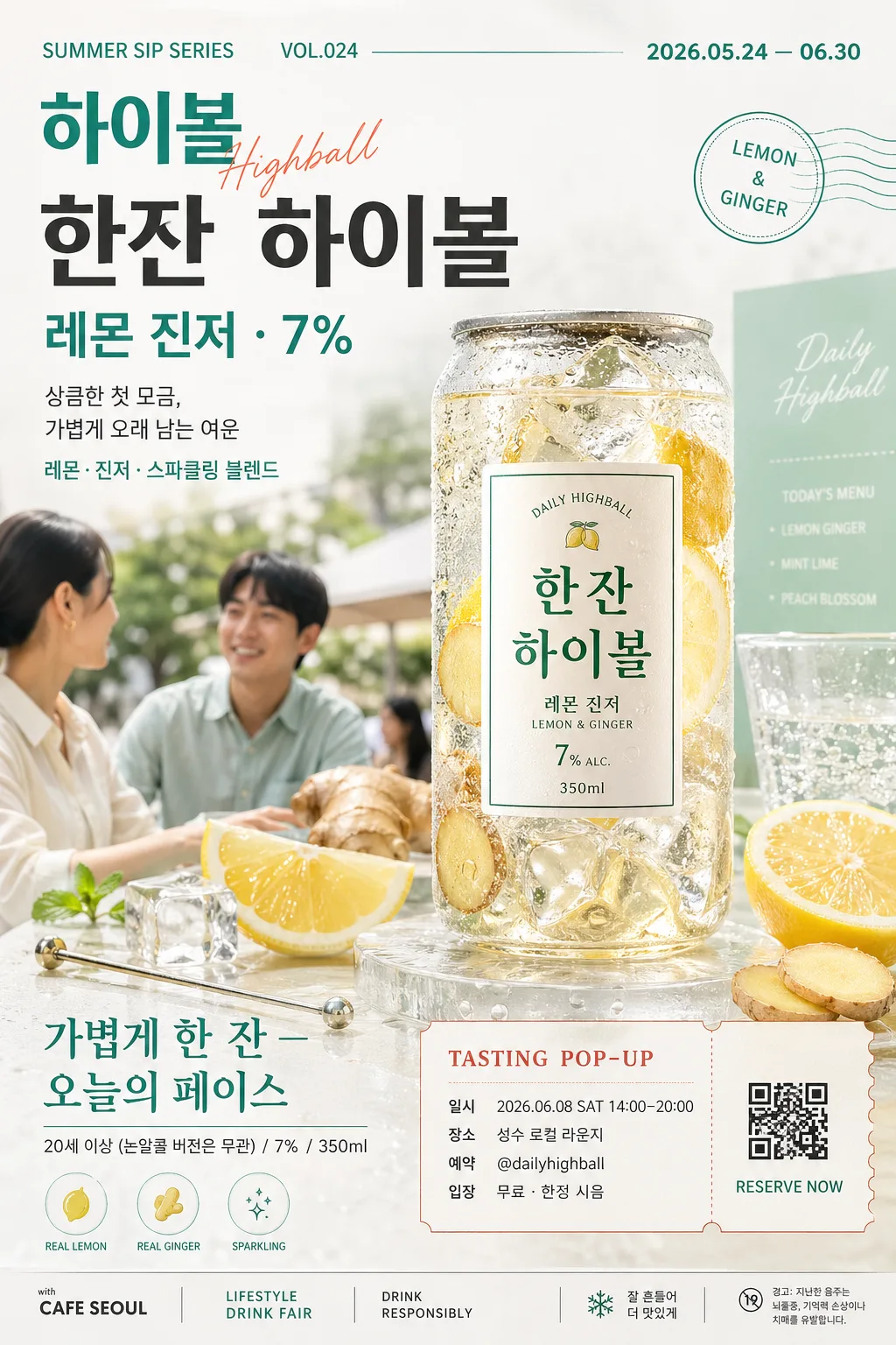
하이볼·논알콜 시즌 광고. 캐주얼·트렌디 톤. 캔·병 + 얼음 + 가벼운 무드.
하이볼·논알콜 광고 포스터 (트렌드) summary
Copy this ChatGPT image prompt to create Ads/Posters results. Its subject, background, style, and composition are organized for quick iteration.
Related keywords: 하이볼·논알콜 광고 포스터 (트렌드), 하이볼·논알콜 광고 포스터 (트렌드) 프롬프트, Ads/Posters 프롬프트, Ads/Posters AI 이미지 프롬프트, ChatGPT 이미지 프롬프트, AI 이미지 생성 프롬프트, AI 프롬프트, 이미지 프롬프트
How to use 하이볼·논알콜 광고 포스터 (트렌드)
Keep the prompt structure and swap the subject, background, palette, or composition to create new variations.
- Keep the main subject and adjust the palette and background for your brand, season, or channel.
- If the result feels busy, simplify the background and make the subject, composition, and lighting more specific.
- After copying, ask ChatGPT to adapt it for your platform, aspect ratio, or text requirements.
Original prompt
[Input]
- language: Korean
- output_size: 1024x1536

[Purpose]
Korean lifestyle beverage advertising poster for a trendy highball or non-alcoholic cocktail, designed for Instagram, café wall display, pop-up store promotion, and lifestyle magazine placement.
Casual editorial commercial poster with a transparent can/bottle hero, realistic chilled condensation, fresh garnish cues, event-style campaign information, and premium retail appeal.

[Composition]
- Main hero product is placed slightly right of center, occupying about 42% of the frame height, with {브랜드·제품명·도수} as the primary focal point.
- Supporting lifestyle scene uses {모델 톤} in a softly cropped background layer, keeping the face and body secondary to the product while still feeling like a real café terrace or studio pop-up moment.
- Background is a bright white-to-mint beverage campaign set with a lightly textured tabletop, frosted acrylic riser, small condensation puddles, café menu-card edges, and natural garnish details that support the product story.
- Maintain strong readability around the headline and product label through layered typography, soft tonal separation, and realistic product-lighting contrast.
- Use {제품 카테고리}, {시각 컨셉}, {컬러 톤}, and {브랜드 정보} as customizable content anchors.
- Add believable poster information elements: campaign date, tasting event details, venue line, ticket/QR-style reservation block, sponsor strip, and small legal-style product notes in Korean.

[3. CORE STRUCTURE]
1. Header zone (top 15%): set a trendy poster headline treatment with the product category first, then the product name and alcohol detail as a compact subline, aligned to the left. Include small uppercase campaign text such as “SUMMER SIP SERIES”, “VOL.024”, and a Korean date label “2026.05.24 — 06.30”.
2. Hero product zone (center-right 42%): render the transparent can or bottle with crisp condensation, visible ice, lemon peel, ginger slice, sparkling bubbles, and a reflective wet base; the label must be the sharpest element in the frame.
3. Lifestyle layer (left-lower 30%): add {모델 톤} as a natural, candid editorial presence, with a relaxed hand near the table, linen shirt sleeve, shoulder framing, or soft profile crop; the model should feel like part of a premium café campaign rather than a direct sales pose.
4. Ingredient / freshness accents: place lemon slices, ginger pieces, ice cubes, mint leaves, a metal stirrer, a small clear glass with sparkling bubbles, and a folded tasting note card around the base and edge areas, arranged like a premium café product shoot.
5. Color harmony: apply {컬러 톤} across background gradients, garnish accents, poster stickers, and small graphic elements, keeping the can/bottle label high-contrast and readable.
6. Copy block (lower 20%): place the main copy {카피 한 줄} in a bold but airy layout, with supporting brand info {브랜드 정보} in small neat text underneath. Add short Korean subcopy lines such as “상큼한 첫 모금, 가볍게 오래 남는 여운” and “레몬·진저·스파클링 블렌드”.
7. Event details and CTA area: include a small ticket-style block near the bottom or lower-right with “TASTING POP-UP”, “일시 2026.06.08 SAT 14:00–20:00”, “장소 성수 로컬 라운지”, “예약 @dailyhighball”, and “입장 무료 · 한정 시음”. Add a small square QR-code-like placeholder graphic that looks decorative, not scannable.
8. Sponsor / retail strip: add a thin bottom sponsor area with small Korean text such as “with CAFE SEOUL”, “LIFESTYLE DRINK FAIR”, “DRINK RESPONSIBLY”, plus tiny icons for ice, lemon, and sparkle.
9. Finish: add subtle editorial motion cues such as soft splash droplets, fizz bubbles, chilled condensation trails, and reflective highlights so the poster feels photographed and printed rather than flat.

[4. STYLE RULES]
- Typography: Pretendard or Noto Sans KR for the main copy, Bold 700–800 for the headline, Medium 500 for supporting text, with tight but breathable line spacing. Use small condensed English labels for campaign metadata and sponsor strip.
- Color palette: {컬러 톤} plus off-white #F7F7F2, pale mint #DDEFE5, lemon yellow #F6E56B, coral accent #F4A08A, dark charcoal #232323 for text.
- Graphic system: layered poster typography, small rounded sticker tags, thin warm-gray dividers, ticket-style information box, tiny icon row, and café campaign microcopy.
- Border/shadow: soft product drop shadow with 4px y-offset, 14px blur, 16% opacity; optional thin divider line in warm gray #D9D9D2; realistic glass reflections and wet-surface highlights.
- Text hierarchy: product/category at top, hero label in center-right, main copy in lower block, event and sponsor information at bottom.

[5. VISUAL STYLE]
- Camera / lens: high-end studio beverage photography, 85mm f/2.0 on full-frame or 50mm f/1.8 for a slightly wider lifestyle-commercial feel, sharp focus on label and condensation.
- Lighting: softbox key light from upper-left at 45°, gentle fill from front-right, subtle rim light from behind to outline the transparent can/bottle and ice.
- Color grade: fresh mint-white editorial grade with lemon highlights and slightly lifted blacks, similar to modern Korean café brand campaigns and Condé Nast-style lifestyle ads.
- Material realism: transparent packaging, glossy label ink, chilled aluminum or glass, crushed ice translucency, citrus pulp texture, mint leaf veins, tiny water droplets, paper ticket fibers, and matte printed poster graphics.

[6. MOOD]
Premium café-lifestyle beverage campaign — modern Korean editorial poster with a polished Kinfolk x Aesop commercial feel, enriched with a believable pop-up tasting event atmosphere and fresh summer retail energy.

[7. CRITICAL]
- Korean text accuracy: 반드시 아래 문구가 정확히 보여야 함.
  - {제품 카테고리}
  - {브랜드·제품명·도수}
  - {카피 한 줄}
  - {브랜드 정보}
- Additional Korean poster text may appear and should be clean and readable, for example: “2026.05.24 — 06.30”, “상큼한 첫 모금, 가볍게 오래 남는 여운”, “일시 2026.06.08 SAT 14:00–20:00”, “장소 성수 로컬 라운지”, “예약 @dailyhighball”, “입장 무료 · 한정 시음”.
- The can/bottle label must remain legible and centered as the main visual point.
- Adult-appropriate commercial tone only; no underage cues, no intoxication, no explicit drinking pose.
- If a model appears, keep proportions natural and anatomy correct, with realistic hands and no distorted fingers.

[8. 🚫 PROHIBITED]
- Fake official seals / certifications
- Broken Korean characters
- Celebrity composites or unauthorized likeness