写真加工・フィルター
레스토랑 메뉴 푸드 포토
프로 푸드 포토. Hasselblad 중형 + 셀러 라이팅 + top-down/45도. 레스토랑 메뉴·푸드 매거진·쇼핑몰 활용.
레스토랑 메뉴 푸드 포토の概要
写真加工・フィルター画像を作るためのChatGPT画像プロンプトです。主題、背景、スタイル、構図を整理し、すぐに試せるよう構成しています。
関連キーワード: 레스토랑 메뉴 푸드 포토, 레스토랑 메뉴 푸드 포토 프롬프트, 写真加工・フィルター 프롬프트, 写真加工・フィルター AI 이미지 프롬프트, ChatGPT 이미지 프롬프트, AI 이미지 생성 프롬프트, AI 프롬프트, 이미지 프롬프트
레스토랑 메뉴 푸드 포토の活用方法
元の構造を保ちながら、被写体、背景、色、構図を変更して別案に展開できます。
- 主題を維持し、ブランドや季節、媒体に合わせて色と背景を変更してください。
- 結果が複雑な場合は背景要素を減らし、被写体、構図、照明を具体化してください。
- コピー後、ChatGPTに媒体、アスペクト比、文字の有無を追加で指定できます。
プロンプト原文
[Input]
- language: Korean
- output_size: 1024x1536

[Purpose]
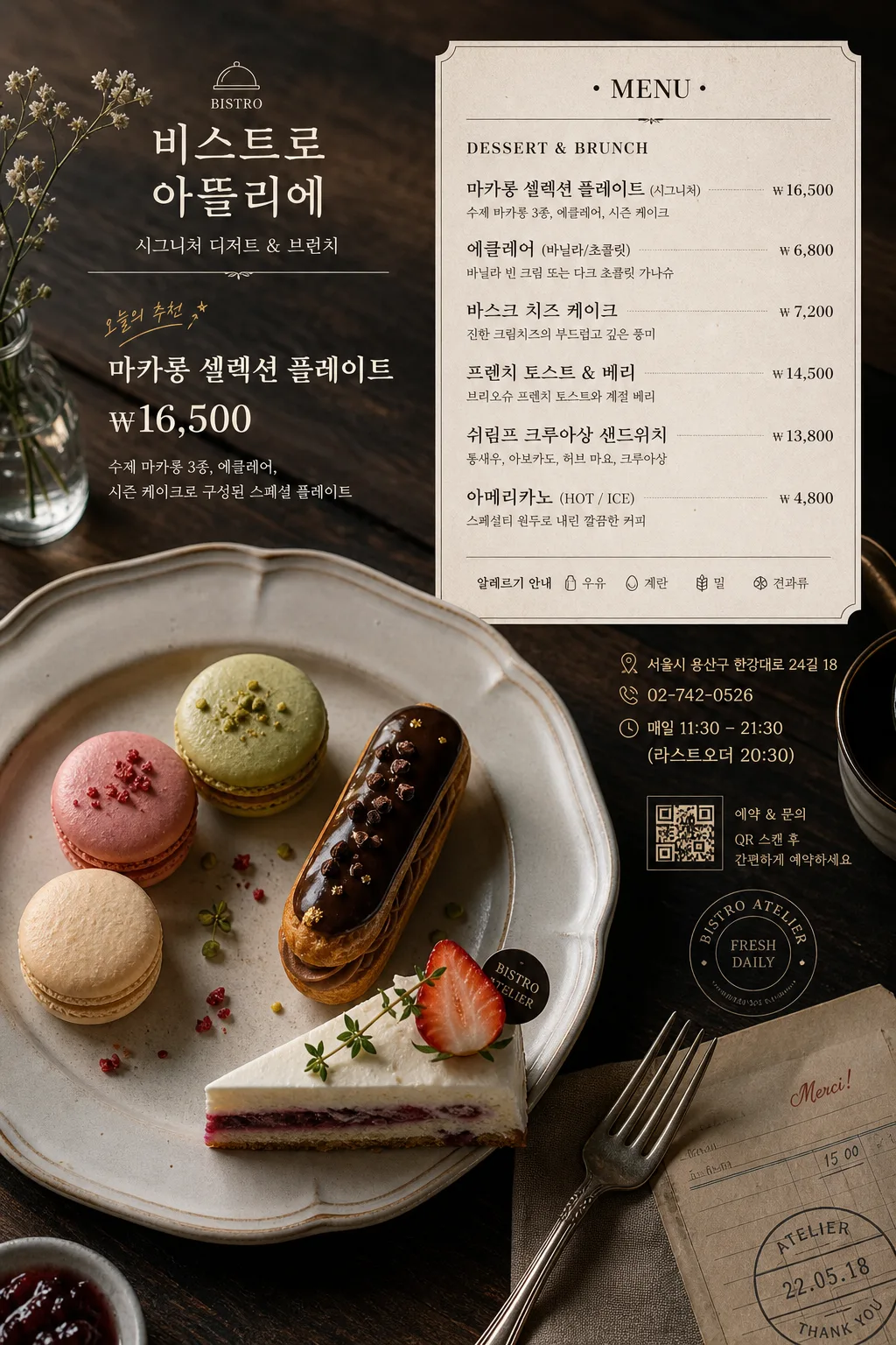
Professional food photography layout for a restaurant menu, in-store pricelist, and delivery-app promo, with a magazine-quality editorial finish.
Vertical full-bleed food image that combines premium plated food photography with realistic Korean menu information, ready for print menu use, Instagram, and premium delivery listings.

[Composition]
- Main food area occupies about 60–65% of the frame, with {메뉴 모티프} presented as the hero subject and a designed menu-information zone integrated along the upper or side area.
- Background uses {배경·소품} as a tactile restaurant surface, including real tabletop texture, fabric folds, utensil reflections, crumbs, sauce sheen, garnish fragments, and small service details that naturally fit the dish.
- Composition follows {구도}, with framing that emphasizes the dish silhouette, ingredient texture, plated balance, and printed menu usability.
- The dish should read as the primary hero, while supporting props such as folded linen, cutlery, small sauce dish, water glass rim, receipt corner, or menu card reinforce restaurant mood and scale.
- Use {메뉴 모티프} as the exact food subject, arranged with natural asymmetry, appetizing garnish placement, and premium plating discipline.

[3. CORE STRUCTURE]
- Hero plating zone: {메뉴 모티프} rendered as the central subject, with crisp edges, visible surface texture, realistic moisture, browned edges, cream layers, glaze, garnish, or ingredient detail appropriate to the dish.
- Menu/pricelist zone: add a refined Korean menu block for {매장명}, including category title, 4–6 menu items, prices, short descriptions, address, contact, and business hours, laid out like a premium restaurant menu overlay or printed menu card placed on the table.
- Information hierarchy: include {대표메뉴명} as the highlighted dish name, {대표가격} as the main price, and a smaller “오늘의 추천” or “시그니처” label near the hero dish.
- Surface and base: place the dish on {배경·소품}, allowing wood grain, slate texture, linen weave, ceramic glaze, metal cutlery, and soft contact shadows to enrich the restaurant atmosphere.
- Light-and-shadow structure: shape highlights so the food surface looks dimensional, with controlled shadow falloff, believable reflections on glaze or sauce, and no plastic-looking shine.
- Atmosphere detail: keep 음식 텍스처·증기·스팀 자연스럽게, with realistic heat cues only where appropriate, such as subtle warmth above noodles, soup, steak, or fresh pastry.
- Final polish: maintain a premium magazine-food aesthetic for {용도}, with natural color fidelity, elegant typography placement, and commercial menu readability.

[4. STYLE RULES]
- Typography: include Korean menu typography in a tasteful editorial layout, mixing a refined serif-style headline with small sans-serif details; text should look printed or professionally overlaid, aligned with dividers and price columns.
- Menu details: show {매장명}, {메뉴카테고리}, {대표메뉴명}, {대표가격}, {주소}, {연락처}, {영업시간}, and 4–6 additional item lines with realistic won prices.
- Graphic accents: use thin divider lines, small dot leaders, tiny allergen-style icons, a small QR-style reservation mark, and subtle section labels, all integrated with the food photo rather than floating randomly.
- Color palette: natural food colors balanced with deep neutrals from {컬러·톤}; include dark walnut brown, slate gray, warm cream, muted beige, ink black, and subdued accent tones.
- Print finish: menu panel or card may have soft paper texture, slight shadow, rounded corners, foil-like dark ink accents, or a small stamped date label to feel like an actual restaurant menu.

[5. VISUAL STYLE]
- Camera / lens: {카메라·렌즈}, with premium medium-format clarity and controlled depth separation.
- Lighting: {라이팅}, mimicking soft studio daylight from one side and creating natural, controlled shadows across plate, paper, utensils, and tabletop.
- Color grade: {컬러·톤}, natural food color fidelity with a slightly dark matte magazine grade, restrained contrast, and elegant tonal separation.
- Rendering quality: high-resolution commercial food photo realism, tactile paper and tabletop detail, readable Korean typography, realistic ceramic, glass, metal, sauce, crumb, and garnish materials.

[6. MOOD]
Premium editorial food still life — akin to a high-end restaurant menu spread and boutique bistro print menu, with refined commercial polish, appetizing realism, and a warm dining-table atmosphere.

[7. CRITICAL]
- Korean text accuracy: render legible Korean menu text, including “{매장명}”, “{메뉴카테고리}”, “대표 메뉴”, “{대표메뉴명}”, “{대표가격}”, “오늘의 추천”, “주소 {주소}”, “문의 {연락처}”, “영업시간 {영업시간}”.
- Add realistic sample item lines in Korean, such as “트러플 크림 파스타 ₩18,000”, “한우 채끝 스테이크 ₩42,000”, “계절 샐러드 ₩13,000”, “바닐라 에클레어 ₩7,500”, with aligned prices and small descriptions.
- Maintain realistic food anatomy and plating structure: the dish must look physically possible, with believable ingredients, portions, temperature cues, utensils, and surface texture.
- Keep the layout consistent with restaurant-menu usage: readable, appetizing, commercially usable, and suitable for {용도}.

[8. 🚫 PROHIBITED]
- Fake official seals / certifications
- Broken Korean characters
- Celebrity composites or unauthorized likeness mashups