廣告/海報
두쫀쿠 SNS 광고 캠페인 카드
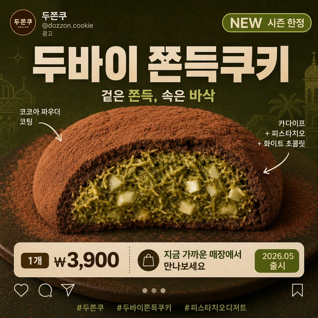
두쫀쿠 사진 첨부하면 롯데시네마·메가박스·CGV·편의점 PB 캠페인 톤의 광고 SNS 카드로 변환. 매거진 톤 X — 큰 한글 카피 + 음식 단면 강조 + 깔끔한 배경. 인스타·매대·매장 광고 활용.
두쫀쿠 SNS 광고 캠페인 카드摘要
這是用來製作廣告/海報內容的 ChatGPT 圖像提示詞,已整理主題、背景、風格與構圖,方便快速調整。
相關關鍵字: 두쫀쿠 SNS 광고 캠페인 카드, 두쫀쿠 SNS 광고 캠페인 카드 프롬프트, 廣告/海報 프롬프트, 廣告/海報 AI 이미지 프롬프트, ChatGPT 이미지 프롬프트, AI 이미지 생성 프롬프트, AI 프롬프트, 이미지 프롬프트
두쫀쿠 SNS 광고 캠페인 카드使用方式
保留原始結構並替換主體、背景、色彩或構圖,即可延伸出不同版本。
- 保留核心主體,並依品牌、季節或平台調整色彩與背景。
- 如果畫面太複雜,請減少背景元素並具體描述主體、構圖與光線。
- 複製後可要求 ChatGPT 配合平台、長寬比或文字需求調整。
提示詞原文
[Input]
- reference_image: {참고 이미지}
- language: Korean
- output_size: 1024x1024

[Purpose]
Korean dessert SNS campaign card, square 1:1 Instagram-style advertising layout, photoreal food composite with bold promotional copy.
Retail cinema / convenience-store PB ad aesthetic, centered product hero with explanatory arrow labels, account handle, campaign badge, price/CTA, hashtag line, and subtle save/share micro icons for a realistic social feed impression.

[Composition]
- Subject placement: {원본 보존} food hero centered and enlarged to occupy about 60–65% of the frame, with the cut face clearly visible and slightly angled for depth.
- Text placement: {메인 카피} as the dominant headline near the upper third or strong side block, {서브 카피} placed as a smaller supporting line below or opposite the headline.
- Social ad header: add a compact top-left account label with {브랜드명} and {인스타 핸들}, plus a small {프로모션 배지} tag near the headline.
- Annotation system: {화살표 라벨 가이드} should use thin clean arrows and compact Korean labels that precisely match the pointed surface.
- Purchase information: include {가격 문구} and {CTA 문구} as a readable lower information strip or rounded sticker-style callout.
- Social micro UI: add small save/share/like-style micro icons, carousel dot indicator, and {해시태그 문구} near the lower edge as if this is a polished Instagram ad card.
- Background treatment: {배경 톤} with subtle campaign-grade texture, soft gradient, cocoa dust speckles, faint geometric patterning, or gentle paper-like grain that supports the dessert mood.
- Framing direction: {구도} with copy zones arranged around the product while keeping the cut section readable, sharp, and visually dominant.

[3. CORE STRUCTURE]
1) Hero food layer — {원본 보존} as a photoreal cutout, preserving the matte cocoa powder surface, rough kataifi interior, pistachio green, and white chocolate granularity exactly as seen in the reference.
2) Brand/social header layer — {브랜드명}, {인스타 핸들}, and a small “Sponsored” or “광고” style marker, rendered like a real Korean SNS campaign post header without overpowering the product.
3) Main headline layer — {메인 카피} set in large bold Korean sans-serif, positioned so it does not cover the cut face or arrow endpoints.
4) Subcopy layer — {서브 카피} in a smaller supporting weight, aligned with the campaign composition and kept visually subordinate to the headline.
5) Campaign badge layer — {프로모션 배지} in a rounded capsule, sticker, or small ribbon graphic using pistachio green, cream, or cocoa brown accents.
6) Arrow labeling layer — {화살표 라벨 가이드} rendered with thin, precise lines and small Korean labels, each label pointing to the correct material region only.
7) Commerce and CTA layer — {가격 문구}, {CTA 문구}, and {캠페인 날짜} arranged as realistic ad information, such as a bottom band, small coupon tag, or caption-like line.
8) Instagram detail layer — {해시태그 문구}, small save/share/like micro icons, and a 3-dot carousel indicator to make the card feel like an actual SNS ad creative.
9) Background finish — {배경 톤} with a polished Korean dessert ad look, including refined grain, cocoa-powder speckles, soft radial lighting, and gentle accent graphics that frame the product.

[4. STYLE RULES]
- Typography: Pretendard Black, Sandoll Gothic Bold, or Cafe24 Ssurround style for the main copy at about 72–110 px equivalent; subcopy in Pretendard Medium or Noto Sans KR at about 28–40 px equivalent.
- Color palette: use {배경 톤} as the base, with charcoal black, cream white, cocoa brown, and accent greens matching the pistachio tones in the reference.
- Social UI text: {인스타 핸들}, {해시태그 문구}, {캠페인 날짜}, and micro-labels should be smaller but legible, using Noto Sans KR or Pretendard Regular/Medium.
- Badge and CTA styling: {프로모션 배지} and {CTA 문구} may use rounded rectangles, ticket-stub edges, small arrow icons, cocoa bean motifs, pistachio-green highlights, or cream sticker shapes.
- Border/shadow: subtle soft drop shadow under the food only, around 4px y-offset, 12px blur, 15% opacity; arrows should stay fine and precise.
- Layout realism: make the design feel like a finished Korean Instagram ad card with headline hierarchy, product callouts, commerce information, hashtags, and social micro-icons all balanced in a 1024x1024 frame.

[5. VISUAL STYLE]
- Camera / lens: photoreal product-shot look, 85mm lens at f/4 equivalent for a clean commercial food portrait, crisp focus on the cut surface and surface texture.
- Lighting: studio softbox from upper-left at about 45°, with a gentle fill from the right and controlled specular glare so the cocoa powder remains matte and realistic.
- Color grade: cinematic Korean dessert campaign grade with cocoa brown, deep olive, cream ivory, and pistachio green balanced in a clean retail-ad palette.
- Material detail: preserve powdery cocoa bloom, crumb fragments, uneven kataifi strands, pistachio paste color variation, and white chocolate pieces with realistic micro-shadowing.
- Graphic finish: crisp vector-like Korean typography and arrows composited over photoreal food, with subtle texture in the background rather than flat empty color.

[6. MOOD]
Premium Korean dessert campaign card — cinema chain concession ad meets convenience-store PB launch poster and Instagram sponsored post, polished and commercial like a seasonal dessert drop with appetizing product close-up, playful labels, and shareable social-feed energy.

[7. CRITICAL]
- Korean text accuracy: 반드시 정확히 렌더링할 문구: "두바이 쫀득쿠키", "겉은 쫀득, 속은 바삭", "@dozzon.cookie", "NEW 시즌 한정", "1개 ₩3,900", "지금 가까운 매장에서 만나보세요".
- Required visible SNS details: 브랜드명 "두쫀쿠", 캠페인 날짜 "2026.05 출시", 해시태그 "#두쫀쿠 #두바이쫀득쿠키 #피스타치오디저트"를 작은 보조 요소로 포함.
- Arrow-label integrity: the arrow pointing to the cocoa-coated outer surface must be labeled as the outer cocoa coating only, and the arrow pointing to the interior cut face must be labeled as the kataifi / pistachio / white chocolate interior only.
- Preserve the original dessert identity, shape, cocoa powder tone, and rough cut-face texture; do not smooth out the interior.
- Food cutout must remain photoreal and anatomically plausible to the original dessert shape.

[8. 🚫 PROHIBITED]
- Fake official seals / certifications
- Broken Korean characters
- Misaligned arrow-label targets
- Celebrity composites or unauthorized portrait likeness