広告・ポスター
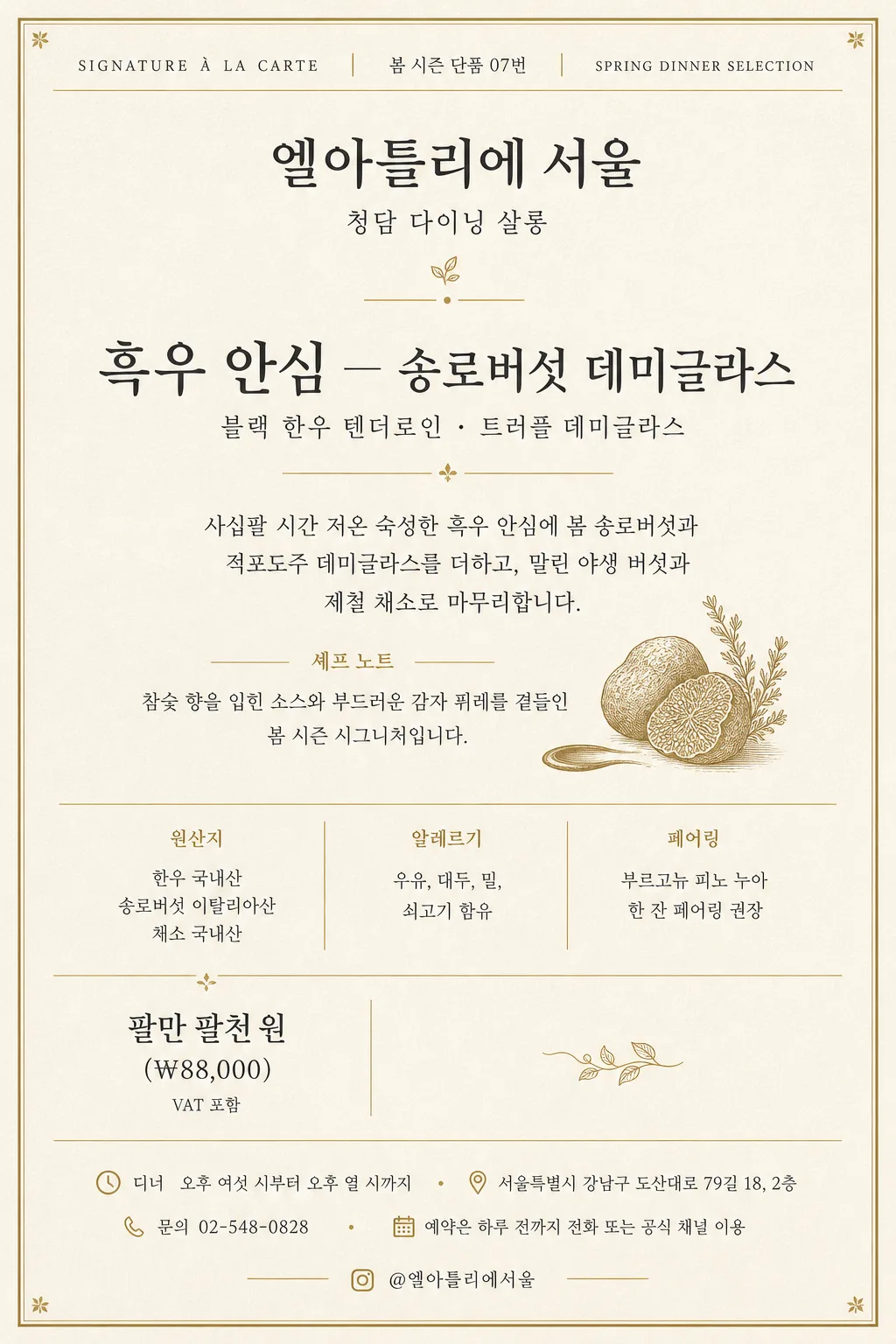
미슐랭 시그니처 단품 메뉴 카드 (크림·골드)
미슐랭 파인다이닝 단품 시그니처 메뉴 카드. 크림·아이보리 배경 + 가는 골드 라인 + 본명조·Trajan 세리프. 단일 메뉴 + 디스크립션 1~2줄 + 가격. 매장 입구·인스타·웰컴카드 활용.
미슐랭 시그니처 단품 메뉴 카드 (크림·골드)の概要
広告・ポスター画像を作るためのChatGPT画像プロンプトです。主題、背景、スタイル、構図を整理し、すぐに試せるよう構成しています。
関連キーワード: 미슐랭 시그니처 단품 메뉴 카드 (크림·골드), 미슐랭 시그니처 단품 메뉴 카드 (크림·골드) 프롬프트, 広告・ポスター 프롬프트, 広告・ポスター AI 이미지 프롬프트, ChatGPT 이미지 프롬프트, AI 이미지 생성 프롬프트, AI 프롬프트, 이미지 프롬프트
미슐랭 시그니처 단품 메뉴 카드 (크림·골드)の活用方法
元の構造を保ちながら、被写体、背景、色、構図を変更して別案に展開できます。
- 主題を維持し、ブランドや季節、媒体に合わせて色と背景を変更してください。
- 結果が複雑な場合は背景要素を減らし、被写体、構図、照明を具体化してください。
- コピー後、ChatGPTに媒体、アスペクト比、文字の有無を追加で指定できます。
プロンプト原文
[Input]
- language: Korean
- output_size: 1024x1536

[Purpose]
Michelin-informed fine-dining single-item signature menu card for an à la carte restaurant display, table insert, reservation preview, and social-media menu introduction.
Cream-ivory paper feel with muted gold rules, classic serif typography, precise menu information, and a refined luxury restaurant identity that feels like a premium tasting-menu booklet page.

[Composition]
- Vertical single-page menu card in {비율}: upper area for restaurant identity and menu metadata, center area for the signature dish title and description, lower area for price, pairing, origin, allergy, reservation, address, and contact details.
- Background treatment: warm cream / ivory matte paper texture with subtle fibers, slight letterpress impression on gold rules, soft tactile printed-paper realism, and delicate tonal variation across the sheet.
- Composition should feel premium and readable: a thin gold top rule, small section label, centered restaurant name, generous dish title block, elegant divider marks, and structured footer information with restaurant-card realism.
- Use {레스토랑 이름}, {지점명}, {시그니처 메뉴}, {메뉴 부제}, {메뉴 설명}, {셰프 노트}, {가격}, {와인 페어링}, {원산지 안내}, {알레르기 안내}, {운영 정보}, {주소}, {연락처}, {예약 안내}, {메뉴 코드}, {소셜 핸들}, {한글 폰트}, {영문 폰트}, {컬러 톤} placeholders.

[3. CORE STRUCTURE]
- Top metadata band (upper 8%): place a small caps English label such as SIGNATURE À LA CARTE with wide tracking, plus {메뉴 코드} and a seasonal line such as SPRING DINNER SELECTION; separate it with a very thin muted-gold rule.
- Brand line (upper 15%): place {레스토랑 이름} as the primary brand text, centered in a refined serif or high-contrast display serif; set {지점명} below in smaller type, then add a small gold dot, short rule, or tiny fork-and-leaf line ornament.
- Main dish title block (upper-mid 22%): render {시그니처 메뉴} as the largest text element, elegant and highly legible; set {메뉴 부제} as a lighter secondary line below, using smaller tracking and softer charcoal.
- Description block (mid 20%): place {메뉴 설명} in 2–3 calm lines with refined line-height; add {셰프 노트} as a smaller chef’s note line beneath, introduced with the Korean label 셰프 노트.
- Informational divider row (mid-lower 12%): create three compact columns or neatly stacked rows for 원산지 {원산지 안내}, 알레르기 {알레르기 안내}, and 페어링 {와인 페어링}; use hairline gold separators and small serif labels.
- Price block (lower left 9%): set {가격} prominently but not louder than the dish title, followed by a small VAT 포함 note; align with the lower information grid for a realistic menu-card hierarchy.
- Restaurant footer (lower 14%): include {운영 정보}, {주소}, {연락처}, {예약 안내}, and {소셜 핸들} in small clean text, using tiny gold bullets or vertical dividers; make it look like a real restaurant menu card rather than a decorative quote page.
- Decorative graphics: include subtle gold corner ticks, a tiny ingredient line-art accent such as truffle slice, herb stem, or sauce spoon mark, and refined divider rules that support the fine-dining identity.
- The overall layout must remain a single featured dish page; supporting text should be restaurant details, service information, and menu metadata rather than a full multi-item menu.

[4. STYLE RULES]
- Typography: use {한글 폰트} for Korean text, and {영문 폰트} for English labels; body copy should be light to regular, the dish name medium to semibold, and micro-information clean and crisp.
- Color palette: derive from {컬러 톤}; keep cream ivory paper, deep charcoal body text, muted mustard-gold dividers, and occasional warm-gray secondary labels.
- Print finish: emulate premium uncoated stock, slight debossed gold ink on rules, very soft page-edge shadow, and subtle ink density differences visible on close inspection.
- Layout details: use consistent baseline alignment, clear visual hierarchy, refined dividers, small menu-code metadata, and carefully placed footer information so the card feels professionally typeset.
- Border/shadow: allow a thin inset gold rule or corner ticks and a very soft paper shadow around the sheet edge, with no heavy boxed frame effect.

[5. VISUAL STYLE]
- Camera / lens: flat printed editorial layout, as if photographed with a Hasselblad X2D 100C and 80mm lens at f/5.6 for even paper clarity, or rendered as a perfectly sharp print mockup.
- Lighting: soft diffused studio top light with gentle falloff, mild paper texture visibility, controlled highlights on muted gold ink, and no harsh reflections.
- Color grade: cream ivory, muted gold, charcoal black, warm gray, low saturation, warm neutral balance, and refined restaurant-stationery realism.

[6. MOOD]
Michelin Guide presentation page meets luxury Seoul fine-dining stationery — quiet confidence, polished service details, tactile paper, restrained gold accents, and a signature-dish focus.

[7. CRITICAL]
- Korean text accuracy: 반드시 정확히 들어가야 하는 문자열: {레스토랑 이름}, {지점명}, {시그니처 메뉴}, {메뉴 부제}, {메뉴 설명}, {셰프 노트}, {가격}, {와인 페어링}, {원산지 안내}, {알레르기 안내}, {운영 정보}, {주소}, {연락처}, {예약 안내}, {메뉴 코드}, {소셜 핸들}
- 고정 라벨은 선명하게 렌더링: 시그니처 단품, 셰프 노트, 원산지, 알레르기, 페어링, 예약, 주소, 문의, VAT 포함
- Keep Korean characters fully intact and readable; no broken jamo, no incorrect spacing, no garbled bilingual title treatment.
- Maintain one clear focal menu item, with restaurant footer details and menu metadata supporting the featured dish.

[8. 🚫 PROHIBITED]
- Fake official seals / certifications / fabricated Michelin stars or award badges
- Broken Korean characters, split jamo, or garbled bilingual text
- Celebrity composites or unauthorized celebrity likeness