광고/포스터
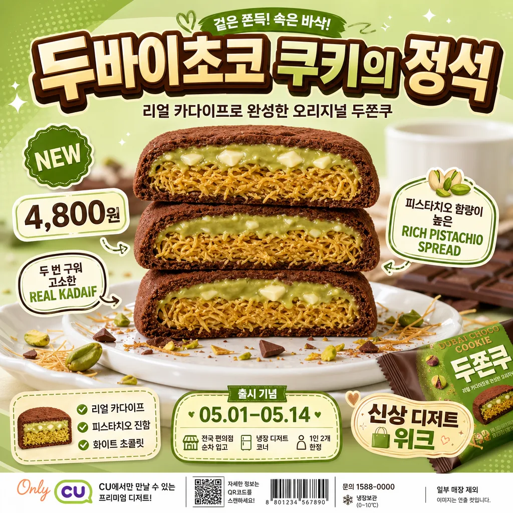
두쫀쿠 편의점 신상 디저트 포스터
두쫀쿠 사진 첨부하면 한국 편의점 신상 디저트 광고 SNS 포스터로 변환. 정사각 1024 + 그린·피스타치오 배경 + 잘린 단면 강조 + 큰 한글 타이틀 + 말풍선·가격·태그. 광고 캠페인 결.
두쫀쿠 편의점 신상 디저트 포스터 검색 요약
두쫀쿠 편의점 신상 디저트 포스터은 광고/포스터 결과물을 만들 때 바로 복사해 활용할 수 있는 ChatGPT 이미지 프롬프트입니다. 주제, 배경, 스타일, 구도 조건을 함께 담아 빠르게 시안을 만들 수 있도록 구성했습니다.
관련 키워드: 두쫀쿠 편의점 신상 디저트 포스터, 두쫀쿠 편의점 신상 디저트 포스터 프롬프트, 광고/포스터 프롬프트, 광고/포스터 AI 이미지 프롬프트, ChatGPT 이미지 프롬프트, AI 이미지 생성 프롬프트, AI 프롬프트, 이미지 프롬프트
두쫀쿠 편의점 신상 디저트 포스터 활용 포인트
원본 구조를 유지하면서 피사체, 배경, 색감, 구도를 바꿔 다양한 시안으로 확장할 수 있습니다.
- 핵심 소재는 유지하고 브랜드, 계절, 채널 목적에 맞는 색감과 배경을 바꿔보세요.
- 결과가 산만하면 배경 요소를 줄이고 피사체, 구도, 조명 조건을 구체화하세요.
- 복사한 뒤 ChatGPT에서 플랫폼, 화면 비율, 텍스트 포함 여부를 추가로 요청할 수 있습니다.
프롬프트 원문
[Input]
- reference_image: {참고 이미지}
- language: Korean
- output_size: 1024x1024

[Purpose]
Korean convenience-store new dessert SNS poster, square 1:1 promotional ad with cute but premium food-photography finish.
Designed for Instagram, in-store display, blog thumbnails, product-launch banners, and a realistic convenience-store dessert-week promotion.

[Composition]
- Main subject placement: {원본 보존} as the hero element, centered and occupying about 58–62% of the frame, with the cut surface clearly visible and appetizing.
- Composition direction: follow {음식 구도}; either a vertical 3-stack of the dessert or a single hero cutaway angle that makes the interior layers easy to read, with a lively retail-poster crop.
- Background treatment: {배경 컬러} smooth promotional backdrop with subtle rounded graphic panels, small sparkle accents, diagonal color blocks, and convenience-store campaign energy.
- Props and spacing: lower area anchored by a white ceramic plate; scattered pistachio crumbs, chocolate fragments, kadaif strands, tiny cocoa dust, and a partially opened dessert wrapper around the base; add {소품·배경} naturally as supporting food-styling elements.
- Rear depth layer: softly blurred chocolate bar, white cup, folded napkin, mini spoon, and small shelf-card or price-pop shape in the rear with shallow depth separation.
- Text layout: top title block, mid-lower subtitle, price badge, benefit bubbles, date/event strip, sponsor/store area, and small footer information placed around the hero without covering the most important cut surface details.

[3. CORE STRUCTURE]
1. Hero area (center 60%): extract the dessert cleanly from {참고 이미지} and composite it sharply onto the poster background, preserving the original cocoa powder matte tone, the kadaif yellow interior, pistachio green, and white chocolate details.
2. Base layer: place a glossy white porcelain plate slightly below center, with pistachio pieces, chocolate shards, thin kadaif strands, cocoa powder speckles, and a few cream-colored crumbs naturally scattered near the front edge for realistic retail-food styling.
3. Rear depth layer: add softly blurred supporting props behind the dessert—one chocolate bar, one white cup, a folded receipt-like strip, and a small convenience-store shelf label—kept lower in contrast so the dessert remains dominant.
4. Title zone (top 15–20%): render {메인 타이틀} in a large Korean ad-style headline with strong stroke presence and shadow, centered or slightly arced for campaign energy; apply {텍스트 톤} to the lettering personality.
5. Subtitle zone (under title): place {서브 카피} in smaller, clean sans-serif type with enough tracking to stay readable on a square social post.
6. Tag/bubble zone: place {말풍선·태그} as small promotional stickers around the hero, not overlapping the cut face; use them as price/benefit callouts together with short tags such as “NEW”, “4,800원”, “리얼 카다이프”, and “피스타치오 진함”.
7. Event information strip: add a compact lower or side ribbon with realistic poster details: “출시 기념 05.01–05.14”, “전국 편의점 순차 입고”, “냉장 디저트 코너”, “1인 2개 한정”.
8. Sponsor / retail footer: add a small sponsor-style area at the bottom with micro text, barcode-like product block, QR-style square, contact line, and store notice text such as “신상 디저트 위크”, “문의 1588-0000”, “일부 매장 제외”.
9. Decorative graphic elements: add rounded sticker shapes, small hearts, sparkles, check marks, soft halftone dots, and cream/chocolate swooshes that match the color palette and make the poster feel printed and campaign-ready.

[4. STYLE RULES]
- Typography: use bold Korean sans-serif such as Pretendard ExtraBold or Noto Sans KR Black for the main title, paired with a handwritten accent only if needed for emphasis; subtitle in Pretendard Medium or Noto Sans KR Regular at compact size.
- Color palette: {배경 컬러} as the primary base, plus cocoa brown, pistachio green, cream white, warm chocolate beige, and small yellow highlight accents; keep contrast high and retail-friendly.
- Border/shadow: use a soft drop shadow under the dessert with about 4px y-offset, 12px blur, and 15% opacity; title can have a thick dark-brown outline and a subtle 2–3px shadow for sticker-like legibility.
- Surface finish: polished commercial poster texture with believable printed-ad details, clean product reflections, subtle paper/poster finish, and crisp digital campaign graphics.
- Retail realism: include readable micro-layout details such as product price, release period, store notice, mini barcode block, tiny social handle “@duzzonku_official”, and small footer credit “PHOTO BY DESSERT LAB”.

[5. VISUAL STYLE]
- Camera / lens: 85mm f/2.8 product-photo look or 70mm macro-style product framing, tight composition with shallow depth of field.
- Lighting: bright studio softbox from upper-left at about 45°, with gentle fill from the front-right and a faint rim light to separate the dessert from the background; natural shadow edges, no harsh specular blowout.
- Color grade: fresh pistachio green + cocoa brown + milk-white commercial grade, slightly warm and vivid, with crisp contrast suitable for a convenience-store launch poster.
- Food texture: cocoa powder should look velvety and dry, pistachio spread should look thick and rich, kadaif should show crisp fibrous strands, and white chocolate detail should have a creamy satin finish.

[6. MOOD]
Korean convenience-store launch campaign — playful retail dessert ad with a polished commercial food-photography feel, like a real Instagram product poster for a new refrigerated dessert release.

[7. CRITICAL]
- Korean text accuracy: 반드시 정확히 보여야 하는 문구: “두바이초코 쿠키의 정석”, “리얼 카다이프로 완성한 오리지널 두쫀쿠”, “4,800원”, “피스타치오 함량이 높은 RICH PISTACHIO SPREAD”, “두 번 구워 고소한 REAL KADAIF”, “NEW”.
- Add realistic Korean poster details where they fit: “출시 기념 05.01–05.14”, “전국 편의점 순차 입고”, “냉장 디저트 코너”, “1인 2개 한정”, “신상 디저트 위크”, “문의 1588-0000”, “일부 매장 제외”, “@duzzonku_official”.
- Preserve the dessert identity exactly: cocoa powder tone, kadaif yellow layer, pistachio green layer, and white chocolate detail must remain faithful to the reference image.
- The cut surface must stay clearly readable, with headlines, bubbles, price badges, and props arranged around the layers rather than blocking them.
- If multiple pieces are stacked, all pieces must match the same dessert identity and color structure.

[8. 🚫 PROHIBITED]
- Fake official seals / certifications
- Broken Korean characters
- Celebrity composites or unauthorized likeness