漫畫/插畫
한글 만화책 표지 생성
한글 제목·작가·장르 입력하면 만화책·웹툰 표지로 변환. 애니메이션 스타일 캐릭터 + 메인 타이포 + 잡지 결.
한글 만화책 표지 생성摘要
這是用來製作漫畫/插畫內容的 ChatGPT 圖像提示詞,已整理主題、背景、風格與構圖,方便快速調整。
相關關鍵字: 한글 만화책 표지 생성, 한글 만화책 표지 생성 프롬프트, 漫畫/插畫 프롬프트, 漫畫/插畫 AI 이미지 프롬프트, ChatGPT 이미지 프롬프트, AI 이미지 생성 프롬프트, AI 프롬프트, 이미지 프롬프트
한글 만화책 표지 생성使用方式
保留原始結構並替換主體、背景、色彩或構圖,即可延伸出不同版本。
- 保留核心主體,並依品牌、季節或平台調整色彩與背景。
- 如果畫面太複雜,請減少背景元素並具體描述主體、構圖與光線。
- 複製後可要求 ChatGPT 配合平台、長寬比或文字需求調整。
提示詞原文
[Input]
- language: Korean
- output_size: 1024x1536

[Purpose]
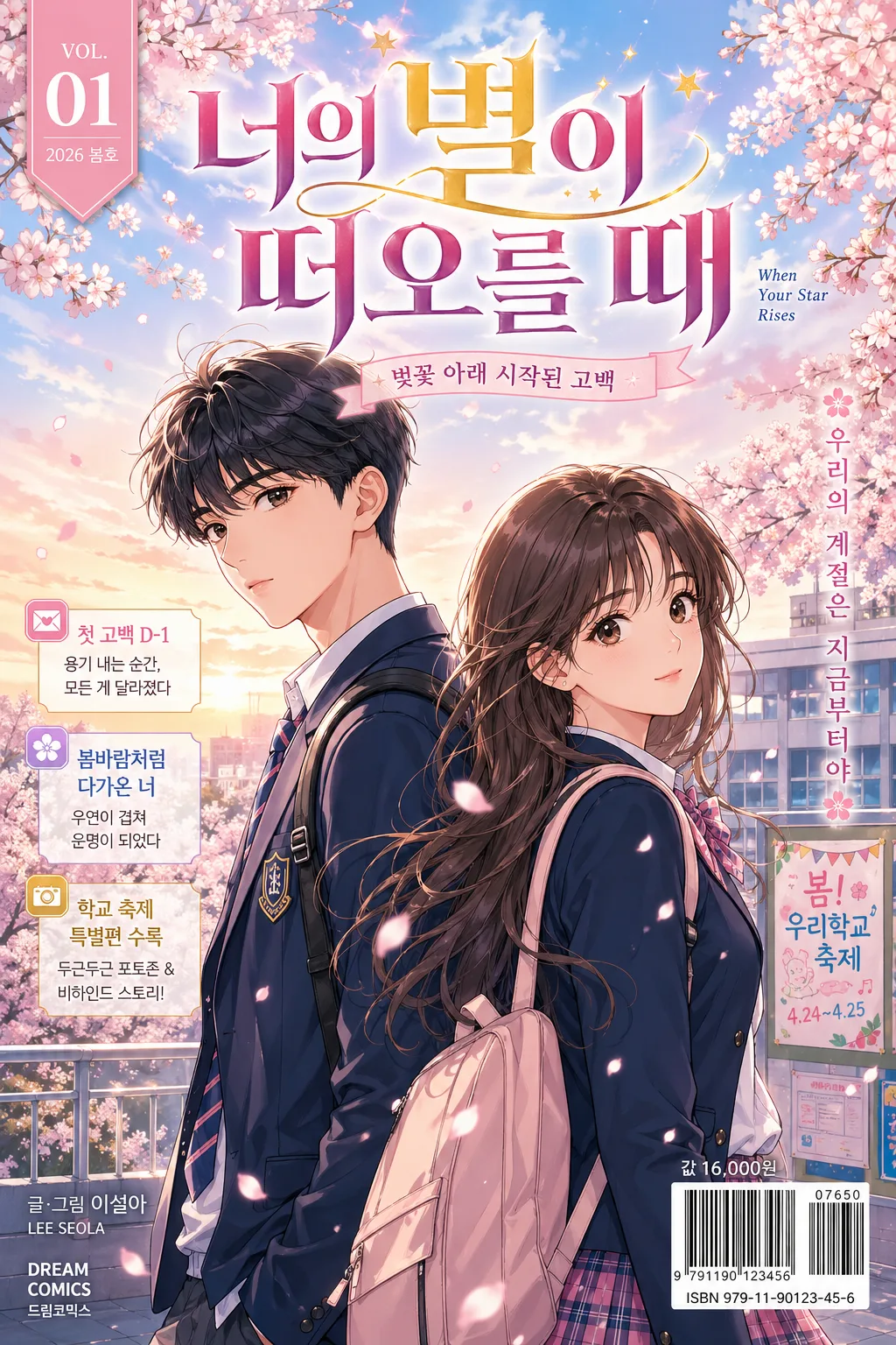
Korean comic book / webtoon cover, vertical single-cover layout for print-like publication use.
Youth romance school-life cover with cherry blossom spring mood, polished Korean manhwa finish, and realistic retail-volume cover details.

[Composition]
- Main subject placement: {메인 캐릭터} occupy the central 55–65% of the frame, arranged as a balanced two-person composition with one character slightly forward and the other slightly behind for depth, natural late-teen posture, expressive eye contact, and wind-touched hair and uniforms.
- Title placement: {만화 제목} sits in the upper 15–20% or slightly above the characters, large and dominant, with a small volume label, author credit, and publisher-style imprint integrated around it.
- Background treatment: {배경} rendered with soft atmospheric depth, visible school rooftop railings, distant classroom windows, festival notice boards, drifting cherry blossoms, and spring sky layers so the setting feels like a real Korean romance manhwa volume.
- Publication details: add a compact volume marker, date label, barcode/ISBN-style area, price line, small spine/credit text, and 2–3 short Korean feature blurbs positioned around the sides without overpowering the main title.
- Framing direction: vertical cover framing with strong center focus, clear title readability, full faces visible, and {비율} respected for a printed comic cover crop.
- Use {만화 제목}, {장르·무드}, {메인 캐릭터}, {배경}, {컬러 톤}, {타이포}, {비율} placeholders naturally across the design.

[3. CORE STRUCTURE]
1. Title zone (top 15–20%): place {만화 제목} as the primary headline in a bold Korean display style, with crisp edges, high contrast, and a slightly glossy printed ink feel. Add a small label near the title such as “VOL.01”, “2026 봄호”, and a thin subtitle ribbon reading “벚꽃 아래 시작된 고백”.
2. Character zone (middle 55–65%): draw {메인 캐릭터} as a clean Korean manga/manhwa duo, with expressive faces, neat school uniforms, school bags, ribbon/tie details, subtle cel-shading, and readable silhouettes at thumbnail size.
3. Environmental zone (mid-to-back layer): build {배경} with cherry blossoms, school rooftop geometry, courtyard depth, festival posters pinned in the distance, soft petal drift, and light perspective lines guiding attention toward the characters.
4. Cover copy zone (side accents): include 2–3 short Korean blurbs in small cover-line boxes, for example “첫 고백 D-1”, “봄바람처럼 다가온 너”, “학교 축제 특별편 수록”, styled as authentic comic-volume promotional text.
5. Color treatment: apply {컬러 톤} across the cover with pastel sky gradients, blush highlights, warm skin tones, and restrained gold accents on the title, volume label, or ribbon details.
6. Credit and retail zone (bottom 8–12%): set author/publisher-style small text, model-name style credit, price, barcode box, and imprint marks in compact alignment; make it feel like an actual Korean retail manga/webtoon volume.

[4. STYLE RULES]
- Typography: use {타이포} as a bold Korean serif or display font such as Cafe24, Sandoll, or a similar high-contrast title face for {만화 제목}; make the title large, with strong vertical strokes, tight spacing, and glossy highlight edges. Use a small clean sans-serif for credits, date label, price, barcode captions, and feature blurbs.
- Color palette: pink #F7C7D7, sky blue #B9DDF7, warm gold #D8B56A, soft white #FFF8F2, pale lavender #DCCEF5.
- Cover finishing: subtle printed-cover shadow, 2–4px vertical offset, 10–14px blur, 12–18% opacity; optional thin edge glow around the title for separation, light paper grain, and gentle spot-varnish shine on title letters.
- Decorative graphic elements: add small petal icons, ribbon dividers, thin chapter-line ornaments, tiny star/sparkle highlights, and tasteful corner accents that match {장르·무드} and the spring romance setting.

[5. VISUAL STYLE]
- Camera / lens: 50mm standard editorial framing, shallow depth of field feel, manga cover illustration composition rather than photo realism.
- Lighting: late-afternoon spring light from upper-left, soft backlight on hair and petals, gentle fill from front-right, no harsh shadows.
- Color grade: pastel spring editorial grade with clean highlights, blush-pink and clear-blue dominance, warm gold accents, slightly soft print contrast.
- Rendering quality: premium Korean manhwa cover art with refined linework, layered cel shading, subtle paper texture, polished hair highlights, detailed uniform fabric folds, and believable rooftop/background perspective.

[6. MOOD]
Korean youth romance manhwa cover — polished volume-art aesthetic with a spring school-festival / rooftop romance feeling, retail-ready cover details, gentle excitement, and the emotional warmth of a first-love serialized webtoon release.

[7. CRITICAL]
- Korean text accuracy: 반드시 정확히 렌더링할 문구: “{만화 제목}”.
- Additional Korean cover text may include: “VOL.01”, “2026 봄호”, “벚꽃 아래 시작된 고백”, “첫 고백 D-1”, “봄바람처럼 다가온 너”, “학교 축제 특별편 수록”, “글·그림 서하린”, “정가 ₩7,500”.
- Title must be legible, properly spaced, and fully in Korean characters without distortion.
- The two main characters should look like late-teen students in school uniforms, with anatomically correct proportions, natural poses, expressive faces, and polished Korean manhwa styling.
- Keep the cover composition suitable for a Korean printed comic / webtoon volume, including authentic barcode, volume, date, price, and credit placement.

[8. 🚫 PROHIBITED]
- Fake official seals / certifications
- Broken Korean characters