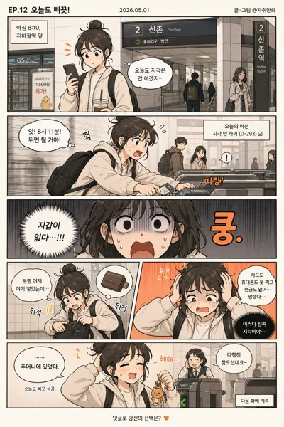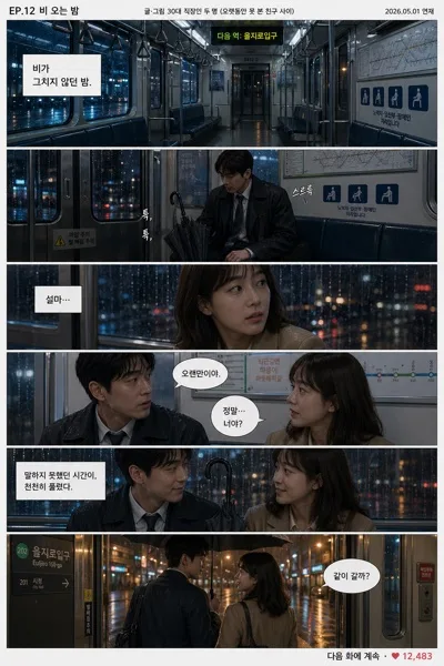
Comics/Illustration
상업용 소설·만화 표지
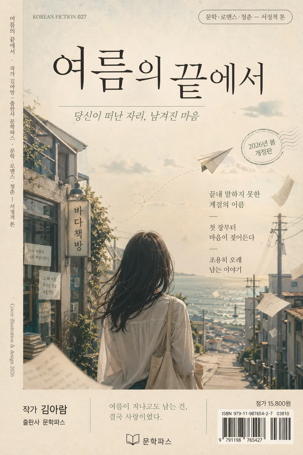
한글 제목 + 부제·작가·출판사 정보 박힌 상업용 소설/만화 표지. 캐릭터 배치 + 메인 타이포 + 보조 정보. 출판물 결.
상업용 소설·만화 표지 summary
Copy this ChatGPT image prompt to create Comics/Illustration results. Its subject, background, style, and composition are organized for quick iteration.
Related keywords: 상업용 소설·만화 표지, 상업용 소설·만화 표지 프롬프트, Comics/Illustration 프롬프트, Comics/Illustration AI 이미지 프롬프트, ChatGPT 이미지 프롬프트, AI 이미지 생성 프롬프트, AI 프롬프트, 이미지 프롬프트
How to use 상업용 소설·만화 표지
Keep the prompt structure and swap the subject, background, palette, or composition to create new variations.
- Keep the main subject and adjust the palette and background for your brand, season, or channel.
- If the result feels busy, simplify the background and make the subject, composition, and lighting more specific.
- After copying, ask ChatGPT to adapt it for your platform, aspect ratio, or text requirements.
Original prompt
[Input]
- language: Korean
- output_size: 1024x1536

[Purpose]
Commercial Korean novel cover / manga-style literary paperback cover for bookstore shelves and online retail thumbnails.
A polished publishing-cover design with layered typography, narrative mood, realistic print details, and content-rich editorial packaging that feels ready for a contemporary Korean bookstore display.

[Composition]
- Vertical book-cover frame in {비율} with a strong top-to-bottom reading flow; title occupies the upper 28–32% of the canvas, main visual sits in the center 40–45%, and author/publisher information anchors the lower 12–15%.
- Background: softly faded coastal street, train-side alley, or old-bookstore exterior scene with matte paper texture, desaturated atmospheric haze, signboards, window reflections, telephone wires, distant lamps, small notices, and subtle lived-in environmental details that support the story world.
- Keep the main figure as a back view or silhouette only; posture, clothing folds, hair outline, bag strap, umbrella, scarf, or coat hem may communicate emotion without showing facial features.
- Add realistic publishing-cover elements: a small {장르} category label, edition/date text such as “2026년 봄 개정판”, short Korean recommendation blurbs, a tiny publisher mark, price/ISBN-style barcode area, and slim spine-like credit text along one edge.
- Use {제목}, {부제}, {작가·출판사}, {장르}, {메인 비주얼}, {컬러 톤}, {타이포}, {비율} as the content and layout variables.

[3. CORE STRUCTURE]
- Title zone (top 20–28%): place {제목} as the dominant masthead in a refined Korean serif style, large enough to read clearly at thumbnail size, with subtle tracking, confident line breaks, and a slightly tactile ink-on-paper presence.
- Subtitle zone (just below title): place {부제} in smaller italic or light-weight text, aligned to the title width, with a literary pause between title and image.
- Top micro-detail zone: include a small line such as “KOREAN FICTION 027”, “VOL. 14”, or “문학동네 감성 장편선” near the top corner, plus the {장르} label in a neat capsule or fine rule treatment.
- Main visual zone (center 40–45%): render {메인 비주얼} as the emotional focal point, with the figure positioned slightly off-center and story elements drifting diagonally—loose manuscript pages, train tickets, flower petals, rain streaks, comic-panel fragments, or torn memo notes—to create narrative motion.
- Mid-layer atmosphere: blend the scene into the background with soft depth, gentle edge diffusion, visible paper grain, faint halftone or ink wash texture, and small realistic details like street signs, old posters, bookstore stickers, window condensation, or distant silhouettes.
- Blurb and review zone: place 2–3 short Korean cover lines around the central visual without covering the figure, for example “끝내 말하지 못한 계절의 이름”, “첫 장부터 마음이 젖어든다”, “조용히 오래 남는 이야기”.
- Bottom info band (lower 12–15%): place {작가·출판사} in a compact sans-serif hierarchy, with a thin rule, tiny publisher logo mark, price line such as “정가 15,800원”, and a small ISBN/barcode-style box tucked into the lower-right or lower-left.
- Edge details: add vertical spine-like micro text on the left or right edge, such as “{제목} · {작가·출판사} · {장르}”, plus tiny production credits like “Cover illustration & design 2026”.
- Color organization: apply {컬러 톤} consistently across sky, shadows, paper accents, title ink, blurb labels, and small retail details so the whole cover feels unified and editorial.

[4. STYLE RULES]
- Typography: title in {타이포}, Noto Serif KR, or 본명조 medium, 54–78 pt feel; subtitle in Pretendard light italic or Noto Sans KR light, 20–28 pt feel; author/publisher in Pretendard regular, 14–18 pt feel; micro labels in 8–11 pt feel with high legibility.
- Use the palette from {컬러 톤} as the main scheme; keep contrast high enough for bookstore readability while preserving a faded literary tone.
- Add tasteful cover-design decoration where appropriate: fine divider rules, small corner registration marks, soft translucent label blocks, hand-drawn manga-style panel lines, subtle foil-like ink accents, or torn-paper overlays that match the story mood.
- Shadow and separation: use a very soft drop shadow at 3–4px y-offset, 10–14px blur, 12–18% opacity behind the title, figure, barcode box, or blurb labels when needed for readability.
- Paper and print feel: uncoated paper grain, slight ink absorption, restrained CMYK softness, tiny print speckles, faint fold/handling marks, and realistic paperback lamination sheen like a contemporary Korean literary book.

[5. VISUAL STYLE]
- Camera / lens: Canon EOS R5 full-frame editorial still, 50mm lens at f/2.8 for a natural perspective and soft background separation, composed like a premium book-cover photography shoot blended with refined manga-cover illustration when appropriate.
- Lighting: overcast diffused daylight or late-afternoon side light from upper-left, with a faint rim on the silhouette, gentle shadow falloff, window glints, wet pavement reflections, or dusty sunbeams to preserve a contemplative atmosphere.
- Color grade: faded cyan-sage highlights with warm beige midtones and charcoal text, lightly desaturated, with a touch of filmic softness similar to indie publishing photography.
- Rendering quality: realistic paperback cover mock-print surface, crisp Korean typography, layered editorial graphics, believable barcode/price area, and tactile paper texture visible at close view.

[6. MOOD]
Premium Korean literary romance paperback — a Kinfolk magazine spread meets a contemporary indie bookstore novel cover, with the emotional density of a quiet manga opening scene and the commercial polish of a real retail paperback.

[7. CRITICAL]
- Korean text accuracy: 반드시 정확히 보여야 하는 문구: {제목}, {부제}, {작가·출판사}.
- Additional Korean cover text must be readable and correctly formed: “{장르}”, “2026년 봄 개정판”, “정가 15,800원”, “끝내 말하지 못한 계절의 이름”, “첫 장부터 마음이 젖어든다”.
- Face visibility rule: the person must remain back-view or silhouette only; no visible facial features, no direct eye contact.
- Layout integrity: keep the title, subtitle, blurbs, genre label, barcode/price area, and author/publisher hierarchy clearly separated and readable; do not let the main visual obscure the text.
- Preserve a real commercial book-cover feeling: front-cover typography, publisher/retail details, atmospheric scene, and tactile print texture should all feel integrated rather than pasted on.

[8. 🚫 PROHIBITED]
- Fake official seals / certifications
- Broken Korean characters
- Celebrity composites or unauthorized likeness