만화/일러스트
트레이너 카드 캐릭터 변환
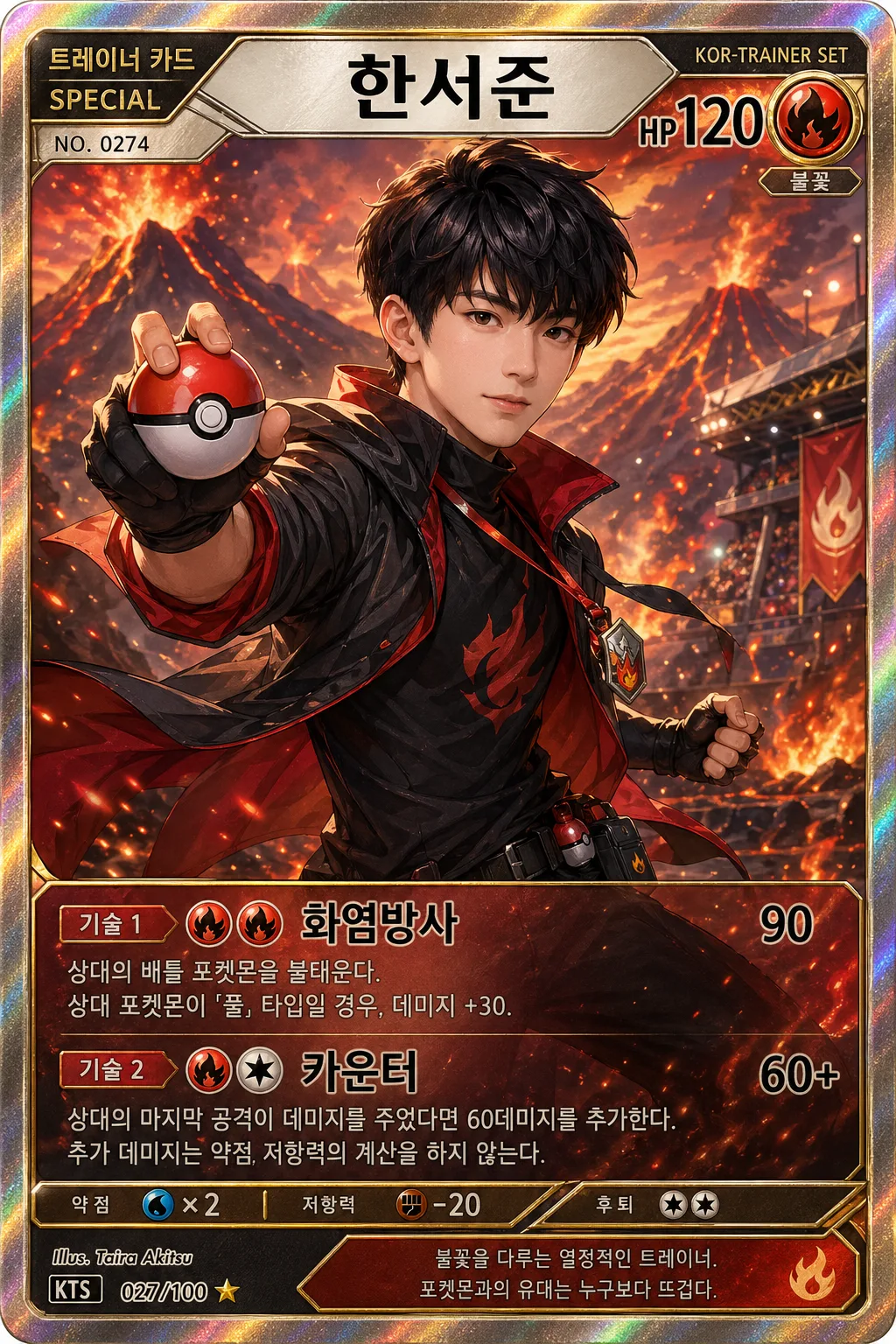
인물 사진 → 포켓몬 트레이너 카드 스타일. 반실사 일러스트 + 포켓볼 + 속성 (불꽃/물/번개/얼음) + 이름·HP·기술.
트레이너 카드 캐릭터 변환 검색 요약
트레이너 카드 캐릭터 변환은 만화/일러스트 결과물을 만들 때 바로 복사해 활용할 수 있는 ChatGPT 이미지 프롬프트입니다. 주제, 배경, 스타일, 구도 조건을 함께 담아 빠르게 시안을 만들 수 있도록 구성했습니다.
관련 키워드: 트레이너 카드 캐릭터 변환, 트레이너 카드 캐릭터 변환 프롬프트, 만화/일러스트 프롬프트, 만화/일러스트 AI 이미지 프롬프트, ChatGPT 이미지 프롬프트, AI 이미지 생성 프롬프트, AI 프롬프트, 이미지 프롬프트
트레이너 카드 캐릭터 변환 활용 포인트
원본 구조를 유지하면서 피사체, 배경, 색감, 구도를 바꿔 다양한 시안으로 확장할 수 있습니다.
- 핵심 소재는 유지하고 브랜드, 계절, 채널 목적에 맞는 색감과 배경을 바꿔보세요.
- 결과가 산만하면 배경 요소를 줄이고 피사체, 구도, 조명 조건을 구체화하세요.
- 복사한 뒤 ChatGPT에서 플랫폼, 화면 비율, 텍스트 포함 여부를 추가로 요청할 수 있습니다.
프롬프트 원문
[Input]
- language: Korean
- output_size: 1024x1536
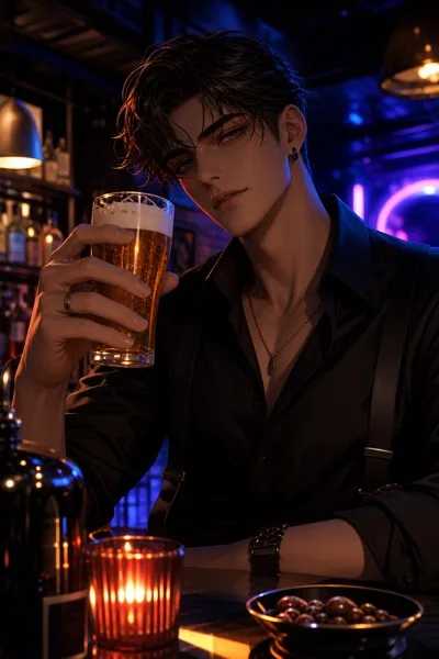
- reference_image: {참고 이미지}

[Purpose]
Create a portrait-oriented character card illustration that transforms the provided photo into a Pokémon-trainer-inspired trading card look, with a premium collectible-card composition, rich printed details, and readable Korean text.
Designed for an i2i workflow: preserve the person’s likeness while converting it into a semi-realistic game-card illustration that feels like a real photographed card print with foil, stats, badges, and layered game-world atmosphere.

[Composition]
- The reference subject should occupy the central hero area, with the upper body and face taking about 55–65% of the frame for strong card readability and emotional presence.
- Keep the composition vertically stacked like a trading card: collectible header at the top, character illustration in the middle, attribute/status strip and move text in the lower third.
- Background should be a themed game field matching {속성}, with depth-separated foreground/midground/background layers, environmental cues, particles, terrain detail, and lighting that frames the face clearly.
- Use {원본 보존} to preserve facial identity, hairstyle impression, expression, and recognizable features, and apply {포즈} as the action pose without distorting the body proportions.
- Place {이름} as the card name header, and integrate {HP·기술} in the lower info panel with clear hierarchy, move icons, damage/status markers, and readable Korean line breaks.
- Apply {카드 디자인} as the overall card frame language, with a premium outer frame, inner rules, rarity markers, set number, small credit text, and polished collectible print finish.
- Make the image feel like a real premium trainer card photographed or scanned for catalog display: tactile paper thickness, subtle holographic sheen, micro scratches, ink texture, and crisp printed edges.

[3. CORE STRUCTURE]
1. Top header band: Place {이름} centered in a bold card-title style with clear Korean typography, using a high-contrast strip that reads like a classic monster-card header. Add small supporting labels such as "트레이너 카드", "SPECIAL", "NO. 0274", and a tiny series mark like "KOR-TRAINER SET" without covering the title.
2. HP and attribute header details: Put "HP" and the HP value from {HP·기술} near the upper-right or beside the name, with a visible {속성} icon or elemental badge near the title or upper corner. The badge should have crisp edges, enamel-like shine, and elemental texture such as flame glow, water ripple, leaf vein, electric spark, stone grain, psychic aura, ice frost, or shadow mist depending on {속성}.
3. Main character panel (mid 55%): Render the person from the reference image as a semi-realistic trainer character, matching {원본 보존}; keep facial structure recognizable, add stylized clothing detail, trainer accessories, gloves, jacket seams, pins, lanyard, belt pouch, or elemental gear that fits {속성}, and build the pose from {포즈} with dynamic motion in sleeves, hems, hair, straps, and light effects.
4. Background scene: Build a vivid battle-field environment based on {배경}, using clear horizon separation, atmospheric depth, and lighting that supports the character silhouette. Include natural scene details appropriate to the theme, such as arena floor markings, grass blades, sparks, rain droplets, floating leaves, dust, mist, bokeh lights, distant silhouettes, signboards, stone paths, stadium glow, or elemental trails.
5. Lower information panel: Set {HP·기술} in a structured card-data box with legible Korean text, clean line breaks, icon-like separators between HP and move descriptions, and distinct labels "기술 1" and "기술 2". Add small columns for "효과", "에너지", "쿨타임", and short stat tags such as "공격", "방어", "민첩" if space allows.
6. Flavor text and metadata strip: Add a thin lore strip beneath the move panel with a short Korean flavor line like "어떤 순간에도 자신만의 리듬으로 승부한다." Include tiny print details such as "ILLUST. CARD STUDIO", "MODEL: {이름}", "2026 시즌", "SET 274/500", "RARITY ★★★", and a small barcode-style or QR-like decorative block that is clearly fictional and not an official seal.
7. Card border and frame: Surround the whole composition with {카드 디자인} style outer borders, inner rules, corner brackets, metallic bevels, small star marks, rarity gems, and accent lines; keep the frame symmetrical and print-like while allowing decorative energy to interact with the frame edges.
8. Final polish: Add subtle foil-like highlights, embossed ink, tiny halftone print texture, laminated reflection streaks, tactile paper grain, crisp edge definition, and realistic shadow along the card thickness while preserving readability and the trading-card illustration feel.

[4. STYLE RULES]
- Typography: Pretendard Bold or Noto Sans KR Bold for {이름}, Pretendard Medium for data text; title around 54–72px feel, info text around 24–32px feel, metadata around 10–16px feel. Korean text should look printed, aligned, and intentionally designed rather than randomly scattered.
- Color palette: Use a high-contrast card palette tuned to {속성}, with clean white or cream text areas, deep outline blacks, and accent colors derived from the elemental theme; support with cream #F7F1E3, charcoal #1F1F1F, warm gold foil, and one strong accent hue.
- Border/shadow: Use a crisp double-line card border with a soft drop shadow, 4px vertical offset, 12px blur, about 18% opacity; add mild inner glow on elemental accents and subtle metallic bevel highlights on the frame.
- Print realism: Include authentic collectible-card surface details such as laminated glare, tiny registration dots, micro texture, very slight edge wear, fine embossing on the nameplate, and a believable card-stock thickness.
- Iconography: Use small elemental icons, move cost symbols, star rarity marks, and stat badges that match {속성}; they should feel like part of one cohesive card system.
- Korean text density: Add enough short Korean labels to make the card feel complete, but keep the most important strings larger: {이름}, "HP", "기술 1", "기술 2", and all Korean text contained in {HP·기술}.

[5. VISUAL STYLE]
- Camera / lens: Full-frame 85mm portrait lens look at f/2.8, card-illustration perspective, subject framed like a premium character portrait rather than a wide scene.
- Lighting: Soft studio key light from upper-left at 45°, subtle rim light from the right to separate hair and shoulders, balanced fill to keep the face readable, plus localized elemental glow that reflects on clothing, frame bevels, and the lower information panel.
- Color grade: Saturated game-card grade with clean blacks, vivid elemental highlights, slightly warm skin tones, controlled contrast for print clarity, and foil highlights that catch light without washing out the Korean typography.
- Rendering quality: Semi-realistic illustration with anime-inspired energy, painterly but polished skin and fabric, detailed accessories, crisp typography, and realistic printed-card surface behavior.

[6. MOOD]
Premium collectible game card illustration — a polished Japanese trading-card presentation with anime-inspired energy, modern semi-realistic character rendering, tactile foil-card realism, and the feeling of a rare trainer card pulled from a booster pack.

[7. CRITICAL]
- Korean text accuracy: 반드시 정확히 표시되어야 하는 문자열: "{이름}", "HP", "기술 1", "기술 2", "{HP·기술}"에 포함된 모든 한국어 텍스트.
- Additional Korean text should be short and readable, such as "트레이너 카드", "효과", "에너지", "쿨타임", "공격", "방어", "민첩", "2026 시즌", "도감 번호", "어떤 순간에도 자신만의 리듬으로 승부한다.", and "MODEL: {이름}".
- Preserve the subject’s facial likeness from the reference image as much as possible while converting to illustration.
- Keep the card layout vertically structured and readable, with no text collisions, no cropped title, and no obscured HP or move text.
- If {속성} is one of the elemental options, the badge, glow, background environment, and accent palette must clearly match the chosen element.
- {카드 디자인} must drive the frame style, borde