興趣/生活
드림 파스텔 음악 플레이어 배경
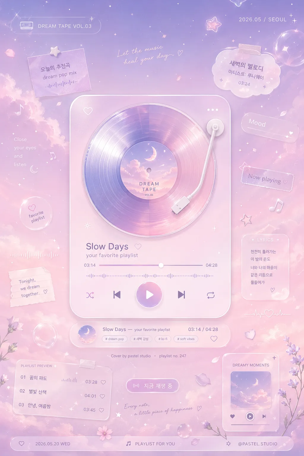
꿈같은 음악 플레이어 인터페이스. 라벤더·베이비 핑크 파스텔 그라데이션 + 에테리얼 로맨틱 톤. 폰 잠금화면·노트북 바탕화면 활용.
드림 파스텔 음악 플레이어 배경摘要
這是用來製作興趣/生活內容的 ChatGPT 圖像提示詞,已整理主題、背景、風格與構圖,方便快速調整。
相關關鍵字: 드림 파스텔 음악 플레이어 배경, 드림 파스텔 음악 플레이어 배경 프롬프트, 興趣/生活 프롬프트, 興趣/生活 AI 이미지 프롬프트, ChatGPT 이미지 프롬프트, AI 이미지 생성 프롬프트, AI 프롬프트, 이미지 프롬프트
드림 파스텔 음악 플레이어 배경使用方式
保留原始結構並替換主體、背景、色彩或構圖,即可延伸出不同版本。
- 保留核心主體,並依品牌、季節或平台調整色彩與背景。
- 如果畫面太複雜,請減少背景元素並具體描述主體、構圖與光線。
- 複製後可要求 ChatGPT 配合平台、長寬比或文字需求調整。
提示詞原文
[Input]
- language: Korean
- output_size: 1024x1536

[Purpose]
Dreamy pastel music player background wallpaper, vertical mobile-friendly interface backdrop. Designed as a rich soft visual UI scene for playlist covers, music app promos, lo-fi aesthetic social posts, and dreamy music mood boards.

[Composition]
- Main player module sits centered, occupying about 52% of the frame height, surrounded by layered pastel atmosphere, floating music-themed stickers, and soft translucent interface details.
- Background is a smooth {배경 그라데이션} with lavender-to-baby-pink depth, faint cloud haze, bokeh glints, translucent bubbles, tiny star specks, and soft vinyl-light reflections.
- Keep the composition tall and balanced, with {플레이어 디자인} as the focal structure and {곡 정보} placed to read clearly near the main module.
- Build a realistic wallpaper-like layout with small decorative playlist labels, micro waveform graphics, lyric snippets, floating note icons, and subtle album-promo details around the player.
- Include a compact bottom metadata area with a date label, playlist tag, and tiny credit text so the image feels like a finished music-poster UI rather than a blank mockup.

[3. CORE STRUCTURE]
- Top zone (upper 20%): soft gradient field with faint cloud-like haze, tiny star specks drifting diagonally, a small rounded label reading "DREAM TAPE VOL.03", and a tiny date mark "2026.05 / SEOUL".
- Center zone (middle 55%): render {플레이어 디자인} as a polished dreamy interface object, with a circular LP or cassette illustration, glossy album-art surface, clean song title and artist text, a slim progress bar, visible play button, previous/next controls, small shuffle/repeat icons, and soft reflections.
- Song card details: place {곡 정보} as the main song metadata, supported by short Korean UI text such as "새벽의 멜로디", "아티스트: 루나웨이", "03:24", "dream pop mix", and a tiny label "오늘의 추천곡".
- Info strip (around center-lower): place {곡 정보} in small, crisp text aligned with the player module, maintaining clear hierarchy and easy readability; add tiny credit text "Cover by pastel studio" and "playlist no. 247".
- Decorative layer (throughout background): apply {포인트 디테일} as scattered micro doodles, tiny hearts, stars, music notes, crescent moons, floating stickers, pearl-like dots, glassy blur flares, and miniature waveform ribbons that feel suspended in air.
- Bottom zone (lower 18%): include a soft mini tracklist preview with 3 short Korean lines: "01 꿈의 파도", "02 별빛 산책", "03 안녕, 여름밤", plus a small rounded CTA-style tag "지금 재생 중".
- Typography layer: set all text using {텍스트 폰트}, with thin elegant letterforms for the interface, slightly bolder Korean song title, and tiny editorial microtext for realism.

[4. STYLE RULES]
- Typography: Inter Light or Helvetica Neue Thin for English UI text, with Pretendard Light for small Korean support text; use 22–34px for main labels, 12–16px for secondary details, and 8–10px for tiny credit and metadata text.
- Color palette: use lavender #c9b8e0, baby pink #ffd9e6, soft lilac #eadff7, milk white #fff9fc, pale rose accent highlights, and occasional powder-blue glints for depth.
- Border/shadow: use translucent rounded glass panels, soft ambient glow around the player with a 4px y-offset, 14px blur, 16% opacity drop shadow, subtle inner highlights, and delicate glossy reflections.
- UI detail density: include believable music-player micro elements such as timestamps, equalizer bars, small playlist chips, waveform fragments, and lyric-sticker accents while preserving the centered vertical hierarchy.
- Text rendering: Korean text should look printed or rendered directly into the graphic, not handwritten unless {텍스트 폰트} implies a handwritten style.

[5. VISUAL STYLE]
- Camera / lens: front-facing digital poster composition, equivalent to an 85mm f/1.8 portrait look with very shallow depth feel and clean graphic focus.
- Lighting: soft diffused studio light from upper-left with a faint secondary fill from lower-right, plus subtle luminous bloom around the central player and small glass highlights on UI surfaces.
- Color grade: pastel lavender-pink grade with milky highlights, low contrast, slightly hazy highlights, soft bloom, and a dreamy UI finish.
- Rendering quality: polished high-resolution digital artwork with realistic glassmorphism, layered translucent materials, soft grain, detailed typography, and gentle depth separation between foreground player, midground stickers, and background haze.

[6. MOOD]
Dream-pop playlist cover — a soft editorial blend of Tokyo stationery branding, pastel album-promo graphics, cozy bedroom listening mood, and Y2K digital UI nostalgia.

[7. CRITICAL]
- Korean text accuracy: the rendered image must correctly include the Korean strings: "플레이어 디자인", "배경 그라데이션", "곡 정보", "포인트 디테일", "텍스트 폰트", "비율".
- Also include readable Korean music UI text such as "새벽의 멜로디", "아티스트: 루나웨이", "오늘의 추천곡", "지금 재생 중", "꿈의 파도", "별빛 산책", and "안녕, 여름밤".
- UI must feel like a music player background or playlist-poster wallpaper, not a real app screenshot; avoid functional phone chrome, notifications, or device status bars.
- Maintain clean legibility for the song info and preserve the centered vertical hierarchy.
- Keep the final layout aligned to {비율} and optimized for 1024x1536 vertical wallpaper framing.

[8. 🚫 PROHIBITED]
- Fake official seals / certifications
- Broken Korean characters