廣告/海報
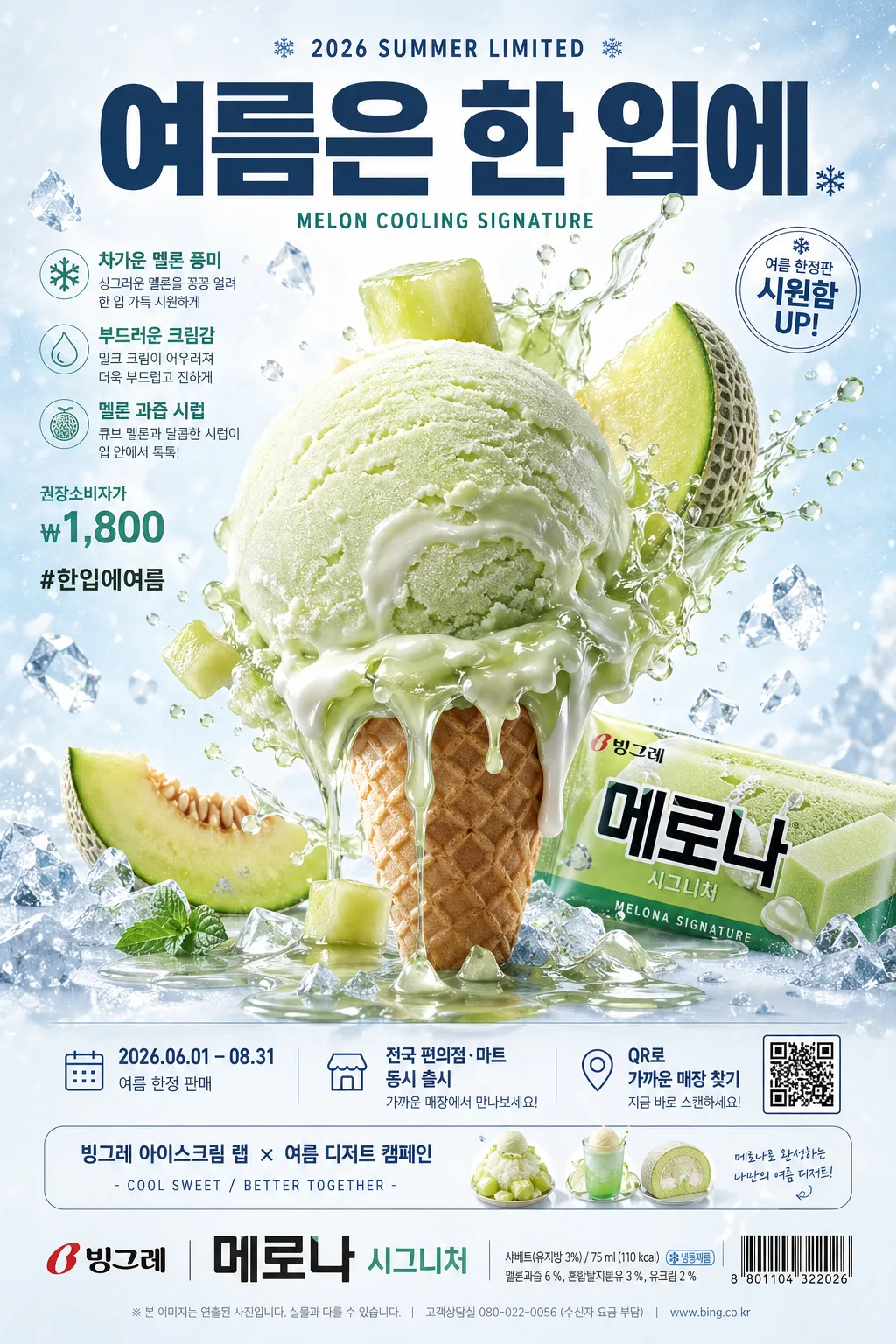
아이스크림 초현실 광고 (빙하·녹아내림·과일 비주얼)
초현실적 아이스크림 광고 톤. 녹아내리는 빙하처럼 연출 + 과일·시럽 흩날림 + 큰 한글 카피. 빙그레·롯데·해태 캠페인 결.
아이스크림 초현실 광고 (빙하·녹아내림·과일 비주얼)摘要
這是用來製作廣告/海報內容的 ChatGPT 圖像提示詞,已整理主題、背景、風格與構圖,方便快速調整。
相關關鍵字: 아이스크림 초현실 광고 (빙하·녹아내림·과일 비주얼), 아이스크림 초현실 광고 (빙하·녹아내림·과일 비주얼) 프롬프트, 廣告/海報 프롬프트, 廣告/海報 AI 이미지 프롬프트, ChatGPT 이미지 프롬프트, AI 이미지 생성 프롬프트, AI 프롬프트, 이미지 프롬프트
아이스크림 초현실 광고 (빙하·녹아내림·과일 비주얼)使用方式
保留原始結構並替換主體、背景、色彩或構圖,即可延伸出不同版本。
- 保留核心主體,並依品牌、季節或平台調整色彩與背景。
- 如果畫面太複雜,請減少背景元素並具體描述主體、構圖與光線。
- 複製後可要求 ChatGPT 配合平台、長寬比或文字需求調整。
提示詞原文
[Input]
- language: Korean
- output_size: 1024x1536

[Purpose]
Surreal ice cream advertising poster, vertical campaign key visual for a confectionery brand. Premium commercial poster for print, retail display, subway lightbox, and social media sharing, featuring a giant central product hero with realistic campaign information and polished Korean ad typography.

[Composition]
- Use {구도}: place the product hero slightly below center, taking about 55–60% of the frame height, with the headline zone above and a dense but orderly campaign footer below.
- Build the scene around {브랜드·제품명} as the visual anchor: the ice-cream form must read instantly as a luxurious product sculpture, with the surreal melting glacier or fruit-and-syrup burst clearly visible.
- Use {배경} as a bright studio-paper environment with a cool gradient, frosty condensation mist, tiny suspended ice shards, glossy syrup droplets, and subtle paper grain so the poster feels like a real photographed campaign set.
- Integrate natural product-ad elements: close-up frost crystals, melting ridges, fruit pulp, wafer crumbs, cold vapor trails, reflective puddles of syrup, and a soft grounded shadow beneath the hero.
- Arrange supporting poster information around the hero without blocking it: a top campaign label, 2–3 short feature lines, a small promo badge, QR-style square, date and purchase information, sponsor/collaboration strip, and footer lockup.

[3. CORE STRUCTURE]
- Top campaign zone (15–20%): place {시그니처 카피} in bold Korean sans-serif, centered or slightly left-aligned, with a small upper label reading {출시 정보} and a secondary line {영문 보조 카피}.
- Feature headline cluster: add 2–3 realistic Korean ad lines near the main copy, such as {제품 특징}, {가격 문구}, and {해시태그}; use varied type sizes like a real seasonal poster hierarchy.
- Main hero zone (middle 55–60%): render the {비주얼 컨셉} as the main object cluster, dramatically enlarged, glossy, and sculptural; melting edges should look surreal, cold, appetizing, and physically lit.
- Material detail zone: emphasize semi-frozen sheen, soft condensation, micro frost, translucent syrup skins, crushed ice, and realistic highlight rolls on the ice cream surface; fruit elements should look freshly cut with vivid pulp and splashes frozen mid-air.
- Color zone: apply {컬러 톤} as the dominant palette, balancing product-specific hues against icy whites and pale blues so the composition feels cold, crisp, and high-contrast.
- Poster information zone: include {캠페인 기간}, {구매 안내}, {QR 문구}, and a small QR-like square graphic at the lower-right; include {후원·협업} as a slim sponsor/collaboration strip.
- Bottom lockup zone (8–12%): place {브랜드·제품명} as a polished brand signature with a barcode-like retail graphic, small nutrition-style microcopy, and a compact legal/campaign note line.

[4. STYLE RULES]
- Typography: use {텍스트 톤}; main Korean copy should feel like Pretendard Black, 44–64 px equivalent, with precise baseline control; secondary information should use Noto Sans KR Regular or Pretendard Medium in smaller sizes.
- Text hierarchy: headline first, product name second, feature lines third, then campaign date, price, QR prompt, and sponsor strip; keep all Korean text sharp and intentionally typeset.
- Color palette: use the product color plus icy neutrals such as #F7FBFF, #DDEEFF, #BFE8FF, and a subtle mint or strawberry accent depending on the product tone.
- Graphic details: add thin dividers, small circular promo badge, translucent ice-blue panels, barcode/QR-style blocks, and tiny snowflake or splash icons that match a premium Korean confectionery campaign.
- Shadow and depth: use a soft grounded shadow under the hero, 4px y-offset, 14px blur, 18% opacity, plus believable reflections and contact shadows in syrup or melt puddles.

[5. VISUAL STYLE]
- Camera / lens: high-end studio product photography, shot on a Phase One IQ4 with an 80mm lens at f/8, front-facing advertising composition.
- Lighting: large overhead softbox at 45° from upper-left, with a faint cool fill from the right and crisp specular highlights to show the icy surface.
- Color grade: clean commercial grade with cool whites, minty greens or strawberry pinks, and restrained blue shadows; keep saturation controlled but vivid.
- Surface realism: macro-level frost crystals, condensation beads, semi-translucent ice edges, thick glossy syrup, and fresh fruit fibers should be visible where appropriate.

[6. MOOD]
Premium Korean ice cream campaign key visual — a Hyundai department-store seasonal ad meets a surreal product poster aesthetic, polished like a high-end food editorial, with lively summer retail details and a collectible limited-edition feeling.

[7. CRITICAL]
- Korean text accuracy: the following strings must appear exactly as written: "여름은 한 입에", "빙그레 — 메로나 시그니처".
- Include the poster information as readable Korean text: "2026 SUMMER LIMITED", "2026.06.01 – 08.31", "전국 편의점·마트 동시 출시", "권장소비자가 ₩1,800", "차가운 멜론 풍미 · 부드러운 크림감", "QR로 가까운 매장 찾기", "#한입에여름".
- The product must remain the clear central hero and feel oversized, luxurious, cold, appetizing, and commercial.
- If fruit, syrup, ice shards, QR/barcode graphics, or decorative campaign badges appear, they must look physically believable, sharply printed, and integrated into the poster design.

[8. 🚫 PROHIBITED]
- Fake official seals / certifications
- Broken Korean characters
- Crooked, illegible, or misspelled typography
- Low-resolution, muddy, or overly plastic-looking ice cream texture