廣告/海報
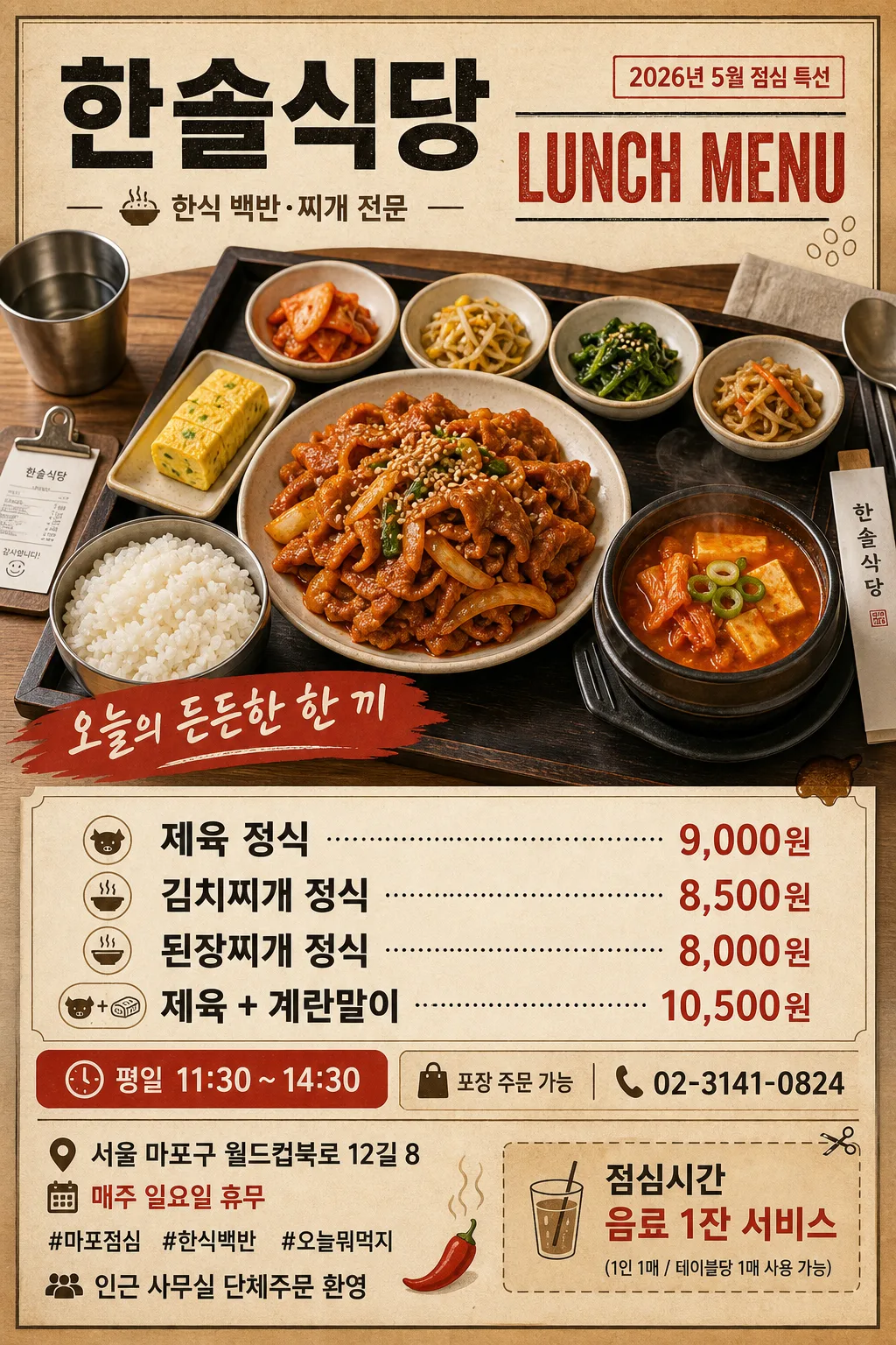
로컬 식당 런치메뉴 광고 포스터
동네 식당 런치메뉴 광고 포스터. 메인 메뉴 클로즈업 + 가격·시간 + 매장 정보. 소상공인 광고용 — 인쇄·SNS 활용.
로컬 식당 런치메뉴 광고 포스터摘要
這是用來製作廣告/海報內容的 ChatGPT 圖像提示詞,已整理主題、背景、風格與構圖,方便快速調整。
相關關鍵字: 로컬 식당 런치메뉴 광고 포스터, 로컬 식당 런치메뉴 광고 포스터 프롬프트, 廣告/海報 프롬프트, 廣告/海報 AI 이미지 프롬프트, ChatGPT 이미지 프롬프트, AI 이미지 생성 프롬프트, AI 프롬프트, 이미지 프롬프트
로컬 식당 런치메뉴 광고 포스터使用方式
保留原始結構並替換主體、背景、色彩或構圖,即可延伸出不同版本。
- 保留核心主體,並依品牌、季節或平台調整色彩與背景。
- 如果畫面太複雜,請減少背景元素並具體描述主體、構圖與光線。
- 複製後可要求 ChatGPT 配合平台、長寬比或文字需求調整。
提示詞原文
[Input]
- language: Korean
- output_size: 1024x1536

[Purpose]
Local Korean restaurant lunch menu advertising poster for SNS feed, neighborhood noticeboard, and A4-style print flyer.
Designed to communicate lunch set options, pricing, hours, location, phone contact, and a practical coupon-style callout with a warm local eatery atmosphere.

[Composition]
- Main composition: {비주얼메인} placed in the center 45–55% of the frame, with {매장명} and a bold “LUNCH MENU” headline at the top 15–18%, then menu pricing, time, address, and contact information anchored in the lower 30%.
- Background treatment: matte warm beige paper with lightly visible kraft-paper fibers, subtle wood-table edge, small realistic dining details such as chopsticks sleeve, spoon, folded napkin, stainless cup reflection, soy-sauce stain dot, and a tiny receipt clip used as atmosphere around the food area.
- Framing direction: vertical poster hierarchy with strong top-to-bottom reading flow; maintain clear separation between hero food photography, menu price grid, time strip, and footer contact area.
- Use {매장명}, {업종}, {런치메뉴}, {런치시간}, {시그니처카피}, {주소}, {전화번호}, {휴무안내}, {주문안내}, {포스터날짜}, {스폰서문구}, {쿠폰문구}, {대표해시태그} as editable text elements.

[3. CORE STRUCTURE]
1. Top header band: place {매장명} as the primary masthead in large bold Korean type, with {업종} as a smaller descriptor underneath; add “LUNCH MENU” in condensed English lettering and a small date label “{포스터날짜}” near the corner.
2. Hero food zone: feature {비주얼메인} as the visual centerpiece, shot to look freshly plated and appetizing, with visible rice, side dishes, steam, glossy sauce texture, stew surface, sesame garnish, and realistic tableware proportions; use a slight shadow underneath to lift it from the printed poster background.
3. Signature copy zone: set {시그니처카피} near the hero image or just below it, styled like a short promotional slogan on a red brush-stroke ribbon or paper sticker.
4. Menu list zone: present {런치메뉴} in a stacked price-board layout with dotted leaders, won pricing, and thin charcoal divider lines; group the list inside a light rice-white panel so items scan quickly.
5. Time and order strip: display {런치시간} as a compact chili-red strip near the menu list; add {주문안내}, {전화번호}, and a small takeaway-bag or phone icon treatment for practical ordering information.
6. Footer information area: include {주소}, {휴무안내}, {대표해시태그}, and {스폰서문구}; add {쿠폰문구} as a small tear-off coupon box or stamp-like rectangle with scissors mark, plus simple decorative graphics such as rice-grain dots, chili pepper illustration, steam lines, and thin rule dividers.

[4. STYLE RULES]
- Typography: use Pretendard ExtraBold or Noto Sans KR Bold for the main title, Pretendard SemiBold for menu items, and Noto Sans KR Regular for supporting details; headline around 64–88px, menu text around 30–40px, time text around 24–28px, footer details around 18–24px.
- Color palette: follow {컬러톤}; recommended palette warm beige #F3E7D3, wood brown #B98B62, dark charcoal #2B2B2B, chili red #D94B3D, rice white #FFF8EF, sesame yellow #E7C66A.
- Layout system: follow {레이아웃}; use a strong rectangular menu panel, dotted price leaders, small date badge, coupon box, footer contact bar, and consistent left/right alignment for fast readability.
- Border/shadow: add a soft realistic drop shadow under the food image (0px x-offset, 6px y-offset, 16px blur, 18% opacity), thin charcoal divider lines at 1–2px, and a slightly darker kraft-paper outer frame for a printed flyer feel.

[5. VISUAL STYLE]
- Camera / lens: top-down food poster feel with a 50mm lens look at f/5.6, or a gentle 45° food-photography angle using a 35mm prime for a more natural restaurant-ad look.
- Lighting: soft diffused daylight from upper-left, subtle fill from right, realistic highlights on glossy sauce and soup surface, faint steam over hot dishes, no harsh flash reflections.
- Color grade: warm beige and wood tones balanced with rich red-brown food color, slightly muted contrast, clean editorial restaurant print finish with tactile paper texture.

[6. MOOD]
Neighborhood lunch-special poster with the practical editorial charm of a Korean local diner ad: friendly, filling, affordable, and believable as something taped near an office building elevator or shared on a local SNS account.

[7. CRITICAL]
- Korean text accuracy: the rendered poster must contain these strings exactly as written: "한솔식당", "한식 백반·찌개 전문", "제육 정식 9,000원 / 김치찌개 정식 8,500원 / 된장찌개 정식 8,000원 / 제육 + 계란말이 10,500원", "평일 11:30 ~ 14:30", "오늘의 든든한 한 끼", "서울 마포구 월드컵북로 12길 8", "02-3141-0824", "매주 일요일 휴무", "포장 주문 가능", "2026년 5월 점심 특선", "인근 사무실 단체주문 환영", "점심시간 음료 1잔 서비스", "#마포점심 #한식백반 #오늘뭐먹지".
- Layout requirement: menu prices must be aligned and readable; separate the food image, menu panel, time strip, coupon box, and footer information into clear poster zones.
- Food depiction requirement: if side dishes are visible, show them as a complete set of 4 or more small banchan portions with realistic plating proportions.
- Print realism requirement: include tactile paper grain, believable tableware shadows, and small local-flyer details such as coupon perforation marks, date badge, and contact footer.

[8. 🚫 PROHIBITED]
- Fake official seals / certifications
- Broken Korean characters
- Illegible pricing or duplicated menu lines
- Celebrity composites or fake celebrity endorsements