인포그래픽/안내
요리책 레시피 매거진 레이아웃
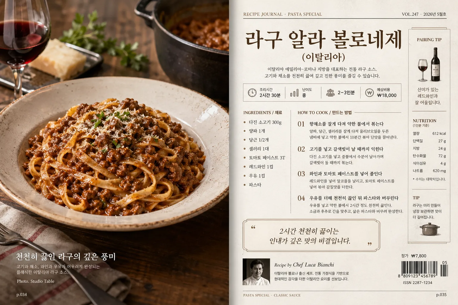
잡지 톤의 요리책 레시피 페이지. 음식 사진 + 재료 리스트 + 조리 단계 + 셰프 코멘트. 아이폰 렌즈 톤 photoreal.
요리책 레시피 매거진 레이아웃 검색 요약
요리책 레시피 매거진 레이아웃은 인포그래픽/안내 결과물을 만들 때 바로 복사해 활용할 수 있는 ChatGPT 이미지 프롬프트입니다. 주제, 배경, 스타일, 구도 조건을 함께 담아 빠르게 시안을 만들 수 있도록 구성했습니다.
관련 키워드: 요리책 레시피 매거진 레이아웃, 요리책 레시피 매거진 레이아웃 프롬프트, 인포그래픽/안내 프롬프트, 인포그래픽/안내 AI 이미지 프롬프트, ChatGPT 이미지 프롬프트, AI 이미지 생성 프롬프트, AI 프롬프트, 이미지 프롬프트
요리책 레시피 매거진 레이아웃 활용 포인트
원본 구조를 유지하면서 피사체, 배경, 색감, 구도를 바꿔 다양한 시안으로 확장할 수 있습니다.
- 핵심 소재는 유지하고 브랜드, 계절, 채널 목적에 맞는 색감과 배경을 바꿔보세요.
- 결과가 산만하면 배경 요소를 줄이고 피사체, 구도, 조명 조건을 구체화하세요.
- 복사한 뒤 ChatGPT에서 플랫폼, 화면 비율, 텍스트 포함 여부를 추가로 요청할 수 있습니다.
프롬프트 원문
[Input]
- language: Korean
- output_size: 1536x1024

[Purpose]
Cookbook recipe magazine spread for a single featured dish, designed like a real editorial recipe feature with generous food photography, ingredient list, cooking method, chef note, captioning, issue metadata, and magazine production details.
A premium double-page layout suitable for a printed cooking magazine or recipe book, with the richness of a photographed editorial spread rather than a sterile mockup.

[Composition]
- Left page: large food photo occupies about 60% of the full spread width, framed edge-to-edge with a narrow inner gutter and a realistic printed-page crop. The dish from {음식 사진} should feel freshly plated, with visible sauce sheen, pasta texture, steam warmth, table surface detail, and natural food styling elements that support {요리명·국가}.
- Right page: structured editorial column stack with title, ingredient list, cooking steps, chef comment, prep metadata, and magazine sidebars, aligned on a neat 12-column grid using {레이아웃}.
- The overall layout should clearly separate the hero dish from the text-heavy recipe information while still feeling like one cohesive magazine spread with a visible center gutter, page numbers, section labels, and subtle paper fold realism.
- Background treatment: soft paper-like off-white base with subtle magazine print texture, faint fiber grain, realistic ink density variation, and gentle page curvature near the center fold.
- Use {요리명·국가} as the main recipe title hierarchy at the top of the right page, with strong visual emphasis and a small editorial kicker above it.
- Use {재료} in a readable list block, and place {셰프 코멘트} as a highlighted pull-quote or side note.
- Add recipe-magazine details: issue label, date label, page numbers, section marker, small barcode/pricing area, photo caption, chef credit line, difficulty/time/serving badges, and a short Korean recipe intro paragraph.

[3. CORE STRUCTURE]
- Hero image area (left page): present the dish from {음식 사진} as the main visual, filling the page with realistic food texture, shallow depth impression, crisp highlight control, glossy sauce detail, herb flecks, plate rim detail, and an editorial tabletop scene that naturally belongs in a cookbook shoot.
- Left-page overlay/caption: add a small caption block near the bottom or outer margin with Korean editorial text such as "천천히 끓인 라구의 깊은 풍미", a photographer credit "Photo. Studio Table", and a page number like "p.034".
- Title block (right page top): set {요리명·국가} in a large serif headline with magazine-style spacing, aligned to the top grid and separated by thin rules. Above it include a small section label: "RECIPE JOURNAL · PASTA SPECIAL" and issue/date text: "VOL.247 · 2026년 5월호".
- Metadata strip: beneath the title, include compact badges or labels in Korean: "조리시간 2시간 30분", "난이도 중", "2–3인분", "예상비용 ₩18,000".
- Ingredients block (right page upper-middle): display {재료} as a compact but highly legible list, with consistent line spacing, small circular bullets or short separators, and a small heading "INGREDIENTS / 재료".
- Recipe body block (right page middle): reserve space for step-by-step cooking instructions in clean short paragraphs, numbered 01–04, using realistic Korean placeholder copy such as "향채소를 잘게 다져 약한 불에서 볶는다", "고기를 넣고 갈색빛이 날 때까지 익힌다", "와인과 토마토 페이스트를 넣어 졸인다", "우유를 더해 천천히 끓인 뒤 파스타와 버무린다".
- Chef note block (right page lower): place {셰프 코멘트} in an italic or quoted editorial box with a subtle tinted background, fine border, quotation mark detail, and label "CHEF'S NOTE".
- Sidebar elements: include a small "PAIRING TIP" box with Korean text like "산미가 있는 레드와인과 잘 어울립니다", plus a tiny nutrition-style row "칼로리 620kcal · 단백질 28g · 소금 1.4g".
- Footer area: include magazine-like metadata styling, page number treatment, barcode/pricing area, small caps labels, section marker "DINING / WEEKEND TABLE", and editorial credit text such as "Recipe. 편집부 테스트 키친 · Styling. 한지우".

[4. STYLE RULES]
- Typography: use {타이포}; title in Noto Serif KR or Nanum Myeongjo Bold, 42–56 px equivalent; body in Pretendard or Noto Sans KR Regular, 18–24 px equivalent; small caps labels in a condensed sans style; numerals and issue labels may use a refined editorial grotesque.
- Color palette: {컬러 톤} with fade beige #E8DDCF, charcoal #2B2B2B, warm amber #C98A3A, tomato brown #7A3E25, herb olive #6F7A3A, and paper white #F6F1E8.
- Border/shadow: thin 1px charcoal rules, very light print grain, subtle shadow under the photo panel only, 8px blur, 12% opacity; include faint registration-like crop ticks, small divider lines, and realistic ink-on-paper softness.
- Layout detailing: use visible magazine hierarchy with kicker, headline, dek paragraph, ingredient list, numbered method, pull quote, captions, credits, barcode block, and page folios. Keep all text blocks aligned to the editorial grid while allowing the food photograph to feel abundant and tactile.
- Decorative graphic elements: warm amber rule lines, small circular bullets, recipe category tags, tiny icons for time/serving/difficulty, and subtle page fold shading that reinforces the printed double-page spread.

[5. VISUAL STYLE]
- Camera / lens: editorial food photography look, 50mm lens at f/2.8 or 85mm macro at f/4, clean top-down or slight 30° angle depending on plated composition.
- Lighting: soft natural window light from upper-left, gentle fill from right, controlled specular highlights on sauce and pasta, realistic shadow falloff across the plate, table linen, utensils, and page surface.
- Color grade: warm editorial paper tones, beige + amber + deep brown balance, slightly muted contrast like a high-end cookbook spread.
- Food realism: emphasize authentic ingredient detail from {재료}, including browned meat sauce, tomato paste depth, pasta strands or ribbons, grated cheese dusting if appropriate, tiny herb garnish, sauce cling, and natural plating imperfections.
- Print realism: include slight paper grain, barely visible halftone texture in the photograph, ink absorption around Korean text, center gutter compression, and page-edge shadows to make the spread feel physically photographed or scanned from a premium magazine.

[6. MOOD]
Premium cookbook editorial — feels like a high-end food magazine spread with warm kitchen storytelling, appetizing realism, and the polished recipe design of Bon Appétit, Kinfolk-style paper tactility, and a contemporary Korean lifestyle magazine sensibility.

[7. CRITICAL]
- Korean text accuracy: 반드시 아래 문자열이 정확히 보여야 함.
  - "라구 알라 볼로네제 (이탈리아)"
  - "다진 소고기 300g / 양파 1개 / 당근 1/2개 / 셀러리 1대 / 토마토 페이스트 3T / 레드와인 1컵 / 우유 1컵 / 파스타"
  - "2시간 천천히 끓이는 인내가 깊은 맛의 비결입니다."
- Additional Korean editorial text should be readable and magazine-realistic, including examples such as "VOL.247 · 2026년 5월호", "조리시간 2시간 30분", "난이도 중", "2–3인분", "INGREDIENTS / 재료", "CHEF'S NOTE", "Recipe. 편집부 테스트 키친", and "p.035".
- Layout invariant: left page is image-dominant, right page is text-dominant, both aligned as a single cohesive magazine spread with visible center gutter and printed-page realism.
- Korean and English typography must be clean and correctly rendered with no broken characters.

[8. 🚫 PROHIBITED]
- Fake official seals / certifications
- Broken Korean characters