Photo Edits/Filters
믹스드 미디어 인물 에디토리얼
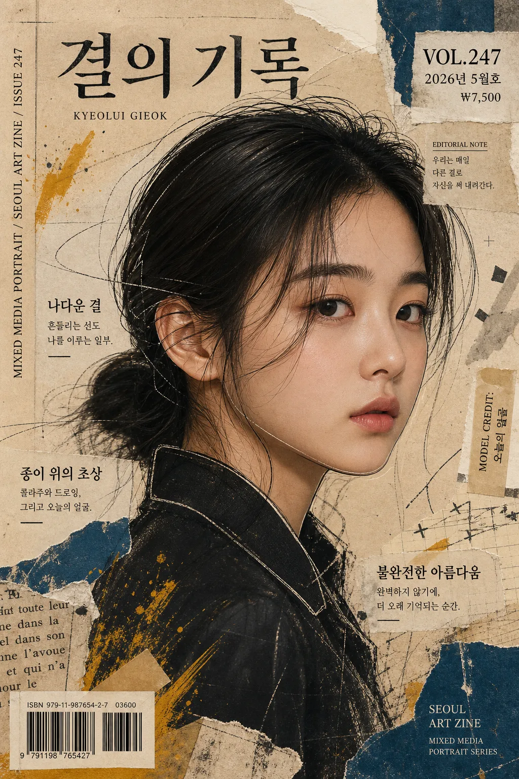
사진 + 손그림 일러스트 + 콜라주 텍스처 혼합 portrait. 잡지 에디토리얼 결, 인물 사진 + 페인팅·종이·낙서 레이어 합성.
믹스드 미디어 인물 에디토리얼 summary
Copy this ChatGPT image prompt to create Photo Edits/Filters results. Its subject, background, style, and composition are organized for quick iteration.
Related keywords: 믹스드 미디어 인물 에디토리얼, 믹스드 미디어 인물 에디토리얼 프롬프트, Photo Edits/Filters 프롬프트, Photo Edits/Filters AI 이미지 프롬프트, ChatGPT 이미지 프롬프트, AI 이미지 생성 프롬프트, AI 프롬프트, 이미지 프롬프트
How to use 믹스드 미디어 인물 에디토리얼
Keep the prompt structure and swap the subject, background, palette, or composition to create new variations.
- Keep the main subject and adjust the palette and background for your brand, season, or channel.
- If the result feels busy, simplify the background and make the subject, composition, and lighting more specific.
- After copying, ask ChatGPT to adapt it for your platform, aspect ratio, or text requirements.
Original prompt
[Input]
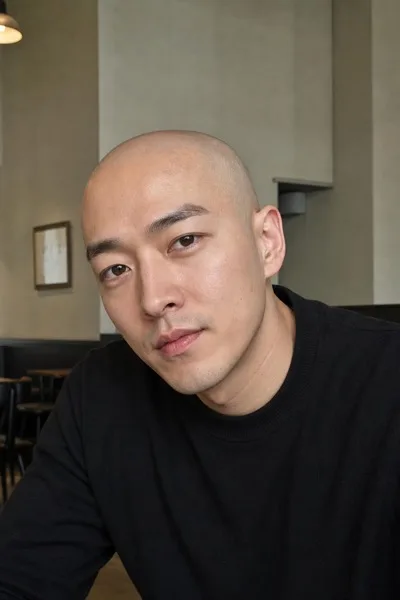
- reference_image: {참고 이미지}
- language: Korean
- output_size: 1024x1536

[Purpose]
Mixed-media portrait editorial poster built from an input face photo, combining photography, hand-drawn illustration, collage paper, painterly overlays, and realistic magazine-cover publishing details.
Designed like a contemporary Korean art magazine cover / gallery zine page with a vertical editorial composition, printed texture, issue metadata, short feature blurbs, and collectible indie-publication realism.

[Composition]
- Subject placement: {원본 보존} is the clear focal point, occupying about 55–65% of the frame, with the face slightly off-center so collage layers, cover typography, and paper fragments wrap naturally around the portrait.
- Pose direction: {포즈} with the head angle preserved naturally so the identity remains readable and the portrait still feels photographed before being remixed.
- Background treatment: {배경} fills the full canvas with visible paper grain, torn-edge accents, layered page fragments, taped corners, photocopy marks, faint registration crosses, and subtle overlapping magazine scraps.
- Editorial cover layout: build the image as a real zine/magazine cover with a masthead area at the top, issue number, date label, price, barcode block, model-name credit, small spine/credit text, and 2–3 short Korean feature headline blurbs arranged around the portrait.
- Layering and spacing: integrate textural marks, cut-paper shapes, paint splashes, and printed labels around the forehead, hair, shoulders, and side edges while keeping key facial features clear and expressive.

[Core Structure]
- Base portrait layer: preserve the likeness from {원본 보존} cleanly, then blend it into an editorial mixed-media treatment without flattening facial structure.
- Line art layer: add hand-drawn contour lines around the jawline, nose bridge, cheek outline, eyelid crease, collar, and hair edge, using fine black ink strokes that look sketched on top of the photo.
- Mixed element layer: express {혼합 요소} through visible media combinations such as translucent tracing paper, kraft-paper scraps, risograph dots, handwritten arrows, masking tape strips, paint daubs, scanned fabric fibers, and sliced magazine typography.
- Collage layer: place irregular paper cutouts around the face and shoulder area, with torn magazine fragments overlapping the background edges, lightly crossing hair or clothing, and avoiding obstruction of the eyes or mouth.
- Paint layer: add controlled paint splashes, dry-brush marks, graphite smudges, and acrylic streaks in small clusters near the outer frame and one shoulder, especially along one side of the composition for asymmetry.
- Texture layer: overlay vintage magazine halftone, kraft paper fibers, ink bleed, small dust specks, misregistered print color, and slight print noise across the full poster, keeping the skin tones readable.
- Typography layer: embed {타이포} as part of the collage structure, mixed with realistic cover details such as “VOL.247”, “2026년 5월호”, “₩7,500”, “EDITORIAL NOTE”, and “MODEL CREDIT: 오늘의 얼굴”; make the typography feel cut, stamped, pasted, or printed rather than floating digitally.
- Feature blurbs: include 2–3 short Korean magazine lines, for example “나다운 결”, “종이 위의 초상”, “불완전한 아름다움”, set near the left/right margins or lower third as supporting cover copy.
- Barcode and credits: add a small barcode area near the lower corner with tiny catalog text, plus vertical spine-style micro text along one side reading “MIXED MEDIA PORTRAIT / SEOUL ART ZINE / ISSUE 247”.
- Color balance: apply {컬러 톤} consistently across the collage fragments, paint accents, typographic blocks, and background paper so the piece feels unified and print-authentic.

[Style Rules]
- Typography: use Noto Serif KR or Nanum Myeongjo style for Korean cover text, plus a condensed serif like Cormorant Garamond for English accents; combine 400–700 weights, sizes ranging from tiny 8–12 px credits to 18–46 px blurbs, with slight print misregistration and uneven ink pressure.
- Magazine metadata: include readable cover details in Korean/English mix: “VOL.247”, “2026년 5월호”, “ISSN 1226-0526”, “₩7,500”, “서울 / 아트진”, and a small model-name credit line such as “모델 크레딧: 첨부 인물”.
- Color palette: follow {컬러 톤} with specific surfaces in mustard #C8A23A, deep cyan #0E6A78, charcoal #2B2B2B, and cream #F4EBD8; keep accents muted, editorial, and tactile.
- Border/shadow: use subtle paper-edge shadows, 3px y-offset with 10px blur at 14% opacity, torn-paper rough edges, taped overlaps, folded-corner hints, and layered print depth.
- Graphic details: add small arrows, crop marks, ink stamps, page-number-like labels, torn caption strips, and hand-numbered notes so the cover feels physically assembled and photographed/scanned.

[Visual Style]
- Camera / lens: full-frame editorial portrait look, 85mm f/1.4 with shallow depth of field, crisp facial detail, and a slightly compressed perspective.
- Lighting: soft studio key light from upper-left at about 45°, with gentle fill from front-right and a faint rim on the hairline to separate the subject from the textured background.
- Color grade: muted vintage print grade with cream, mustard, deep cyan, and charcoal; slightly desaturated highlights, warm paper whites, rich ink-like shadows, and realistic CMYK-style print variation.
- Material realism: surfaces should look scanned, pasted, brushed, torn, and printed, with tactile fibers, paper thickness, overlapping shadows, ink bleed, halftone dots, and imperfect handmade alignment.

[Mood]
Contemporary mixed-media fashion editorial — as if a Korean independent art magazine cover were remixed by a collage artist, annotated by hand, printed on textured zine paper, and photographed for a gallery publication.

[Critical]
- Korean text accuracy: the following verbatim Korean strings must appear correctly if rendered as part of the design: 첨부 인물 사진 정체성·표정 유지, 옆모습(side-facing) 또는 3/4 각도, 손그림 라인 드로잉 (얼굴 윤곽 강조), 콜라주 종이 조각, 페인트 스플래시, 빈티지 잡지 텍스처, 머스타드·딥 시안·차콜 + 크림 — 빈티지 잡지 결, 크라프트·잡지 페이지 텍스처, 살짝 찢어진 가장자리, 작은 영문 세리프 또는 한글 명조, 콜라주 일부로 박힘
- Additional Korean cover strings should be rendered cleanly and legibly where used: 나다운 결, 종이 위의 초상, 불완전한 아름다움, 2026년 5월호, 서울 / 아트진, 모델 크레딧: 첨부 인물.
- Preserve the subject’s identity, facial expression, and overall likeness from the reference image.
- Keep the portrait anatomically correct and maintain natural facial proportions under all collage overlays.
- Any visible hand-drawn lines must follow believable facial contours and should not distort the eyes, nose, or mouth.
- Cover text, barcode, collage scraps, paint, and stickers may overlap hair, clothing, or background, but must not hide the eyes, nose, or mouth.

[8. 🚫 PROHIBITED]
- Fake official seals / certifications
- Broken Korean characters
- Celebrity composites or unauthorized likeness substitution