個人檔案/頭像
표정별 이모티콘 16종 그리드
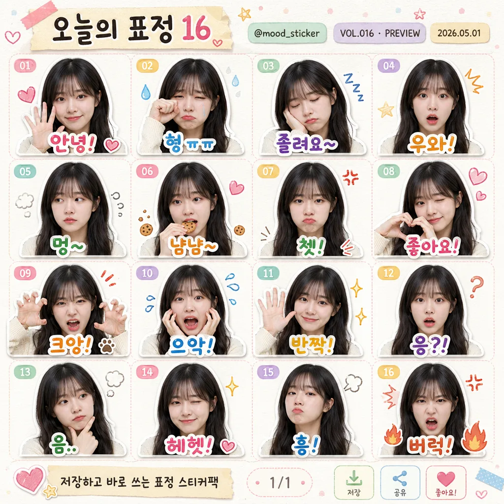
인물 사진 첨부하면 카카오톡 이모티콘 스타일 16개 표정(웃음·울음·졸림·놀람·멍함·먹는모습·찡그림·사랑·화남 등) 4x4 그리드로 변환. 얼굴 특징 100% 유지 + 한국어 텍스트 + 미니 이모지 + 흰 스티커 테두리.
표정별 이모티콘 16종 그리드摘要
這是用來製作個人檔案/頭像內容的 ChatGPT 圖像提示詞,已整理主題、背景、風格與構圖,方便快速調整。
相關關鍵字: 표정별 이모티콘 16종 그리드, 표정별 이모티콘 16종 그리드 프롬프트, 個人檔案/頭像 프롬프트, 個人檔案/頭像 AI 이미지 프롬프트, ChatGPT 이미지 프롬프트, AI 이미지 생성 프롬프트, AI 프롬프트, 이미지 프롬프트
표정별 이모티콘 16종 그리드使用方式
保留原始結構並替換主體、背景、色彩或構圖,即可延伸出不同版本。
- 保留核心主體,並依品牌、季節或平台調整色彩與背景。
- 如果畫面太複雜,請減少背景元素並具體描述主體、構圖與光線。
- 複製後可要求 ChatGPT 配合平台、長寬比或文字需求調整。
提示詞原文
[Input]
- reference_image: {참고 이미지}
- language: Korean
- output_size: 1024x1024

[Purpose]
Create a 4x4 grid sheet of 16 messenger-style emotes based on the attached portrait photo. The result should feel like a polished sticker pack preview page: photo-based, cute, expressive, commercially presented, and shareable as a single square image with title, creator metadata, version/date details, and playful sticker-pack UI cues.

[Composition]
- {원본 보존} 인물의 얼굴이 16개 셀 모두에서 동일하게 유지되도록 하며, 각 셀은 표정과 제스처만 바뀌도록 구성한다.
- {배경 스타일} 위에 파스텔 톤의 얇은 구분선, 작은 종이 질감, 반투명 컬러 스티커 조각, 손그림 느낌의 점·별·하트 장식을 가볍게 배치한다.
- 상단에는 {팩 제목}, {크리에이터 핸들}, {버전 표기}, {제작일}을 작은 스티커팩 카탈로그 헤더처럼 배치한다.
- {배치}는 중앙 영역을 4x4 균등 그리드로 나누어 총 16개 이모티콘을 좌→우, 상→하 순서로 정렬한다.
- 각 셀은 둥근 사각형 카드 또는 투명 스티커 프레임처럼 보이게 만들고, 셀 상단 모서리에 {셀 번호 라벨}을 작은 캡슐 태그로 넣는다.
- 각 셀 하단 또는 얼굴 주변에 {16개 한국어 텍스트}를 배치하고, 작은 {미니 이모지}를 표정에 맞게 1~2개씩 곁들인다.
- 하단에는 {하단 안내문}과 작은 page indicator, 저장/공유/좋아요를 암시하는 마이크로 아이콘을 넣어 실제 스티커팩 미리보기 카드처럼 완성한다.

[3. CORE STRUCTURE]
1. Overall canvas: build a square 1024x1024 sticker-pack preview sheet with a compact header, 16 equal emote cells, and a slim footer information strip, all aligned to a consistent editorial grid.
2. Header information: render the pack title “{팩 제목}” prominently, with “{크리에이터 핸들}”, “{버전 표기}”, and “{제작일}” as smaller realistic metadata.
3. Each cell portrait: place the same person in every cell, keeping identity, face shape, eye-nose-mouth positions, and proportions unchanged while changing only expression, micro-gesture, and emotion accents.
4. Sticker treatment: apply {스티커 디자인} to every emote so each face reads like an individual sticker placed on a preview sheet.
5. Expression mapping: render the 16 expressions in order from left to right, top to bottom, matching each cell to the corresponding {16개 표정 리스트} item.
6. Caption placement: set the matching {16개 한국어 텍스트} clearly in each cell, positioned as a bold sticker caption that supports the facial expression.
7. Decorative accents: add small {미니 이모지}, pastel speech bubbles, mini sparkle marks, sweat drops, tiny hearts, flames, food crumbs, or motion lines according to the emotion of each cell.
8. Footer details: include “{하단 안내문}”, a small “1/1” page indicator, and simple save/share/heart micro icons to make the sheet feel like a real preview card rather than an isolated grid.

[4. STYLE RULES]
- Typography: use {텍스트 폰트}; captions should be thick, rounded, and highly readable, with occasional pastel shadow blocks or sticker-label backplates.
- Color palette: use {컬러 톤} across captions, mini labels, header stickers, footer strip, and decorative accents.
- Layout finish: keep all 16 cells equal in size with consistent spacing, rounded card corners, playful capsule labels, and a balanced header/footer hierarchy.
- Border/shadow: apply a crisp white sticker outline around each emote, soft drop shadow, and subtle contact shadow under the sticker cutout for a tactile printed-sheet look.
- Text realism: Korean captions must look typeset, centered, and intentionally designed; use handwritten emphasis only where it improves the emote feeling.
- Decorative graphics: use small tape pieces, sticker tabs, sparkles, dots, hearts, and emotion marks as part of the designed sticker-pack preview.

[5. VISUAL STYLE]
- Camera / lens: Canon EOS R5 with RF 85mm f/1.2L USM portrait-photo look, natural facial proportions, clean skin detail, realistic eye highlights, adapted into a sticker-sheet layout.
- Lighting: soft studio softbox from upper-left at 45° with gentle fill from the right, even skin tones, delicate cheek highlights, and soft shadows below sticker cutouts.
- Color grade: pastel editorial grade with creamy whites, gentle coral-mint-lilac accents, warm neutral skin tones, and lightly printed paper texture.
- Rendering finish: realistic photo-collage sticker style, crisp facial detail, rounded graphic elements, polished app-store sticker preview presentation.

[6. MOOD]
Cute premium sticker-sheet editorial — a playful messenger emote pack preview with expressive portrait realism, pastel stationery charm, cheerful Korean captions, and a finished creator-card presentation.

[7. CRITICAL]
- Korean text accuracy: 반드시 정확히 보여야 하는 16개 캡션: "안녕!", "힝 ㅠㅠ", "졸려요~", "우와!", "멍~", "냠냠~", "쳇!", "좋아요!", "크앙!", "으악!", "반짝!", "응?!", "음..", "헤헷!", "흥!", "버럭!"
- Header/footer Korean text must be readable: "{팩 제목}", "{크리에이터 핸들}", "{버전 표기}", "{제작일}", "{하단 안내문}".
- All 16 cells must show the same person and the same facial identity; only the expression, gesture, and emotion accent changes.
- Facial features, eye/nose/mouth placement, face shape, hairline, and key identity markers must remain consistent.
- The 4x4 grid must be evenly balanced; every cell must align correctly with its expression number and matching Korean caption.

[8. 🚫 PROHIBITED]
- Fake official seals / certifications
- Broken Korean characters
- Different person or face replacement
- Celebrity composites unless explicitly provided as the reference image