社群/圖卡
자유 카테고리 손글씨 메모 메이커
사진 첨부 + 카테고리 선택 (음식/OOTD/여행/카페/운동/책/영화/일기) + 자유 텍스트로 손글씨 메모 합성. 따뜻한 인스타 감성, 한글 정확.
자유 카테고리 손글씨 메모 메이커摘要
這是用來製作社群/圖卡內容的 ChatGPT 圖像提示詞,已整理主題、背景、風格與構圖,方便快速調整。
相關關鍵字: 자유 카테고리 손글씨 메모 메이커, 자유 카테고리 손글씨 메모 메이커 프롬프트, 社群/圖卡 프롬프트, 社群/圖卡 AI 이미지 프롬프트, ChatGPT 이미지 프롬프트, AI 이미지 생성 프롬프트, AI 프롬프트, 이미지 프롬프트
자유 카테고리 손글씨 메모 메이커使用方式
保留原始結構並替換主體、背景、色彩或構圖,即可延伸出不同版本。
- 保留核心主體,並依品牌、季節或平台調整色彩與背景。
- 如果畫面太複雜,請減少背景元素並具體描述主體、構圖與光線。
- 複製後可要求 ChatGPT 配合平台、長寬比或文字需求調整。
提示詞原文
[Input]
- reference_image: {참고 이미지}
- language: Korean
- output_size: 1024x1024

[Purpose]
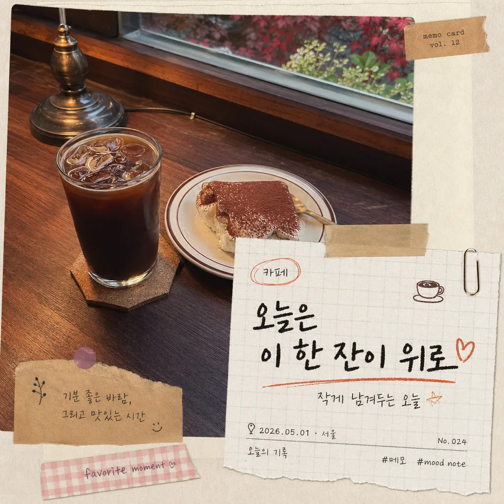
Korean hand-written memo overlay compositing template for social media, diary archives, and lifestyle post cards. Preserve the source photo identity while adding a readable category memo, real paper texture, date/location details, and small scrapbook objects that feel photographed together rather than pasted as a sterile graphic.

[Composition]
- Main subject: {원본 보존} source photo remains the visual base, occupying the full frame or a natural photo-print area, with the original identity, colors, textures, and perspective maintained.
- Memo placement: {메모 내용} appears as a paper-note overlay or handwritten caption, anchored to one side, a lower corner, or slightly overlapping the image edge, covering about 18–30% of the frame while staying readable.
- Category cue: {카테고리} is expressed through a small category tab, handwritten label, doodle motif, and note tone, without redrawing the original scene.
- Background treatment: {배경 종이} with visible paper fiber, tiny creases, torn or softly cut edges, realistic tape, a paperclip, washi strip, or small label sticker for a natural cut-and-paste scrapbook feel.
- Supporting details: include a small date/location line such as “2026.05.01 · 서울”, a tiny caption like “오늘의 기록”, a note number like “No. 024”, and 1–2 micro tags such as “#메모” or “mood note” printed or handwritten near the memo.
- Framing: let the original photo read clearly while making the memo area feel tactile, layered, and intentionally arranged like a real diary page photographed from above or composited with matched shadows.

[3. CORE STRUCTURE]
1. Base layer — keep {원본 보존} intact as the full-bleed or near full-bleed foundation, preserving original colors, textures, lighting direction, and composition.
2. Paper layer — place {배경 종이} as a memo sheet element near the photo edge or partially underlapping the image, with realistic thickness, paper grain, slight curl, faint smudges, and irregular handmade placement.
3. Handwriting layer — write {메모 내용} in prominent Korean handwriting, with {손글씨 톤} style, using strong contrast against the paper; add a smaller Korean line such as “작게 남겨두는 오늘” or “기록해두기” if it fits the mood.
4. Category and index layer — show {카테고리} as a tiny tab, file-label sticker, or circled header near the top of the memo; add a realistic date stamp, page mark, or small index text like “memo card / vol. 12”.
5. Doodle layer — add {장식·doodle} around the memo edge and nearby paper corners: small arrows, stars, hearts, flowers, food icons, travel marks, check boxes, underline strokes, or hand-drawn frames that match the category.
6. Scrapbook objects — include believable stationery details such as beige masking tape, transparent tape shine, a small binder clip shadow, pressed-paper sticker, receipt strip, or torn kraft label; keep them physically plausible and matched to the photo lighting.
7. Color harmony — apply {컬러 톤} consistently across ink, doodles, category tab, tape, and paper accents so the whole composition feels unified and reusable across categories.
8. Final polish — make the result look like a scanned or photographed scrapbook note pasted onto a real photo, with tactile paper edges, readable handwriting, natural shadows, and authentic lifestyle-magazine finishing.

[4. STYLE RULES]
- Typography: handwritten Korean in a marker-pen / pencil / fountain-pen hybrid feel, with small English secondary notes in Pretendard SemiBold or handwritten sans, size hint 28–54 px for the main memo and 12–18 px for tiny support text.
- Text hierarchy: {메모 내용} is the largest text; {카테고리} appears as a small header or label; support text can include “오늘의 메모”, “No. 024”, “2026.05.01”, “서울 성수동”, “mood note”, or “save this moment”.
- Color palette: use {컬러 톤} as the main palette, anchored by beige, charcoal ink, and coral or green accents; paper tones should stay in off-white, kraft brown, warm gray, pale butter, or recycled-paper beige.
- Border/shadow: subtle real-paper drop shadow, 4px y-offset, 10–14px blur, 12–18% opacity; use tactile paper edges, tape overlaps, and ink underlines instead of hard digital outline boxes or neon glow.
- Material detail: handwriting should show slight ink pressure variation, tiny pen skips, soft pencil grain, or marker pooling; paper should show fiber, compression marks, folded corners, and gentle surface imperfections.

[5. VISUAL STYLE]
- Camera / lens: realistic smartphone photo or 50mm f/1.8 documentary snapshot look, depending on the source image; keep perspective natural and unwarped.
- Lighting: preserve the original lighting of the source photo; if adding paper overlays, match them with soft ambient light from upper-left and a faint shadow to the lower-right.
- Color grade: warm cream + beige + charcoal with small coral or sage accents, low saturation, slightly matte finish.
- Realism: stationery objects, tape shine, paper curl, dust specks, and handwritten ink must share the same perspective and light direction as the source photo.

[6. MOOD]
Indie scrapbook journaling aesthetic — like a personal note page from a modern Korean lifestyle magazine spread, with a handmade diary feel, tactile stationery details, and a warm collected-memory atmosphere.

[7. CRITICAL]
- Korean text accuracy: the following verbatim Korean strings must appear correctly when used by the user: “{메모 내용}”.
- If {카테고리} appears as visible text, render it accurately in Korean and make it feel like a real memo label or category tab.
- Additional small Korean text may be included when appropriate, such as “오늘의 메모”, “기록해두기”, “서울”, “작게 남긴 하루”, or “다시 보고 싶은 순간”; all Korean must be legible and naturally handwritten or printed.
- Preserve the source image identity, colors, and texture as much as possible; do not convert the photo into a different scene.
- Handwriting must remain readable, natural, and category-appropriate, with believable human variation rather than a generic font look.
- Doodles and stationery details should support the memo theme and feel hand-placed, not randomly scattered.

[8. 🚫 PROHIBITED]
- Fake official seals / certifications
- Broken Korean characters
- Celebrity composites or unauthorized likeness replacement