SNS/카드뉴스
카페 투어 별점 손글씨 메모
카페 사진 + 카페 투어 손글씨 메모. 별점 + 시그니처 메뉴 + 가격 + 분위기 한 줄. 카페 추천 인스타·블로그.
카페 투어 별점 손글씨 메모 검색 요약
카페 투어 별점 손글씨 메모은 SNS/카드뉴스 결과물을 만들 때 바로 복사해 활용할 수 있는 ChatGPT 이미지 프롬프트입니다. 주제, 배경, 스타일, 구도 조건을 함께 담아 빠르게 시안을 만들 수 있도록 구성했습니다.
관련 키워드: 카페 투어 별점 손글씨 메모, 카페 투어 별점 손글씨 메모 프롬프트, SNS/카드뉴스 프롬프트, SNS/카드뉴스 AI 이미지 프롬프트, ChatGPT 이미지 프롬프트, AI 이미지 생성 프롬프트, AI 프롬프트, 이미지 프롬프트
카페 투어 별점 손글씨 메모 활용 포인트
원본 구조를 유지하면서 피사체, 배경, 색감, 구도를 바꿔 다양한 시안으로 확장할 수 있습니다.
- 핵심 소재는 유지하고 브랜드, 계절, 채널 목적에 맞는 색감과 배경을 바꿔보세요.
- 결과가 산만하면 배경 요소를 줄이고 피사체, 구도, 조명 조건을 구체화하세요.
- 복사한 뒤 ChatGPT에서 플랫폼, 화면 비율, 텍스트 포함 여부를 추가로 요청할 수 있습니다.
프롬프트 원문
[Input]
- reference_image: {참고 이미지}
- language: Korean
- output_size: 1024x1024

[Purpose]
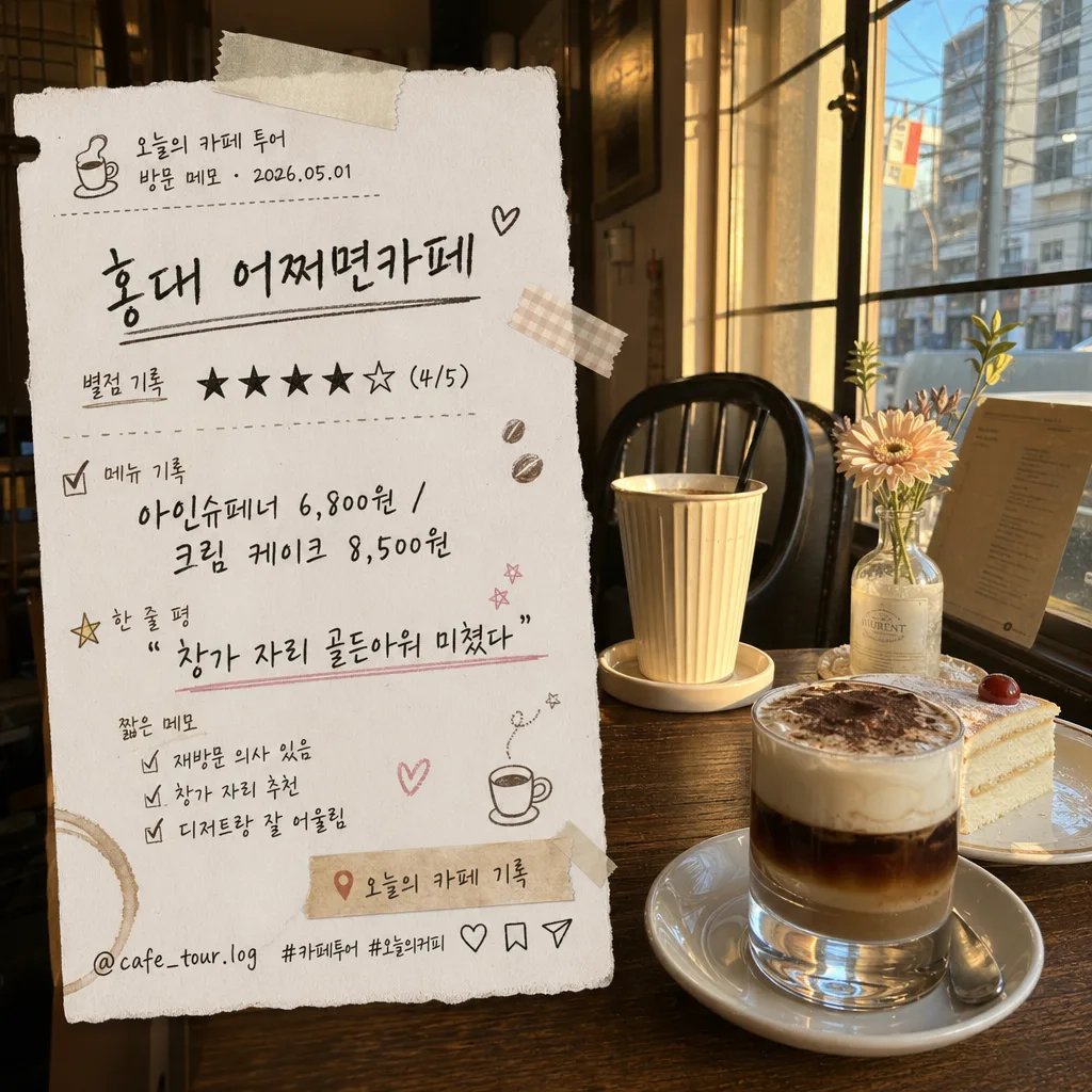
Create a realistic café tour handwritten memo overlay on top of the provided café/photo reference, designed like an Instagram story note, blog recap sticker, or diary scrapbook cutout captured from an actual café visit.
Warm handwritten annotation style with clear Korean text, rating marks, menu details, date/location cues, and small social-post elements integrated naturally into the photo.

[Composition]
- The provided photo remains the main base layer, with a tactile handwritten memo arranged over a readable zone covering about 35–45% of the frame.
- Place the memo text blocks along one side or in a slightly diagonal cluster, letting the original café scene, cups, table surface, lighting, and interior atmosphere remain visible around and behind the note.
- Use {원본 보존} as the underlying image content, while the text overlay summarizes {카페명·위치}, {별점}, {시그니처 메뉴}, and {분위기 한 줄}.
- Add {장식} as diary-like doodles, tiny tape strips, coffee bean marks, underlines, check marks, and small sticker accents around the memo edges so it feels handmade and lived-in.
- Use {배경 종이} as a soft paper-note, receipt fragment, vellum tag, or torn-paper memo patch, blended into the photo with visible paper fiber, faint crease marks, and natural shadow.
- Include small Instagram-story style details such as a tiny handle “@cafe_tour.log”, a date label “2026.05.01”, a location chip “오늘의 카페 기록”, and small save/share micro icons near the lower edge of the memo.

[3. CORE STRUCTURE]
1. Base photo layer — Keep {원본 보존} fully recognizable, with the café atmosphere still visible behind the memo overlay; preserve real photographic depth, reflections, table texture, cups, plates, pastries, window light, or interior details that already exist in the source.
2. Memo backing — Add a paper-note or receipt-like backing using {배경 종이}, with slightly irregular torn edges, subtle texture, faint fold lines, translucent tape at one or two corners, and a soft drop shadow as if the note is physically placed on the photo.
3. Mini header strip — At the top of the memo, add small support text in Korean: “오늘의 카페 투어” and “방문 메모 · 2026.05.01”, set in a neat tiny sans-serif style.
4. Title line — Write {카페명·위치} in a bold handwritten header style near the top of the memo, slightly tilted 2–4 degrees for a casual diary look.
5. Rating line — Render {별점} directly beneath the title, using compact hand-drawn star marks, a clean slash format, and a tiny label “별점 기록”, sized smaller than the title but still highly legible.
6. Menu note — Place {시그니처 메뉴} in a neat two-part line or short stacked format, with menu prices or separators styled like café receipt handwriting using slashes, dots, or small bullets for easy reading.
7. Mood quote — Insert {분위기 한 줄} in quotation marks as a casual side note or underlined scribble, mimicking a real handwritten reaction after tasting coffee.
8. Detail snippets — Add 2–3 short Korean micro-notes around the main memo: “재방문 의사 있음”, “창가 자리 추천”, “디저트랑 잘 어울림”, using tiny handwriting so the card feels like a real review note.
9. Decorative accents — Add {장식} around corners and gaps, including soft marker circles, washi-tape pieces, tiny stars, coffee-ring stains, receipt perforation dots, and hand-drawn arrows pointing toward the café photo.
10. Social footer — Near the bottom, include “@cafe_tour.log  #카페투어 #오늘의커피” with tiny heart, save, and share icons, as if this memo is prepared for an Instagram story archive.
11. Final integration — Blend the memo into the café photo with slight shadow, paper grain, real-world perspective, and warm color matching so it looks like a photographed scrapbook capture rather than a flat pasted graphic.

[4. STYLE RULES]
- Typography: handwritten Korean style with a mix of Pretendard SemiBold for tiny support text and hand-drawn marker / brush script for the main memo lines; title roughly 28–34 px equivalent, body 18–22 px equivalent, micro labels 10–13 px equivalent.
- Color palette: {컬러 톤}, plus off-white #F5F0E6, deep charcoal #2D2A26, muted amber #C98A3A, soft brown #8A6B52, pale latte #D9C2A3, and muted sage #9BA889 for small accent stickers.
- Paper and ink: use slightly uneven marker edges, graphite pencil pressure changes, tiny ink pooling at stroke ends, paper fibers, tape translucency, faint receipt grid marks, and subtle coffee-ring stains.
- Border/shadow: subtle paper shadow with 0 px x-offset, 4 px y-offset, 12 px blur, 14% opacity; if framing is needed, use a hand-drawn wavy line, folded paper edge, or torn receipt edge rather than a rigid digital box.
- Layout rhythm: combine a bold title, compact rating row, stacked menu note, quote line, and tiny social footer so the image has the density of a real café diary page while keeping the main review text easy to read.

[5. VISUAL STYLE]
- Camera / lens: smartphone café snapshot or 35mm documentary-style photo look, preserving the original perspective of the source image.
- Lighting: keep the existing café lighting from the source photo; if adding graphic shading, use a soft diffused shadow from upper-left at about 45° so the memo feels physically placed on paper.
- Color grade: beige + charcoal + warm amber accents, with slight film grain and restrained contrast, similar to a cozy magazine diary recap.
- Realism details: add natural paper curl, tiny dust specks, slight lens softness at the far edges, gentle tabletop reflections, and imperfect handmade alignment so the final image feels captured in a real café moment.

[6. MOOD]
Indie café diary scrapbook — like a Kinfolk-style notebook spread mixed with a real Instagram café review snapshot, warm enough to feel personal and detailed enough to resemble an actual saved café-tour memory.

[7. CRITICAL]
- Korean text accuracy: must appear exactly as written for the rendered content: "{카페명·위치}", "{별점}", "{시그니처 메뉴}", "{분위기 한 줄}".
- Render supplemental Korean microcopy clearly when included: “오늘의 카페 투어”, “방문 메모 · 2026.05.01”, “별점 기록”, “재방문 의사 있음”, “창가 자리 추천”, “디저트랑 잘 어울림”, “#카페투어”, “#오늘의커피”.
- Keep all Korean text clean and fully legible, with no broken Korean characters, no garbled spacing, and no mistaken star symbols.
- The original café photo must remain recognizable beneath the memo overlay, and the added paper, tape, doodles, and social footer must feel physically integrated into the same warm café scene.

[8. 🚫 PROHIBITED]
- Fake official seals / certifications
- Broken Korean characters