사진 변환/필터
일상 다이어리 손글씨 메모
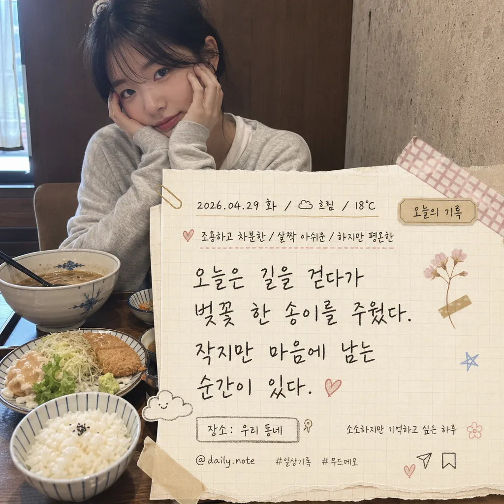
일상 사진 + 다이어리 감성 손글씨. 오늘의 무드·날짜·날씨 + 자유 메모 한 단락. 감성 일기 인스타.
일상 다이어리 손글씨 메모 검색 요약
일상 다이어리 손글씨 메모은 사진 변환/필터 결과물을 만들 때 바로 복사해 활용할 수 있는 ChatGPT 이미지 프롬프트입니다. 주제, 배경, 스타일, 구도 조건을 함께 담아 빠르게 시안을 만들 수 있도록 구성했습니다.
관련 키워드: 일상 다이어리 손글씨 메모, 일상 다이어리 손글씨 메모 프롬프트, 사진 변환/필터 프롬프트, 사진 변환/필터 AI 이미지 프롬프트, ChatGPT 이미지 프롬프트, AI 이미지 생성 프롬프트, AI 프롬프트, 이미지 프롬프트
일상 다이어리 손글씨 메모 활용 포인트
원본 구조를 유지하면서 피사체, 배경, 색감, 구도를 바꿔 다양한 시안으로 확장할 수 있습니다.
- 핵심 소재는 유지하고 브랜드, 계절, 채널 목적에 맞는 색감과 배경을 바꿔보세요.
- 결과가 산만하면 배경 요소를 줄이고 피사체, 구도, 조명 조건을 구체화하세요.
- 복사한 뒤 ChatGPT에서 플랫폼, 화면 비율, 텍스트 포함 여부를 추가로 요청할 수 있습니다.
프롬프트 원문
[Input]
- reference_image: {참고 이미지}
- language: Korean
- output_size: 1024x1024

[Purpose]
1-2 English lines: i2i diary-note composite over a casual everyday photo, styled as a realistic handwritten daily memo for Instagram, blog, or digital diary use.
Square 1:1 social post with warm stationery details, layered paper textures, readable Korean handwriting, and the feeling of a real personal diary page placed over a lived-in snapshot.

[Composition]
- The attached everyday photo stays as the main background base via {원본 보존}, with memo elements layered on top in a natural scrapbook / diary-card layout.
- Main text area should occupy about 35–45% of the frame while the original photo remains recognizable; place the paper and writing so the main face, food, object, pet, scenery, or key moment in the reference image is still clearly visible.
- Place the date/weather near the top-left or top-center in small handwritten text, the mood line just below it, and the main memo as the largest handwritten block in the lower-middle or mid-right area.
- Add a small diary label near the header reading “오늘의 기록”, a tiny location-style tag reading “장소: 우리 동네”, and a subtle footer caption reading “소소하지만 기억하고 싶은 하루”.
- Add a small social-post detail such as “@daily.note”, tiny save/share micro icons, and short hashtag-like text “#일상기록 #무드메모” near the bottom edge of the paper or photo.
- Add {장식} around the memo corners and page edges as real stationery details: washi-tape strips, tiny pressed-flower doodles, pen stars, soft stamp marks, masking tape shadows, or small sticker labels that feel physically attached to the paper.
- Use {배경 종이} as a semi-transparent paper layer or torn-paper panel behind the writing, with soft edge blending, visible fiber texture, and slight curling or lifted corners so the original photo still feels present beneath it.
- Apply {컬러 톤} consistently across ink, doodles, tape, stamps, and paper accents so the full composition feels like one cohesive diary entry.

[Core Structure]
- Background base: preserve {원본 보존} as the photographic foundation, keeping natural perspective and original lighting intact, including realistic background details from the source photo.
- Paper layer: place a cream diary-page surface inspired by {배경 종이} behind the memo, with visible paper grain, faint ruled or grid lines, light creases, tiny fibers, torn edges, and gentle shadows that suggest real paper resting over the photo.
- Header line: render {날짜·날씨} in a smaller handwritten style near the top, aligned like a real diary timestamp; include the fixed label “오늘의 기록” close by as a small tag or stamp.
- Mood line: place {오늘의 무드} directly under the date/weather with slightly looser brush handwriting, visually softer than the header and narrower than the main memo block.
- Location / caption details: add “장소: 우리 동네” as a small handwritten label, “소소하지만 기억하고 싶은 하루” as a tiny caption line, and “@daily.note” with “#일상기록 #무드메모” as realistic social diary metadata.
- Main memo block: set {자유 메모} as the dominant handwritten text, with natural line breaks, comfortable leading, small baseline variations, pressure changes, and slight organic tilt for an authentic pen-on-paper feel.
- Decorative accents: scatter {장식} in 3–5 small positions around the page edges or memo corners, mixing hand-drawn marks with tactile stationery pieces such as washi tape, small labels, translucent sticky tabs, or a soft ink stamp.
- Color integration: apply {컬러 톤} to ink, accent doodles, tabs, and subtle paper overlays; use warm cream, beige, charcoal, coral, or lilac accents with readable contrast and a natural diary-film balance.
- Final finish: make the whole piece look like a photographed diary note composited over a real-life snapshot, with layered shadows, paper thickness, realistic texture, and personal everyday details.

[Style Rules]
- Typography: handwritten Korean script style, casual pen-note feel, slightly uneven stroke width; use a clean handwritten font fallback such as Nanum Pen Script or a hand-lettered brush style, with the date smaller, the mood medium-sized, and the memo body larger.
- Color palette: use {컬러 톤} plus warm paper tones like cream #F6F0E6, beige #D8C7B3, charcoal #3C3A37, and a soft accent such as coral #E88D7B or lilac #B9A7D9.
- Border/shadow: if a paper panel is used, add a soft drop shadow with 4px vertical offset, 12px blur, and about 15% opacity; keep edges irregular, torn, taped, or paper-like rather than a flat digital box.
- Stationery realism: include tactile details such as faint pencil guide lines, tiny ink pooling at stroke ends, slightly translucent tape, small sticker paper thickness, light dust specks, and gentle paper creases.
- Layout rhythm: balance the handwritten memo, labels, hashtags, and decorative pieces so it reads like a real diary card prepared for a personal social post.

[Visual Style]
- Camera / lens: realistic smartphone photo base, equivalent to a 26mm wide smartphone lens at f/1.8 look, preserving everyday snapshot perspective rather than studio product framing.
- Lighting: natural ambient indoor or outdoor daylight from one side, ideally soft overcast light or window light from upper-left at about 45°, with gentle fill and realistic shadows cast by paper, tape, and stickers.
- Color grade: warm cream + muted beige + charcoal with subtle coral or lilac accents, low saturation, slightly faded diary-film tone.
- Texture detail: emphasize believable paper fibers, matte ink, translucent tape, soft sticker edges, and the original image’s real photographic texture.

[Mood]
Personal diary scrapbook overlay — like a gentle Kinfolk journal page mixed with a Real Simple handwritten note layout, but richer and more lived-in, as if someone actually wrote and decorated the memory after the day ended.

[Critical]
- Korean text accuracy: 반드시 아래 문구가 이미지에 정확히 보여야 함:
  - {날짜·날씨}
  - {오늘의 무드}
  - {자유 메모}
  - 오늘의 기록
  - 장소: 우리 동네
  - 소소하지만 기억하고 싶은 하루
  - @daily.note
  - #일상기록 #무드메모
- The handwritten text must remain fully legible, with clean Hangul character forms and natural spacing.
- Keep the original photo content recognizable; place paper, labels, and decorations around the key subject rather than flattening the entire image.
- Decorations should feel like real diary stationery: tape, tiny tags, small doodles, stamps, and stickers integrated with believable shadows and texture.

[8. 🚫 PROHIBITED]
- Fake official seals / certifications
- Broken Korean characters