興趣/生活
우편엽서 손글씨 메시지
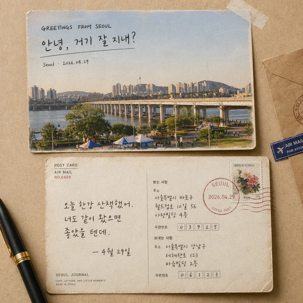
사진을 우편엽서 앞면 + 뒷면에 손글씨 메시지·주소·우표·소인 박힌 형태. 빈티지 여행 엽서 결.
우편엽서 손글씨 메시지摘要
這是用來製作興趣/生活內容的 ChatGPT 圖像提示詞,已整理主題、背景、風格與構圖,方便快速調整。
相關關鍵字: 우편엽서 손글씨 메시지, 우편엽서 손글씨 메시지 프롬프트, 興趣/生活 프롬프트, 興趣/生活 AI 이미지 프롬프트, ChatGPT 이미지 프롬프트, AI 이미지 생성 프롬프트, AI 프롬프트, 이미지 프롬프트
우편엽서 손글씨 메시지使用方式
保留原始結構並替換主體、背景、色彩或構圖,即可延伸出不同版本。
- 保留核心主體,並依品牌、季節或平台調整色彩與背景。
- 如果畫面太複雜,請減少背景元素並具體描述主體、構圖與光線。
- 複製後可要求 ChatGPT 配合平台、長寬比或文字需求調整。
提示詞原文
[Input]
- reference_image: {참고 이미지}
- language: Korean
- output_size: 1024x1024

[Purpose]
Create a photoreal postcard-style handwritten memo composite from the provided photo, designed for Instagram, blog posts, and diary journaling. Show a real two-sided postcard moment in a warm editorial scrapbook flat-lay, with the original photo integrated as the printed front image and the reverse side filled with postal handwriting, travel notes, address details, stamp marks, and tactile paper aging.

[Composition]
- The canvas is a square 1:1 composition with both postcard sides visible, arranged as either top/bottom or left/right depending on the input photo’s shape and balance.
- The {원본 보존} image should be integrated as the main postcard front with convincing print-on-paper realism, slight ink absorption, tiny paper fibers, and natural surface sheen rather than a floating digital cutout.
- The front side should occupy about 45–50% of the frame, while the back side and handwritten message should occupy the remaining area, with a believable overlap and tactile tabletop depth.
- Use {레이아웃} to place the front and back in a balanced postcard mockup layout, as if two sides of the same mailed card were laid out for a journal photo.
- Background should feel like {배경 종이}: aged kraft paper or vintage warm ivory postcard stock with subtle paper grain, gentle worn texture, faint stains, soft creases, and natural desk-surface variation.
- Add realistic postcard context: printed divider line, address rules, postal-code boxes, small “POST CARD” label, air-mail style micro text, a tiny date/location notation, and a few subtle scrapbook details such as a kraft envelope corner, a strip of translucent washi tape, or a fountain-pen shadow near the edge.

[3. CORE STRUCTURE]
- Front postcard area: apply {원본 보존} directly onto the postcard front with photoreal paper transfer, preserving natural photo detail, realistic print texture, slight paper absorption at the edges, and very mild wear on the corners.
- Front copy area: place {앞면 카피} as the front-side caption in a handwritten postcard note style; set the main Korean phrase prominently and add the location/date line “Seoul · 2026.04.29” smaller beneath it like a real travel postcard caption.
- Back postcard area: write {뒷면 메시지} in natural handwritten ink on the reverse side, with casual line breaks, slight baseline variation, and pressure changes like a real pen on textured paper.
- Postal details: add {우표·소인} near the upper-right corner of the postcard, with the stamp slightly tilted and the circular postmark stamped in semi-faded red ink; include small cancellation waves crossing part of the stamp.
- Address anatomy: include printed Korean labels such as “받는 사람”, “보내는 사람”, “주소”, “우편번호”, plus sample postal-code boxes and short address-like filler lines that look handwritten but do not overpower the main message.
- Extra printed micro details: add small realistic marks such as “POST CARD”, “AIR MAIL”, “NO.0429”, “SEOUL JOURNAL”, and a tiny printer registration dot or paper maker line near the bottom edge.
- Surface treatment: the paper should show gentle crease marks, light fiber texture, tiny ink feathering, slightly rounded corners, mild edge darkening, and realistic shadow falloff where the postcard overlaps the background.
- Overall balance: ensure the front and back sides feel like one coherent mailed object photographed in a diary spread, with tactile paper depth and naturally arranged postal ephemera.

[4. STYLE RULES]
- Typography: use a handwritten script style for the memo text, paired with clean sans-serif support text for postal labels; approximate fonts such as Nanum Pen Script, Cafe24 Oneprettynight, or a neat Pretendard for small support labels; handwriting should feel medium-weight, 26–34px equivalent on a 1024 canvas, with smaller postal micro type at 10–16px equivalent.
- Color palette: use {컬러 톤} with beige paper #E8DCC8, black ink #1A1A1A, muted postal red #B43A35, soft graphite gray #77716A, and faint blue-gray address lines; avoid neon or oversaturated tones.
- Border/shadow: apply a soft natural paper shadow, 4px y-offset, 14px blur, 18% opacity, with slightly darker contact shadow under overlapping postcard edges and subtle corner lift.
- Printed details should look physically pressed, stamped, written, or printed on paper: uneven ink density, slight misalignment, faint stamp grain, tiny paper dents, and authentic mailing-card wear.

[5. VISUAL STYLE]
- Camera / lens: studio flat-lay realism, equivalent to a Canon EOS R5 with 35mm lens at f/5.6, top-down framing for the postcard mockup.
- Lighting: soft diffused window light from upper-left at roughly 45°, with a faint fill from lower-right to keep the paper texture visible and reduce harsh contrast.
- Color grade: warm parchment + muted sepia + postal red accents, with natural paper whites, restrained contrast, realistic ink blacks, and a gentle analog-photo warmth.

[6. MOOD]
Quiet travel-journal editorial — a real mailed postcard caught in a Kinfolk-style lifestyle spread, personal, tactile, nostalgic, and freshly written after a spring walk in Seoul.

[7. CRITICAL]
- Korean text accuracy: the following strings must appear exactly and clearly in the rendered image:
  - "안녕, 거기 잘 지내?"
  - "오늘 한강 산책했어. 너도 같이 왔으면 좋았을 텐데. — 4월 29일"
  - "Seoul · 2026.04.29"
- Add small supporting Korean postcard text that fits the theme, such as "받는 사람", "보내는 사람", "우편번호", "서울에서 보냄", and "봄 산책 기록", while keeping the three required strings most prominent and legible.
- The front and back postcard sides must both be visible in the final composition.
- Handwritten text must be legible, evenly inked, and not broken, mirrored, or garbled.
- Postal stamp, postmark, address lines, postal-code boxes, and printed labels should look physically printed or handwritten on the card, not like UI stickers.

[8. 🚫 PROHIBITED]
- Fake official seals / certifications
- Broken Korean characters