社群/圖卡
잡지 마진 손글씨 메모
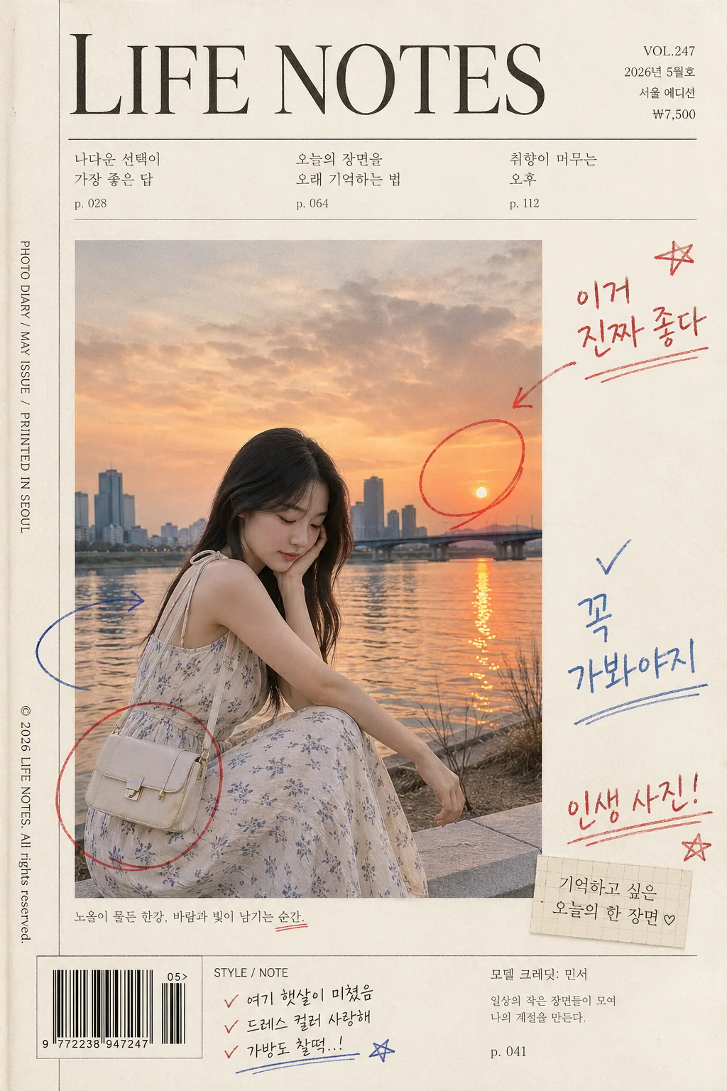
사진을 잡지 페이지에 박고 여백에 독자가 적은 듯한 손글씨 메모. 인용·체크·동그라미 표시.
잡지 마진 손글씨 메모摘要
這是用來製作社群/圖卡內容的 ChatGPT 圖像提示詞,已整理主題、背景、風格與構圖,方便快速調整。
相關關鍵字: 잡지 마진 손글씨 메모, 잡지 마진 손글씨 메모 프롬프트, 社群/圖卡 프롬프트, 社群/圖卡 AI 이미지 프롬프트, ChatGPT 이미지 프롬프트, AI 이미지 생성 프롬프트, AI 프롬프트, 이미지 프롬프트
잡지 마진 손글씨 메모使用方式
保留原始結構並替換主體、背景、色彩或構圖,即可延伸出不同版本。
- 保留核心主體,並依品牌、季節或平台調整色彩與背景。
- 如果畫面太複雜,請減少背景元素並具體描述主體、構圖與光線。
- 複製後可要求 ChatGPT 配合平台、長寬比或文字需求調整。
提示詞原文
[Input]
- reference_image: {참고 이미지}
- language: Korean
- output_size: 1024x1536

[Purpose]
Magazine-style i2i composition that places the attached photo as the main spread image and adds reader-like handwritten margin notes, editorial labels, issue metadata, and realistic printed-page details.
Built for Instagram, blog posts, and diary-style scrapbook use with a premium magazine-paper layout that feels collected, annotated, and lived-in.

[Composition]
- Center the photo from {원본 보존} as the main magazine image, occupying about 62% of the canvas height, embedded into a vertical 1024x1536 editorial page with tactile paper margins, small print labels, and annotation marks.
- Use a refined magazine page structure: main image anchored slightly left-of-center, reader notes distributed on the right and lower margins, with a top masthead strip and lower editorial footer details for a real magazine tear-sheet feel.
- Keep the background as warm off-white magazine paper (#F4F0E6) with subtle print fiber, faint handling marks, light ink absorption, and natural page shadow; avoid making it look like a flat sterile mockup.
- Place {여백 손글씨} in the paper margins using {손글씨 톤}, and position {표시 doodle} near visually important parts of the photo as if a reader circled, underlined, or pointed to them while reading.
- Use {잡지 톤} as the overall page direction so the image reads like a high-end lifestyle magazine spread with personal marginalia rather than a poster.
- Apply {컬러 톤} consistently across paper, printed headings, annotation ink, and the preserved photo so the whole page feels like one photographed magazine artifact.

[3. CORE STRUCTURE]
1. Main photo block: show {원본 보존} cleanly embedded on the page with straight crop edges, like a real magazine print inset, preserving the original photo realism and keeping the key subject unobstructed.
2. Magazine identity layer: add a refined masthead and issue metadata around the image, including short Korean editorial text such as "LIFE NOTES", "VOL.247", "2026년 5월호", "서울 에디션", and a small price label "₩7,500".
3. Feature headline layer: include 2-3 short Korean magazine blurbs in balanced serif/sans typography, for example "나다운 선택이 가장 좋은 답", "오늘의 장면을 오래 기억하는 법", and "취향이 머무는 오후"; keep them readable and secondary to the photo.
4. Margin handwriting layer: add {여백 손글씨} in several free-form locations around the photo, varying size, pressure, and tilt slightly so it feels handwritten directly in the margins rather than typeset.
5. Doodle annotation layer: place {표시 doodle} around select subject areas, using small red or blue ink circles, check marks, arrows, stars, underlines, and bracket marks with thin casual strokes.
6. Real magazine details: include a small barcode area at the lower outside edge, tiny spine/credit text along one side such as "PHOTO DIARY / MAY ISSUE / PRINTED IN SEOUL", a model-name credit line such as "모델 크레딧: 민서", and a small photo caption below the image.
7. Editorial text balance: keep the attached photo as the visual anchor while surrounding it with authentic magazine microtext, footer numbering like "p. 041", section marker "STYLE / NOTE", and handwritten reader reactions in the margins.
8. Print realism pass: add slight paper grain, mild ink absorption, gentle off-register alignment in tiny printed text, faint page crease or scan shadow, and realistic pen texture while keeping all important Korean text crisp and readable.

[4. STYLE RULES]
- Typography: main magazine headings in Vogue-like Didot or Noto Serif KR, body-style accents in Pretendard or Noto Sans KR, handwritten notes in marker-pen, gel pen, or pencil style with a slightly rough edge matching {손글씨 톤}.
- Color palette: off-white paper #F4F0E6, black ink #1A1A1A, red annotation #D94B45, blue annotation #2F62B8, subtle gray print shadows #B9B2A8, harmonized through {컬러 톤}.
- Border/shadow: use a very soft paper shadow, 4px y-offset, 12px blur, 12% opacity, to separate the inset image from the page; allow natural printed dividers, fine rules, crop marks, barcode lines, and editorial footer elements.
- Handwritten elements should look human: uneven baseline, varied pen pressure, slight ink pooling, occasional tiny correction mark, and natural spacing around the printed magazine text.
- Printed details should feel authentic: small but legible captions, issue/date labels, page number, barcode block, section tags, and credit lines integrated into the page hierarchy.

[5. VISUAL STYLE]
- Camera / lens: editorial scan look based on a 50mm f/1.8 or 85mm f/1.4 portrait frame, then flattened into a magazine-page composition.
- Lighting: neutral diffused studio light with realistic paper texture visibility, softbox-style illumination at 45°, gentle contact shadows, and a photographed/flatbed-scan hybrid finish.
- Color grade: magazine print tone with slightly warm paper whites, controlled blacks, restrained red/blue ink accents, and cohesive {컬러 톤} across the printed page and handwritten layers.
- Material rendering: matte magazine stock, subtle tooth in the paper, printed ink sitting slightly into the fibers, and hand-drawn ink layered visibly above the print.

[6. MOOD]
Premium editorial scrapbook — like a Kinfolk meets Vogue marginalia spread, with casual reader notes, issue metadata, tiny credits, and real magazine artifacts layered onto a polished lifestyle page.

[7. CRITICAL]
- Korean text accuracy: "이거 진짜 좋다", "꼭 가봐야지", "인생 사진!" must appear exactly as handwritten notes.
- Korean text accuracy: include readable printed magazine details such as "VOL.247", "2026년 5월호", "서울 에디션", "나다운 선택이 가장 좋은 답", "오늘의 장면을 오래 기억하는 법", "취향이 머무는 오후", "모델 크레딧: 민서", and "p. 041".
- Korean text accuracy: all margin annotations, captions, feature blurbs, and any visible Korean handwriting must be legible, correctly spaced, and free of broken characters.
- Layout invariants: the attached photo must remain the main focal image, and handwritten notes must stay in the margins or near image edges without covering the key subject.
- Doodle rules: circles, check marks, underlines, arrows, stars, and bracket marks must be small, casual, and clearly readable as annotation marks.
- Barcode and microtext must look like magazine production details, not a product advertisement or official document.

[8. 🚫 PROHIBITED]
- Fake official seals / certifications
- Broken Korean characters
- Celebrity composites / unauthorized likeness