굿즈/목업
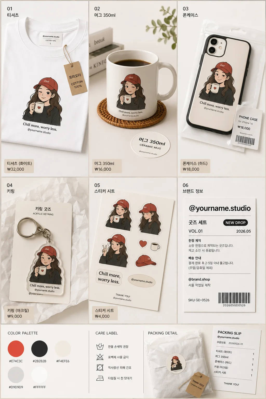
본인 굿즈 목업 (티셔츠·머그·폰케이스·키링)
본인 사진·일러스트를 굿즈에 박은 mockup 시트. 티셔츠·머그·폰케이스·키링·스티커 4~5종. 자체 IP 굿즈 컨셉.
본인 굿즈 목업 (티셔츠·머그·폰케이스·키링) 검색 요약
본인 굿즈 목업 (티셔츠·머그·폰케이스·키링)은 굿즈/목업 결과물을 만들 때 바로 복사해 활용할 수 있는 ChatGPT 이미지 프롬프트입니다. 주제, 배경, 스타일, 구도 조건을 함께 담아 빠르게 시안을 만들 수 있도록 구성했습니다.
관련 키워드: 본인 굿즈 목업 (티셔츠·머그·폰케이스·키링), 본인 굿즈 목업 (티셔츠·머그·폰케이스·키링) 프롬프트, 굿즈/목업 프롬프트, 굿즈/목업 AI 이미지 프롬프트, ChatGPT 이미지 프롬프트, AI 이미지 생성 프롬프트, AI 프롬프트, 이미지 프롬프트
본인 굿즈 목업 (티셔츠·머그·폰케이스·키링) 활용 포인트
원본 구조를 유지하면서 피사체, 배경, 색감, 구도를 바꿔 다양한 시안으로 확장할 수 있습니다.
- 핵심 소재는 유지하고 브랜드, 계절, 채널 목적에 맞는 색감과 배경을 바꿔보세요.
- 결과가 산만하면 배경 요소를 줄이고 피사체, 구도, 조명 조건을 구체화하세요.
- 복사한 뒤 ChatGPT에서 플랫폼, 화면 비율, 텍스트 포함 여부를 추가로 요청할 수 있습니다.
프롬프트 원문
[Input]
- language: Korean
- output_size: 1024x1536

[Purpose]
Photoreal custom merchandise mockup sheet for personal brand use, arranged as a rich multi-product presentation for online shop listings, social sharing, and portfolio display.
Show one consistent {원본 디자인} applied across apparel, drinkware, phone accessory, keychain, and the selected {굿즈 종류}, with realistic packaging details and shop-ready labeling.

[Composition]
- Main composition: follow {레이아웃} as a polished 2x3 or 3x2 merchandise board filling the full vertical canvas, with product tiles arranged like a real boutique catalog shoot.
- Subject placement: each mockup sits on a tactile tabletop or paper backdrop, with the hero product slightly above center and supporting items angled naturally to show depth, scale, and material finish.
- Background treatment: {배경 톤} with seamless studio surface, subtle paper grain, matte tabletop texture, soft grounding shadows, and realistic contact shadows beneath every object.
- Framing direction: straight-on product presentation with controlled perspective, suitable for e-commerce while still feeling like an actual photographed brand sample kit.
- Brand label zone: include a refined header or footer card for {브랜드 이름}, plus small shop metadata such as ‘굿즈 샘플팩’, ‘NEW DROP’, ‘VOL.01’, ‘2026.05’, ‘SKU GD-0526’, and a tiny barcode-style price label.
- Realistic set dressing: include tasteful production details such as folded tissue paper, a small kraft hangtag, color swatch chips matching {컬러 톤}, a thin packing slip edge, clear acrylic keychain reflections, and a small care-label card without hiding the products.

[3. CORE STRUCTURE]
- Top row / left tile: a photoreal T-shirt mockup showing {원본 디자인} printed crisply on the chest area, with visible cotton weave, natural fabric folds, collar seam, sleeve hems, inner neck label, and a small hangtag reading ‘프리오더’ or ‘COTTON 100%’.
- Top row / center tile: a ceramic mug mockup with {원본 디자인} wrapped naturally around the curved surface, handle visible, ceramic lip thickness, glossy highlights, faint reflection on the tabletop, and a small coaster or product sticker nearby reading ‘머그 350ml’.
- Top row / right tile: a phone case mockup featuring {원본 디자인} centered on the back panel, accurate camera cutout, realistic edge thickness, satin or glossy plastic finish, and a tiny packaging sleeve label reading ‘PHONE CASE’ and ‘₩18,000’.
- Bottom row / left tile: a keychain mockup with {원본 디자인} scaled to fit the small surface cleanly, metal ring, clasp, acrylic or enamel material rendered with real reflections, and a backing card marked ‘키링 굿즈’.
- Bottom row / center tile: an extra product tile from {굿즈 종류}, styled as part of the same drop, with matching print placement, material-specific reflections, a small price tag, and packaging detail.
- Bottom row / right tile: a brand information tile using {브랜드 이름}, styled like a real shop insert card with Korean microcopy such as ‘굿즈 세트’, ‘한정 제작’, ‘배송 안내’, ‘@brand.shop’, a tiny barcode block, item code, and contact-style line ‘서울 작업실 제작’.
- Across all tiles: apply the same {원본 디자인} consistently, with matching color response and realistic material interaction across fabric, ceramic, plastic, acrylic, enamel, paper, and metal.

[4. STYLE RULES]
- Typography: use Pretendard or Noto Sans KR for label text, medium to semibold weight, 24–48px equivalent for the brand name and 10–18px equivalent for shop metadata, with precise Korean typesetting and believable print alignment.
- Color palette: base the sheet on {컬러 톤}, with neutral white #FFFFFF, soft beige #F4EFE6, charcoal #2B2B2B, muted gray #D9D9D9, and one or two small accent swatches derived from the design.
- Border/shadow: use soft product-card shadows, natural contact shadows, paper overlaps, thin printed dividers, and subtle corner radius where appropriate, matching a premium stationery-and-merch presentation.
- Surface finish: mix matte paper, cotton fabric, glazed ceramic, satin phone-case plastic, reflective metal rings, and clear acrylic highlights so each object feels physically distinct.
- Layout details: include small readable Korean labels such as ‘신상품’, ‘제작 샘플’, ‘옵션 선택’, ‘패키지 포함’, ‘₩7,500’, and ‘2026년 5월 제작’ only where they enhance the catalog realism.

[5. VISUAL STYLE]
- Camera / lens: professional product photography look, equivalent to a Canon EOS R5 with a 50mm lens for the overall grid and a 85mm perspective feel for individual product clarity, f/8 to keep all product edges sharp.
- Lighting: large diffused studio softbox from upper-left at about 45°, very light fill from the right, gentle bounce under each item, and controlled specular highlights on ceramic, acrylic, plastic, and metal.
- Color grade: clean neutral whites with gentle warm beige balance, natural material colors preserved, slight contrast lift for catalog clarity, realistic print ink density, and no artificial cinematic tint.

[6. MOOD]
Premium e-commerce merchandise catalog with the warmth of a real maker studio sample shoot — refined, tactile, shop-ready, and personal-brand focused, like a curated Shopify product launch image or a boutique stationery brand drop.

[7. CRITICAL]
- Korean text accuracy: render {브랜드 이름} correctly if shown as text, and render added Korean labels accurately, including ‘굿즈 세트’, ‘신상품’, ‘제작 샘플’, ‘한정 제작’, ‘배송 안내’, ‘키링 굿즈’, ‘머그 350ml’, ‘프리오더’, and ‘2026년 5월 제작’.
- All mockups must share the same {원본 디자인} and maintain realistic product proportions.
- Each product tile must remain photorealistic, with correct reflections, folds, seams, shadows, print distortion, and edge geometry for the specific material.
- Keep shop details secondary to the merchandise: labels, barcode blocks, hangtags, packaging sleeves, and swatches should support the product story without covering {원본 디자인}.

[8. 🚫 PROHIBITED]
- Fake official seals / certifications
- Broken Korean characters