趣味・ライフスタイル
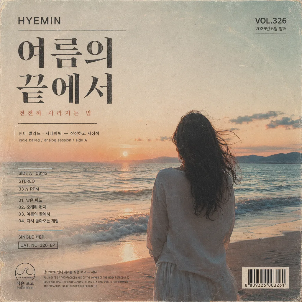
앨범 커버 인디 LP (싱글·EP 커버 디자인)
인디 음악·싱글·EP 앨범 커버. 미니멀·페인팅·콜라주·사진 톤 자유. 음악 SNS·LP 스트리밍 활용.
앨범 커버 인디 LP (싱글·EP 커버 디자인)の概要
趣味・ライフスタイル画像を作るためのChatGPT画像プロンプトです。主題、背景、スタイル、構図を整理し、すぐに試せるよう構成しています。
関連キーワード: 앨범 커버 인디 LP (싱글·EP 커버 디자인), 앨범 커버 인디 LP (싱글·EP 커버 디자인) 프롬프트, 趣味・ライフスタイル 프롬프트, 趣味・ライフスタイル AI 이미지 프롬프트, ChatGPT 이미지 프롬프트, AI 이미지 생성 프롬프트, AI 프롬프트, 이미지 프롬프트
앨범 커버 인디 LP (싱글·EP 커버 디자인)の活用方法
元の構造を保ちながら、被写体、背景、色、構図を変更して別案に展開できます。
- 主題を維持し、ブランドや季節、媒体に合わせて色と背景を変更してください。
- 結果が複雑な場合は背景要素を減らし、被写体、構図、照明を具体化してください。
- コピー後、ChatGPTに媒体、アスペクト比、文字の有無を追加で指定できます。
プロンプト原文
[Input]
- language: Korean
- output_size: 1024x1024

[Purpose]
Indie LP / EP album cover design, square 1:1 release artwork for streaming platforms and physical jacket use.
Cinematic indie-ballad sleeve with restrained emotional depth, designed to feel like a real small-label record cover with authentic printed-jacket details, catalog markings, release metadata, and tactile production texture.

[Composition]
- Square LP format fills the full frame, with the main visual occupying about 65% of the canvas and integrated typography, label marks, and jacket metadata arranged as part of a real release cover.
- Primary title block is placed in the upper-left or upper-center area according to {레이아웃}, while the artist name, label mark, catalog number, and release-date microtext sit near the bottom edge like a finished indie record sleeve.
- Background treatment should feel like a tactile printed surface: faded paper grain, slightly desaturated color wash, subtle ink density variation, faint sleeve scuffs, soft corner wear, and offset-print texture.
- Include believable album-cover production details: small catalog number such as “CAT. NO. 326-EP”, release date “2026.05.01”, format note “SINGLE / EP”, tiny copyright line “ⓒ 2026 {브랜드·라벨}”, and a compact barcode block on the back-cover-inspired lower corner or side strip.
- Use {아티스트·제목}, {장르·무드}, {비주얼 컨셉}, {타이포}, {컬러 톤}, {레이아웃}, {브랜드·라벨} as editable placeholders.

[3. CORE STRUCTURE]
- Main visual zone (center 60–70%): build one clear focal subject based on {비주얼 컨셉}, such as a beach at dusk, a sunset road, a back-view figure near water, a bedroom window scene, a faded flower still life, or one expressive abstract painting treatment; enrich it with natural scene details like windblown hair, rippled water, curtain texture, handwritten tape marks, film dust, paper fibers, or soft environmental traces that support the mood.
- Title zone: place {아티스트·제목} as the dominant typographic anchor, with strong hierarchy, readable Hangul, and elegant spacing aligned to {레이아웃}; add one short Korean cover line nearby, for example “천천히 사라지는 밤” or “다시 돌아오는 계절”, small enough to feel like sleeve poetry rather than advertising.
- Supporting mood text zone: integrate {장르·무드} as a small secondary line beneath or beside the title, paired with compact English microtype such as “indie ballad / analog session / side A”.
- Release metadata zone: include short realistic sleeve details: “VOL.326”, “2026년 5월 발매”, “SIDE A 03:42”, “STEREO”, “33⅓ RPM”, and a tiny track hint such as “01. 낮은 파도” or “02. 오래된 편지” in Korean, arranged like genuine LP jacket typography.
- Typography treatment: apply {타이포} with a refined editorial balance, ensuring Hangul remains crisp and English microtype stays compact, realistic, and print-accurate.
- Palette application: render {컬러 톤} across the whole cover through muted print-like layering, allowing natural tonal variation, ink overlap, gentle stains, and analog grain while avoiding neon saturation or glossy digital gradients.
- Bottom margin / label zone: place {브랜드·라벨} small and restrained as if printed by an indie label on a real LP jacket, accompanied by a tiny label emblem, catalog code, copyright line, and barcode area.
- Layout structure: respect {레이아웃} by keeping the cover cohesive and grid-aware, with the visual, title, microtext, label information, and barcode arranged as a finished retail-ready album sleeve.

[4. STYLE RULES]
- Typography: combine a bold Korean serif for the main title, such as Noto Serif KR or Nanum Myeongjo Bold at large size, with a small sans-serif like Pretendard Medium or Inter for secondary English details, catalog numbers, release date, and track metadata.
- Color palette: use specific muted tones derived from {컬러 톤}, such as faded cyan #8FB7C6, coral #E7A08A, ivory #F4EFE6, charcoal #2C2C2C, dusty beige #D8C9B6, and warm gray #8A8178.
- Printed jacket realism: add subtle CMYK misregistration, faint halftone edge texture, sleeve rub marks, paper tooth, tiny dust specks, light ink trapping, and mild corner softening so the design feels physically printed.
- Border/shadow: no heavy frames; instead use a soft printed shadow or gentle tonal separation, around 3–5px offset and 10–15% opacity, to mimic offset-print jacket artwork.
- Album-cover details: include a compact barcode block, catalog number, release-date label, tiny track or side information, and small credits such as “photo / design / mix note” in Korean or English microtype, without overpowering the main title.

[5. VISUAL STYLE]
- Camera / lens: if figurative, shoot like a 50mm f/1.8 full-frame editorial portrait with a slightly compressed, intimate perspective; if abstract, present it like a high-resolution scanned artwork sheet with flat, even framing.
- Lighting: use soft overcast daylight or late golden-hour side light from the right, with low-contrast shadow rolloff, gentle texture visibility, and a faint rim on the subject edge.
- Color grade: apply faded analog print tones, slightly lifted blacks, muted cyan-coral balance, ivory paper warmth, light film grain, and realistic scanned-sleeve texture.
- Physical finish: make the cover feel like matte uncoated paper or lightly worn record-jacket stock, with believable ink absorption and small imperfections visible at close inspection.

[6. MOOD]
Indie record sleeve editorial — like a quiet A24 film poster meets a 1990s small-label LP cover, upgraded with authentic release metadata, tactile sleeve production marks, and emotionally specific scene details.

[7. CRITICAL]
- Korean text accuracy: 반드시 다음 문자열이 정확히 보여야 함: "{아티스트·제목}", "{장르·무드}", "{브랜드·라벨}".
- Additional Korean sleeve text may include short realistic lines such as “2026년 5월 발매”, “천천히 사라지는 밤”, “낮은 파도”, “오래된 편지”, and “서울 녹음실 기록”, but all Hangul must remain legible.
- Typography must be fully legible, with no broken Hangul characters, no distorted spacing inside Korean syllables, and no accidental replacement of the title with English-only text.
- The cover must feel like a real 1:1 album jacket, with one coherent visual system, authentic indie-label metadata, and a finished printed-release presentation.

[8. 🚫 PROHIBITED]
- Fake official seals / certifications
- Broken Korean characters
- Celebrity composites / unauthorized likeness