Social/Card News
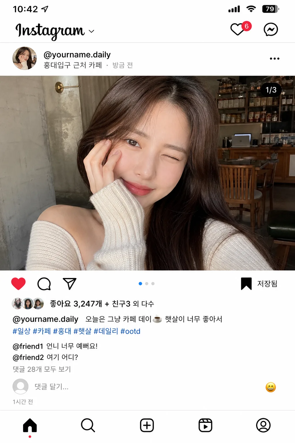
인스타그램 셀카 피드 장면 목업 (좋아요·댓글·해시태그)
인스타 피드 게시물 mockup. 본인 셀카 사진 + 좋아요·댓글·해시태그·캡션. 인플루언서 일상 피드 결.
인스타그램 셀카 피드 장면 목업 (좋아요·댓글·해시태그) summary
Copy this ChatGPT image prompt to create Social/Card News results. Its subject, background, style, and composition are organized for quick iteration.
Related keywords: 인스타그램 셀카 피드 장면 목업 (좋아요·댓글·해시태그), 인스타그램 셀카 피드 장면 목업 (좋아요·댓글·해시태그) 프롬프트, Social/Card News 프롬프트, Social/Card News AI 이미지 프롬프트, ChatGPT 이미지 프롬프트, AI 이미지 생성 프롬프트, AI 프롬프트, 이미지 프롬프트
How to use 인스타그램 셀카 피드 장면 목업 (좋아요·댓글·해시태그)
Keep the prompt structure and swap the subject, background, palette, or composition to create new variations.
- Keep the main subject and adjust the palette and background for your brand, season, or channel.
- If the result feels busy, simplify the background and make the subject, composition, and lighting more specific.
- After copying, ask ChatGPT to adapt it for your platform, aspect ratio, or text requirements.
Original prompt
[Input]
- reference_image: {참고 이미지}
- language: Korean
- output_size: 1024x1536

[Purpose]
Instagram-style selfie feed post mockup for social media presentation, designed to look like a believable real app screenshot captured from a modern phone. Vertical 4:5-like mobile feed composition that preserves the source selfie while adding account identity, likes, caption, hashtags, comments, micro UI icons, timestamp, location, and small realistic interaction details.

[Composition]
- Main post area: {원본 보존} fills the central feed image region, cropped naturally like a real uploaded selfie with authentic phone-camera proportions and everyday lifestyle context visible from the reference image.
- Top account row: {아이디·프로필} placed at the upper-left of the post card, with a small circular avatar, compact username line, subtle verification-like dot only if it reads as a generic UI accent, and a three-dot menu icon on the right.
- Location and meta row: add a small Korean location label under the handle such as “서울 마포구 연남동” or “홍대입구 근처 카페”, plus a tiny “방금 전” / “2026.05.01” style timestamp treatment in muted gray.
- Interaction row: heart, comment bubble, paper-plane/share, and bookmark/save icons aligned in a familiar Instagram-style row beneath the image, with consistent spacing, thin line weight, and tiny tap-target realism.
- Text blocks: {좋아요 수}, {캡션}, {해시태그}, and {댓글} stacked vertically with clear hierarchy, realistic line breaks, username bolding, muted metadata, and natural app padding.
- Social micro details: include a small “저장됨” style bookmark hint, carousel-style dot indicator if appropriate, tiny “공유” / “보내기” affordance feel, and a light-gray input hint at the bottom such as “댓글 달기...” with a small emoji button.
- Background treatment: clean white app canvas with subtle light-gray separators, faint card depth, visible status-bar area, and realistic mobile screenshot spacing.
- Frame behavior: all UI elements should stay inside a single tall mobile feed card, sized like a phone screenshot, with app navigation hints at top and bottom that reinforce the feed context.

[Core Structure]
- Status/navigation section: very top includes small phone status-bar details and an Instagram-like header strip with “Instagram” wordmark-style text, a notification heart icon, and message icon, rendered as generic app UI elements.
- Profile header section: {아이디·프로필} displayed immediately above the image area in standard app-post header placement, with a small profile circle, compact handle text, location line, and right-side menu dots.
- Hero image section (top 58%): {원본 보존} shown as the main Instagram photo, centered and edge-to-edge within the post card, preserving the natural selfie look and retaining believable background texture from the original image.
- Image overlay realism: add a tiny carousel/page dot or subtle media indicator only if it fits the feed screenshot, keeping it small and app-native rather than poster-like.
- Engagement section: icon row directly below the image, then {좋아요 수} in bold text, followed by {캡션} in one or two realistic app lines with the account handle emphasized.
- Hashtag section: {해시태그} appended under the caption in muted blue/link-like styling, separated by subtle spacing as in a real feed post.
- Comment section: {댓글} placed below the caption/hashtags block, with smaller secondary text, short Korean replies, and a “댓글 28개 모두 보기” style link treatment inside the provided copy.
- Bottom app area: include a small “댓글 달기...” field, emoji shortcut, timestamp such as “1시간 전”, and a faint bottom navigation bar with home/search/reels/profile icons.
- UI realism pass: {화면 톤} must govern every icon, divider, text color, avatar treatment, spacing decision, and screenshot clarity so the final image reads as an authentic Instagram feed post.
- Canvas finish: {비율} kept as a tall mobile-screen mockup with believable app chrome, subtle screen edges, and crisp high-resolution UI rendering.

[Style Rules]
- Typography: use Pretendard or Noto Sans KR for the UI text, 400–600 weight, 18–26 px for body lines, 28–34 px for key counts, and 14–18 px for comments/meta; username and like count should appear slightly bolder.
- Color palette: pure white #FFFFFF, near-black #111111, Instagram-like neutral gray #8E8E8E, separator gray #DBDBDB, soft icon gray #262626, muted link blue #385898 or #00376B for hashtags and comment links.
- Border/shadow: subtle phone-screen card depth, soft gray edge separation, and light UI dividers that feel like a real screenshot captured on a modern device.
- UI density: include realistic app-level detail such as small icon alignment, line-height consistency, avatar ring edge, bottom nav icons, timestamp, location line, and comment input microcopy.
- Korean rendering: all visible Korean text must be sharp, correctly spaced, and natural for an everyday Instagram post rather than advertising copy.

[Visual Style]
- Camera / lens: phone-camera selfie look, 26mm-equivalent smartphone lens, f/1.8 aesthetic, realistic social-app upload sharpness rather than studio portrait polish.
- Lighting: natural window light from upper-left at about 45°, soft fill from front, minimal hard shadowing, realistic indoor daylight balance.
- Color grade: clean neutral whites with slightly warm skin tones, modest contrast, and app-screenshot clarity with no heavy filters.
- Screen realism: crisp 1024x1536 mobile screenshot feel, high-DPI UI edges, slight compression realism in the photo area, and accurate contrast between photo content and app interface.

[Mood]
Casual social-media documentation — modern Instagram feed screenshot aesthetic with the crisp, functional feel of an everyday lifestyle post, enriched with believable interaction details, Korean captioning, and natural mobile-app atmosphere.

[Critical]
- Korean text accuracy: "좋아요 3,247개 + 친구3 외 다수", "오늘은 그냥 카페 데이☕️ 햇살이 너무 좋아서", "#일상 #카페 #홍대 #햇살 #데일리 #ootd", "@friend1 \"언니 너무 예뻐요!\" / @friend2 \"여기 어디?\" / 댓글 28개 모두 보기".
- Add small realistic Korean UI strings where space allows: "서울 마포구 연남동", "1시간 전", "댓글 달기...", "공유", "저장", "더 보기".
- The layout must read as a real Instagram feed post screenshot, with correct icon order, realistic spacing, status/header/bottom navigation hints, and no broken Korean characters.
- Preserve the source selfie naturally without over-stylized filters, artificial bokeh spam, or mismatched UI components.
- Keep {아이디·프로필}, {좋아요 수}, {캡션}, {해시태그}, {댓글}, {화면 톤}, and {비율} visually represented as the controlling content fields.

[8. 🚫 PROHIBITED]
- Fake official seals / certifications
- Broken Korean characters
- Celebrity composites / unauthorized likeness