Ads/Posters
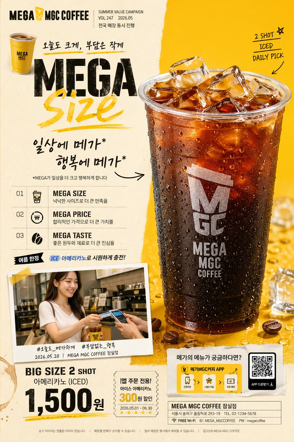
저가 커피 브랜드 광고 포스터
메가커피 같은 한국 저가 커피 브랜드 광고 톤. 노란색·블랙·크라프트 + 큰 영문 헤드라인 + 손글씨 카피 + 3대 가치 + 큰 음료 hero + QR. 가성비·MEGA 컨셉.
저가 커피 브랜드 광고 포스터 summary
Copy this ChatGPT image prompt to create Ads/Posters results. Its subject, background, style, and composition are organized for quick iteration.
Related keywords: 저가 커피 브랜드 광고 포스터, 저가 커피 브랜드 광고 포스터 프롬프트, Ads/Posters 프롬프트, Ads/Posters AI 이미지 프롬프트, ChatGPT 이미지 프롬프트, AI 이미지 생성 프롬프트, AI 프롬프트, 이미지 프롬프트
How to use 저가 커피 브랜드 광고 포스터
Keep the prompt structure and swap the subject, background, palette, or composition to create new variations.
- Keep the main subject and adjust the palette and background for your brand, season, or channel.
- If the result feels busy, simplify the background and make the subject, composition, and lighting more specific.
- After copying, ask ChatGPT to adapt it for your platform, aspect ratio, or text requirements.
Original prompt
[Input]
- language: Korean
- output_size: 1024x1536

[Purpose]
Korean low-cost coffee brand advertising poster, vertically structured A4-style campaign sheet for social feed, counter display, window posting, and in-store menu promotion.
Photoreal commercial poster that sells value, size, cold refreshment, and everyday accessibility with a bold MEGA concept, enriched with realistic franchise-ad details such as promo dates, store information, menu snippets, small legal copy, QR/app order callout, and campaign micro-labels.

[Composition]
- Poster format: tall vertical sheet with a left-branding column and right hero-product column, using {레이아웃} as the base structure.
- The top-left area carries {브랜드명·로고} as a compact logo lockup, while the main headline occupies the upper-left 22% of the frame with a real franchise-poster masthead feel.
- The center-left column stacks the headline, handwritten subcopy, the three value statements, a short seasonal promo label, and a compact menu/pricelist strip with tight editorial rhythm and clear hierarchy.
- The right half is reserved for {hero 음료}, shown as the main visual anchor with crisp product edges, realistic condensation, visible ice geometry, meniscus line, cup lid detail, and natural reflections on the transparent cup.
- The lower band contains {가격·태그} with a strong promo block, QR-style app/order callout, ticket-like coupon detail, and small store/contact information aligned to the bottom-right.
- Include a small supporting lifestyle cut based on {인물·lifestyle 컷}, integrated as a secondary campaign image with a realistic photo-card border, tiny caption, date/location label, and natural storefront atmosphere.
- Use {컬러 톤} as the core background split and accent system, with subtle paper grain, printed poster texture, coffee splash marks, ice-cube accents, hand-drawn marker strokes, and small menu-divider graphics that feel appropriate for a real coffee chain advertisement.

[3. CORE STRUCTURE]
1. Brand zone: Place {브랜드명·로고} at the upper-left in a compact commercial logo treatment, sized to feel like a real coffee-chain poster masthead. Add tiny campaign metadata nearby: "SUMMER VALUE CAMPAIGN", "VOL.247", "2026.05", and a short branch line such as "전국 매장 동시 진행".
2. Main headline zone: Set {메인 헤드라인} beneath the logo in a rough stencil-style English headline with hand-marked emphasis on the word “size,” using a yellow marker effect. Add a small Korean kicker above or beside it: "오늘도 크게, 부담은 작게".
3. Handwritten message zone: Add {손글씨 부카피} under the headline in casual handwritten Korean, with the fine-print line rendered small but fully legible. Include small annotation arrows and a marker underline that point toward the hero drink.
4. Value list zone: Stack {3대 가치} as three short editorial rows, each with the MEGA term leading and the explanatory Korean sentence following it. Use small icons or badges for size, price, and taste, plus tiny separators like "01", "02", "03".
5. Hero product zone: Show {hero 음료} on the right side as a photoreal commercial drink shot, with transparent cup material, ice detail, cold condensation, realistic logo print placement, straw/lid detail if appropriate, and a subtle contact shadow on the poster surface. Add a small flavor note tag near the cup: "2 SHOT", "ICED", "DAILY PICK".
6. Lifestyle support zone: Insert {인물·lifestyle 컷} as a natural supplemental image or connected secondary visual, keeping the same campaign lighting and camera realism. Frame it like a small printed campaign snapshot with caption text: "출근길 한 잔", "서울 성수점 앞", "2026.05.01 08:42".
7. Promo / price zone: Place {가격·태그} in the lower-right area with a strong price emphasis, QR-style square, and a short utility line. Add realistic order details: "APP ORDER", "매장 픽업 가능", "쿠폰은 결제 전 제시", and a tiny barcode-like strip.
8. Background / balance zone: Use a split-field poster background from {컬러 톤}, with the left side calmer and the right side more saturated. Add tactile realism through printed paper fibers, mild fold impression near the lower third, small coffee-ring texture, tiny dotted grid accents, and practical in-store poster details such as a small footer address line: "서울시 강남구 테헤란로 123 · 고객센터 1588-0000".

[4. STYLE RULES]
- Typography: use bold stencil-style English for the main headline, Pretendard or Noto Sans KR for Korean body lines, and a handwritten brush style for the subcopy; headline weight should feel heavy and poster-like, body text medium to semibold, small print crisp and readable.
- Color palette: cream ivory #f5ebd6, mustard yellow #fdc433, black #1a1a1a, with subtle warm off-white and muted coffee-brown accents; keep strong contrast for legibility.
- Border/shadow: use realistic editorial shadows, soft product drop shadow with 4px y-offset, 14px blur, 18% opacity, small inset shadows around coupon/QR blocks, and natural printed-poster depth where paper overlaps photo-card or label elements.
- Add believable commercial-poster details: small campaign labels, dotted dividers, coupon perforation marks, simple illustrated ice cubes, marker strokes, menu tabs, app-order micro icons, and a compact price/menu strip without changing the provided main copy.
- Include a secondary mini menu/pricelist area with realistic Korean text, for example: "카페라떼 2,900원", "바닐라라떼 3,400원", "아이스티 2,000원", "디저트 세트 +1,500원"; keep it subordinate to the required hero price.
- Maintain a polished Korean franchise advertising look, practical and approachable rather than luxury; every graphic element should support the value-forward coffee campaign.

[5. VISUAL STYLE]
- Camera / lens: Hasselblad X2D 100c with XCD 80mm f/2.8 for the hero drink, or Sony A7R V with 50mm f/1.4 for the lifestyle support image; shoot with commercial advertising precision and shallow-but-real depth.
- Lighting: soft diffused studio light from upper-left at roughly 45°, gentle fill from the right, and a subtle rim highlight on the cup edge; lifestyle cut should feel like natural storefront daylight or overcast outdoor light.
- Color grade: warm cream + mustard + black with realistic coffee browns and cool ice highlights, avoiding HDR punch and avoiding oversaturated neon tones.
- Image rendering should feel like a photographed and printed real campaign poster with believable ink, paper texture, product photography, and in-store promotional design details, not an illustration or CG composite.

[6. MOOD]
Mainstream Korean coffee-chain campaign — practical, value-forward brand poster with the energetic commercial realism of a real franchise advertisement: bold price appeal, iced coffee refreshment, everyday commute mood, and friendly neighborhood-store accessibility.

[7. CRITICAL]
- Korean text accuracy: 반드시 정확히 보여야 하는 문구 — "일상에 메가*", "행복에 메가*", "*MEGA가 일상을 더 크고 행복하게 합니다", "MEGA SIZE", "MEGA PRICE", "MEGA TASTE", "BIG SIZE 2 SHOT", "아메리카노(ICED) 1,500원", "메가의 메뉴가 궁금하다면?"
- Additional small Korean poster text may appear and must be sharp: "오늘도 크게, 부담은 작게", "전국 매장 동시 진행", "출근길 한 잔", "서울 성수점 앞", "APP ORDER", "매장 픽업 가능", "카페라떼 2,900원", "바닐라라떼 3,400원".
- Keep all Korean and English text sharp, correctly spaced, and free of broken characters or jamo errors.
- The hero drink must remain a realistic transparent cup with ice and condensation, not a stylized illustration.
- The lifestyle person(s) must look candid and natural, with photoreal skin texture and no camera-aware posing.
- Layout must preserve a strong left-text / right-product hierarchy with a lower price strip, QR area, promo/date/store footer, and compact menu details.

[8. 🚫 PROHIBITED]
- Fake official seals / certifications
- Broken Korean characters, jamo breakup, or font fallback artifacts
- Celebrity composites or unauthorized likeness