廣告/海報
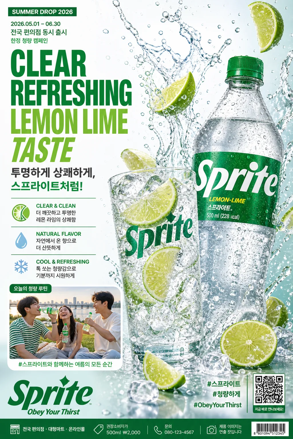
청량음료 시원한 광고 포스터
Sprite 같은 청량 음료 광고. 그린·화이트 + 큰 영문 헤드라인 + 한글 부카피 + 3특징 + 음료 병+잔+라임 hero + 물 splash·얼음. 시원함 강조.
청량음료 시원한 광고 포스터摘要
這是用來製作廣告/海報內容的 ChatGPT 圖像提示詞,已整理主題、背景、風格與構圖,方便快速調整。
相關關鍵字: 청량음료 시원한 광고 포스터, 청량음료 시원한 광고 포스터 프롬프트, 廣告/海報 프롬프트, 廣告/海報 AI 이미지 프롬프트, ChatGPT 이미지 프롬프트, AI 이미지 생성 프롬프트, AI 프롬프트, 이미지 프롬프트
청량음료 시원한 광고 포스터使用方式
保留原始結構並替換主體、背景、色彩或構圖,即可延伸出不同版本。
- 保留核心主體,並依品牌、季節或平台調整色彩與背景。
- 如果畫面太複雜,請減少背景元素並具體描述主體、構圖與光線。
- 複製後可要求 ChatGPT 配合平台、長寬比或文字需求調整。
提示詞原文
[Input]
- language: Korean
- output_size: 1024x1536

[Purpose]
Photoreal soda advertising poster for a lemon-lime soft drink, vertical A4-style layout with bold headline column and dynamic product hero.
Built for a real print-style campaign key visual, convenience-store display poster, and social-shareable ad poster, with a crisp refreshment-first look and believable retail advertising details.

[Composition]
- Poster orientation: A4 portrait, using {레이아웃}: a strong left text column occupying about 38% of the frame and the hero product visual dominating the right 62%.
- Main subject: {브랜드·제품명} positioned as the central hero, with a transparent glass, lime slices, ice, and a large PET bottle arranged in a layered diagonal flow.
- Background treatment: white-to-cool-mint studio backdrop with subtle moisture haze, real condensation textures, faint citrus pulp specks, tiny air bubbles, and soft reflected highlights on a glossy acrylic surface.
- Motion and spacing: dynamic splash arcs radiate upward and slightly toward the upper-right, with droplets, lime wedges, crushed ice pieces, and chilled mist surrounding the product while the headline remains readable.
- Poster information layer: include believable campaign details such as a small date label, promo period, QR/barcode area, retail availability line, sponsor/partner strip, and fine-print credit text in the footer.
- Optional lifestyle support visual: {인물·lifestyle 컷} integrated as a smaller campaign cut or soft secondary panel showing a candid summer refreshment moment, keeping the main product hero dominant.

[3. CORE STRUCTURE]
1. Left text column: set the headline stack at the upper-left with strong visual hierarchy; place {메인 헤드라인 (영문)} in a large bold sans-serif, and place {한글 부카피} directly below in smaller but still prominent Korean copy.
2. Campaign label area: above or beside the headline, add small Korean retail-ad details such as "SUMMER DROP 2026", "2026.05.01–06.30", "전국 편의점 동시 출시", and "한정 청량 캠페인" in compact type.
3. Feature block: arrange {3 특징} as three compact callout lines below the subcopy, each line paired with a small lime slice icon, water-drop bullet, or thin aqua divider so it feels like a finished beverage advertisement.
4. Hero product zone: position {hero 비주얼} in the right half with the glass slightly in front of the bottle, lime slices catching highlights, ice cubes visible through the liquid, carbonation bubbles rising, and splash droplets frozen sharply for energy.
5. Brand labels: anchor {브랜드 라벨} near the lower corners with a believable print-ad finish; include a left brand logo lockup and a right hashtag/QR area as if this poster is ready for store display.
6. Retail footer: add a slim footer band with tiny but legible Korean details: "전국 편의점 · 대형마트 · 온라인몰", "권장소비자가 500ml ₩2,000", "문의 080-123-4567", "제품 이미지는 연출 컷입니다", plus a small barcode/QR-style block.
7. Lifestyle integration: if used, embed {인물·lifestyle 컷} as a small supporting image strip, rounded photo inset, or sticker-like panel labeled "오늘의 청량 루틴" that suggests summer refreshment without overpowering the main product.
8. Final balance: let the white and cool-mint field feel icy and spacious, with green accents concentrated around the product, splash, headline, campaign labels, footer details, and decorative citrus graphics.

[4. STYLE RULES]
- Typography: use Pretendard ExtraBold or Helvetica Neue Condensed Bold for {메인 헤드라인 (영문)}, and Noto Sans KR Bold for {한글 부카피} and {3 특징}; headline size should feel oversized and ad-like, with the Korean copy in a clean 1/3 to 1/4 of the headline scale.
- Supporting typography: use Noto Sans KR Medium/Regular for promo period, availability line, footer, QR label, and fine print; make the microcopy believable but subordinate to the headline and product hero.
- Color palette: use {컬러 톤} with crisp white #FFFFFF, cool aqua highlights, vivid green #009639, and small lemon-lime accents; keep black text controlled and preserve detail in the greens.
- Graphic elements: include lime-tinted translucent panels, thin aqua rule lines, small droplet icons, subtle citrus rings, and a realistic QR/barcode block to make the poster feel printed and campaign-ready.
- Shadow and surface: use a soft drop shadow under the glass and bottle, roughly 4px y-offset, 14px blur, 18% opacity, plus realistic reflected highlights, wet tabletop glints, and tiny condensation beads.
- Print finish: emulate a glossy beverage poster with sharp product edges, fine halftone-free gradients, rich ink density, and clean studio contrast.

[5. VISUAL STYLE]
- Camera / lens: Hasselblad X2D 100c with XCD 80mm f/2.8 at ISO 100, f/4, studio commercial product photography framing.
- Lighting: bright softbox key from upper-left at 45°, cool fill from front-right, and a thin rim light from behind to outline the bottle, glass, and splash droplets.
- Color grade: clean cool white balanced against vivid green #009639 and lime-yellow accents, with slightly chilled cyan shadows and crisp specular highlights.
- Rendering feel: photoreal advertising campaign scan, with realistic condensation, liquid transparency, carbonation bubbles, ice refraction, PET bottle plastic, and splash physics that look captured in-camera rather than generated.
- Material detail: bottle label should have glossy ink, slight curvature, tiny edge highlights, natural shrink-wrap tension, and visible droplets; the glass should show thickness, refraction, and cold fogging near the rim.

[6. MOOD]
Premium beverage campaign key visual with a Nike-style energy level and a bright Korean summer convenience-store advertising feel, tuned for a fresh lemon-lime soda launch poster that feels lively, cold, and commercially real.

[7. CRITICAL]
- Korean text accuracy: 반드시 정확히 보여야 하는 문자열 — "투명하게 상쾌하게, 스프라이트처럼!", "CLEAR & CLEAN — 더 깨끗하고 투명한 레몬 라임의 상쾌함", "NATURAL FLAVOR — 자연에서 온 향으로 더 산뜻하게", "COOL & REFRESHING — 톡 쏘는 청량감으로 기분까지 시원하게", "좌하단 Sprite 로고 + Obey Your Thirst 슬로건", "우하단 #스프라이트 #청량하게 #ObeyYourThirst".
- Additional small Korean poster text should read naturally and accurately: "SUMMER DROP 2026", "2026.05.01–06.30", "전국 편의점 동시 출시", "권장소비자가 500ml ₩2,000", "제품 이미지는 연출 컷입니다", "QR로 청량 이벤트 참여".
- Layout invariant: the product hero must remain on the right side and the main text column on the left side, with the splash staying dynamic but not covering the headline.
- Photorealism invariant: skin, liquid, bottle plastic, ice, glass refraction, label printing, condensation, and droplets must all look physically believable, with no CGI sheen or fake compositing look.
- If the lifestyle cut is included, the people must look candid and naturally lit, not posed like a studio fashion shot.

[8. 🚫 PROHIBITED]
- Fake official seals or certifications
- Broken Korean characters or jamo breakup
- Celebrity composites or unauthorized likenesses in the lifestyle cut