照片轉換/濾鏡
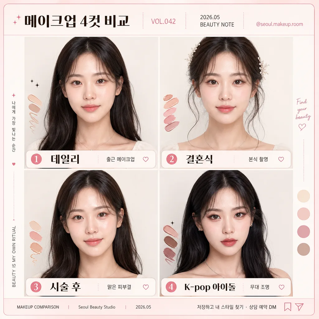
메이크업 4컷 비교
본인 사진 → 메이크업 4종 비교 컷. 데일리·결혼식·시술 후·K-pop 아이돌 톤. 동일 인물 메이크업·헤어 변화.
메이크업 4컷 비교摘要
這是用來製作照片轉換/濾鏡內容的 ChatGPT 圖像提示詞,已整理主題、背景、風格與構圖,方便快速調整。
相關關鍵字: 메이크업 4컷 비교, 메이크업 4컷 비교 프롬프트, 照片轉換/濾鏡 프롬프트, 照片轉換/濾鏡 AI 이미지 프롬프트, ChatGPT 이미지 프롬프트, AI 이미지 생성 프롬프트, AI 프롬프트, 이미지 프롬프트
메이크업 4컷 비교使用方式
保留原始結構並替換主體、背景、色彩或構圖,即可延伸出不同版本。
- 保留核心主體,並依品牌、季節或平台調整色彩與背景。
- 如果畫面太複雜,請減少背景元素並具體描述主體、構圖與光線。
- 複製後可要求 ChatGPT 配合平台、長寬比或文字需求調整。
提示詞原文
[Input]
- reference_image: {참고 이미지}
- language: Korean
- output_size: 1024x1024

[Purpose]
Create a realistic 4-cut makeup comparison portrait card for social sharing, showing one person transformed across clearly different beauty styles while preserving identity.
Fashion/beauty editorial layout with side-by-side comparison, suitable for a Korean salon portfolio, Instagram carousel cover, or beauty magazine feature page.
Use {4컷 모드}, {레이아웃}, {라이팅}, {배경}, and {비율} to guide the final arrangement and visual balance.

[Composition]
- Single model is repeated across 4 equal panels, with identical face angle and framing in every cut so makeup changes are the main difference.
- Keep {원본 보존} as the invariant across all panels; only makeup, hair, and styling may change.
- Use a 2x2 grid as the primary layout following {레이아웃}; if horizontal 4-cut is chosen, maintain equal panel widths and consistent face crop.
- Background should be {배경} with a realistic Korean beauty studio feel: softly lit paper backdrop or seamless wall, subtle blush-beige texture, faint studio depth, and refined salon/editorial atmosphere.
- Keep all faces centered at chest-up or shoulder-up crop, with consistent eye line and similar head size across the 4 panels.
- Add a polished social-card frame around the grid: top header bar, small issue/date label, beauty studio handle, and tiny save/share-style micro icons.
- Include small realistic comparison details around the panels: makeup shade swatches, tiny sparkle stickers, delicate divider dots, and short Korean caption notes that do not cover facial features.
- Add a small bottom footer line with salon-style credit text such as “MAKEUP COMPARISON | Seoul Beauty Studio | 2026.05”.

[Core Structure]
1. Panel 1 — Daily look: soft natural base, light blush, neutral lips, understated eyeliner, and simple natural hair styling; overall effect should read fresh and everyday.
2. Panel 2 — Wedding look: brighter complexion, fuller eye makeup, romantic blush, glossy or satin lips, and polished bridal hair with elegant volume or soft waves.
3. Panel 3 — Post-procedure glow look: luminous skin finish, hydrated cheeks, subtle pink warmth, refined brows, and healthy rested impression without over-contouring.
4. Panel 4 — K-pop idol look: stronger eyeliner, defined lashes, bolder lip color, sharper facial contrast, and more styled hair with performance-ready polish.
5. Bottom labels — Place short readable Korean labels beneath each panel, aligned consistently, with enough padding so the text does not touch the face crop or frame edge.
6. Header content — Add a realistic beauty editorial title area: “메이크업 4컷 비교”, “VOL.042”, “2026.05 BEAUTY NOTE”, and handle “@seoul.makeup.room”.
7. Micro captions — Add very short Korean notes near each label: “출근 메이크업”, “본식 촬영”, “맑은 피부결”, “무대 조명”.
8. Footer CTA — Add small Korean CTA text: “저장하고 내 스타일 찾기 · 상담 예약 DM”.

[Style Rules]
- Typography: Pretendard or Noto Sans KR, medium to semibold weight, 26–34px equivalent for main labels, clean sans-serif with tight vertical alignment; use smaller 11–16px equivalent text for date, handle, micro captions, and footer credits.
- Color palette: white #FFFFFF, soft blush pink #F7E7EC, warm beige #F3EBDD, light gray #E6E6E6, charcoal #2B2B2B for text, with small rose gold or muted mauve accents for stickers and swatches.
- Border/shadow: use thin 1px to 2px separators or subtle panel borders, with a very soft drop shadow 4px y-offset, 12px blur, 12–15% opacity only if needed.
- Layout should feel like a finished Korean beauty comparison card: editorial header, balanced grid, readable panel labels, realistic printed/social UI details, and refined salon portfolio polish.
- Decorative elements may include tiny sparkle icons, lipstick-tone swatches, blush circles, and thin annotation lines, kept secondary to the face and makeup comparison.

[Visual Style]
- Camera / lens: full-frame portrait look, 85mm f/1.4 or 70–200mm at 135mm, medium close-up framing for beauty comparison, sharp facial detail without distortion.
- Lighting: all four panels use the same soft studio setup guided by {라이팅}, key light from upper-left at 45°, gentle fill from front-right, soft catchlights in the eyes, flattering skin texture, and controlled shadow contrast.
- Color grade: clean editorial neutral grade with slightly warm skin tones, soft pink-beige whites, controlled highlights, and moderate contrast.
- Rendering: realistic skin texture, natural pores, believable hair strands, accurate makeup finish differences, and high-resolution beauty-retouch quality without making the face look synthetic.
- Overall ratio and crop should respect {비율}, producing a square 1024x1024 social-ready comparison card.

[Mood]
Korean beauty magazine comparison spread — Vogue Korea / Allure Korea editorial polish with a Seoul salon portfolio feel, lively enough for Instagram but refined enough for professional makeup consultation.

[Critical]
- Korean text accuracy: 반드시 아래 문구가 정확히 보여야 함
  - 메이크업 4컷 비교
  - 데일리
  - 웨딩
  - 시술 후 광채
  - K-POP 아이돌
  - 저장하고 내 스타일 찾기
- Preserve identity across all 4 panels: same person, same facial structure, same camera angle, same crop, same background family, only makeup/hair/style changes.
- All four panels must feel like a deliberate comparison set with equal visual weight and consistent framing.
- The makeup differences must be immediately readable: natural daily, romantic bridal, luminous glow, and bold idol styling.
- Small header, handle, date, captions, swatches, and footer details should enhance realism while keeping the face and makeup as the main focus.

[8. 🚫 PROHIBITED]
- Fake official seals / certifications
- Broken Korean characters