広告・ポスター
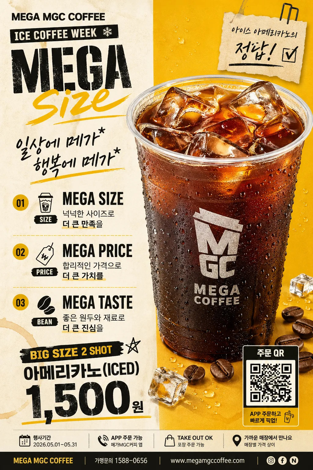
저가 커피 음료 단독 광고
메가커피 같은 한국 저가 커피 브랜드 광고. 노란색·블랙 + MEGA SIZE + 큰 음료 hero + 3대 가치 + QR. 인물 없음 — 음료 단독.
저가 커피 음료 단독 광고の概要
広告・ポスター画像を作るためのChatGPT画像プロンプトです。主題、背景、スタイル、構図を整理し、すぐに試せるよう構成しています。
関連キーワード: 저가 커피 음료 단독 광고, 저가 커피 음료 단독 광고 프롬프트, 広告・ポスター 프롬프트, 広告・ポスター AI 이미지 프롬프트, ChatGPT 이미지 프롬프트, AI 이미지 생성 프롬프트, AI 프롬프트, 이미지 프롬프트
저가 커피 음료 단독 광고の活用方法
元の構造を保ちながら、被写体、背景、色、構図を変更して別案に展開できます。
- 主題を維持し、ブランドや季節、媒体に合わせて色と背景を変更してください。
- 結果が複雑な場合は背景要素を減らし、被写体、構図、照明を具体化してください。
- コピー後、ChatGPTに媒体、アスペクト比、文字の有無を追加で指定できます。
プロンプト原文
[Input]
- language: Korean
- output_size: 1024x1536

[Purpose]
Korean single-product coffee ad poster, vertical A4-style retail layout, no people, centered around a value-for-money iced coffee hero. Designed for in-store window display, menu board, social media promo, kiosk signage, and print-ready brand advertising with realistic café promotion details.

[Composition]
- Overall layout: {레이아웃} organized as a polished editorial-retail poster with a strong left information column and a right product hero, using visible grid alignment, layered promo labels, small ordering details, and realistic printed-ad spacing.
- Hero placement: {hero 음료} occupies the right 42–48% of the frame, scaled large with crisp cutout edges, realistic condensation, ice clarity, tiny water droplets on the cup surface, and a subtle grounding shadow on a warm split-color poster background.
- Text area: the left column takes about 38–42% of the frame, with the headline at the top, supporting hand-drawn copy beneath, and the three value statements stacked vertically with badge-like separators, small icons, and readable retail rhythm.
- Bottom zone: {가격·태그} sits along the lower edge with compact pricing emphasis, a QR-style order box at the bottom-right corner, promo period text, store/contact line, and a small takeaway/app-order information strip.
- Background treatment: {컬러 톤} as a warm cream-and-mustard split poster surface with faint paper grain, subtle coffee-ring graphics, small ice-cube accent illustrations, and retail flyer-style divider rules that support the coffee value campaign.

[3. CORE STRUCTURE]
- Top-left header block: place {브랜드명·로고} as the brand anchor, followed by a small campaign label such as ICE COFFEE WEEK and then {메인 헤드라인} in a bold, attention-grabbing composition with mixed stencil and handwritten feel.
- Supporting copy block: place {손글씨 부카피} directly under the headline, slightly tilted or marker-like, with compact line breaks, a small underline stroke, and a handwritten sticker accent that feels like a real café promo note.
- Value list block: render {3대 가치} as three distinct stacked lines or mini-paragraphs, each separated with clear spacing, small circular number markers 01 / 02 / 03, and short supporting micro-labels such as SIZE, PRICE, BEAN.
- Product hero block: show {hero 음료} as the main object-focused visual, with photoreal ice detail, visible water droplets, transparent cup rim highlights, dark coffee gradient, and a branded cup print treated as part of the product shot rather than a separate logo graphic.
- Pricing block: place {가격·태그} near the lower third, with bold price digits, smaller descriptor text, a limited-period tag, and a QR-style square labeled 주문 QR kept as a realistic retail element.
- Retail detail strip: add a narrow bottom footer with small Korean text for 행사기간 2026.05.01–05.31, APP 주문 가능, TAKE OUT OK, 가까운 매장에서 만나요, and 매장별 가격 상이, using tiny but intentional typography like a real printed ad.
- Decorative poster elements: include simple mustard divider lines, small checkmark bullets, a tiny receipt-like promo tab, coffee bean and ice-chip illustrations near the product base, and a compact footer address/contact line without overpowering the hero.
- Balance and framing: keep the left text column aligned to a strict grid while the right hero feels slightly oversized and premium-commercial, creating a strong low-price value ad composition with believable retail density.

[4. STYLE RULES]
- Typography: use Pretendard ExtraBold for brand and pricing, Noto Sans KR Bold/Medium for body copy, and a hand-drawn marker style for the subcopy; headline size should feel poster-grade and pricing should remain highly legible.
- Color palette: use the exact tones from {컬러 톤}, with black text, cream ivory background areas, and mustard yellow accent emphasis; keep contrast sharp, cheerful, and commercial.
- Border/shadow: use a soft product shadow with 4px vertical offset, 14px blur, and about 18% opacity; allow thin editorial divider lines, sticker-like labels, and a subtle flyer edge treatment that feels printed and real.
- Graphic treatment: keep text flat and print-like, with crisp vector-style labels, small QR/order UI details, faint paper grain, subtle ink variation on handwritten copy, and realistic cup highlights.
- Microcopy hierarchy: all added supporting details should be small secondary retail information, never competing with {메인 헤드라인}, {3대 가치}, {hero 음료}, or {가격·태그}.

[5. VISUAL STYLE]
- Camera / lens: 85mm product lens look at f/8 for the hero drink, with a clean studio-catalog perspective and minimal distortion.
- Lighting: soft studio key light from upper-left at roughly 45°, gentle fill from front-right, and a faint rim highlight to emphasize condensation, cup curvature, dark coffee tone, and ice clarity.
- Color grade: warm cream and mustard commercial palette with neutral blacks, slightly desaturated highlights, crisp beverage-advertising contrast, and a friendly affordable coffee-shop atmosphere.
- Print realism: add subtle poster-paper texture, slight ink density variation, and tiny footer typography consistent with a real Korean café promotion poster.

[6. MOOD]
Korean value coffee brand poster — modern convenience-store ad meets lively café window promotion and clean editorial product photography, with a sharp retail promotion feel similar to a premium fast-casual campaign for an affordable iced coffee.

[7. CRITICAL]
- Korean text accuracy: the following Korean strings must appear exactly as written, with no broken characters:
  - "일상에 메가*"
  - "행복에 메가*"
  - "넉넉한 사이즈로 더 큰 만족을"
  - "합리적인 가격으로 더 큰 가치를"
  - "좋은 원두와 재료로 더 큰 진심을"
  - "행사기간 2026.05.01–05.31"
  - "APP 주문 가능"
  - "가까운 매장에서 만나요"
  - "매장별 가격 상이"
  - "주문 QR"
- The hero must remain product-only in focus: no people, no hands, no faces, no crowd; surrounding printed retail graphics, small icons, QR box, coffee bean accents, and ice-chip accents are acceptable.
- Keep the layout vertically structured and commercial, with clear separation between headline, value copy, product hero, price block, promo period, and footer retail information.
- The cup print may include the brand mark as part of the product, but it must remain clean and readable.
- Make the poster feel like a real Korean low-price coffee promotion displayed in a café window or printed as an A4 retail flyer, with believable pricing hierarchy and practical store-order details.

[8. 🚫 PROHIBITED]
- Fake certification seals or official-looking badges
- Broken Korean characters