広告・ポスター
프리미엄 카페 광고 v1 (투썸 톤·인물 없음·정물)
투썸·할리스 같은 프리미엄 카페 광고. 음료·디저트 정물 hero. 인물 없음 — 차분한 매거진 톤.
프리미엄 카페 광고 v1 (투썸 톤·인물 없음·정물)の概要
広告・ポスター画像を作るためのChatGPT画像プロンプトです。主題、背景、スタイル、構図を整理し、すぐに試せるよう構成しています。
関連キーワード: 프리미엄 카페 광고 v1 (투썸 톤·인물 없음·정물), 프리미엄 카페 광고 v1 (투썸 톤·인물 없음·정물) 프롬프트, 広告・ポスター 프롬프트, 広告・ポスター AI 이미지 프롬프트, ChatGPT 이미지 프롬프트, AI 이미지 생성 프롬프트, AI 프롬프트, 이미지 프롬프트
프리미엄 카페 광고 v1 (투썸 톤·인물 없음·정물)の活用方法
元の構造を保ちながら、被写体、背景、色、構図を変更して別案に展開できます。
- 主題を維持し、ブランドや季節、媒体に合わせて色と背景を変更してください。
- 結果が複雑な場合は背景要素を減らし、被写体、構図、照明を具体化してください。
- コピー後、ChatGPTに媒体、アスペクト比、文字の有無を追加で指定できます。
プロンプト原文
[Input]
- language: Korean
- output_size: 1024x1536

[Purpose]
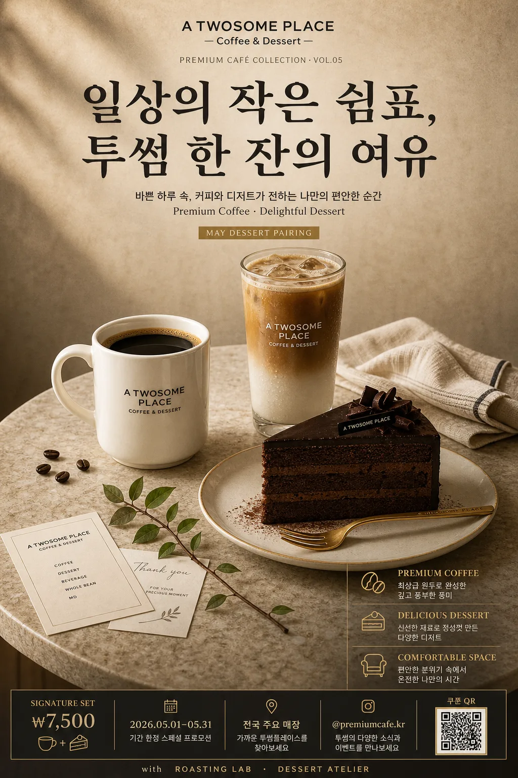
Premium café advertisement poster, still-life only, luxury editorial feel for a coffee and dessert brand. Vertical poster for premium brand marketing, designed as a real printed café campaign poster with rich product photography, seasonal promotion details, and a refined magazine-ad aesthetic.

[Composition]
- Center composition: the {hero 비주얼} occupies about 58% of the lower-middle frame, with the headline block stacked in the upper 22% and the value list aligned in the lower-right or lower-left margin.
- Background treatment: warm beige café-poster backdrop with subtle paper grain, soft wall-to-table transition, faint coffee-toned shadow falloff, and premium printed-ad texture that feels tactile and photographed.
- Spacing and framing: elegant editorial asymmetry with realistic café tabletop context; allow tasteful supporting items such as a folded linen napkin, gold dessert fork, small receipt slip, cacao dust, a few coffee beans, and a slim menu card to enrich the still life without overpowering the main product.
- Main copy layout: place {브랜드명} as a small brand line at top, {메인 한글 헤드라인} large and dominant, {부카피} beneath in smaller text, and {3대 가치} as a structured three-item block.
- Poster information layer: include a small campaign date label, signature set price, store/location line, social handle, QR coupon box, and sponsor/partner strip near the bottom like a real premium café advertisement.

[3. CORE STRUCTURE]
1. Top brand zone: set {브랜드명} small and centered near the top, with refined tracking and restrained luxury spacing, like a premium café masthead; add a tiny line below reading “PREMIUM CAFÉ COLLECTION · VOL.05”.
2. Headline zone: set {메인 한글 헤드라인} in a bold Korean display style, spanning 2 lines with clear line breaks, high contrast against the background, occupying the upper third without touching the edges.
3. Subcopy zone: place {부카피} directly below the headline in smaller sans-serif text, keeping the English phrase integrated naturally and aligned to the same grid; add a compact seasonal tag reading “MAY DESSERT PAIRING”.
4. Hero still life zone: render {hero 비주얼} on a round stone table surface, with the black coffee mug, tall glass latte, and chocolate cake slice arranged in a balanced triangle; include realistic details such as crema sheen, latte condensation, cake crumb texture, glossy chocolate layers, a ceramic saucer, gold spoon, small leaf sprig, folded cream napkin, and subtle logo detail as secondary accents, with no human presence.
5. Value block zone: present {3대 가치} as three stacked benefit lines with clear separators, using compact editorial spacing and crisp alignment for premium ad readability.
6. Footer promotion zone: add a tasteful bottom band containing “SIGNATURE SET ₩7,500”, “2026.05.01–05.31”, “전국 주요 매장”, “@premiumcafe.kr”, a small QR coupon area labeled “쿠폰 QR”, and a slim sponsor/partner area reading “with ROASTING LAB · DESSERT ATELIER”.

[4. STYLE RULES]
- Typography: use Pretendard SemiBold for supporting copy, Noto Sans KR Bold for the headline, and a refined serif accent like Noto Serif KR or Nanum Myeongjo for a premium editorial touch; headline size should feel poster-large, supporting text medium-small, footer microcopy finely typeset like a real printed campaign.
- Color palette: use {컬러 톤} as the core palette, with deep charcoal #1f1f1f, warm beige #e8dfca, and gold #b8924a; allow off-white highlights for paper, foam details, napkin fibers, and table reflections.
- Graphic accents: use thin gold divider lines, small circular bullet marks, restrained café icons, tiny QR-box geometry, and delicate editorial rules to create an authentic premium poster layout.
- Shadows and material realism: add soft realistic contact shadows under table objects, roughly 4px y-offset, 12px blur, 15% opacity; show natural glass reflections, porcelain highlights, paper grain, crumbs, condensation, and subtle print texture.

[5. VISUAL STYLE]
- Camera / lens: premium product editorial shot, 85mm lens at f/4.0, slightly elevated front angle with clean perspective control, comparable to high-end café print photography.
- Lighting: soft window light from upper-left at about 45°, with a gentle fill from right and a faint warm rim on the glassware; reflections should feel controlled, glossy, and realistic.
- Color grade: warm cream + caramel + charcoal with restrained gold highlights, subtle contrast, and a polished magazine print finish.
- Realism cues: macro-level dessert texture, visible cake layers, coffee crema depth, latte gradient, chilled glass condensation, slight stone-table imperfections, fine linen weave, and realistic ink-on-paper typography.

[6. MOOD]
Luxury café editorial — a Kinfolk-meets-contemporary café advertisement feel, polished and calm like a premium magazine spread, but with enough real campaign details, tabletop texture, and café merchandising cues to feel like an actual poster displayed in-store.

[7. CRITICAL]
- Korean text accuracy: the following Korean strings must appear exactly as written:
  - “일상의 작은 쉼표, / 투썸 한 잔의 여유”
  - “바쁜 하루 속, 커피와 디저트가 전하는 나만의 편안한 순간”
  - “최상급 원두로 완성한 깊고 풍부한 풍미”
  - “신선한 재료로 정성껏 만든 다양한 디저트”
  - “편안한 분위기 속에서 온전한 나만의 시간”
- Additional small Korean/price details to render clearly where appropriate:
  - “SIGNATURE SET ₩7,500”
  - “2026.05.01–05.31”
  - “전국 주요 매장”
  - “쿠폰 QR”
  - “오늘의 여유를 예약하세요”
- No people, no crowd, no human hands, no faces; keep the image as a premium still-life café advertisement.
- Keep all Korean characters perfectly rendered and readable, with clean spacing and no broken glyphs.

[8. 🚫 PROHIBITED]
- Fake official seals / certifications
- Broken Korean characters